

Hot or Not?
source link: https://creon.substack.com/p/hot-or-not
Go to the source link to view the article. You can view the picture content, updated content and better typesetting reading experience. If the link is broken, please click the button below to view the snapshot at that time.
Hot or Not?
visualizing temperatures around the world over the last 75 - 100 years.
I recently got re-invigorated to study climate change, and as is my wont I decided to look for data from "unimpeachable" sources, download it, and do statistical and visual analysis on my own.
I don’t like accepting authority or the so-called "scientific consensus" without double-checking. And I like data visualization and "data science". (I have publications in these areas but am skeptical of any discipline that has to add "science" to its name for credibility).
I look for myself, then generate questions to ask specialists who've spent their careers investigating these matters in which I’m just dabbling.
However, in reality, in very early 2020 I moved from San Francisco to Palm Springs California. Palm Springs is very hot in the summer (occasionally close to 120ºF). I was worried this might have been a bad move: That it might become unlivable before too long because of climate change (in this case warming).
There’s also a property in northeastern California I’m involved in where fire is a concern, access to water is an issue, etc. It too gets quite hot in the summer. We are concerned about the climate and how it might impact this property (I may want to, for instance, retire there).
Lastly, after 32 years working at NASA, I went to work for a commercial satellite imaging data company. One of our company’s major messages is that we are providing data to help monitor and address climate change. So for many personal - as well as humanitarian - reasons, I am getting more interested in climate change.
So I did some data analysis of my own - on warming. Here's how I did it, and here's what (I think) I found:
I wanted to find long-term temperature records. From thermometers. Not from proxies (tree rings, ice cores, etc). It turns out thermometers are not that hard to make, and they have been around for a while.
The data source I focused on is the "Automated Surface Observation System" (ASOS). It is a worldwide database of (approximately) hourly temperature data from airports. Many hundreds of airports. Some of the airports' data series are only a few years old, but some have been recorded since the dawn of commercial aviation - since the 1920s.
(ASOS records hourly temperature, wind speed, and humidity - which is what pilots need to know to decide whether they can take off or not. I just looked at temperature).
I focused on the "longest duration" ASOS timeseries: 75, 85, or more years old.
First I looked at Palm Springs CA (where I live - see above), then I looked at Sacramento CA (the closest airport to the property in NE California - see above). Then I looked in Hawaii (Molokai) again for personal reasons.
Then I looked at some arctic sites (Murmansk, Newfoundland...). Then other deserts (in the near east and middle east where "everybody knows" it is getting warmer), Europe (Munich, Stockholm, etc). "Everybody knows" that Stockholm has been warming over the decades too. I looked at other US sites, sites in S. America, Australia, China, India. etc.
I did not cherry pick. I just looked at each "interesting region" (interesting to me) and chose the very first airport in the list which had data going back to the 1930s or before.
Here is what I found.
Let's start with Palm Springs. I visualized each site (starting with Palm Springs) using four graphs of their respective ASOS data: The first graph is always a "sanity check": I just look at all the hourly data for the year 2020 (January 1st to December 31st - every hour) and plot it.

There are a number of things to notice here: 1) the high frequency oscillations are daily ("diurnal") oscillations in temperatures. 2) The very low-frequency sinusoidal modulation that takes all year is the annual, seasonal temperature oscillation. And 3) the medium scale "chaotic" modulation is "weather" - perturbations that take a few days to a few weeks.
Now let's look at the entire data series for Palm Springs: From the 1940s to June 2022, about an 80 year span of hourly data:
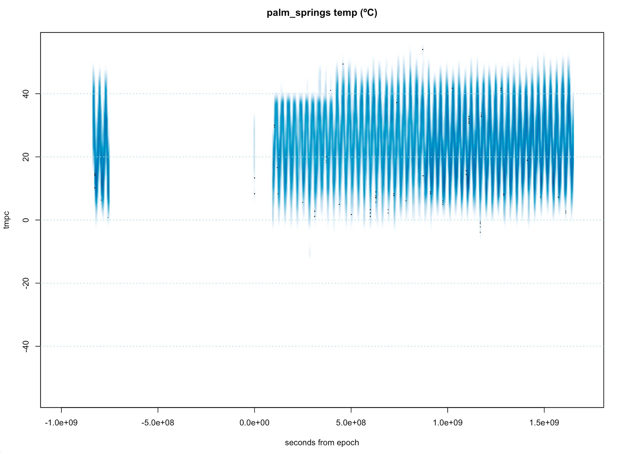
I use a "smoothed kernel density scatterplot". The annual oscillations are obvious, but the finer-scale stuff is blurred out (due to the smoothing kernel). We notice a BIG gap of several decades in the mid-20th century (why?). We see something changed with the sensor system about half way through (not too surprising. Technology upgrade?)
So Palm Springs data has flaws. (General principle: try to visualize all the data first).
But let's continue.
The next plotting technique for the same Palm Springs data is more quantitative: A sequence of boxplots with each individual boxplot summarizing all the hourly data in three year bins (about 26,000 hours per bin). The final bin (always) contains exactly three years of data ending in June 2022.
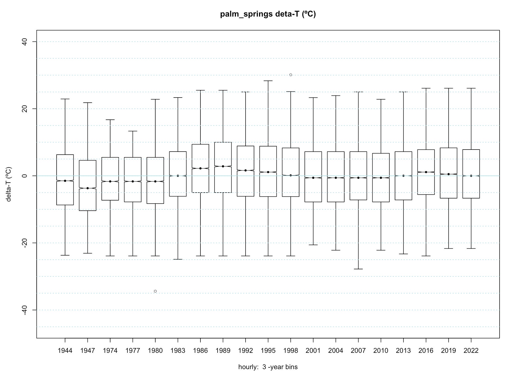
Bins with no data are not drawn (it skips the big gap from ~1950 to ~1974). The global median temperature (of the entire dataset) is uniformly subtracted from every data point, to keep things relative to an arbitrary x-axis of 0.
There are several things I notice here: 1) The medians (as well as the maxima, minima, and quartiles) vary from box to box. I.e. the climate fluctuates. 2) The fluctuations of the medians from box to box are visible, but they are about 20x smaller than the total range spanned by each 3-year box.
In Palm Springs (as in all deserts) the summer daytime highs are very hot and the winter nighttime lows are much colder.
For the final plot for these data we zoom in on the 3-year medians of the boxes (~26,000 hourly data points per median). And we also plot a linear least squares fit to the medians. The least squares fit looks like it is going up about 3ºC across the span. However, this trend is perhaps exaggerated because the first two medians are quite low. The rest of the series looks fairly random.
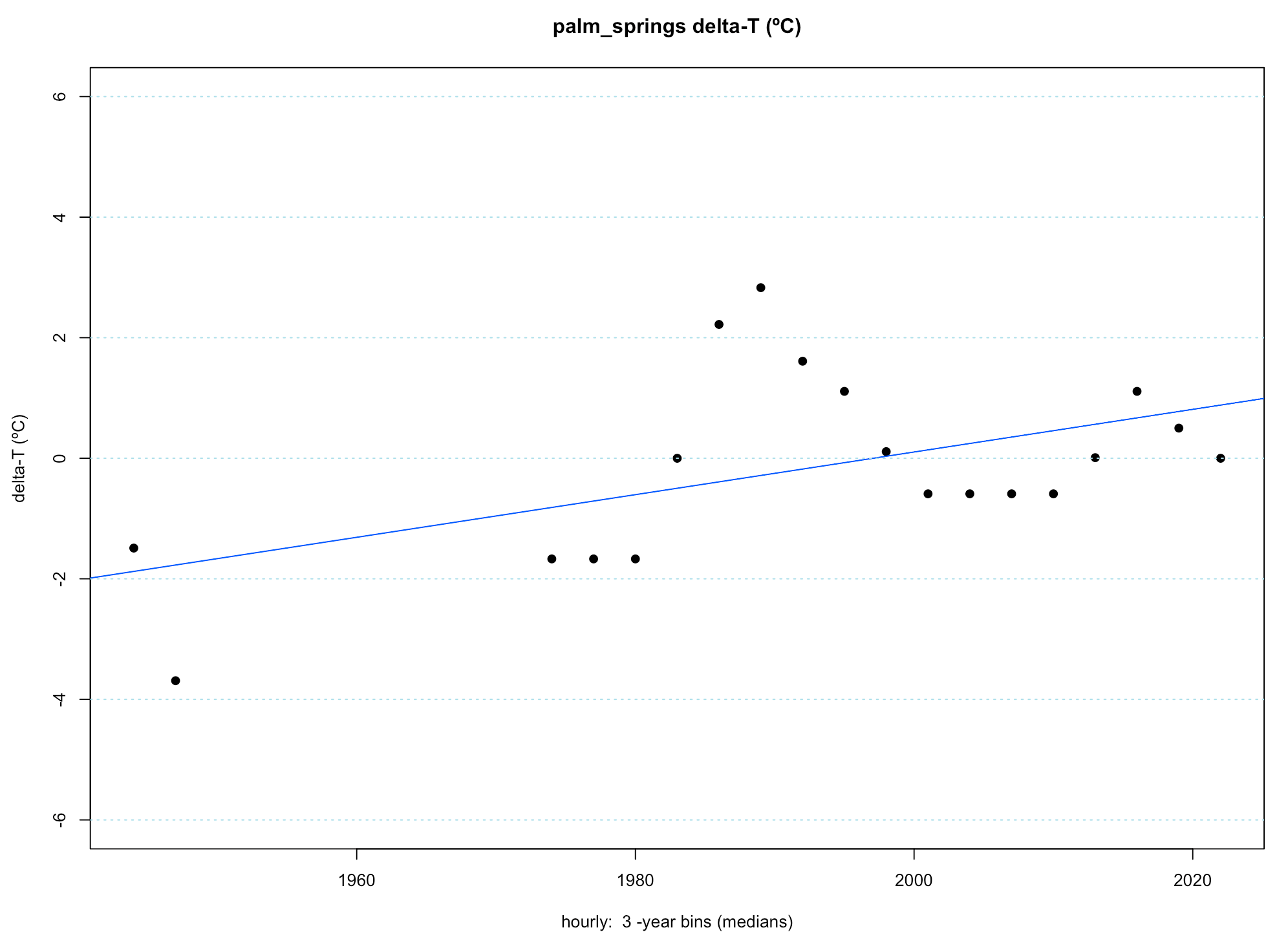
Again, Palm springs has big gaps. That's disappointing. And the Palm Springs area has been extensively developed (paved and suburbanized) over the last 80 years.
Next I plotted another desert site with about 80 years of data.(again with some gaps as you can see, though they are more spread out). It is Arak - a relatively small desert city in Iran. Here are the plots, presented without comment:

Next I looked at Molokai, in Hawaii:

Some things to note here: 1) tropical places have far less temperature variation than deserts. 2) There's another big gap. 3) There are some extreme outliers. I suspect (but do not know) that these may be when the thermometer got rained on or got direct sunlight. In any case, a few outliers do not effect medians. 4) The "median temperature are going down" (FWIW).
Next I looked at Newfoundland - pretty much the most Northeast part of North America. It had a long dataset (about 80 years), and "everybody knows" that temperatures in cold northerly places have been going up.
Data is presented without comment:

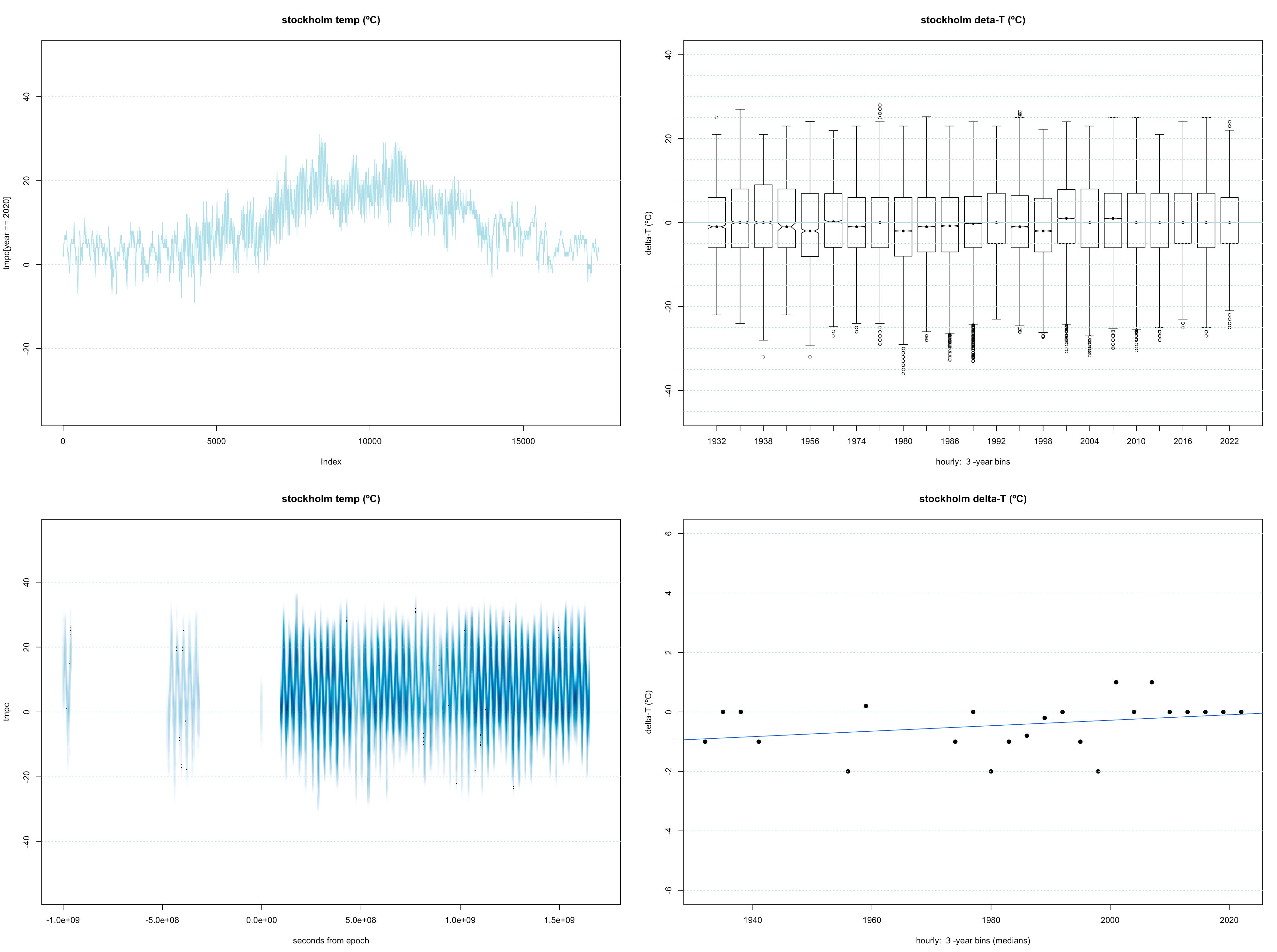
Then I looked at Stockholm, for the same set of reasons:
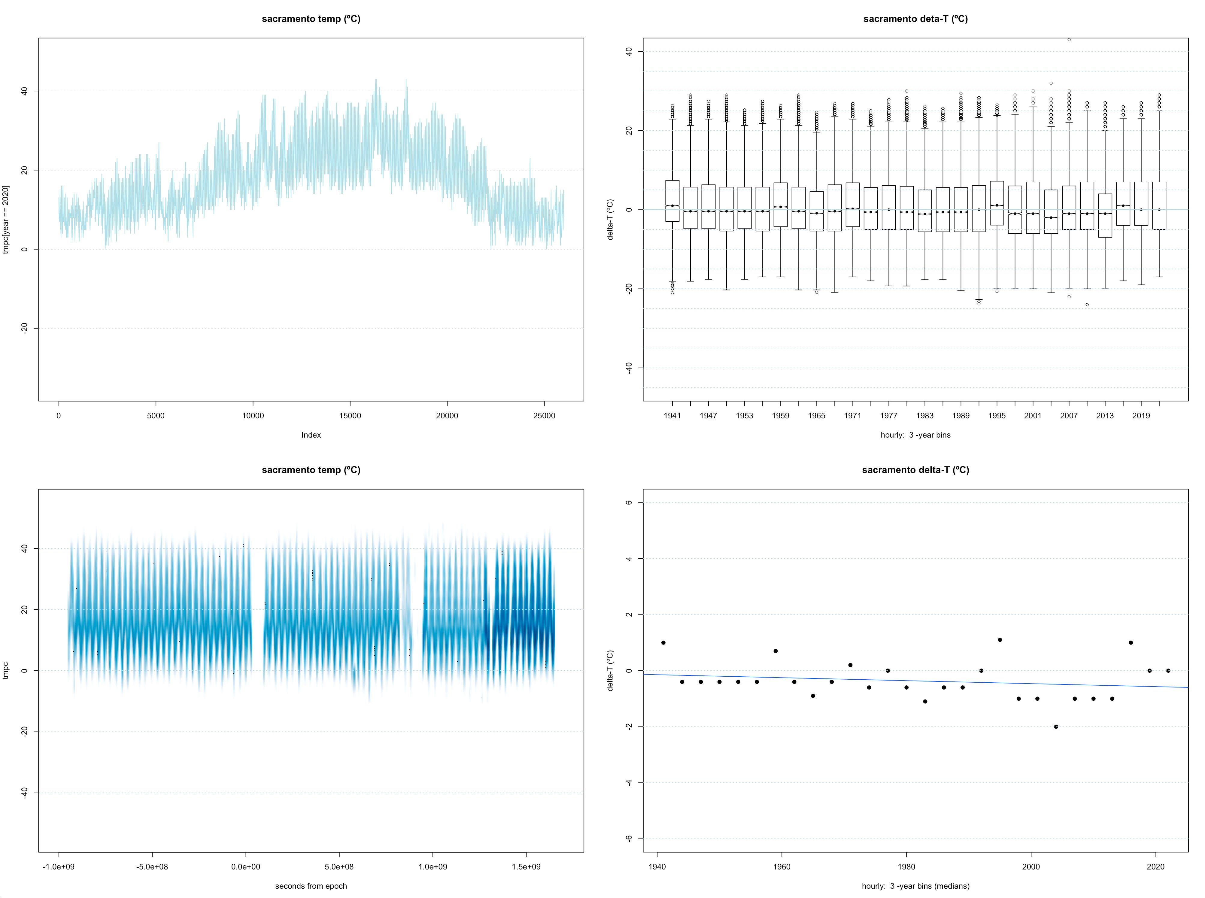
And I looked at Sacramento, California because it is the closest airport to the N. Cal. property I am involved in that also has a long time series. We are very concerned about wildfires at this property. Again, presented without comment:
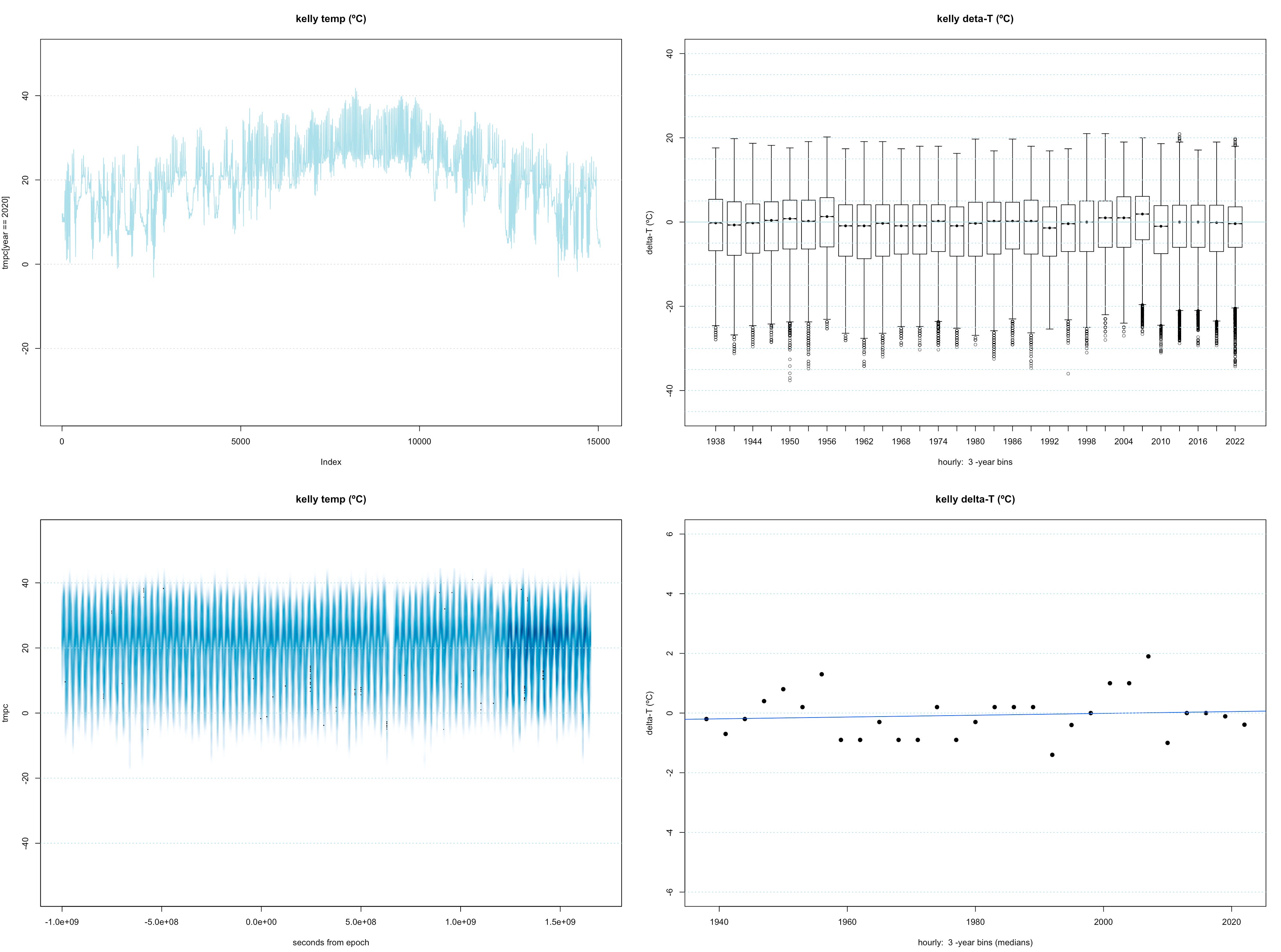
I started to ask friends where they were born, in order to demonstrate the visualizations and get a "random" sample of locations. So next I looked at Kelly, Texas. Here it is. Over 80 years of data. No comment:
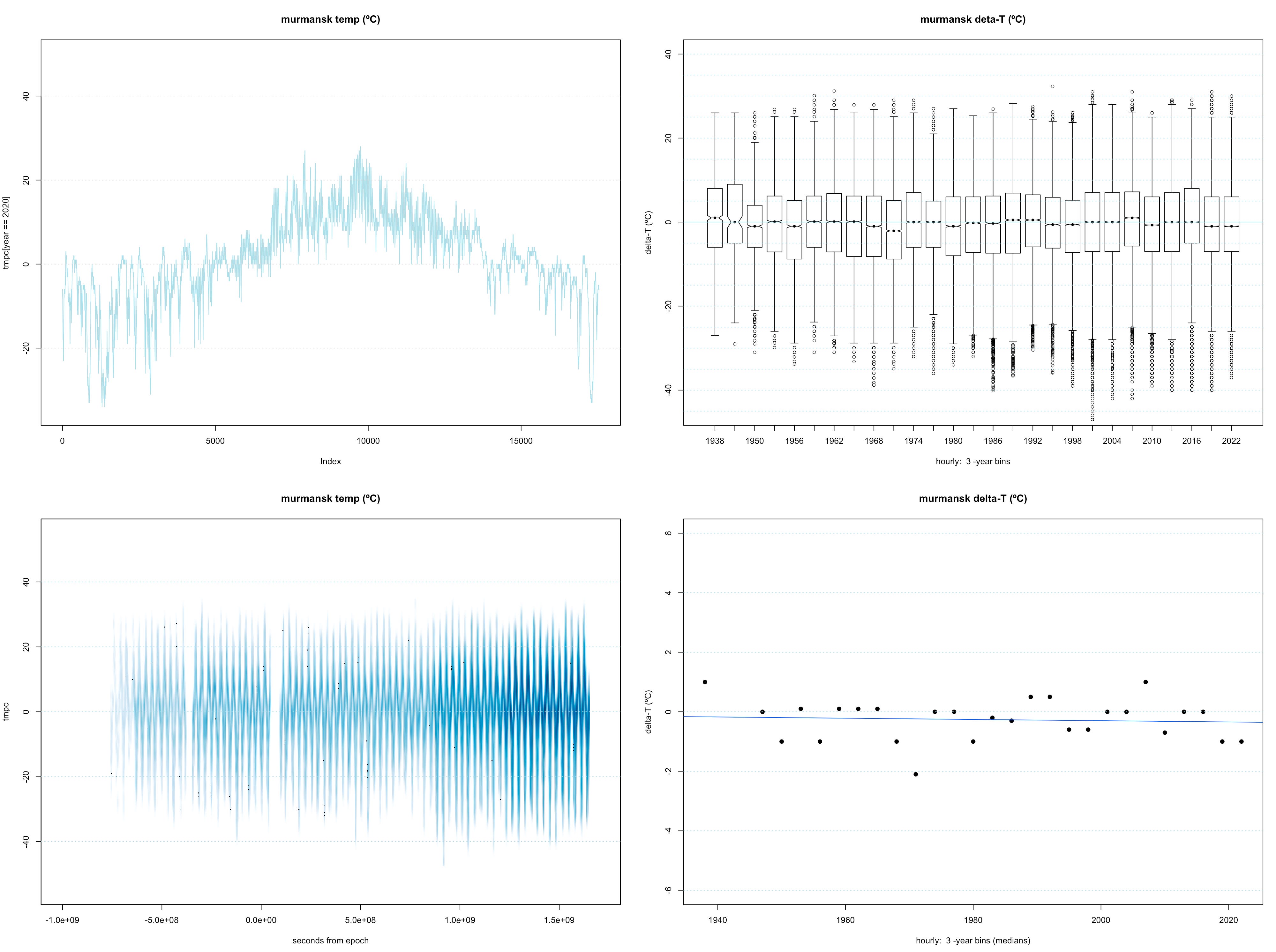
Similarly I looked at Murmansk. I keep expecting to find warming in or near the Arctic:
Next I wanted to look at China. Longer ASOS datasets are few and far between in that country, but I found Kunming. Even I know (or thought I knew) that China has been getting hotter.
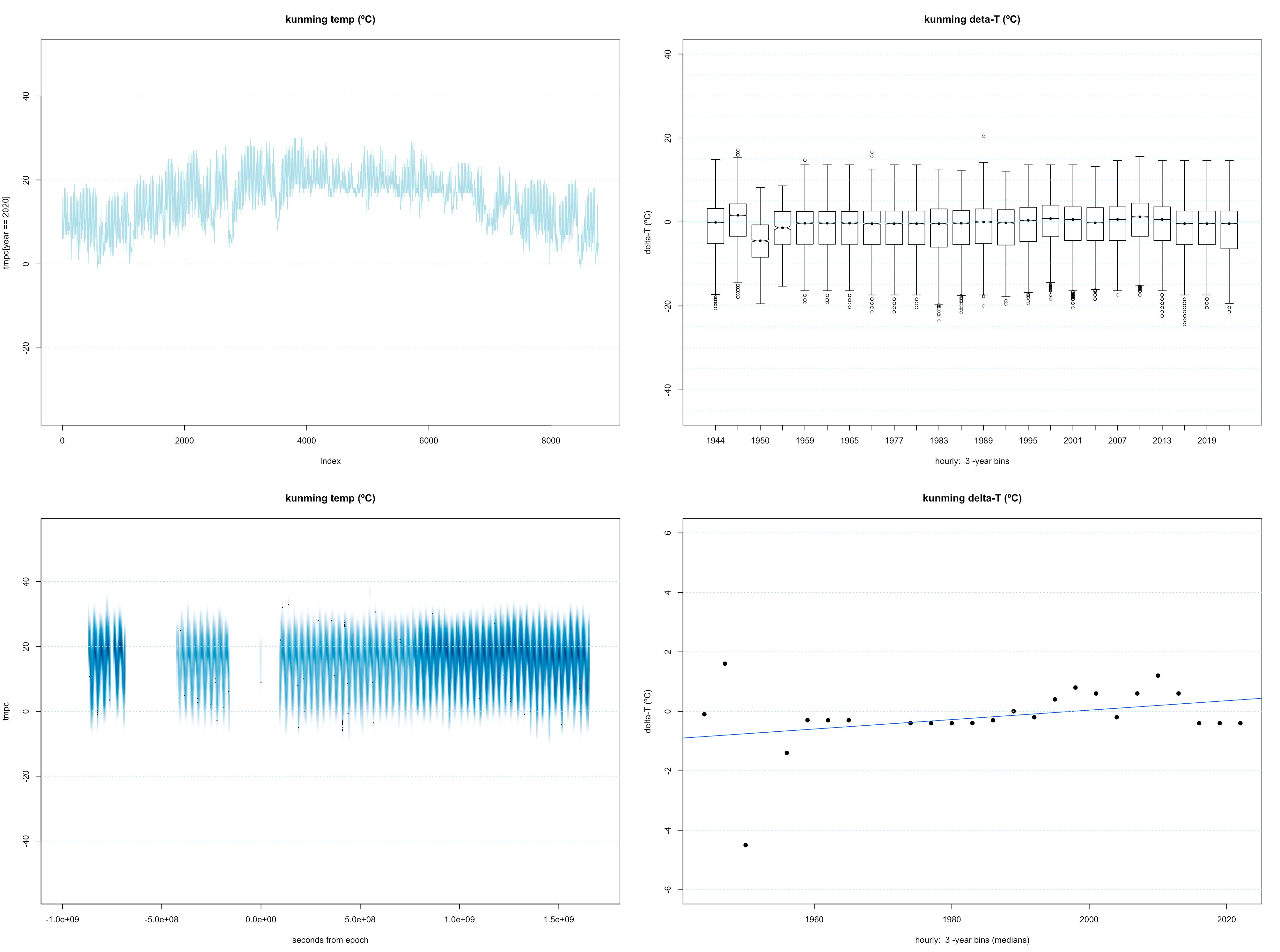
Note the early "lowlier" that helps tilt the least squares fit up and to the right. L2 norms do that sort of thing.
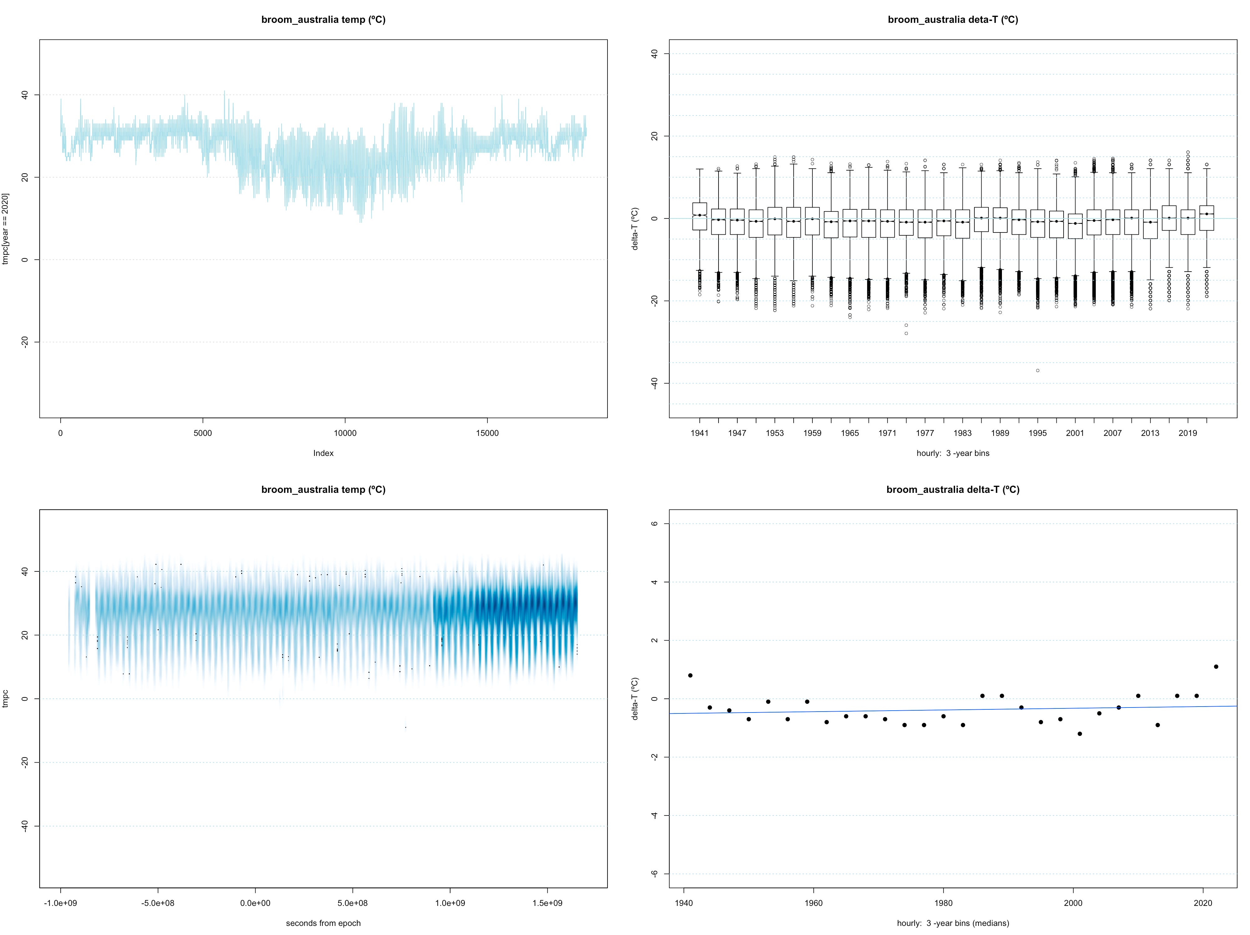
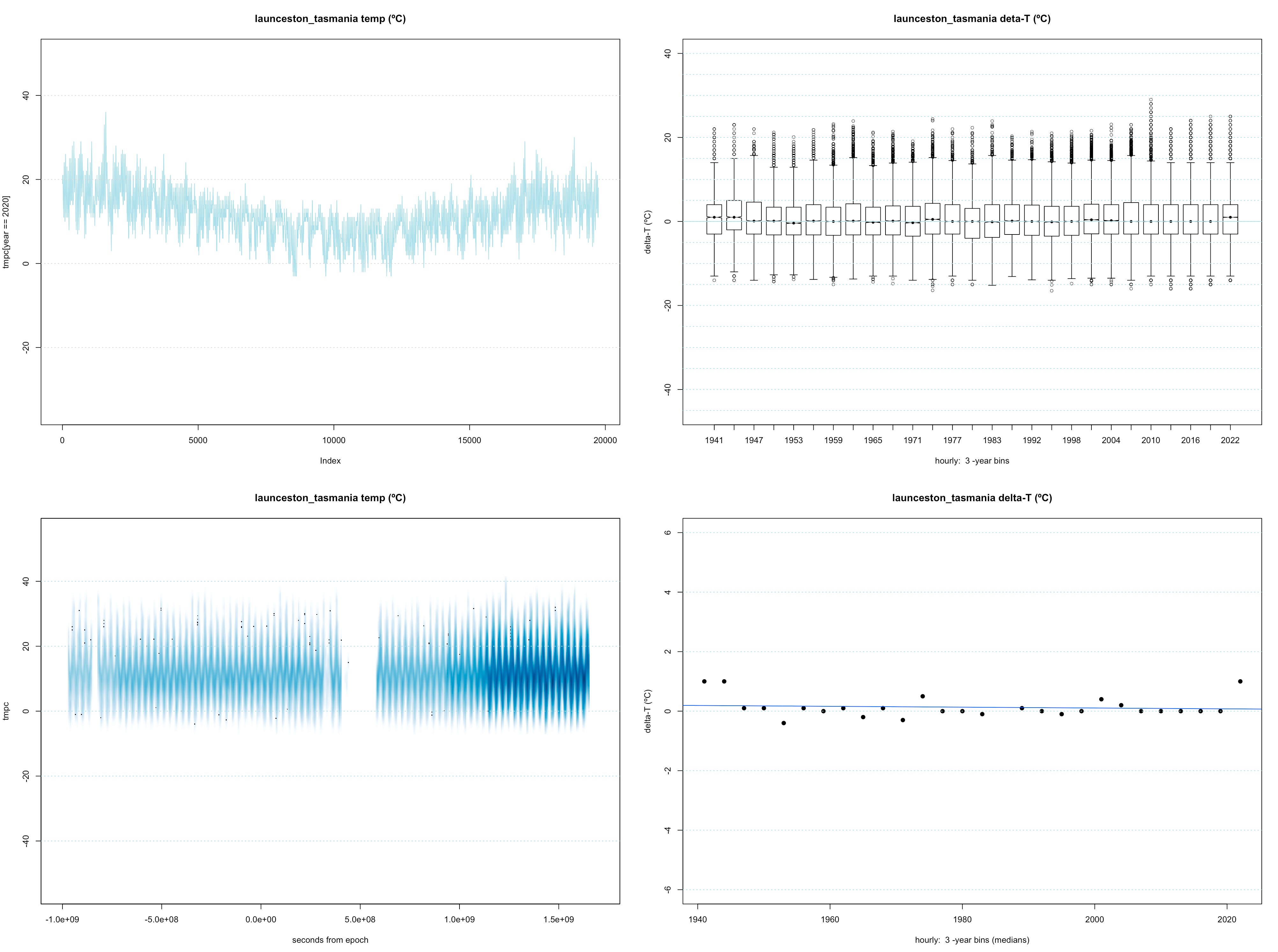
Then I looked south. Australia and Tasmania. Both presented without comment.
Then I decided to look at India. Again "everyone knows" that India is suffering from climate change. Here is the first place I looked at because it had long time series:
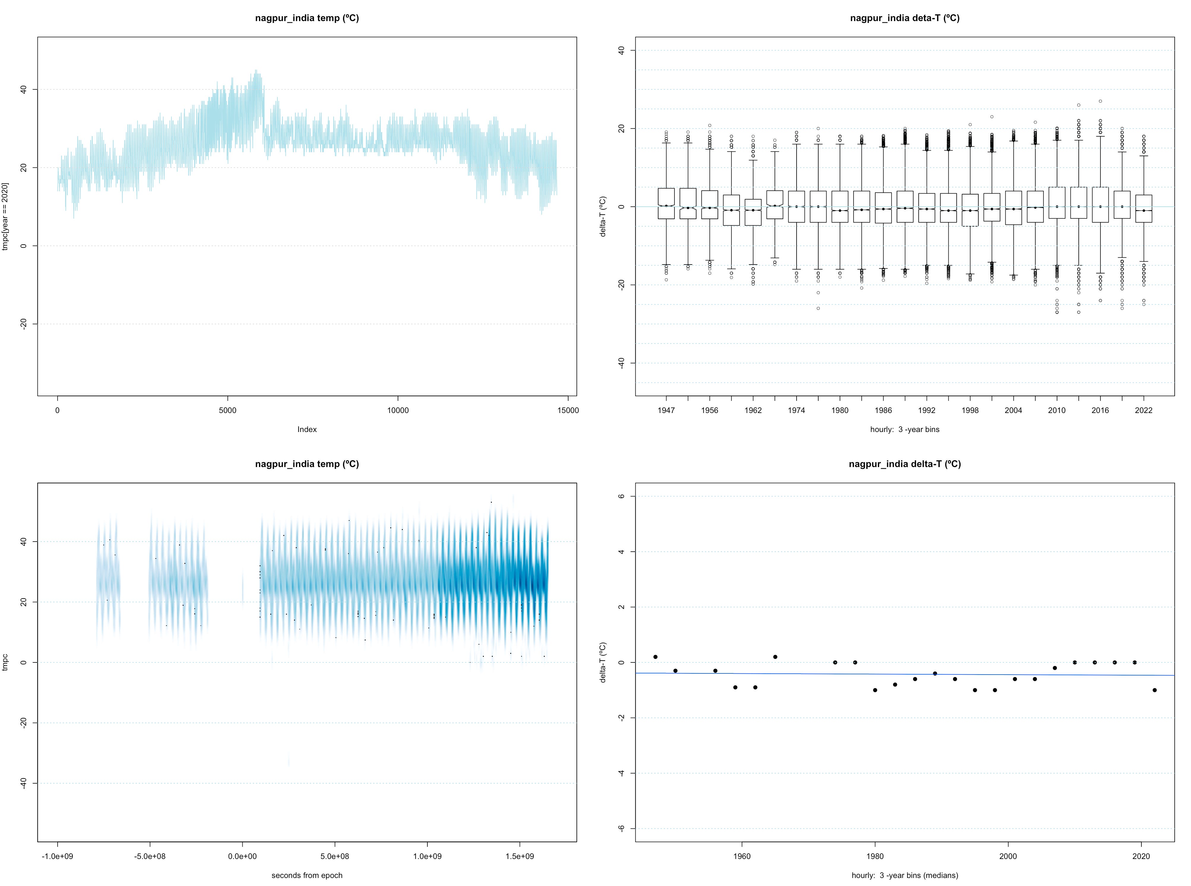
Is the sudden drop in the first plot the onset of the annual monsoon?
Here is the next place I looked at in India:

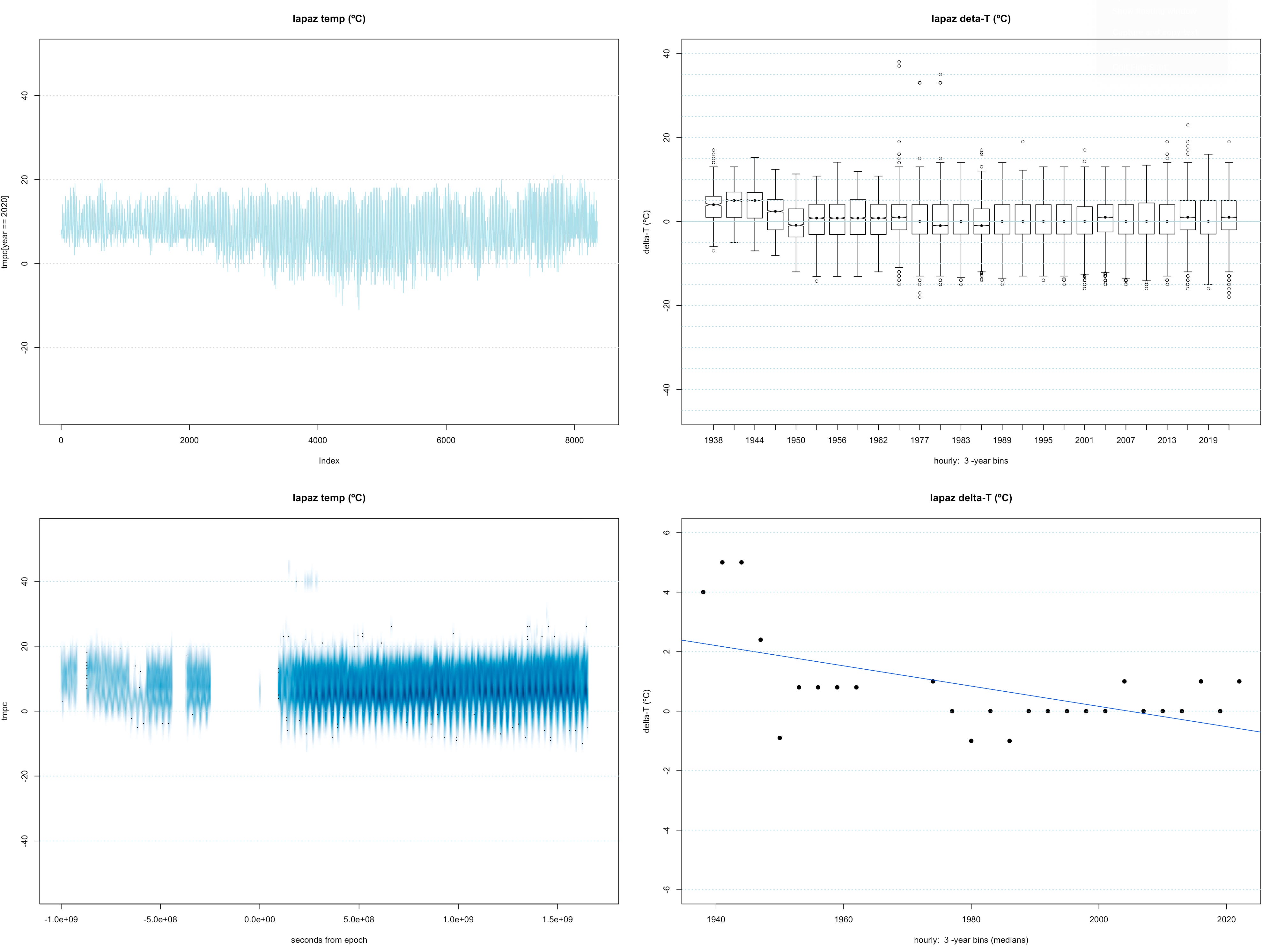
And here is the first place I looked at in South America. Lapaz Bolivia. Heavy urbanization over the time period in question:
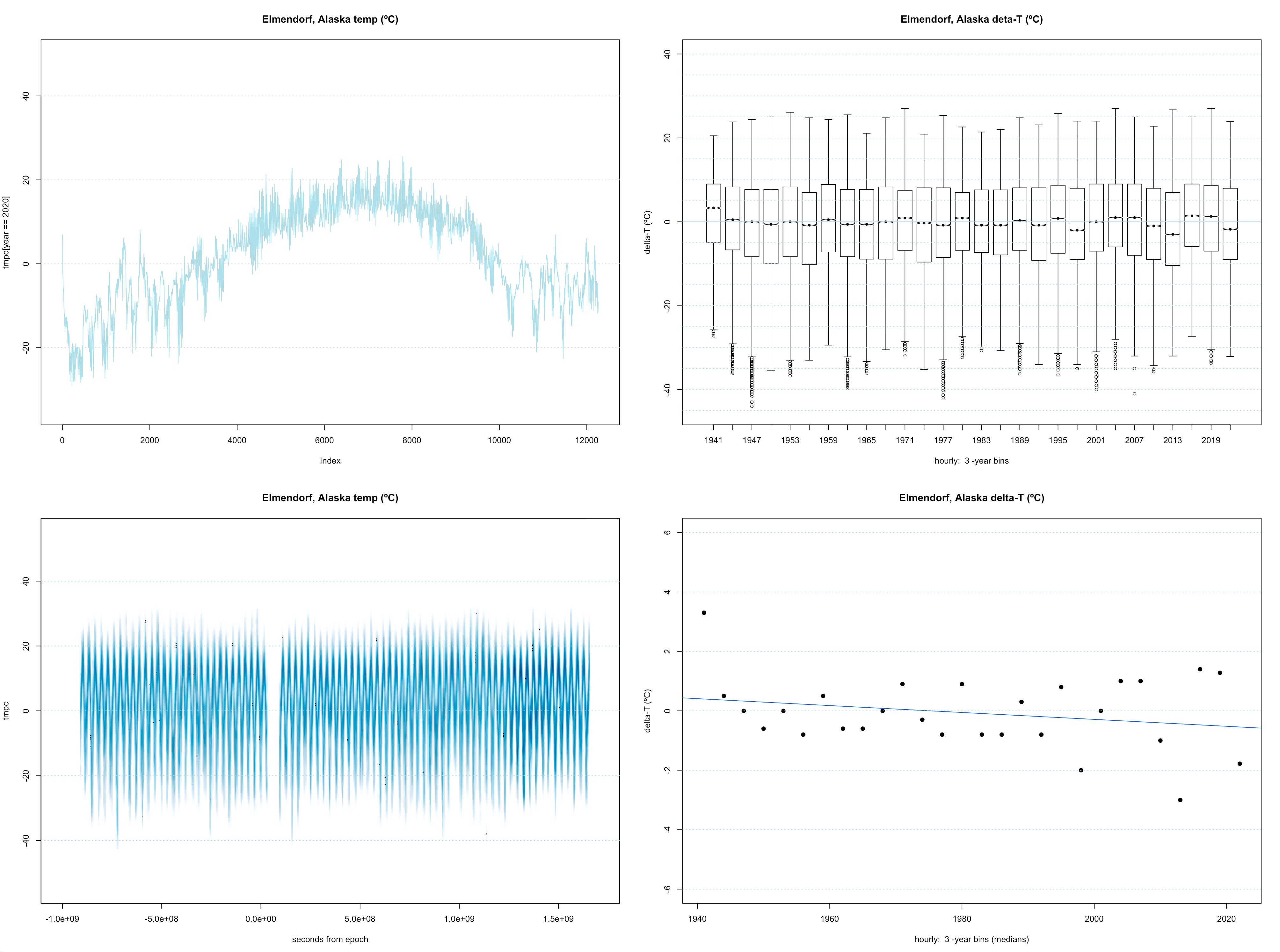
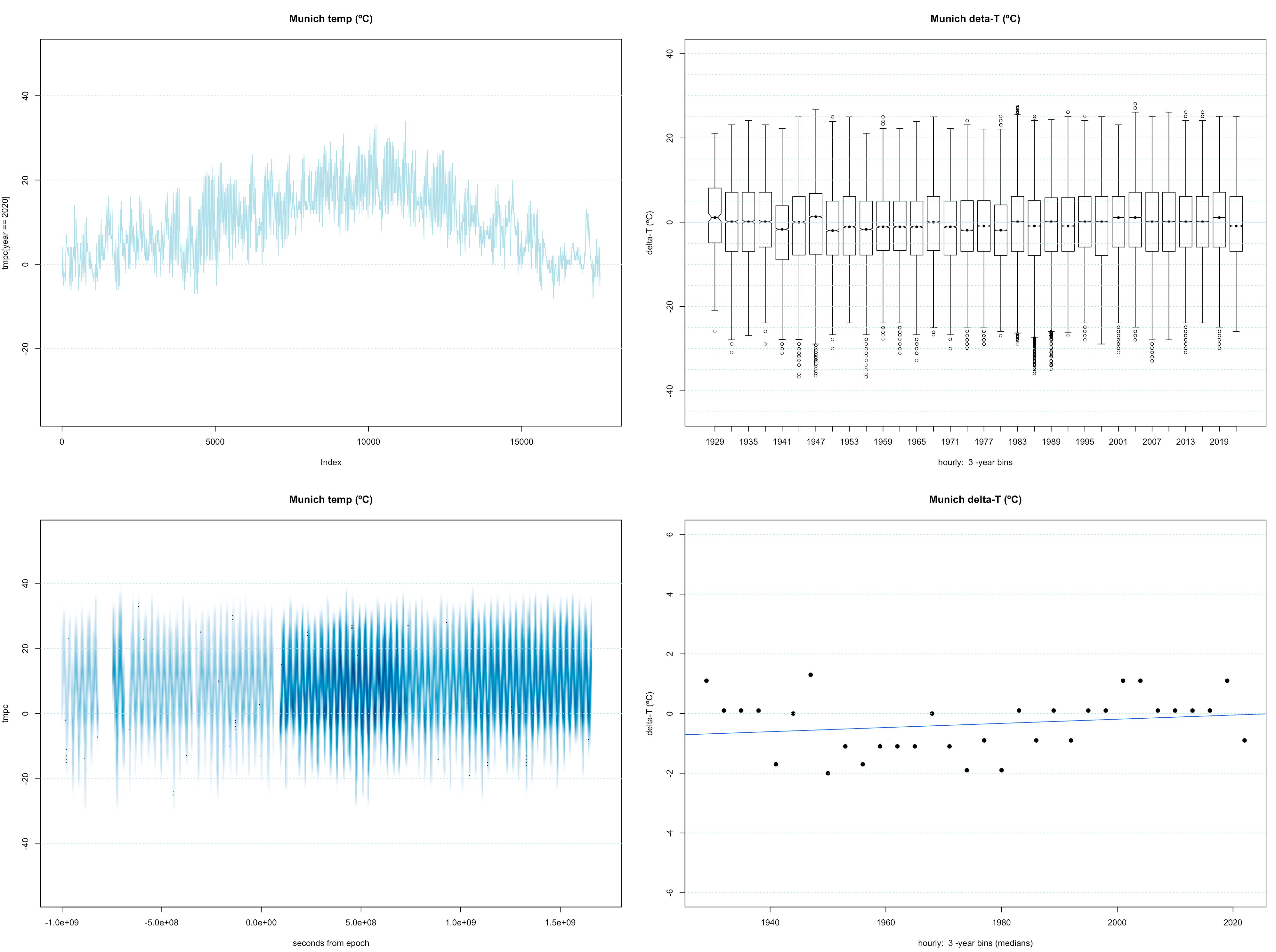
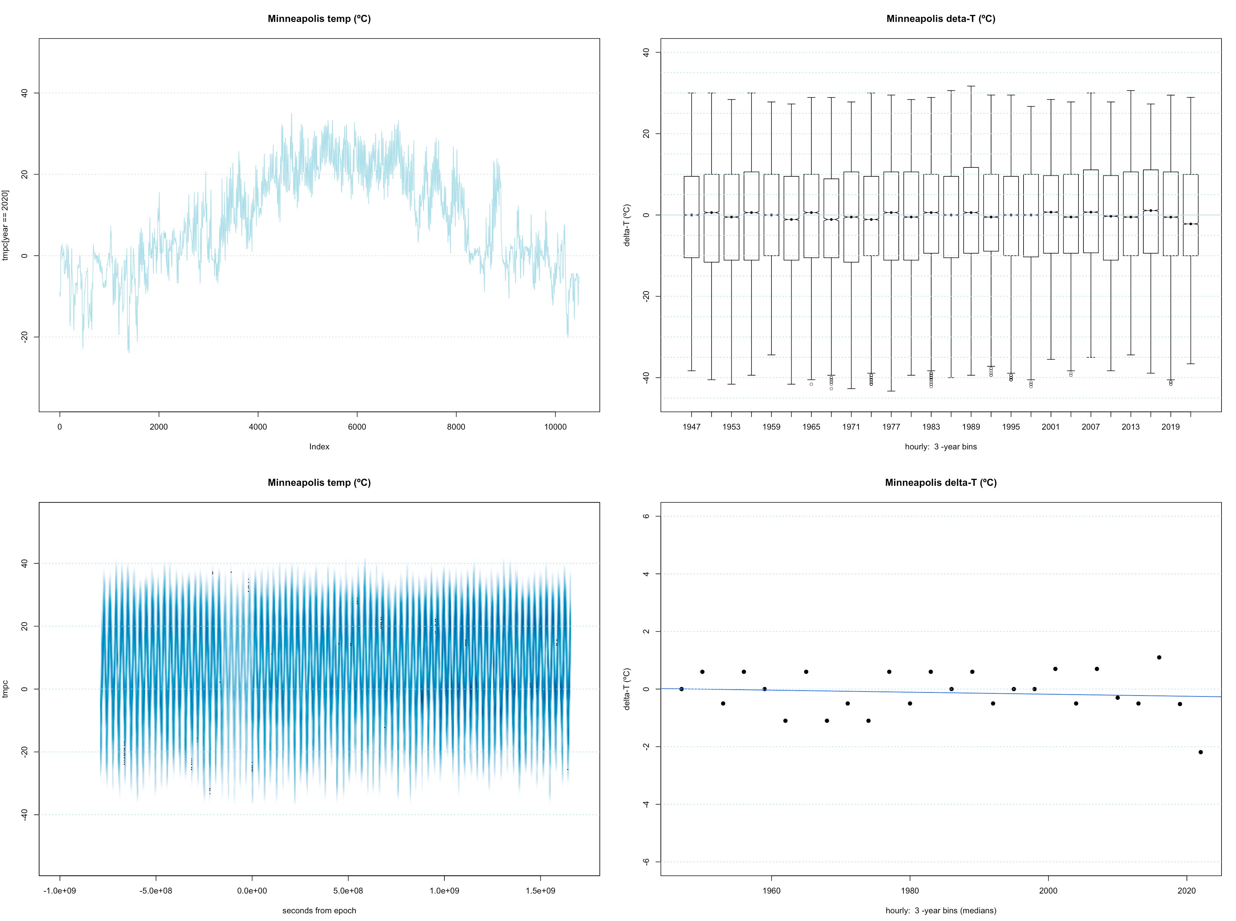
Last I looked at Alaska, Munich, and Minneapolis. I have begun to tire. Again, presented without comment:
These are not "global temperatures". How do you even define "global temperature"? They are a random selection of airports with 75 to 100 years of exact temperatures measured by thermometers.
When I look, I see two big things: 1) The annual extremes at each location span a much larger range of temperatures than any slow wandering of the median temperatures over almost a century. And 2) the series of medians (and the minima and maxima) look pretty close to random walks.
Do these data confirm the existence of a climate crisis? An existential threat to human civilization, the human race, or the biosphere? Does downloading and plotting data (from NOAA and the National Weather Service) make me a "science denier"? I don't want to believe that, but I suppose I am (almost) as biased as the next human.
Let me know what you think. I suspect this is a case where most people will see what they expect to see. I'm not sure that's going to work very well for us. What do you see?
References:
https://www.weather.gov/asos/asostech
https://www.weather.gov/media/asos/aum-toc.pdf
http://sites.psu.edu/shanekearnsportfolio/wp-content/uploads/sites/20899/2014/12/Technical-Definition-and-Description-NOAA-ASOS.pdf
Data sources:
https://mesonet.agron.iastate.edu/request/download.phtml
Code:
Written in the R language. Available upon request.
Recommend
About Joyk
Aggregate valuable and interesting links.
Joyk means Joy of geeK