

从微信聊天框开始学习CSS属性filter
source link: https://www.clzczh.top/2022/06/18/filter/
Go to the source link to view the article. You can view the picture content, updated content and better typesetting reading experience. If the link is broken, please click the button below to view the snapshot at that time.

从微信聊天框开始学习CSS属性filter
给别人发图片时,Ctrl+A选中图片发生了颜色反转。
下面重现一下
至于为什么会联想到filter属性,主要是因为小时候经常玩手机的拍照功能,黑白滤镜、复古。。。
所以第一印象就是搜索CSS的滤镜属性,就找到了,所以来简单学习一下。(微信的那个具体怎么实现并不了解)
说是学习,但是其实就只是了解一下怎么使用而已。使用filter属性主要用法就是通过Filter函数来实现具体效果。
invert()
刚开始就先从实现遇到的反转先。invert()函数反转输入图像,参数是转换的比例,值为0%表示无变化,值为100%表示完全反转。
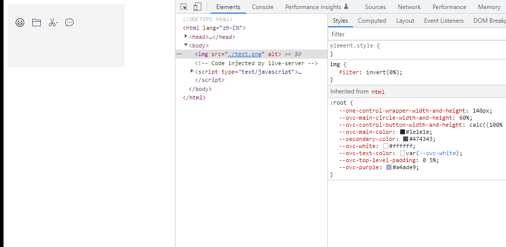
超出100%之后也是和100%一样的效果。也就是说需要反转只需要设置CSS属性filter为invert(100%)即可,当然也不一定需要是100%。上面测试的是图像,但是实际上非图像该属性也是起作用的。
div {
    width: 200px;
    height: 200px;
    background-color: red;
    filter: invert(100%)
}
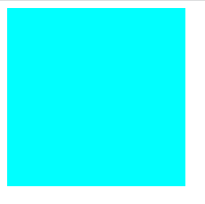
上面的反转是不是很有意思。这是因为红色的rgb值为(255, 0, 0),所以反转后的rgb值为(0, 255, 255),即上面的效果。
我们可以给html元素添加filter: invert(100%),即可实现切换亮暗模式。
document.documentElement.style.filter='invert(100%)'
可以使用该方法开启黑暗模式看pdf文件的(虽然有一些地方会有点怪)
blur()
调整输入图像的模糊程度,参数可以设置为CSS长度(px、em等,不接受百分比)
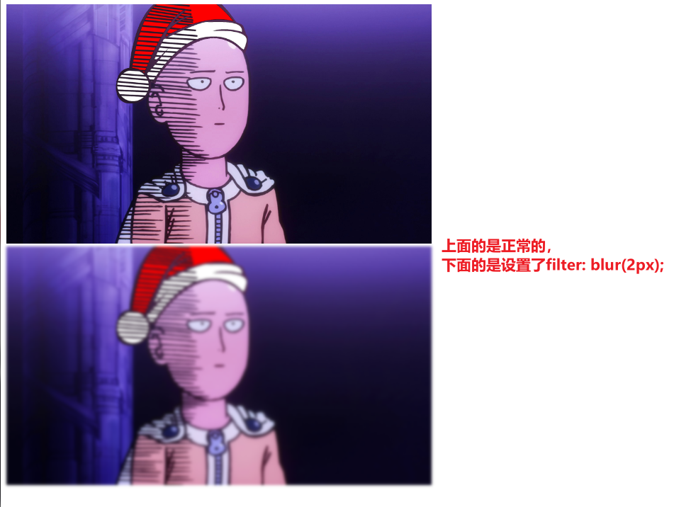
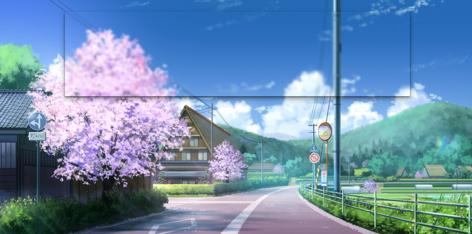
filter属性的blur()可以将模糊应用于元素。说到模糊,可能想到的应用就是自己制作一下有毛玻璃效果的背景图片了。接下来来耍一下。(在网上看到的效果,下面的例子也是参考网上的)
基本解构:
body {
    display: flex;
    justify-content: center;
    align-items: center;
    height: 100vh;
    background: url('https://i.loli.net/2019/11/17/GAYyzeKsiWjP5qO.jpg') no-repeat;
    background-size: cover;
}

.grass {
    position: fixed;
    top: 50px;
    width: 72vw;
    height: 36vh;
    box-shadow: 0 0.3px 0.7px rgb(0 0 0 / 13%), 0 0.9px 1.7px rgb(0 0 0 / 18%), 0 1.8px 3.5px rgb(0 0 0 / 22%), 0 3.7px 7.3px rgb(0 0 0 / 28%), 0 10px 20px rgb(0 0 0 / 40%);
}
<body>
    <div class="grass"></div>
</body>
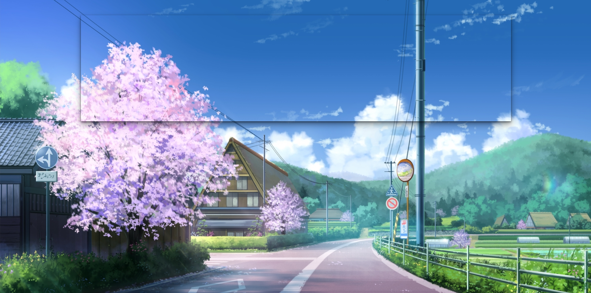
现在给grass盒子添加一下模糊度。
filter: blur(4px);

但是结果和我们想象的不太一样,只有阴影有模糊。这是因为filter是将模糊等图形效果应用于元素,而后面的背景图片是该元素后面的body元素的,所以添加的模糊并不会添加到后面的背景图片中。
这时候,就轮到filter的好兄弟backdrop-filter登场了,它可以让你为一个元素后面区域添加图形效果(如模糊或颜色偏移)。值和filter的一样用法。
backdrop-filter: blur(4px);
drop-shadow()
对输入图像应用阴影效果。(和box-shadow很相似,不过,在部分浏览器中通过filter可以提供硬件加速)
offset-x:设置阴影的水平偏移量offset-y:设置阴影的垂直偏移量blur-radius:设置阴影的模糊半径,值越大,越模糊,阴影也会更大、更淡color:颜色
div {
    width: 200px;
    height: 200px;
    background-color: pink;
    filter: drop-shadow(4px 4px 6px black);
}
Filter函数可以任意组合来控制渲染。
div {
    width: 200px;
    height: 200px;
    background-color: red;
    filter: invert(100%) drop-shadow(4px 4px 6px black);
}
filter属性还有很多很有意思的用法,可以设置对比度、灰度等。这里就不再过多赘述了,有想了解的可以到官方文档查阅。
Recommend
About Joyk
Aggregate valuable and interesting links.
Joyk means Joy of geeK