

CSS布局(一)
source link: https://www.clzczh.top/2022/04/17/CSS-layout-1/
Go to the source link to view the article. You can view the picture content, updated content and better typesetting reading experience. If the link is broken, please click the button below to view the snapshot at that time.
CSS布局(一)
看面试题,看到两个没听说过的布局圣杯布局、双飞翼布局。这就来学习一波CSS布局。
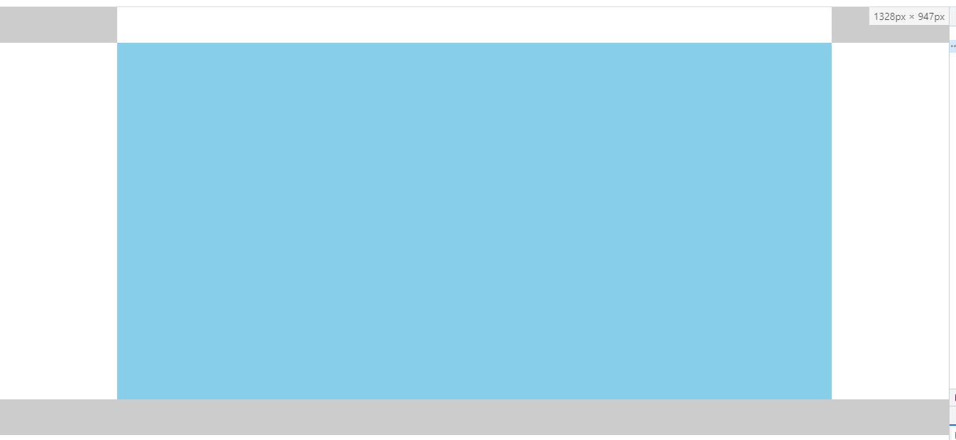
只需要让header,footer充满整个屏幕,header的内容区、foooter的内容区,content设置一样的宽度,然后都设置 margin: 0 auto实现居中即可。
<style>
  html,
  body {
    margin: 0;
    padding: 0;
  }

  header,
  footer {
    width: 100%;
    height: 50px;
    background-color: #ccc;
  }

  nav {
    width: 1000px;
    height: 50px;
    background-color: #fff;
    margin: 0 auto;
  }

  .content {
    width: 1000px;
    height: 500px;
    background-color: skyblue;
    margin: 0 auto;
  }
</style>

<header>
  <nav></nav>
</header>

<div class="content"></div>

<footer></footer>
实际上,可以单独抽离出用于显示内容(包括header、footer的内容部分),也称为版心,然后给对应的内容添加该类名即可。
.w {
  width: 1000px;
  margin: 0 auto;
}
<header>
  <nav class="w"></nav>
</header>

<div class="content w"></div>

<footer></footer>
如果不需要 header、 footer铺满整个屏幕,那么只需要将 header、 footer的宽设置为主内容的宽度,并居中即可
header,
footer {
  width: 1000px;
  height: 50px;
  background-color: #ccc;
  margin: 0 auto;
}
如果有版心CSS,则直接给 header、 footer也添加对应类名就行。
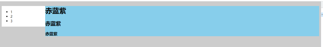
双栏布局是一种非常使用的布局。左边是目录、公告等内容,右边是主内容。
双栏布局的侧边栏部分通常都是放目录、公告等需要稳定表现的内容,所以侧边栏需要固定,然后让主内容自适应。
float+margin/overflow
原理就是侧边栏给定宽度,并设置 float为 left或 right,然后主内容部分设置 margin-left或 margin-right为侧边栏的宽即可,或者设置 overflow为hidden(通过 overflow触发 BFC,而 BFC不会重叠浮动元素)
<style>
  body {
    background-color: #ccc;
  }

  .sidebar {
    float: left;
    width: 200px;
    background-color: #fff;
  }

  .content {
    margin-left: 200px;
    /* 或 */
    /* overflow: hidden; */
    background-color: skyblue;
  }
</style>

<aside class="sidebar">
  <ul>
    <li>1</li>
    <li>2</li>
    <li>3</li>
  </ul>
</aside>
<div class="content">
  <h1>赤蓝紫</h1>
  <h2>赤蓝紫</h2>
  <h3>赤蓝紫</h3>
</div>
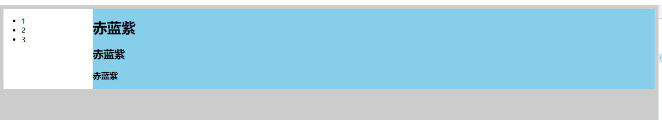
flex布局
利用flex布局的flex属性会均分剩余部分的特性,给侧边栏设置宽度,然后给主内容设置 flex: 1;即可。
body {
  display: flex;
  background-color: #ccc;
}

.sidebar {
  width: 200px;
  background-color: #fff;
}

.content {
  flex: 1;
  background-color: skyblue;
}
grid布局
设置为grid布局的话,只需要设置 grid-template-columns为 auto 1fr即可。
body {
  display: grid;
  grid-template-columns: auto 1fr;
  background-color: #ccc;
}
没学过grid布局,这就来研究下auto 1fr是个啥子玩意。
首先,当然就是设置为像素值看下什么情况。
body {
  display: grid;
  grid-template-columns: 300px 200px;
  background-color: #ccc;
}
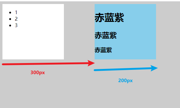
从上图可以发现,第一个值其实就是第一列的宽度,而第二个值就是第二列的宽度。
既然如此,那么设置成 auto 1fr后就能实现就好理解了。首先第一列设置为 auto,即会根据子元素宽度来设置,而子元素的宽度已经设置为 200px了,所以第一列就是 200px,而第二列的 1fr则是占满剩余空间。(没学过grid,推测的结果,不对请指正)
两边的侧边栏固定宽度,中间的主内容自适应宽度。
比较有名的有圣杯布局、双飞翼布局两种。
圣杯布局是比较特殊的三栏布局。它需要主内容部分优先渲染,即在 DOM结构中,应该先有主内容,再有侧边栏
DOM结构
<main>
  <div class="middle"></div>
  <div class="left"></div>
  <div class="right"></div>
</main>
先来一下基础设置,方便观察
body, div { margin: 0; padding: 0; } main>div { height: 300px; } .middle { background-color: #ccc; } .left { width: 200px; background-color: skyblue; } .right { width: 300px; background-color: brown; }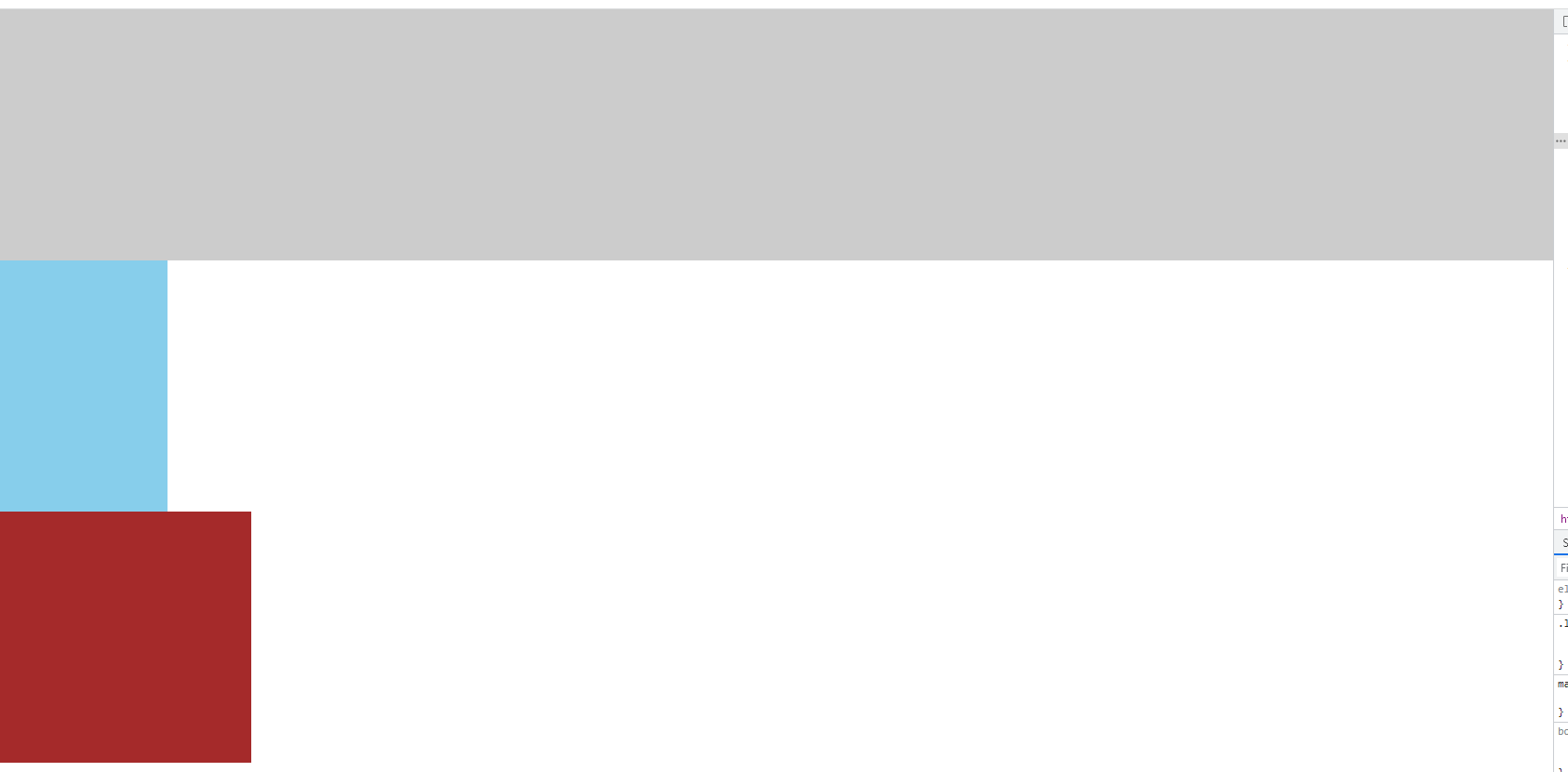 image-20220410112051855
设置三部分都为左浮动,并且设置主内容的宽度为100%,实现中间内容自适应
main>div { float: left; height: 300px; } .middle { /* 实现主内容自适应 */ width: 100%; background-color: #ccc; }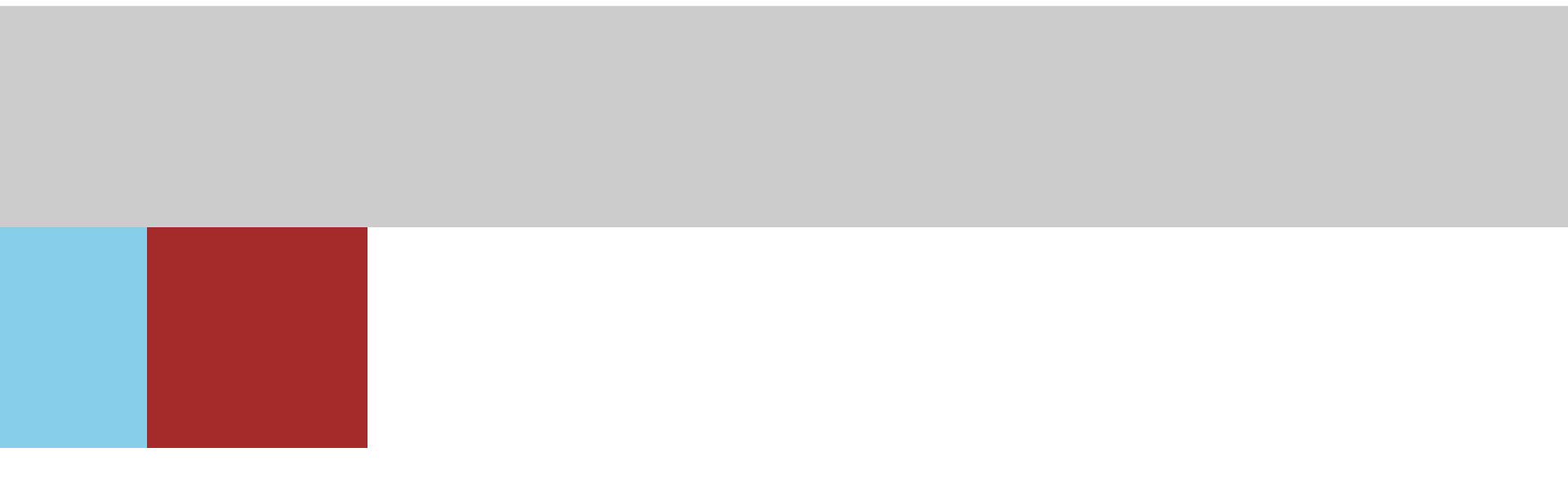 image-20220410112455988
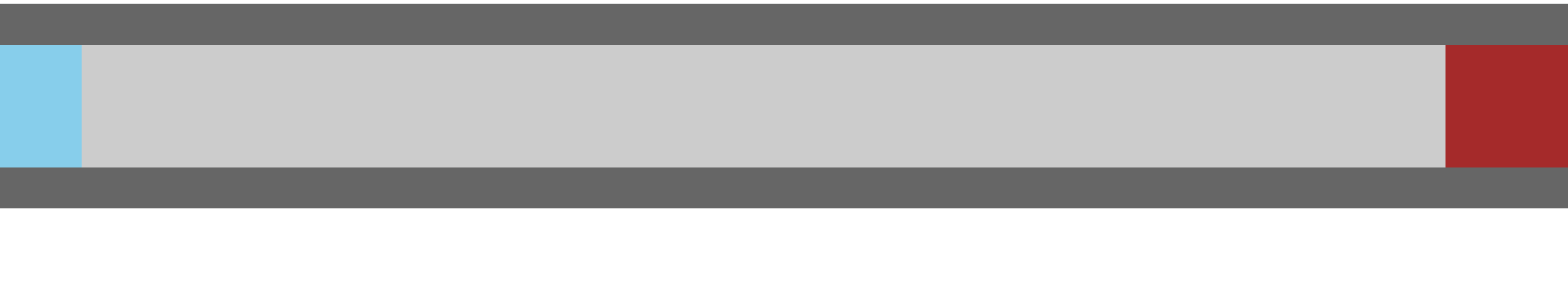
最外面的大盒子添加
padding,为两边的侧边栏留出位置main { padding: 0 300px 0 200px; }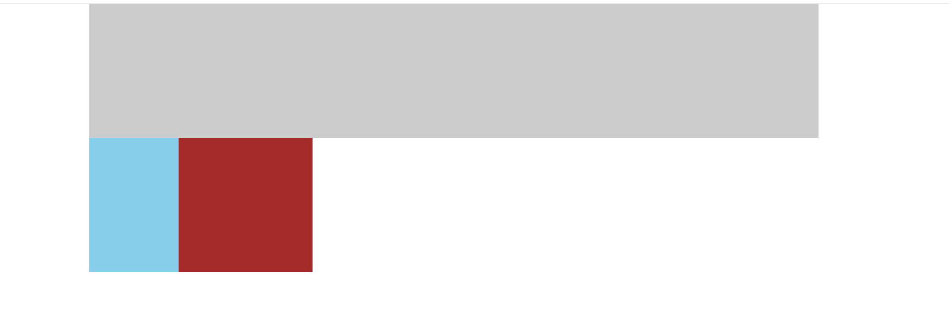 image-20220410113023844
实现左盒子放到留出的位置上
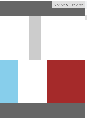
首先,为左盒子添加
margin-left: -100%,让它去到上一层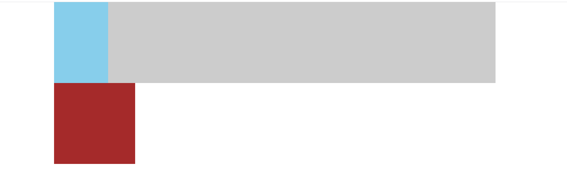 image-20220410113325917
然后,设置
position为relative,即相对定位,然后设置left为盒子的宽度的负值,让它去到该去的位置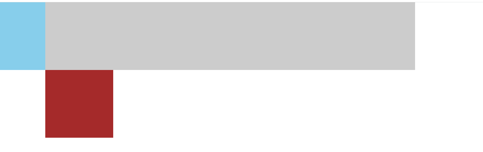 image-20220410113605454
.left {
  position: relative;
  left: -200px;
  width: 200px;
  background-color: skyblue;
  margin-left: -100%;
}
右盒子也是一样的道理,不过右盒子设置的
margin-left不再是100%了,而是自身宽度的负值,因为它们都是浮动的,那么右盒子想要上去,就只需要往左移自己的宽度就行了。.right { position: relative; left: 300px; width: 300px; background-color: brown; margin-left: -300px; } image-20220410114527931
这里用到了浮动,所以还需要清除浮动。之前有些过清除浮动的文章,有需要可以看一下
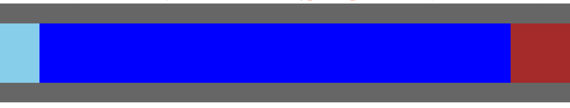
添加页头、页脚
header,
footer {
height: 100px;
background-color: #666;
}

发现,没有页脚,而这正是浮动导致的。所以需要清除浮动。(清除浮动的方法可参考之前的文章)
main:after {
content: '';
display: block;
clear: both;
}
CSS完整代码
body,
div {
margin: 0;
padding: 0;
}
main {
padding: 0 300px 0 200px;
overflow: hidden;
}
main>div {
float: left;
height: 300px;
}
.middle {
/* 实现主内容自适应 */
width: 100%;
background-color: #ccc;
}
.left {
position: relative;
left: -200px;
width: 200px;
background-color: skyblue;
margin-left: -100%;
}
.right {
  position: relative;
  left: 300px;
  width: 300px;
  background-color: brown;
  margin-left: -300px;
}
header,
footer {
  height: 100px;
  background-color: #666;
}
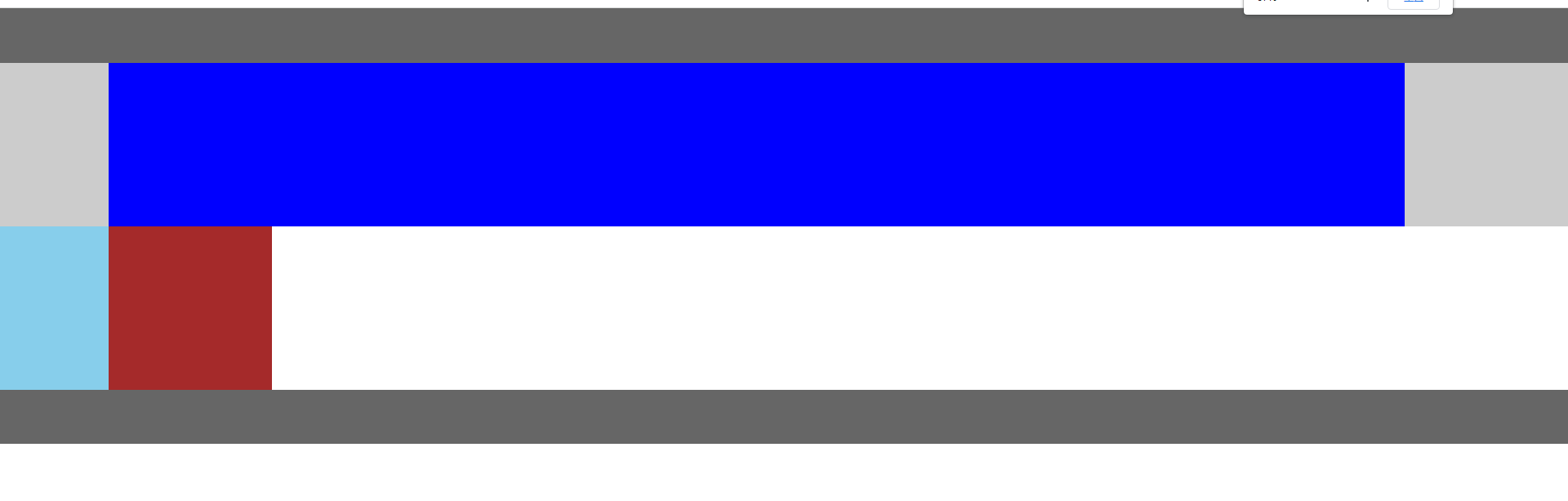
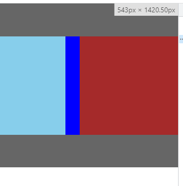
双飞翼布局
双飞翼布局是圣杯布局的改进版。因为当屏幕很小时,圣杯布局就会乱掉,双飞翼布局就是改进了这一点。
改变的点:
- 不再是通过
main的padding给左右盒子留位置,而是通过给新增子盒子添加margin值 - 左右盒子不再需要相对定位
<header></header>
<main>
<div class="middle">
<!-- 多了个子盒子 -->
<div class="middleInner"></div>
</div>
<div class="left"></div>
<div class="right"></div>
</main>
<footer></footer>
css样式改动(其中 main的样式直接删除,不包括伪元素、子元素)
.middleInner {
height: 300px;
/* 换成通过子盒子的margin值给左右盒子留位置 */
margin: 0 300px 0 200px;
background-color: blue;
}
.left {
width: 200px;
background-color: skyblue;
}
.right {
width: 300px;
background-color: brown;
}
因为不是通过父盒子 main的 padding留位置,所以直接 margin负值就能到要去的位置,而不需要再使用相对定位
.left {
width: 200px;
background-color: skyblue;
margin-left: -100%;
}
.right {
width: 300px;
background-color: brown;
margin-left: -300px;
}
CSS完整代码
body,
div {
margin: 0;
padding: 0;
}
.middleInner {
height: 300px;
/* 换成通过子盒子的margin值给左右盒子留位置 */
margin: 0 300px 0 200px;
background-color: blue;
}
main:after {
  content: '';
  display: block;
  clear: both;
}
main>div {
float: left;
height: 300px;
}
.middle {
/* 实现主内容自适应 */
width: 100%;
background-color: #ccc;
}
.left {
  width: 200px;
  background-color: skyblue;
  margin-left: -100%;
}

.right {
  width: 300px;
  background-color: brown;
  margin-left: -300px;
}
header,
footer {
height: 100px;
background-color: #666;
}
参考链接:
Recommend
About Joyk
Aggregate valuable and interesting links.
Joyk means Joy of geeK