

Case Study: Designing a language learning app
source link: https://uxplanet.org/case-study-designing-a-language-learning-app-1e5126411831
Go to the source link to view the article. You can view the picture content, updated content and better typesetting reading experience. If the link is broken, please click the button below to view the snapshot at that time.

Case Study: Designing a language learning app

Have you ever tried to learn a new language? I did! And … failed. Tried again! then failed again. Did that a couple more times before I lost my motivation completely and I gave up.
Why is it so hard to learn a language? A lack of habit? Because we want quick results? Because learning a language uses your brain differently? Well, it’s probably all of them and many other reasons combined — but through continuous repetition and perseverance, I believe we can all succeed.
My childhood inspired this language learning app. After moving to America at a young age, I was far from speaking my native tongue. Only when I started immersing myself in Korean culture did I improve. I consumed a ton of Korean media such as Korean dramas, webtoons, and TV shows. Talked and texted my friends in Korean, changed my phone language, and wrote my diaries in Korean too. This was possible because of my passion for the language and culture. Eventually, I found myself internally thinking in Korean — not English and succeeded in learning my mother tongue.
Well .. let’s get to it!
Design Process
I designed an app to solve problems users experience while learning a new language. This is the design process I followed for this project.
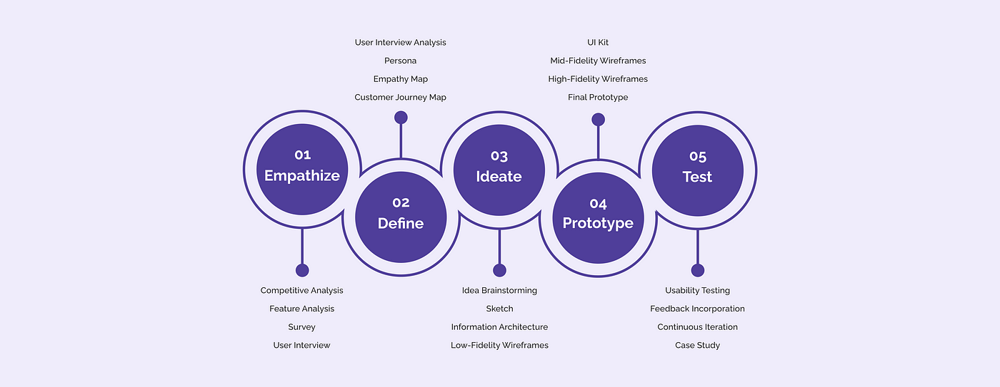
Empathize
First things first, I conducted a competitive and feature analysis for the Korean learning platforms in the market. Then, I surveyed and interviewed language learners to gain insight into their motivation and pain points. Here is my research plan.
Competitive Analysis
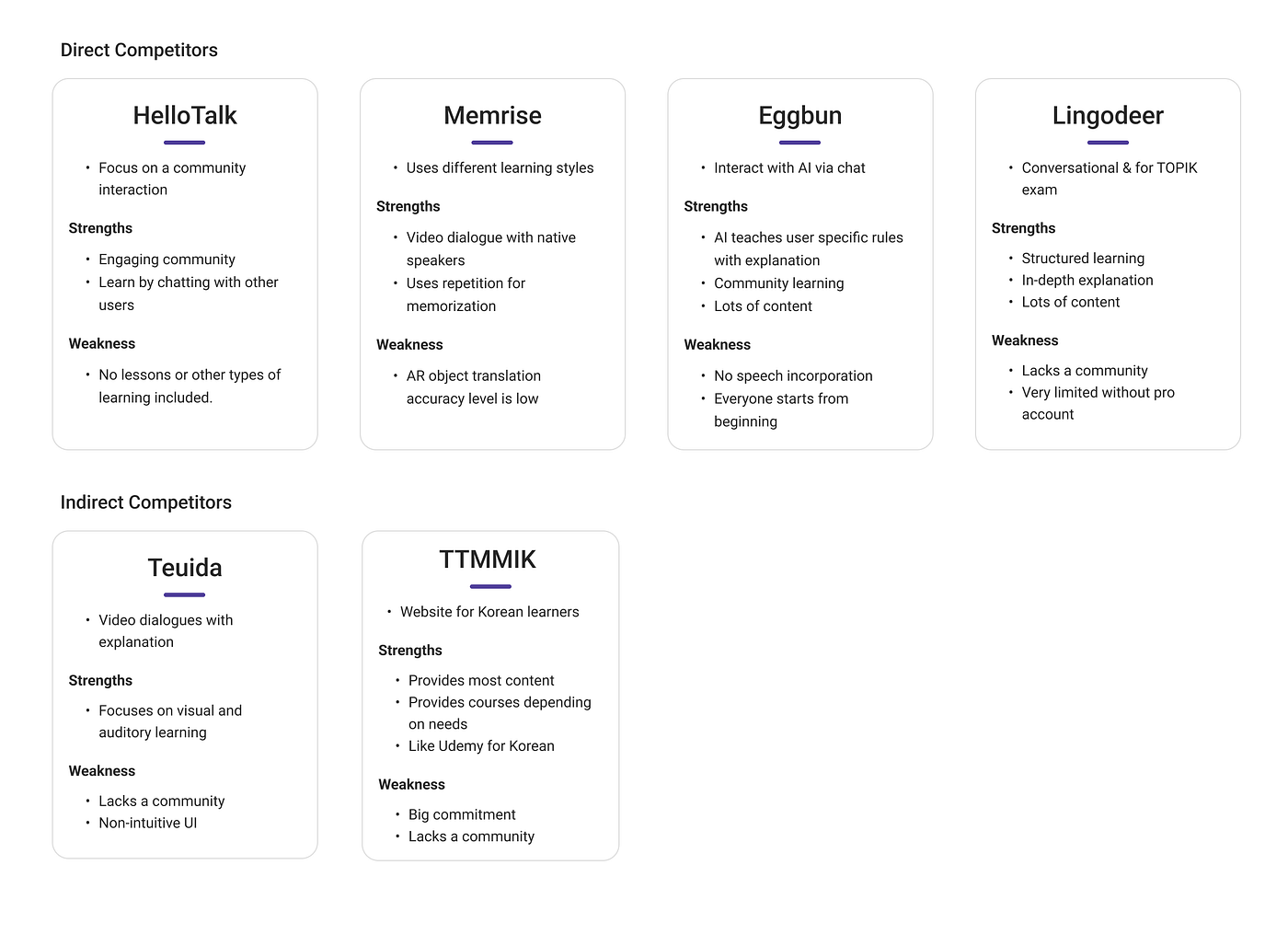
I looked at both direct and indirect competitors of Korean teaching platforms. Many apps are geared towards beginners and are being used to supplement the user’s study. HelloTalk is great for practicing, Memrise for vocabulary, and Teuida for dialogues.
Feature Analysis
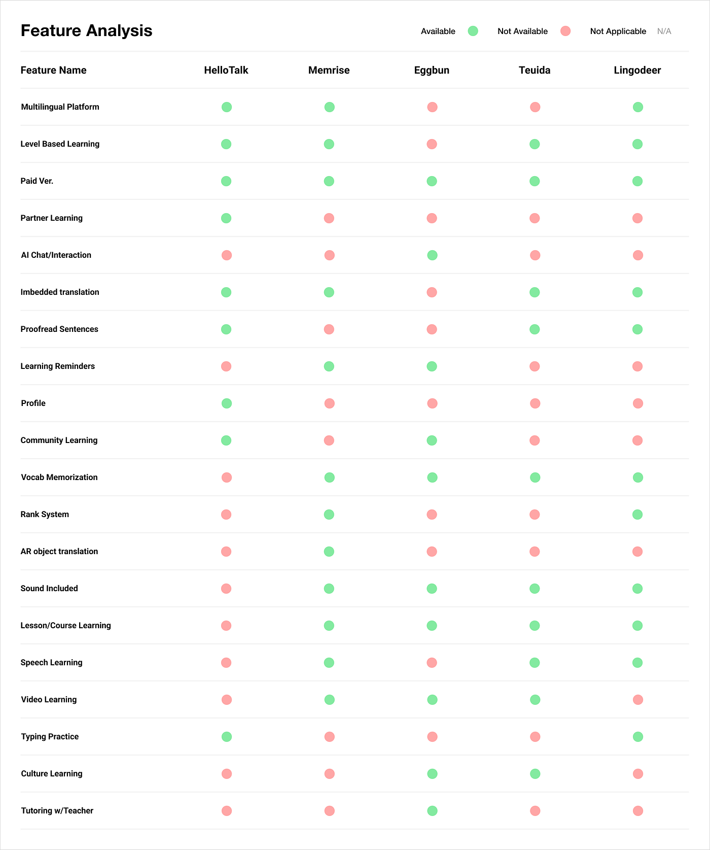
Next, I identified features from the apps and found that HelloTalk provides partner learning, Eggbun has AI chat features, and Memrise has AR object translations. I thought these were all fun and interactive way to learn Korean.
User Survey & Analysis
I decided to perform the user survey to gain quantitative data on how users learn a new language and the struggles many share. 11 users participate in my user survey. They were learning a variety of different languages, from Korean to Spanish, Japanese, French, and Arabic. Here is the link to the survey.

- The majority of the participants chose English as their primary language
- Spent either less than a year OR more than 6 years studying their secondary language.
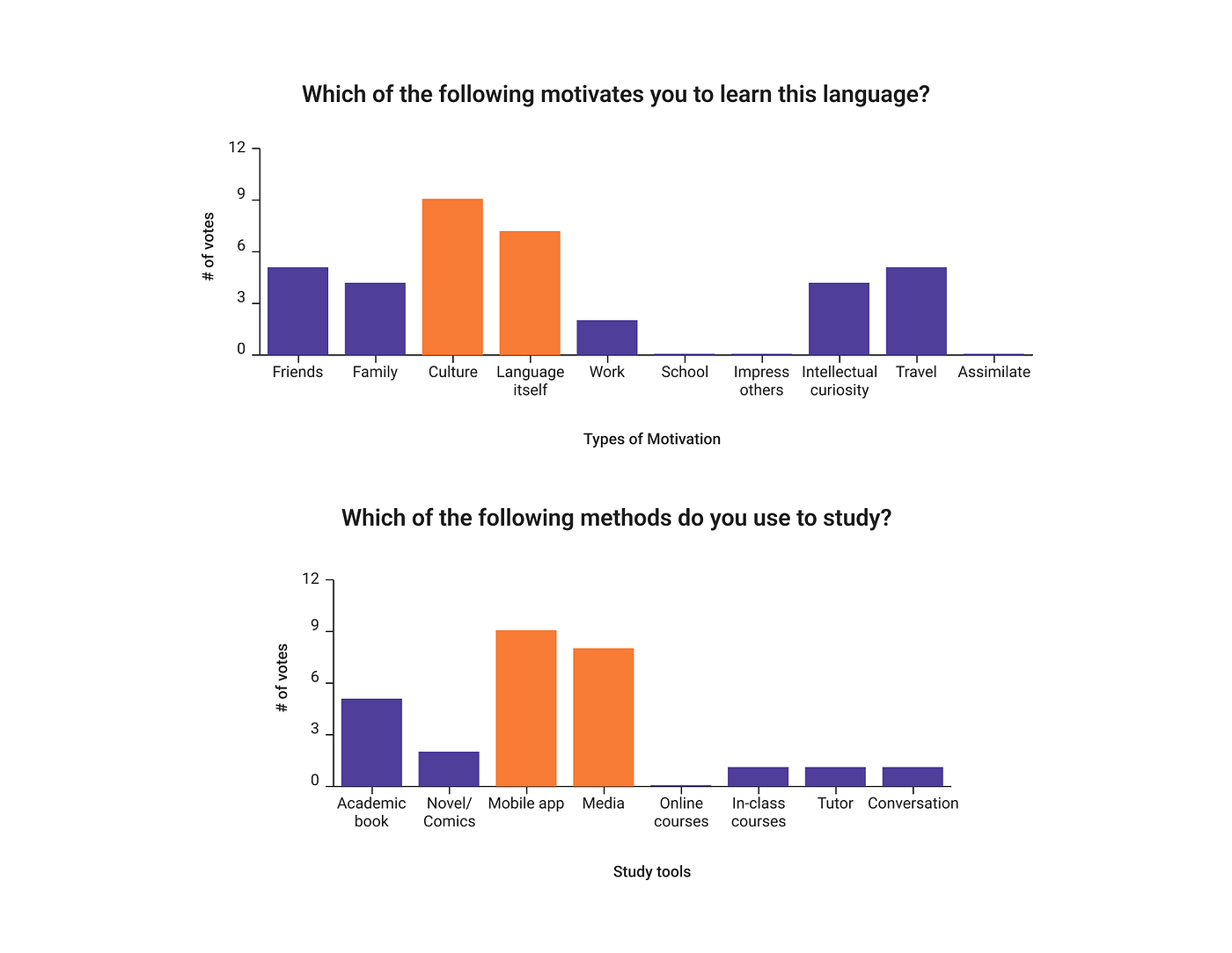
- The biggest motivation for users is their interest in the culture and language.
- Mobile apps and consuming media were the most popular ways to learn a second language.
From the survey results, I found out that:
- 63.6% of users spend less than an hour studying a week, and 36.4% spend 1–3 hours studying per week. No one spent more than 3 hours.
- When asked how difficult it was to maintain a daily practice of learning on a scale of 1 to 10, everyone chose 5 or above. 9 was the most popular with 6 votes.
- Users say that language learning is difficult because life gets in the way, hard to follow a routine, a lack of motivation, and no access to fluent speakers.
User Interview & Analysis
Next, I conducted 3 user interviews, and though I wish I had more participants, I still gained a lot of insights into the language learning experience.

Users now want to move away from the traditional way of studying a language from a book and choose a more immersive way to learn. This adds to the survey findings that many people opt for mobile apps as they are learning a new language.
Define
In the second step of the design process, I will be creating a persona, empathy map, a customer journey map, and finally coming up with a problem statement.
Persona
Creating personas is a way to imagine who I would be designing for. I listed the goals & needs, motivation, and fear & frustrations.
Meet Ashley. She lives in San Francisco, CA, and loves everything about Korean culture and language.

Empathy Map
What does a typical day look like for Ashley? What does she value and think about? How are her actions different — or the same as her thoughts?

Ashley wants to learn Korean to consume Korean media without subtitles and to have a casual conversation with her friends. Although she finds joy in learning and understanding, she is embarrassed when she’s wrong and feels insecure.
Customer Journey Map
If Ashley were to come across Enjoy Korean, what would that look like and how would it help fulfill her goals while removing her pains? A customer journey map is a visual storyline of how the customer engages with our product, service, or brand.

In this journey, Ashley discovered her passion for Korean and found ways to study, but with no success. The image above shows that Ashley comes across Enjoy Korean, as it guides the way to meet her goal.
Problem Statement
After the research phase, I can deduce that the users need help keeping a routine and want to learn a language the non-traditional way.
How might we help people build structure and context of the Korean language while keeping them engaged?
How might we help people who struggle to learn Korean accomplish their goals?
How might we increase engagement and interaction with Korean learning on a daily basis?
Ideate
In the most creative step of the design process, I came up with solutions and created an information architecture. Followed by that are sketches, mid-fidelity wireframes, usability testing, and a UI kit.
Solution
- Learn in Context — Engage in learning with your favorite Korean songs, comic book, and drama.
- Build a Routine — Form a habit and make language learning effortless
- AR Translation — Enhance the Korean learning experience by incorporating a way for users to engage directly with real objects.
Information Architecture

There will be three journeys.
- Onboarding Experience. This flow focuses on building a routine and creating personalized lessons for users.
- Song Lesson. Of the three types of content available in EnjoyKorean, I chose the song to explore and design a lesson.
- AR Translation. This flow allows users to engage in real documents and allow them to come back to the app to study.
I organized all the pages according to each journey and listed items seen on each page. The square boxes represent call-to-action buttons.
Sketches

Alongside the information architecture, I sketched my ideas on my iPad, keeping in mind the user’s pain points and motivations.
Mid Fidelity Wireframes
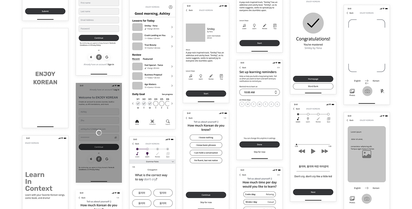
From sketches to mid-fidelity screens, I started by laying out all the pages I need to design for the three journeys. I blocked out sections for each element and did my detail work.
Usability Testing
I conducted usability testing with 6 participants over Zoom, each lasting about 30 minutes.
The objective of the test:
- Observe if users can accomplish the specified task. If they made a mistake, can they recover?
- Identify areas of the app that requires a change to improve user performance and satisfaction
With the provided feedback, I created revisions to fill the gap between my understanding of the users and what the users experienced.

UI Kit
What kind of feeling do I want users to experience while using Enjoy Korean? The color purple is associated with ambition and creativity and the color orange is associated with enjoyment and enthusiasm. These two are the main colors used in Enjoy Korean. I used a sans serif font so it is more legible. Open sans also creates a friendly and inviting environment.

Prototype
Here is the preview of my final prototype of Enjoy Korean :)

Reflection
What’s Next?
I have a huge list of features to add to Enjoy Korean so I want to work on that!
- Adding sounds to lessons. How can I use hearing as a form of learning to teach users more about Korean?
- A skill test to identify user skill level due to the hardships of self.
- Premium Version. Without a source of income, it is hard to imagine a service like this being supported
- Creating a screen for the profile and word bank.
- Example sentences. What if users can see more example sentences related to a specific grammar rule during a lesson?
Lessons Learned
I understood how important the design process was to UX but this case study taught me exactly how. I subconsciously had a thought of what the final design of Enjoy Korean would be like even before I started. However, after the research and defining phase, that completely changed. Through research and analysis, I learned aspects of the learning process I wouldn’t have known otherwise. For example, before research, I thought most people study through an academic textbook or with a tutor. Although many people opt for this method, mobile apps and media learning were the top two in my survey. Like this, I learned that my assumptions are wrong and that I shouldn’t come to a conclusion based on what I think.
I’m super excited to share this experience and thank you for taking the time to read my case study.
Feel free to drop a message on LinkedIn or Email for any feedback and suggestions.
Recommend
-
 27
27
George Bernard Shaw once said: “There is no sincerer love than the love of food”. Perhaps, that’s one of the reasons why food and cooking is the endless source of inspiration for UX designers. Today’s case study from the Tubik team presents t...
-
 21
21
Designing a productivity app: a UX case studyHelping your life goals through sprints; your personal productivity app.
-
 41
41
UX Case Study: Sub-Buddy-Subscription Management app.Your Subscriptions, your way!
-
 4
4
A Machine Learning Case Study Reading Time: 5 minutes This is my third blog post on MR-REX, a software package used to hel...
-
 17
17
IntroductionI was passing by a market the other day and I overheard some sellers talking about “Kryto” (Cryptocurrency). This proved the already trite notion that digital currencies are slowly taking over the world. While pondering o...
-
 11
11
Case study : Designing an online photography platform for a studioIn this case study I will walk you through my entire process of designing a dedicated online photography platform for Two Mann studios (My favorit...
-
 10
10
Case Study: Designing an interactive landing page for a startup competitionFor our second assignment at 10kdesigners, I got a visual design challenge to create a landing page for the given niche. The idea was to...
-
 10
10
Rust: A popular programming language built by 1000s of contributors Rust is a popular modern programming language, designed for performance, reliability and productivity, and used by hundreds...
-
 7
7
Improving Social Feature in Korean Learning App | UX Case Study
-
 6
6
CKC- UX Case Study: Gamified STE(A)M learning for kidsThis case study showcases the design process and decisions I made for one my biggest projects so far. An astronomy learning web app for kids-...
About Joyk
Aggregate valuable and interesting links.
Joyk means Joy of geeK