

Case Study: Designing an interactive landing page for a startup competition
source link: https://bootcamp.uxdesign.cc/case-study-designing-an-interactive-landing-page-for-a-startup-competition-25730f3695f7
Go to the source link to view the article. You can view the picture content, updated content and better typesetting reading experience. If the link is broken, please click the button below to view the snapshot at that time.
Case Study: Designing an interactive landing page for a startup competition
For our second assignment at 10kdesigners, I got a visual design challenge to create a landing page for the given niche. The idea was to create a landing page for an upcoming event. The event could be a workshop, hackathon, webinar, or virtual event. The goal of the assignment was to apply the design process and apply the visual design principles learned in the cohort and create a functional yet aesthetic landing page for a fictional event. Let’s begin!
📝Design Process:
🧭Exploring the Problem:
For this assignment, I picked the niche “Startups & Business” as I have always been interested to explore more about entrepreneurship and startups. This means I had to come up with an event catering to startups or businesses.
The Startup niche is very complex, and there are a lot of companies out there in this niche and also there are a lot of different types of events they host.
So the first question for me to decide is, what would be the event and for which company am I going to make this landing page? So after some googling, secondary research, and talking to some of my friends who are into the entrepreneurial nook, I finally decided to make a landing for a startup competition for TechCrunch.
Who is TechCrunch?
TechCrunch is an American online newspaper focusing on high-tech and startup companies.
Why did I choose this competition for TechCrunch?
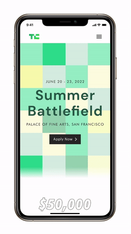
Now, TechCrunch already has a startup battlefield competition. How is this any different?
The Summer Battlefield is organized specifically for up-and-coming student entrepreneurs that may be working on their startups out of their dorm room. This battlefield would give these students to compete for prizes, the opportunity to network with like-minded people and industry leaders and expand their presence.
Why would TechCrunch be interested in hosting another competition?
Benefits for the Business:
- Will give more reach and popularity to TechCrunch of a younger audience.
- A whole younger generation of people will understand and likely pursue entrepreneurship and business.
Benefits to the participants:
- Winners will get the allotted money prizes along with mentorship.
- All participants will get a chance to be in the spotlight.
- Networking opportunities with like-minded people and industry leaders.
📌Problem Statement:
Design a landing page for a 3-day in-person startup competition by TechCrunch.The participants will be competing for money prizes along with mentorship from some of the best minds.
🔍Research:
After having some clarity with the problem statement in hand, I talked to some friends who might be interested in participating in such a competition to collect their perspectives that I should consider for better conversions. After talking with them, the main questions that need to be answered are:
- What am I going to get out of the competition?
- Is it worth it for me to apply?
- Am I the right fit for the competition?
💻Collecting Inspiration
I drew my inspiration from a variety of sources (Lapaninja, Landingfolio, and so on). I gathered screenshots of websites with interesting designs and layouts.
After research, the next task was to decide the information that the landing page will contain.
🕸Information Architecture:
After research, the next thing to be answered was what information will I add to the website. Research and collecting inspiration played a huge role in helping with the IA, as it provided some clarity as to what information has to be provided and what layouts and patterns work for better conversions.
I structured the data to answer these questions properly by noting down the data I wanted to show on the landing page. A good way to structure information is to use the “5 Ws and 1 H” technique.

With all the information, I was able to make a sitemap:
⚡Visual Design:
This part of the process was the most non-linear i.e. I went back and forth between wireframing, visual design, and prototyping.
I started with basic wireframing on paper before jumping to visuals. After creating some lo-fi wireframes on pen and paper, I jumped straight to visual design.
Some decisions I made about the visual style:
- I decided to go with my current brand personality, professional copy.
- As the website is targeted towards a younger student crowd, I decided to add a fun element along with maintaining some professionalism.
So I stayed close to the color pallet of TechCrunch to make this landing page for consistency. And then I jumped to the visuals and started iterating visuals and copies of each section. And, voila! After many iterations and constant feedback loops, here we have the final screens!
🖼Prototyping:
Hero Section InteractionPlay around with the prototype here!
This was the most fun part of this project. For the hero section of the landing, I wanted to do something different that catches the eye. After taking a closer look at the TechCrunch logo and its visual style, they have adapted the “cube aesthetic”. This is when I got my direction to explore. After a lot of changes and iterations from the color of the cubes to getting the perfect timing on the hover effect, it was finally complete!
I faced a small problem when designing the prototype for the mobile view as users cannot hover when they’re viewing the page on mobile. The solution I came up with for mobile was to change the animation from a “hover effect” to “delayed animation”.
Check out the prototype here!
💭In Conclusion:
Web Design was something I used to struggle with. This assignment was the perfect opportunity to learn more about Web Design principles. I also learned that iteration and feedback are crucial to getting closer to success. Huge shoutout to all my mentors and peers at 10kdesigners for helping me and giving awesome feedback and support!
Thank you so much for reading this case study. Let me know your thoughts in the comments!
Hit me up on Twitter andLinkedIn for any kind of feedback, suggestions, collaborations, or even to just say hi!
PS:- If you long hold the clap button you can give up to 50 claps on Medium
Recommend
About Joyk
Aggregate valuable and interesting links.
Joyk means Joy of geeK