

Adapting SwiftUI Label Style
source link: https://useyourloaf.com/blog/adapting-swiftui-label-style/
Go to the source link to view the article. You can view the picture content, updated content and better typesetting reading experience. If the link is broken, please click the button below to view the snapshot at that time.

Creating your own custom styles for labels allows you to adapt the layout for the available horizontal size.
Label Style
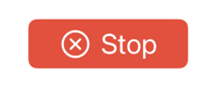
Here’s my button that has a label with an icon and title:
Button(role: .destructive) {
  stop()
} label: {
  Label("Stop", systemImage: "xmark.circle")
    .font(.title3)
    .padding(.horizontal)
}
.buttonStyle(.borderedProminent)
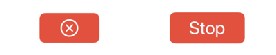
The label style controls the appearance of the label. There are four built-in styles that control whether the label shows the icon and/or the title:
.labelStyle(.automatic)
.labelStyle(.titleAndIcon)
.labelStyle(.iconOnly)
.labelStyle(.titleOnly)
The default is .automatic which allows the label to decide what to show depending on the context. The other styles are self-explanatory. Here’s the .iconOnly and .titleOnly styles:
Note: VoiceOver will still read the title even if the label is only showing the icon.
Switching Styles
When I have limited horizontal space I want to switch from showing the icon and title to showing just the icon. My first thought was to get the horizontal size class from the environment:
@Environment(\.horizontalSizeClass) var horizontalSizeClass
Then apply a condition inside the label style view modifier that switches the style when the horizontal size class is compact:
Label("Stop", systemImage: "xmark.circle")
.labelStyle(horizontalSizeClass == .compact ? .iconOnly : .titleAndIcon)
That doesn’t work, the compiler complains that the ternary expression is not returning the same types. The built-in label styles are distinct types that implement the LabelStyle protocol:
public struct IconOnlyLabelStyle : LabelStyle { ... }
public struct TitleAndIconLabelStyle : LabelStyle { ... }
A better way is to create our own custom label style.
Custom Label Style
The LabelStyle protocol requires a makeBody method that accepts a LabelStyleConfiguration:
protocol LabelStyle {
  associatedtype Body: View
  @ViewBuilder func makeBody(configuration: Self.Configuration) -> Self.Body
  typealias Configuration = LabelStyleConfiguration
}
The configuration provides access to the label icon and title. The Label view has an initializer that takes a LabelStyleConfiguration that we can use in makeBody to customize the label style without changing the layout:
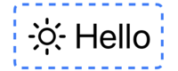
struct BlueDashBorderLabelStyle: LabelStyle {
  func makeBody(configuration: Configuration) -> some View {
    Label(configuration)
    .padding()
    .overlay(
      RoundedRectangle(cornerRadius: 8,
                       style: .continuous)
      .stroke(.blue,
              style: StrokeStyle(lineWidth: 4, dash: [10, 10]))
    )
  }
}
Applying our custom style to a label:
Label("Hello", systemImage: "sun.max")
  .labelStyle(BlueDashBorderLabelStyle())
An Adaptive Label Style
In my example, I want to change the label layout depending on the horizontal size class. We can access the label icon and title via the configuration. That allows us to use our own custom layout depending on the horizontal size class:
struct AdaptiveLabelStyle: LabelStyle {
  @Environment(\.horizontalSizeClass) var horizontalSizeClass

  func makeBody(configuration: Configuration) -> some View {
    if horizontalSizeClass == .compact {
      configuration.icon
    } else {
      Label(configuration)
    }
  }
}
When the size class is compact we return just the icon otherwise we return the default label layout. Another choice might be to return both the icon and title but arranged in a vertical stack:
struct AdaptiveLabelStyle: LabelStyle {
  @Environment(\.horizontalSizeClass) var horizontalSizeClass

  func makeBody(configuration: Configuration) -> some View {
    if horizontalSizeClass == .compact {
      VStack {
        configuration.icon
        configuration.title
      }
    } else {
      Label(configuration)
    }
  }
}

Label Alignment at Accessibility Sizes
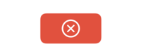
One curiosity is that a bordered button does not correctly center a label when using an accessibility text size (FB9951097). For example:
Button { } label: {
  Label("Stop", systemImage: "xmark.circle")
  .labelStyle(.iconOnly)
}
.buttonStyle(.borderedProminent)
Here’s a preview at the default and accessibilityExtraExtraExtraLarge text sizes:
Notice how in the lower preview the icon if offset from the center. This only seems to be a problem with bordered buttons at accessibility text sizes.
Recommend
-
58
When Apple announced Dark Mode at WWDC 2018, one of my first thoughts was: “Aha! So that’s why Apple has us all switching our icons to template (monochrome) style images.” These images do tend to adapt pretty well to Dark...
-
32
Key Takeaways Nullable reference types need to be enabled on a per-project basis Nullable reference types may need to be disabled when working with generics Many w...
-
30
Apple promotes iPad as the primary computer for regular users. This trend is visible during the last couple of years. More and more users start to use iPad as the main device. I think it is essential to support iPad scree...
-
7
Adapting to User Accessibility Settings in SwiftUIGroupGroupGroupGroupGroupGroupGroupGroupGroupGroupShapeGroupGroupGroupGroupGroupGroupGroupGroupGroupGroupGroupGroupGroupGroupGroupGroupGroupGroupGroupGroupGroupGroupGroupGroupGroupGroupGroupGroup...
-
12
How to make a custom button style supports leading dot syntax in SwiftUI Table of ContentsYou can easily support sarunw.com by checking out this sponsor.
-
7
SwiftUI Label: A standard way to label user interface items 03 Jan 2022 ⋅ 6 min read ⋅ SwiftUI
-
9
How to use Label in SwiftUI custom view 31 Jan 2022 ⋅ 6 min read ⋅ SwiftUI
-
4
How to style SwiftUI text Font 09 May 2022 ⋅ 4 min read ⋅ SwiftUI
-
7
In this article, I will show you all 6 list styles that you can use with SwiftUI List view in iOS. You can easily support sarunw.co...
-
10
SwiftUI makes it very easy for us to customize button appearance. In this article, I'm not going to teach you how to do that, but I will show you what SwiftUI already provided. SwiftUI provides many built-in button...
About Joyk
Aggregate valuable and interesting links.
Joyk means Joy of geeK