

How to make a custom button style supports leading dot syntax in SwiftUI
source link: https://sarunw.com/posts/how-to-make-custom-button-style-supports-leading-dot-syntax-in-swiftui/
Go to the source link to view the article. You can view the picture content, updated content and better typesetting reading experience. If the link is broken, please click the button below to view the snapshot at that time.

How to make a custom button style supports leading dot syntax in SwiftUI
Table of Contents
You can easily support sarunw.com by checking out this sponsor.
Before Swift 5.5
Before Swift 5.5 (Xcode 13), when we set a button style, we have to use a full name of a concrete type that conforms to PrimitiveButtonStyle or ButtonStyle such as PlainButtonStyle.
Button("Sign In", action: {})
    .buttonStyle(PlainButtonStyle())
The downsides of this approach are poor discoverability and verbosity. It would be better if we could use a leading dot syntax as we do with Color.
With Color, we could use leading dot syntax to explore all available colors declared as static members.
extension Color {
    static let midnight: Color = ...
    static let starlight: Color = ...
}
This is a Swift feature called static member lookup. As you can see, it works wonderfully on concrete types. It can infer the base type from context, which allows leading dot syntax with autocomplete.
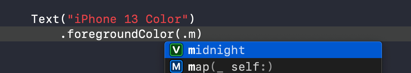 Type a dot, and all static members will show up in code completion, which is great for discoverability.
It won't work if you try to create a similar extension on a PrimitiveButtonStyle protocol.
extension PrimitiveButtonStyle where Self == PlainButtonStyle {
public static var plain: PlainButtonStyle {
PlainButtonStyle()
}
}
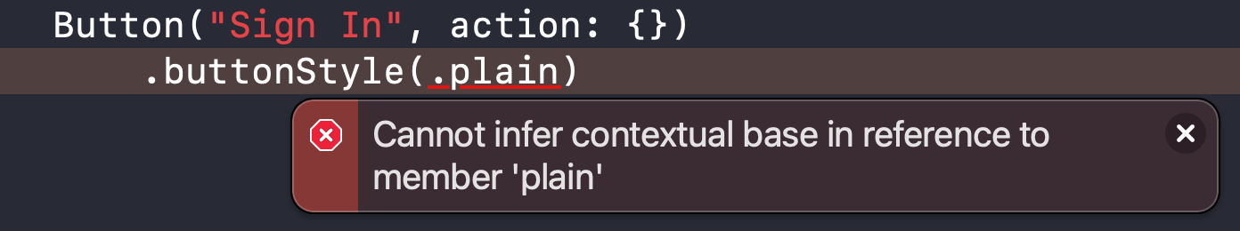
// This won't work
Button("Sign In", action: {})
.buttonStyle(.plain)Swift static member lookup is not supported for members of protocols in generic functions, so there is no way to use leading dot syntax at a generic call site.
 Swift didn't support static member lookup in generic context before Swift 5.5.
.buttonStyle modifier is a generic functions over a PrimitiveButtonStyle protocol.
public func buttonStyle<S>(_ style: S) -> some View where S : PrimitiveButtonStyleStatic Member Lookup in Generic Contexts
Swift 5.5 extends static member lookup capability to cover generic contexts. And that's what we are trying to do in the previous section.
With this Swift feature (Swift 5.5, Xcode 13), we can use leading dot syntax for generic types.
Button("Sign In", action: {})
    .buttonStyle(.plain)
Most SwiftUI use a protocol as a way to style most of its view. And use a generic function to apply that style. That means all views get benefits of this new capability, not just a button style, but we will only focus on a button style in this article.
Toggle and ToggleStyle also getting benefit from this.
Toggle("Wi-Fi", isOn: $isWiFiEnabled)
    .toggleStyle(SwitchToggleStyle())
// To
Toggle("Wi-Fi", isOn: $isWiFiEnabled)
    .toggleStyle(.switch)
Make a custom button style support leading dot syntax
If you have a custom button style, you can also support this leading dot syntax by creating an extension of PrimitiveButtonStyle or ButtonStyle (depending on what your button style conforms to).
First, let's create a simple button style as an example. You can read more on how to create a custom button style in detail in SwiftUI ButtonStyle.
struct CapsuleButtonStyle: ButtonStyle {
    func makeBody(configuration: Configuration) -> some View {
        configuration.label
            .padding()
            .font(.body.bold())
            .foregroundColor(.white)
            .background(
                Capsule()
                    .fill(Color.black)
            )
    }
}

Button("Sign In", action: {})
    .buttonStyle(CapsuleButtonStyle())
It is a simple capsule-style button with a black background.
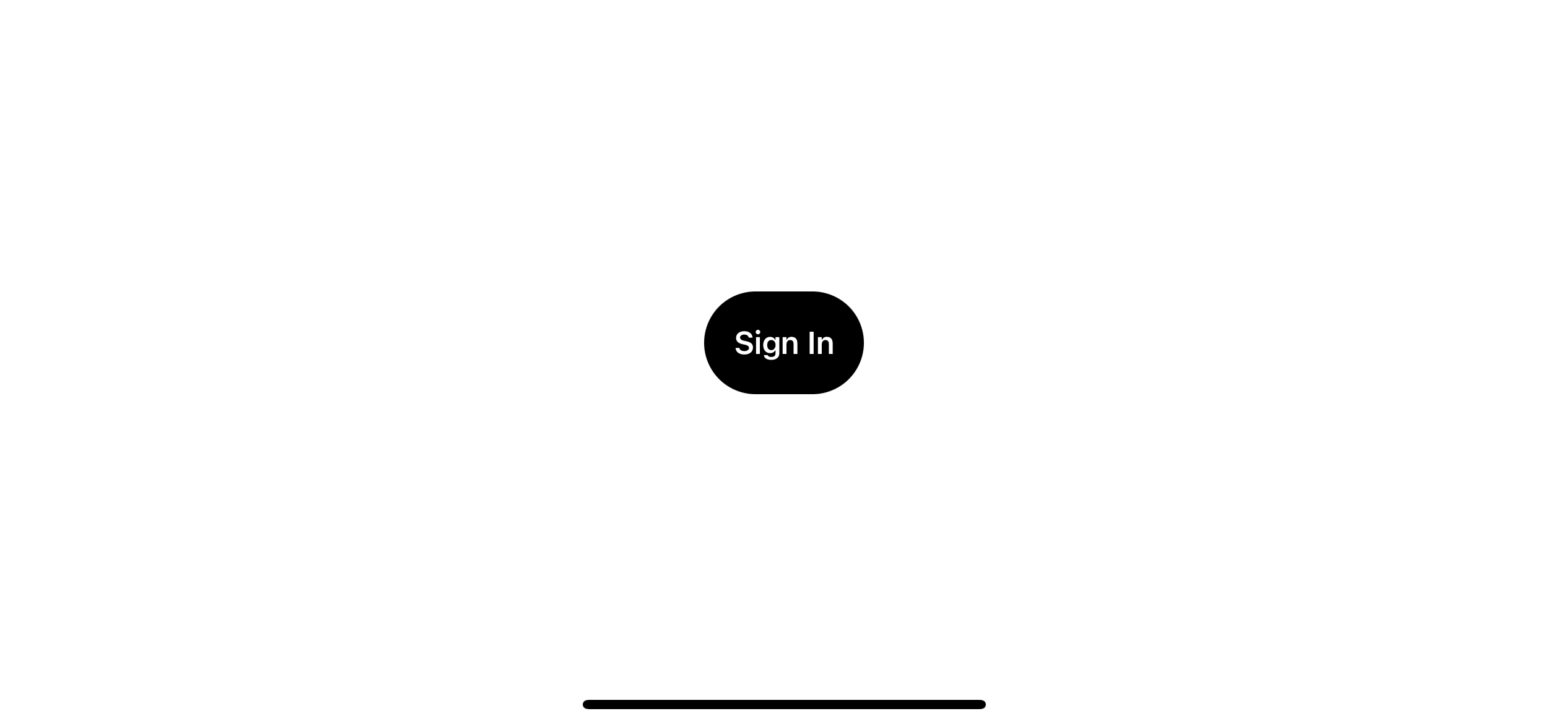 A custom button style.
Solution
To make a custom button style that supports leading dot syntax, we need to do the following:
- Create an extension of a protocol that you want to support leading dot syntax. It is the one that your concreate type conforms to. In this case, it is a
ButtonStyle. - Has
Selfbound to a concrete type that will be used as a type of your static member. In this case, it is our newly created button style,CapsuleButtonStyle. - Declare static members that return a button style we want.
It might sound complicated, but it is not. Here is how an extension for our CapsuleButtonStyle looks like.
extension ButtonStyle where Self == CapsuleButtonStyle {
    static var capsule: Self {
        return .init()
    }
}
1 We create an extension of ButtonStyle with a Self bound to a CapsuleButtonStyle (2).
3 We create a static member that returns our style. Self equals to CapsuleButtonStyle and .init() means CapsuleButtonStyle().
With this extension in place, we can use our custom button style with leading dot syntax, .buttonStyle(.capsule).
Button("Sign In", action: {})
    .buttonStyle(.capsule)
And our custom button style also shows up in code completion along with system-defined ones, which greatly improves discoverability.
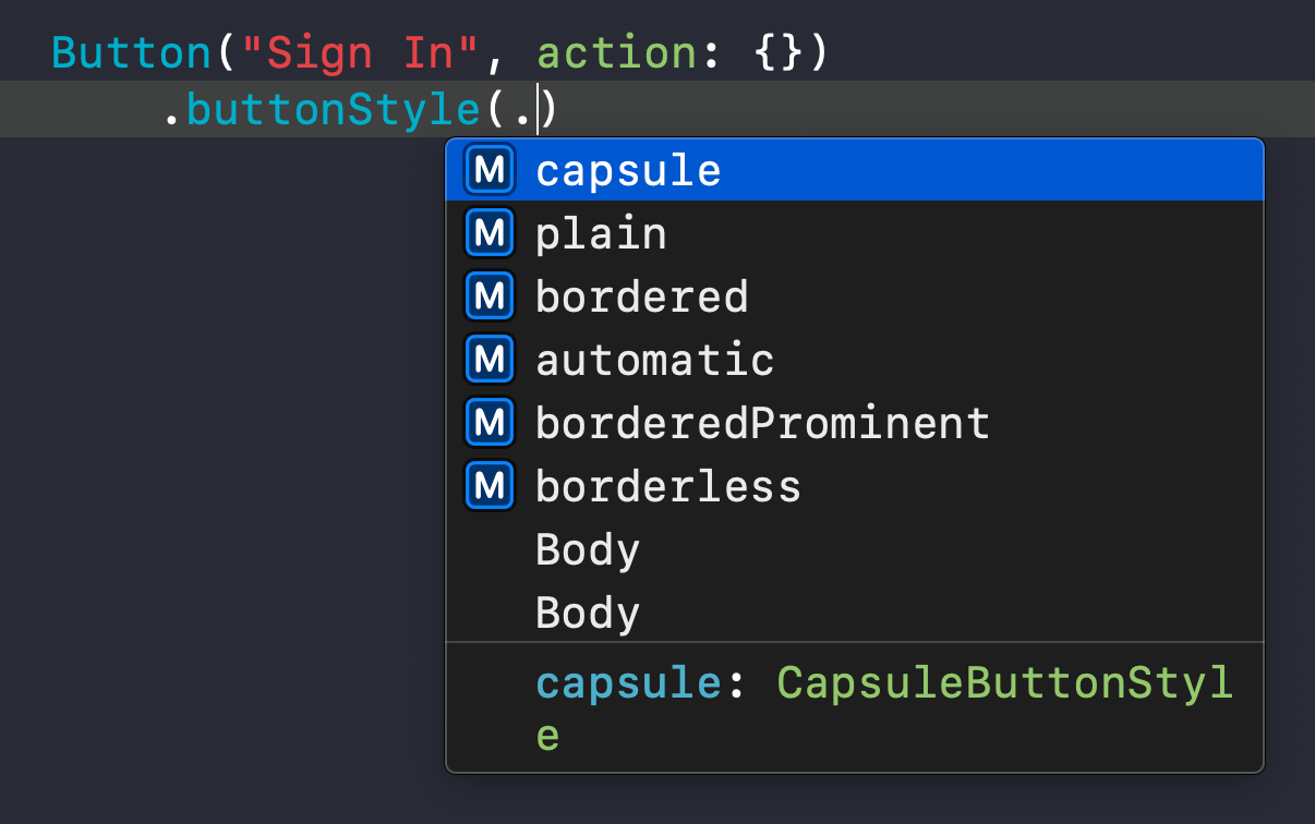 Static members are shown in autocompletion.
You can easily support sarunw.com by checking out this sponsor.
Conclusion
This Swift feature can be easily overlooked, but it is a nice addition that improves many existing APIs and code discoverability.
As mentioned earlier, this change isn't exclusive to a button style. I think you can leverage this feature to other places in your code as well. I encourage you to check this out at SE-0299: Extending Static Member Lookup in Generic Contexts.
You may also like
Learn how to create protocols that constrain their conforming types to a given class.
SwiftLearn a crucial concept in SwiftUI, view modifier, and a guide of how to create your custom modifier.
Swift SwiftUIRead more article about SwiftUI, Swift, ButtonStyle,
or see all available topic
Enjoy the read?
If you enjoy this article, you can subscribe to the weekly newsletter.
Every Friday, you'll get a quick recap of all articles and tips posted on this site. No strings attached. Unsubscribe anytime.
Feel free to follow me on Twitter and ask your questions related to this post. Thanks for reading and see you next time.
If you enjoy my writing, please check out my Patreon https://www.patreon.com/sarunw and become my supporter. Sharing the article is also greatly appreciated.
What is a KeyPath in Swift
By learning about the key path, you open up yourself to an opportunity to improve your existing API or even create a new one that you don't aware you can do it.
How to make a SwiftUI view to fill its container width and height
We can use a frame modifier to make a view appear to be full width and height, but the result might not be what you expected.
Recommend
-
34
In SwiftUI a button is a control that performs a action when triggered. In this tutorial a button can be clicked to increment a value.SwiftUI requires Xcode 11 and MacOS Catalina, for which the Betas can be
-
11
Inside SwiftUI's Declarative Syntax's Compiler Magic Inside SwiftUI's Declarative Syntax's Compiler Magic June 4, 2019 Announced in WWDC 2019, SwiftUI is an incredible UI building framework that...
-
10
Posted 1 month ago2021-01-27T17:30:00+01:00 by Peter Steinberger Updated 1 month ago2021-02-03T16:12:59+01:00
-
8
Creating an Editable Textarea That Supports Syntax-Highlighted Code Oliver Geer on Apr 16, 2021 Take the pain out of building site search...
-
22
The many faces of button in SwiftUI 30 Jun 2021Button is one of the crucial components of any app. We use buttons to provide actions in the user interface of the app. SwiftUI 3 released a bunch of new view modifiers that allow us t...
-
54
How to make a custom button style with UIButton.Configuration in iOS 15 13 Sep 2021 ⋅ 18 min read ⋅ iOS 15
-
7
开发 SwiftUI Bug – PlainButtonStyle Button 触发次数异常 ...
-
4
The Xbox button on Elite 2 controllers now supports RGB colorsSkip to main content
-
11
SwiftUI makes it very easy for us to customize button appearance. In this article, I'm not going to teach you how to do that, but I will show you what SwiftUI already provided. SwiftUI provides many built-in button...
-
6
When talking about a custom Back button in a navigation view, it usually falls into two categories. Custom appearance. Custom action. If you want to customize a back button acti...
About Joyk
Aggregate valuable and interesting links.
Joyk means Joy of geeK