

The many faces of button in SwiftUI
source link: https://swiftwithmajid.com/2021/06/30/the-many-faces-of-button-in-swiftui/
Go to the source link to view the article. You can view the picture content, updated content and better typesetting reading experience. If the link is broken, please click the button below to view the snapshot at that time.
The many faces of button in SwiftUI
30 Jun 2021Button is one of the crucial components of any app. We use buttons to provide actions in the user interface of the app. SwiftUI 3 released a bunch of new view modifiers that allow us to style buttons in different ways. The new bordered button style in conjunction with controlProminence and controlSize view modifiers can change button presentation drastically.
Button role
New in SwiftUI Release 3, you can provide an optional button role. By default, it is nil and uses a standard one, but you can set the predefined role provided by ButtonRole enum. The role can be destructive or cancel. In this case, SwiftUI will set a specified button appearance. For example, SwiftUI changes the button tint to red for destructive buttons.
Button("Delete", role: .destructive) {
    viewModel.delete()
}

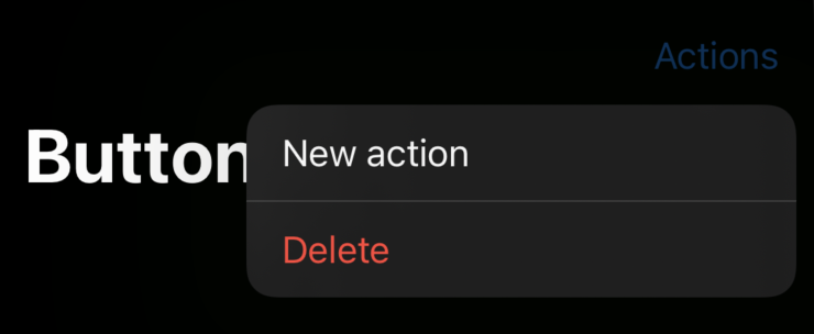
Button roles change the appearance in many places across the app, like context menus, toolbar menus, etc.
struct ContentView: View {
    var body: some View {
        NavigationView {
            Text("Hello, World!")
                .toolbar {
                    Menu("Actions") {
                        Button("New action") {}
                        Button("Delete", role: .destructive) {}
                }
            }.navigationTitle("Buttons")
        }
    }
}
Bordered button style
There is a new BorderedButtonStyle type that allows us to display buttons with rounded corners. You can set the button style for a particular button or the full view hierarchy using the buttonStyle view modifier.
Button("New action") {}
    .buttonStyle(.bordered)
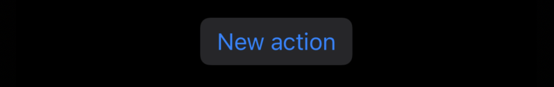
BorderedButtonStyle provides you a bordered button appearance with rounded corners that you can see in many places across the iOS system.
To learn more about buttons and how to create custom button style, take a look at my “Mastering buttons in SwiftUI” post.
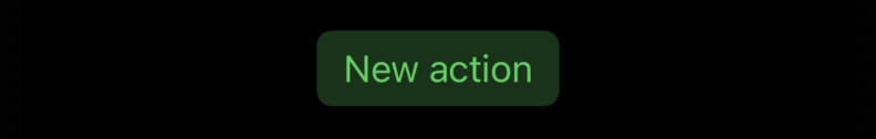
Button tint
There is a new tint view modifier that we should use to override the default accent color. Unlike an app’s accent color, which can be overridden by user preference, the tint color is always respected.
Button("New action") {}
    .buttonStyle(.bordered)
    .tint(.green)

Control size
We can’t directly control the corner radius of the bordered button, but we can affect it using the controlSize view modifier. The controlSize view modifier allows us to set the size of controls within the view. There is a ControlSize enum with four cases: mini, small, regular, and large. We can use one of them and pass it via the controlSize modifier.
 Button("New action") {}
    .tint(.green)
    .buttonStyle(.bordered)
    .controlSize(.large)
In the example above, we set the large size for controls in our view hierarchy. As you can see, it affects the size of our button and changes its corner radius.
Control prominence
Control prominence defines the dominance of control in the user interface. You can set the importance using the controlProminence view modifier that accepts one of two possible prominence cases: standard or increased.
Button("New action") {}
    .tint(.green)
    .buttonStyle(.bordered)
    .controlSize(.large)
    .controlProminence(.increased)
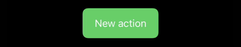
As you can see in the example above, SwiftUI changes button appearance whenever we set the increased prominence. SwiftUI displays buttons with increased prominence by filling them with tint color.
Conclusion
There are a lot of new opportunities for customizing buttons both in SwiftUI and UIKit. New control size and prominence APIs will play a crucial role in styling SwiftUI buttons without implementing custom button styles. I hope you enjoy the post. Feel free to follow me on Twitter and ask your questions related to this post. Thanks for reading, and see you next week!
Recommend
About Joyk
Aggregate valuable and interesting links.
Joyk means Joy of geeK