
Dynamic and Semantic Colors - Four for One
source link: https://www.swiftjectivec.com/one-color-becomes-four/
Go to the source link to view the article. You can view the picture content, updated content and better typesetting reading experience. If the link is broken, please click the button below to view the snapshot at that time.
Dynamic and Semantic Colors - Four for One
Colors are complicated. Beneath the sea of color theory, hitting contrast ratios and settling on forty-eight different versions of a gray (or grey 🇬🇧👋) — iOS 13 “hold my beer”‘d the whole situation by introducing Dark Mode.
Semantic and dynamic colors on iOS made this easy to deal with though, no matter if you addressed the concern by using Apple vended defaults or rolling your own. Instead of juggling a panoply of colors, we can lean on their “meaning” instead of their RGB, HSL or hex value:
var body: some View {
    Text("Use system colors")
        .foregroundColor(Color(uiColor: .label)) // Instead of #D2D2D2 or whatever
}
Many of us do the same thing by creating colors programmatically:
var body: some View {
    Text("Use system colors")
        .foregroundColor(Color(uiColor: customLabel))
}

private var customLabel: UIColor {
    get {
        UIColor { traitCollection in
            switch traitCollection.userInterfaceStyle {
            case .dark: return customDark
            case .light: return customLight
            case .unspecified: return customLight
            @unknown default: fatalError()
            }
        }
    }
}
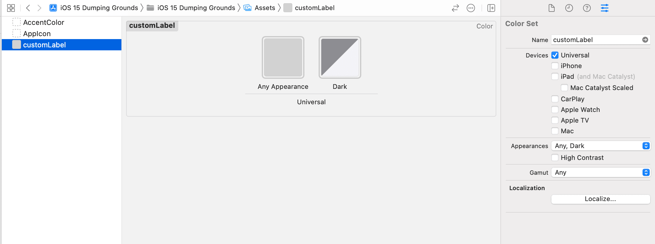
Or, maybe turning to the GUI in an asset catalog is more your style:

Two of those examples gave us two context-aware colors for light and dark mode. Can you spot which one gave us…four?
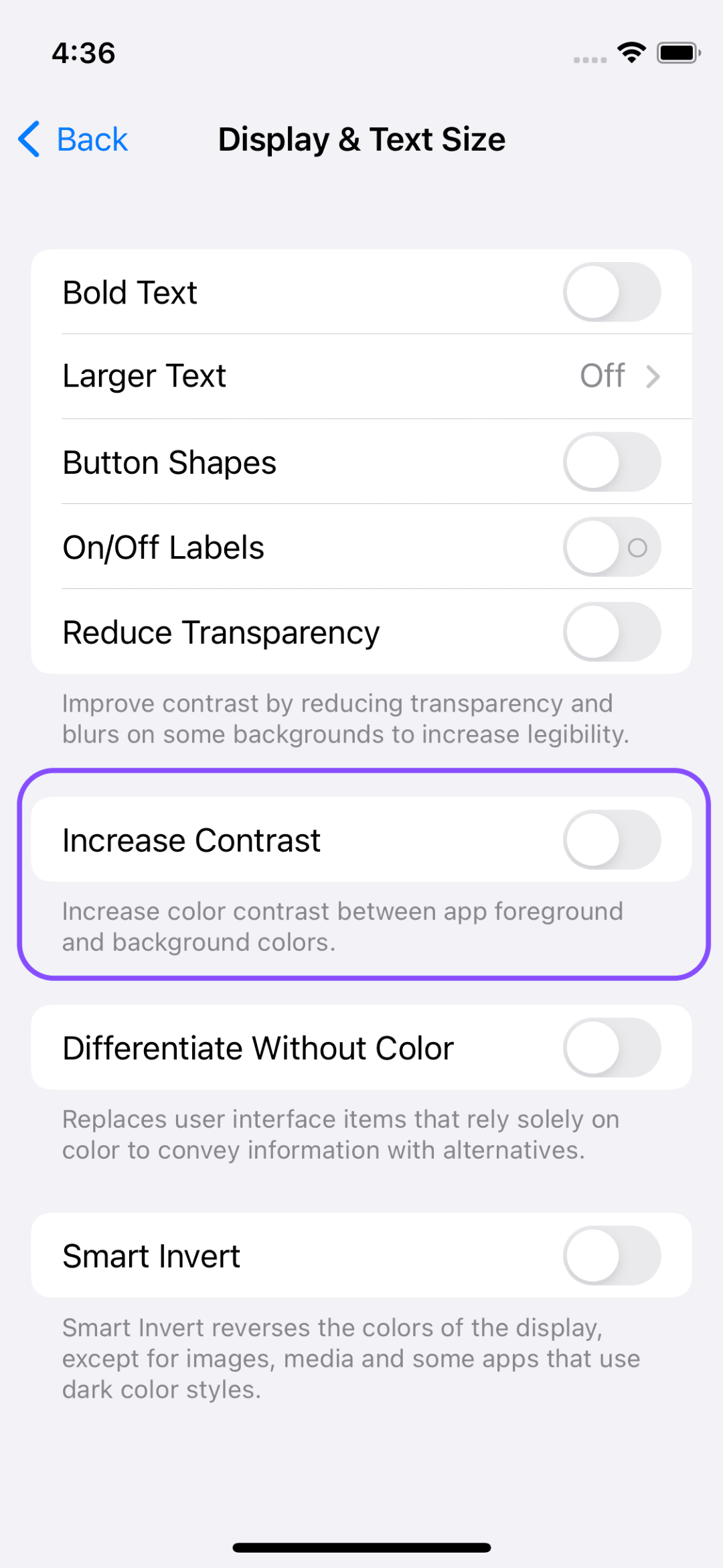
A lot of folks forget there are other situations where you might want to adapt color. One of them? When users pop this little toggle on:

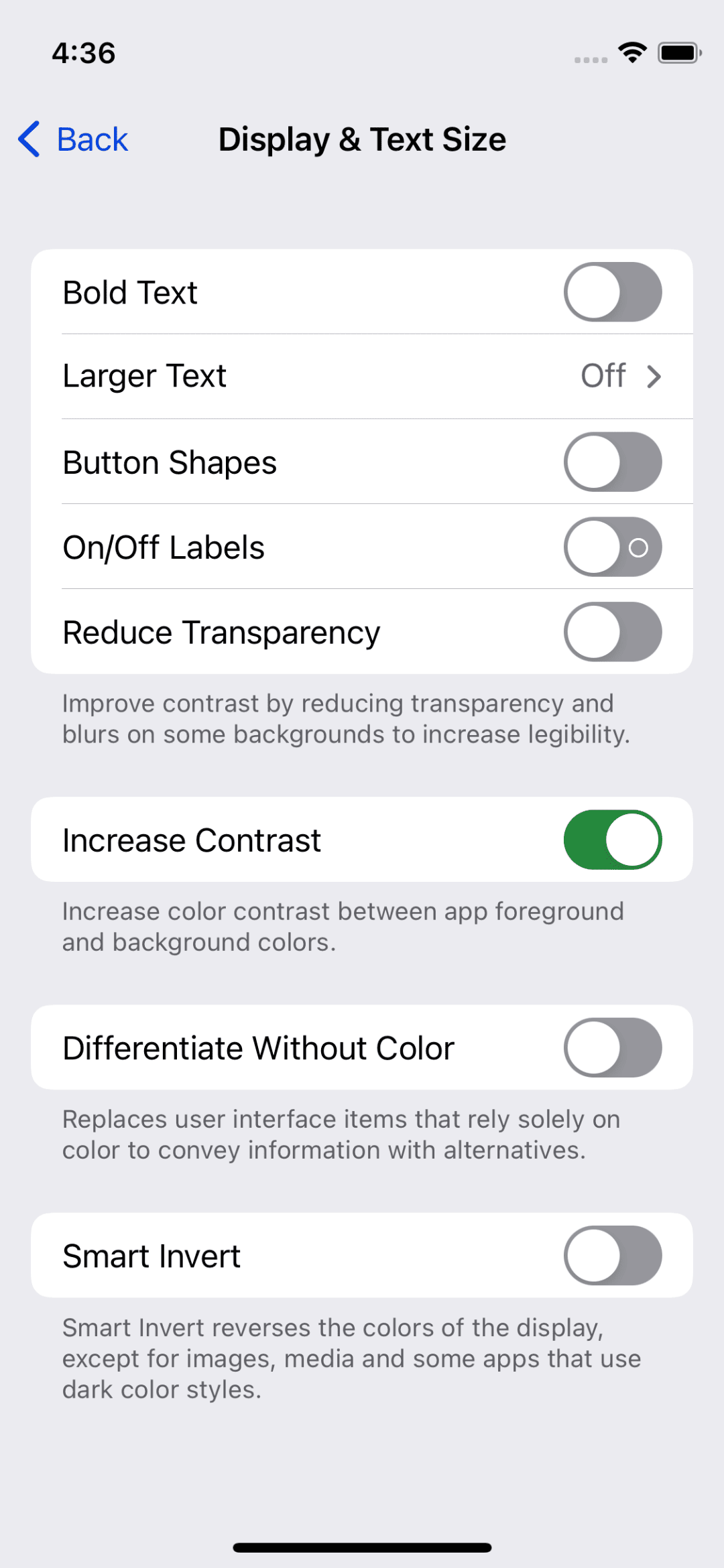
Right away, you can see the Settings app adapt - even though it doesn’t use “new” colors under the hood, it doesn’t apply the same values for those colors it previously did:

So, one color has now become four:
- Light style.
- Dark style.
- Light style, high contrast.
- Dark style, high contrast.
This post is basically me saying — ‘“Don’t sleep on high contrast color values!”
You can handle this at the asset catalog level. Just click the “High Contrast” toggle and you’ll have two more options provided to you to account for high contrast scenarios:

Of course, this is trivial to do at the API level as well:
var body: some View {
    Text("Use system colors")
        .foregroundColor(Color(uiColor: customLabel))
}

private var customLabel: UIColor {
    get {
        let highContrast = UIAccessibility.isDarkerSystemColorsEnabled

        UIColor { traitCollection in
            switch traitCollection.userInterfaceStyle {
            case .dark: return highContrast ? : .customHCDark : customDark
            case .light: return highContrast ? : .customHCLight : customLight
            case .unspecified: return customLight
            @unknown default: fatalError()
            }
        }
    }
}
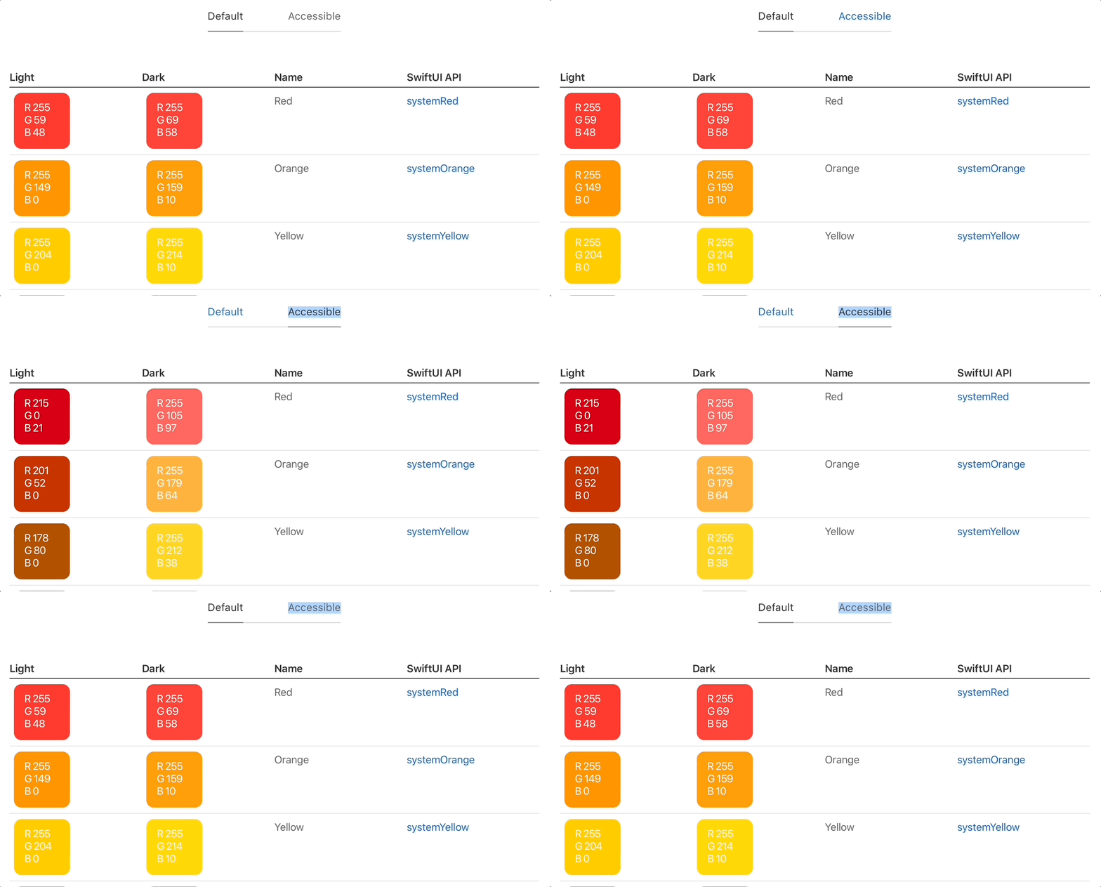
And as we saw above, Apple’s system colors work this way, too. Here’s another example from the Human Interface Guidelines:

So remember, the next time you’re picking out a color, it’s never one color. At the absolute minimum, it’s two. For most colors, that number should be four.
Until next time ✌️.
Recommend
About Joyk
Aggregate valuable and interesting links.
Joyk means Joy of geeK