

A few UI differences between Chinese and English apps
source link: https://uxdesign.cc/a-few-ui-differences-between-chinese-and-english-apps-e72400bb08da
Go to the source link to view the article. You can view the picture content, updated content and better typesetting reading experience. If the link is broken, please click the button below to view the snapshot at that time.

A few UI differences between Chinese and English apps
Growing up in Singapore, I am exposed to cultural influences from the West as well as the East. I use Western apps like Pinterest as well as its Chinese close equivalent 小红书 (Xiao Hong Shu). There are definitely differences in the digital products’ user experience and here are some of my thoughts:
Language system
To start, we have to understand the language systems used by the Chinese and English languages.

Chinese uses a logographic system — a single written character like “好” represents an entire word. A character is made up of intricate strokes so it can appear that there is less white space visually.
English uses an alphabetic system — letters are used to record words. Alphabetic words have irregular lengths (think supercalifragilisticexpialidocious) while logographic characters are squarish and regular in size. This affects how the same information can be packed into the same pixel area.
Design System Implications
Chinese characters are little individual squares, making it easier to design layouts. With a consistent text length, UI tabs can be of shorter length and buttons more regular in size.
Seeing how each UI component is like a screw that holds other parts of the product together, the effects cascade throughout the design system.
1. White Space
Cultural Preference
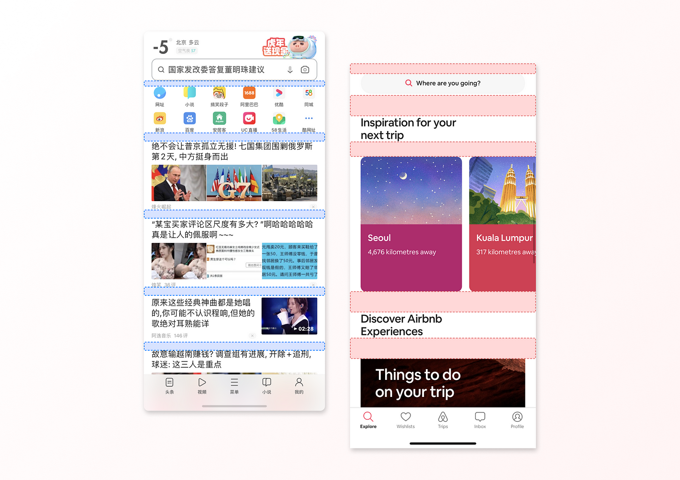
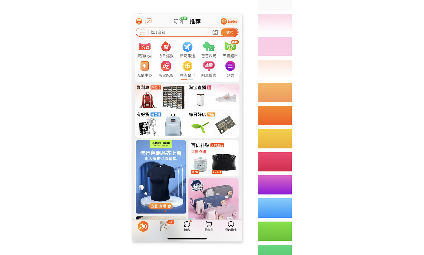
Chinese apps may appear cluttered to Westerners. The general rules of white space, text size, line height are applied slightly differently for Chinese apps.
Chinese apps are often prized for their high functionality which would result in a more densely packed UI design. The compactness of Chinese characters also enables more information to be packed within the same pixels.
Western users tend to prefer cleaner layouts and can be less patient and give up using the app if they can’t find what they want or get overwhelmed. There is more generous use of white space which makes it easier to process information.
Chinese Super Apps impact on UI design
Most Chinese apps are super apps and offer multiple services within an app. Imagine being able to text your mom, order food delivery, hail taxis and book plane tickets all from a single app! And yes, you can do all that using Tencent Holdings Ltd.’s WeChat.
In contrast, mobile users elsewhere use dedicated apps for specific tasks — Postmates for dinner, Lyft for commuting, Skyscanner to buy plane tickets. The density of screen information would definitely differ based on the utility of the apps.
2. Use of promotional pop-ups
The experience of using Chinese apps is similar to a physical marketplace where sellers vie for your attention. Animated pop-ups are used to draw attention to ongoing promotions.
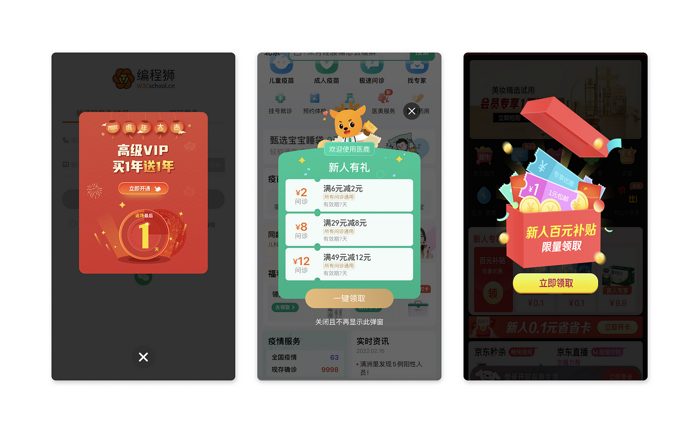
Our digital environments mimic our physical environment. Go to Chinatown anywhere and you would notice how the space is bustling with activities, and the level of sensory load is very high.
While pop-ups have generally been recognised as a disruptive user experience, Chinese app users are used to them and may even enjoy them as it alerts them to ongoing promotions.
3. App Icons
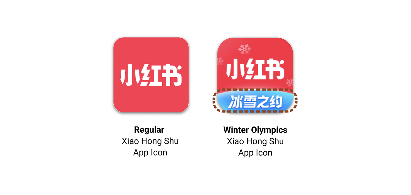
App Icons wear different ‘skins’ and change with the seasons
Apps try to capture users’ attention right from their phone home screen. By switching up its app icon design, it can help to attract users who do not regularly use the app. For instance, it is the Winter Olympics 2022 currently and Xiao Hong Shu uses a seasonal icon with the words “Winter Olympics” within the app icon.
Chinese app icons tend to have Chinese characters in them.
The compactness of Chinese characters allows them to be infused into app icons more easily. App icons are rarely just a logo and tend to have Chinese characters embedded in them.
4. App splash screens are replaced with ads
Splash screens in Chinese apps tend to be animated ads. It’s a smart way to disguise and smooth out delays in loading the app.
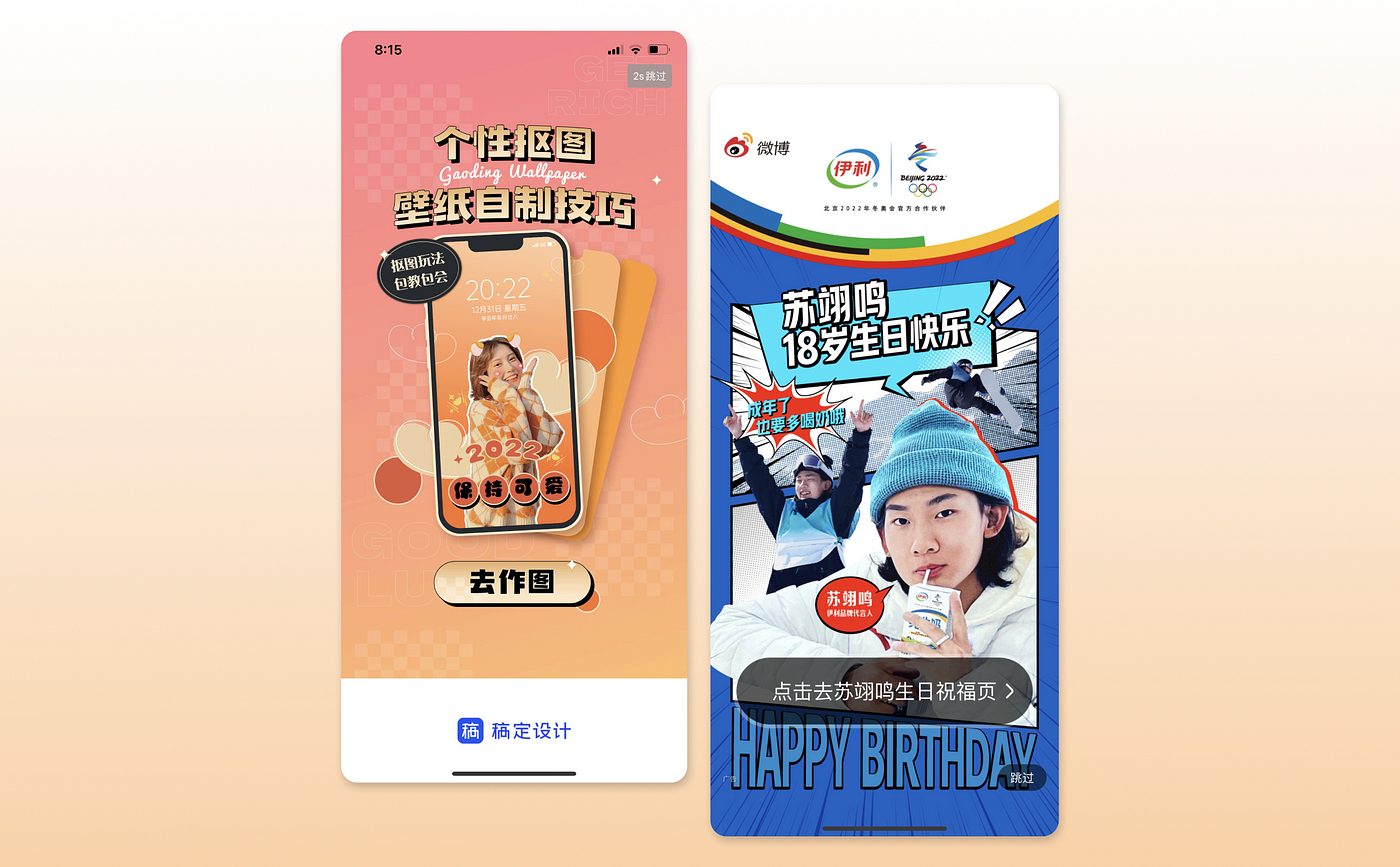
The usage of the full screen also attempts to counteract banner blindness by taking over the entire screen and setting a timer of 3–5s before you can skip it.
5. Use of Colours
Chinese UI design tends to be more colourful with the use of bright vibrant colours to catch your attention. For Western consumers, it may feel like there are too many things vying for your attention at the same time.
Despite the riot of colours, there is a certain harmony within the colour tone. The colours have a similar lightness value and work together to create an engaging and exciting interface that welcomes shoppers.
6. Use of Animal Symbolism
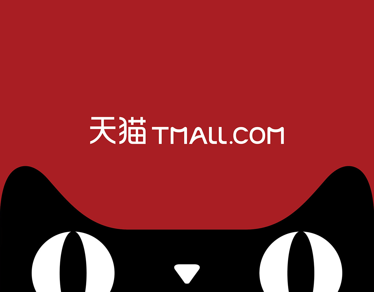
In Chinese culture, animals tend to have symbolic meanings and serve as representations of certain qualities.
In China, it is common to use animals in their corporate logo or mascots. For instance: Baidu, a major search engine in China, has a paw/pad of a bear (not to be mistaken for a dog’s paw) within its logo. Tmall has its popular Skycat.
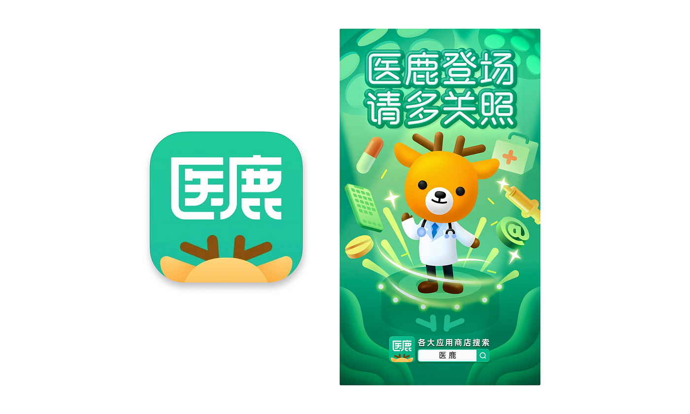
Case in point: A health app called 医鹿 ? (directly translated to Doctor Deer) by Alibaba Health. In traditional Chinese paintings, deers symbolize longevity and riches. Hence, the user of deer as a mascot for a medical app is quite apt.
The psychology behind using animals in logos
Most animal logos are likeable, memorable. They help to quickly build brand recognition and emotional connection with customers, as compared to non-animal logos. This contributes to brand engagement and equity.
Non-UI Related: Captcha
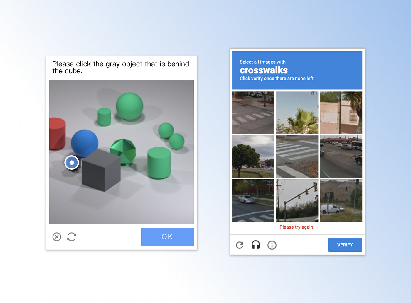
I foolishly thought captchas were universal until I tried the captcha used by Chinese apps. Curious, I read up and realized that reCAPTCHA is owned by Google.
In this case, this app uses shape identification instead of “click images that have streetlamps”. How interesting!
Design is contextual
The only golden rule in design is to design with your user in mind.
Be aware of how cultural difference affects users’ experience of the app. Our preferences in physical environments speak more about our digital environments than we think.
In my attempt to break down the differences in English and Chinese app designs, I always kept in mind how form fits function. ie. The form of English words and Chinese characters and the affordances the language offers.
Given how densely compact Chinese apps are, I do wonder what the UI design systems used in China look like!
Resources:
Recommend
About Joyk
Aggregate valuable and interesting links.
Joyk means Joy of geeK