

UI/UX Design Master Series: Complete E-commerce App Part 3
source link: https://uxplanet.org/ui-ux-design-master-series-complete-e-commerce-app-part-3-c643832e7d9d
Go to the source link to view the article. You can view the picture content, updated content and better typesetting reading experience. If the link is broken, please click the button below to view the snapshot at that time.
Overview
Back again like we never left, in Part 3 of this UI/UX master series where I walk you through, step-by-step, how to research, design, validate, and deliver an entire e-commerce app from the ground-up.
If you haven’t checked out parts one and two yet, I highly recommend starting there so you can get caught up with out process and our discovery phase.
To recap: last time in, Part 2, we went over
- Discovery and getting to the bottom of your design problem.
- How to find out if your problem hypothesis is legitimate.
- Understanding work roles and user types.
- How to quantify business needs.
- and a whole lot more.
This time, in Part 3, we’ll be covering
- How to begin the ideation & conceptualization process.
- How to plan for solid content strategy.
- How to create intuitive information architecture.
- How to begin userflowing, wireframing, prototyping,
- and whole lot more.
Sound good? Let’s get into it.
Ideation & Concept Design
After we’ve discovered as much about our design problem that we need to in order to get a good grasp of what it actually is, including:
- whether or not it’s actually a problem, and
- if users are willing to pay for our proposed solution
We will be moving into real solution space, which is not just what our proposed solution will be designed to do, but how it will deliver results for our users.
When we first approach the solution to a problem, we need to begin with ideation and conceptualization. This process is where we take all of our ideas, and get them down onto paper, so that we can look at them critically, assess them for feasibility, and discuss them with our team.
Crucially, there is no “right” or “wrong” way to begin this process, and there are many methods for ideating, including approaches like mind-mapping, crazy-8’s, etc.
The main goal of ideation and concept design is to get your team’s ideas into a physical, visible format, where they can be discussed, distilled, and decided upon for design direction.
Once you have some initial design ideas picked out, you’ll want to keep working with them, and refining them, until you and your team feel that you’ve collectively come up with an approach that is going to work for solving your design problem.
→ I call this proposed solution your solution hypothesis.
Once you have your solution hypothesis, which represents in a rough way how you and your team want to go about solving your design problem, you can safely move onto the next step, which is content strategy.
Content Strategy
Once you’ve got your ideas for approach picked out, you’ll want to deeply consider your content, which is the main things that users will see and interact with in your app.
Without content, your application is essentially just an empty husk. Content strategy essentially represents the following:
- What will your user see?
- Why will they see it?
- What should their takeaway be from this information?
- Why should they care about it?
This content includes images, illustrations, animations, and both regular & micro-copy.
In our example, this e-commerce application, we know that local businesses will be selling products to local customers who are looking to buy these products and get them shipped on the same day if possible.
This means that our content has some criteria we need to ensure:
- We must show the users local products
- The products must have photos, descriptions, aggregate ratings, prices, and estimated delivery windows.
- Since we don’t want to have to manage comments (trust me, it’s awful at scale), we won’t design them into our first product iteration.
- These products must be available for one to two-day delivery to the customers.
- These products must have relevance to our customers.
- Customers will need information regarding successful orders, failed orders, pending orders, returned orders, and canceled orders.
- Customers will need to have profile information for internal use, but this information will not be shared, and customers cannot be looked up or viewed except by administrators.
- Businesses listed must have a name, address, phone number, valid customer service email, and aggregate ratings of their own.
- Businesses listed must be legitimate (registered through the state as an LLC, S-corp, or C-corp, in good standing; we will not be supporting sole-proprietors at this time due to possible liability concerns).
Now, you may notice that in this list I appear to be focusing specifically on content tailored to customer accounts.
Why would I do that if we’re designing for multiple account types in the end? The reason for this is simple: who’s really paying for this application?
- Is it the businesses who we’re charging for the membership?
- Is it the couriers that are being paid to deliver packages, or
- Is it the customers who are paying the businesses for their products, who are, in turn, paying us?
You see where I’m going with this?
Our target customers are local businesses, but in order to make our value proposition work for them, we have to focus on the people who will be paying the businesses themselves first.
Because how can a business justify paying us money, if we’re not getting them customers and making them money in return?
They can’t, and they won’t.
I call this following the money trail when designing your product’s UI and UX, because you have to appeal the people who are really the ones paying for your product in the end.
If our proposed solution doesn’t get businesses more customers on a regular basis, there’s no way that they’re going to keep paying for it, and our platform relies on local businesses paying us money every month for memberships to keep it alive and contribute to ROI.
In this way, we begin to understand the relationship, that our target customer is not always exclusively our target user, and we must design accordingly.
Information Architecture
Now that we know what our users are going to see, and why it matters to them, we need to plan for where our users will see it on their journey through our application.
This is easier said than done because while we can ASSUME that we know how our users think in terms of “well it’s obvious that _______________ would go here,” we don’t actually KNOW.
So how do we find that out? By using a hybrid card sort.
Hybrid card sorting
Card sorting is a method used in UX research to better understand how your users think in terms of how they group information, and where they expect to find things in an application.
In a hybrid cart sort, we both give our users categories for items, while allowing them to create their own categories as well.
The key to a successful card sort is letting your users take the time they need, and to ask open-ended questions without helping them too much.
- Watch for where they struggle to place things.
- For where they can’t quite figure it out.
- For where they aren’t totally sure how to categorize something.
Additionally, where multiple users have come to the same conclusion independently, you normally have found a pattern that can be used to group your data.
What if you can’t?
Let’s say you don’t have the budget to get users into the building or schedule a card sort with them with appropriate incentives.
We’ve all been there, these things happen.
What you can do instead is do it with members of your team, and with other people in your organization WITH THE KNOWLEDGE that it will more than likely have to change in the future when better representative data comes to light.
→ This will almost always show up in a usability test when a user goes “I don’t know where to find ___________,” and/or struggles when presented with a declarative action from your critical task list like “search for and find a pair of size 13 shoes.”
If they can’t do it, that’s on you, and you need to investigate THOROUGHLY why they can’t and what the problem is that is obscuring the information understanding and application traversal process for your users.
Good enough is better than not at all, and if you have to do it this way to get your idea out there for testing, so be it.
Mapping your IA
Once you’ve determined your information architecture, you need to make sure you map it out in a relational fashion, from entry-point, to end-point.
One of the best ways to do this is with a sitemap.
What you are attempting to do with a sitemap is:
- Order your information in the way that your users expressed categorically in your card sort.
- Establish exactly where your users can find information on your site, in a hierarchical fashion, typically from general to specific.
- Make sure you don’t have duplicate information anywhere.
- To cut down unnecessary pages & interactions wherever you can (trust me on this one, less is more).
Based on the data we have, the sitemap for our product will look something like this:

Userflows & Service Blueprints
Now that we have a better idea of what our content is, where it will go, and the pages that we’ll need to have, we can move onto userflow diagrams and service blueprints.
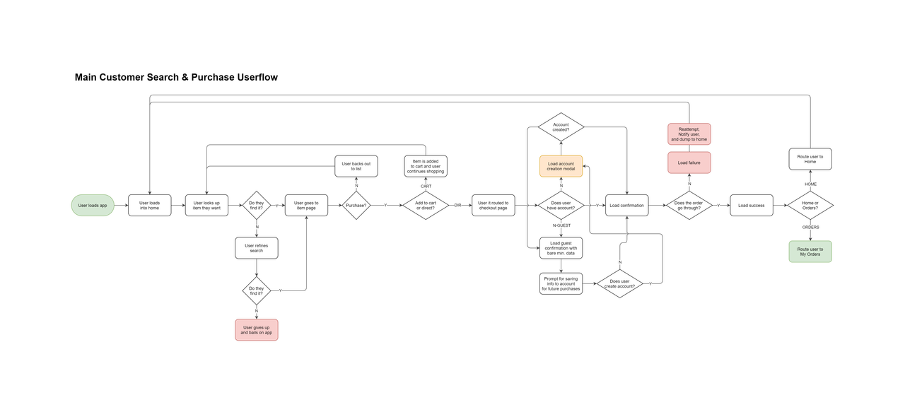
Userflow diagrams
A userflow diagram (also known as user flow diagram, and user task flow diagram) is used to specify how a user will move through your product, the steps they’ll take along the way, the decisions they’ll make, and how they’ll arrive at their desired outcome.
User flow diagrams can also indicate states of success, failure, and what should happen in either case depending upon the current set of screens, series, or step in the process that a user is on.
For our example, our userflow diagram will look something like this:

Bear in mind again that we are only designing for the customer user type initially, to make sure that they both can and will want to use this product, so that businesses have an incentive to purchase ongoing memberships.
Service blueprints
In the same vein but with a much higher level of complexity, service blueprints include not only what the user is doing with your product, but what your product is doing for your user.
This includes all back-end operations including processing data, fetching relevant information, connecting with API’s, authenticating, verifying, and anything else that needs to happen out of sight and out of mind of the user.
Keep in mind while these service blueprints are far more detailed, they do not have to have absolutely everything. I’ve done data maps and blueprints before that look like a particle accelerator at CERN, and I can tell you from experience that they helped no one.
What you want to focus on are the key points of interaction where the system will be intervening and operating on the user’s behalf in a big way.
This includes all parts of the system, even other people who may be helping to provide service to and for your users (sales reps, customer service, etc.).
For our purposes, our service blueprint will look something like this:

Wireframing
Alright, now that we’ve gotten the groundwork laid for a solid product, we can now foray into an area that most designers are familiar with: wireframing.
When it comes to planning out your product, your wireframes will be informed highly by your content strategy, information architecture, and user requirements.
Form follows function; this is the place where UX gives way to UI, and your product’s interface will begin to take shape, even if in a very rough way.
Wireframes are not meant to be accurate, nor are they mean to be permanent. They are tools to help you visualize the culmination of your discovery and planning processes.
→ What will your application look like, screen for screen, in a way that allows you to showcase your general ideas without sinking a huge amount of time into each one?
For our example product, our wireframes for our customer will look like this:

Prototyping
So we’ve finally made it. We’ve been through discovery, the planning, the wireframing, and now we’re ready to synthesize it all into a working, interactive prototype.
This is big, sexy hook that everyone wants to see. The culmination of your efforts, and the fruit of your labors, so we’ll want to make sure it looks as nice as possible.
There are three types of prototypes that you need to be aware of, varying in levels of fidelity, and that you will encounter in the wild:
- Lo-fi prototypes
- Mid-fi prototypes, and
- Hi-fi prototypes
Let’s take a look at each one, what they’re about, and when you’ll use them.
Lo-fi prototypes
Lo-fi’s are used when you first want to move out of your wireframes and into something that is clickable, interactive, and has a little more substance.
Lo-fi’s can include color, some basic animation, but typically don’t include a high degree of content. Additionally, lo-fi prototypes are typically not super detailed.
Mid-fi prototypes
Mid-fi’s are the bread and butter of most UI/UX designers. When you’re doing a mid-fi prototype, you’re including most of the content, more exact placement with grids, and applying things like type styles so that you can get a better sense of what your product will look and feel like in its final form.
Typically, what separates lo-fi’s and mid-fi’s are the applications of color, type styles, content, graphics, branding, and more advanced animations.
Hi-fi prototypes
At the very end of your processes, you will have your hi-fi’s. Your hi-fidelity prototypes should represent almost exactly what your app will look like when it’s done being developed.
Hi-fi’s are where you pull out ALL of the stops, and in some cases, this can include doing things like porting your prototype files from your design tool into a dedicated hi-fi prototyping tool suite.
Some examples of these advanced prototyping tools are things like Framer and Protopie.
Now to clarify, many times using advanced prototyping tools can be overkill, especially if the functionality is already well understood by your development team.
That said, hi-fi’s are the gold standard of UI/UX designer deliverables, and the better you can make your hi-fi’s look and feel, the easier it will be to communicate your design intentions clearly, especially if there’s custom functionality that will require more advanced programming to implement.
For our purposes, I have gone through and done a relatively hi, but still mid-fidelity prototype of what our customer’s application experience should look and feel like when:
- Finding an item
- Adding it to their cart, and
- Checking out with existing information
→ Protoype can be viewed here ←
It is worth mentioning that this prototype is relatively simple, and aims to test specific functionality of the application. It can be tempting to do prototypes that are hundreds of screens long, DON’T DO IT.
→ Instead, I would highly advise breaking your prototypes out into specific flows as they are easier to manage, update, and to test with. The last thing you want is a “perfectly representative” prototype that now has loading issues because it’s so large. Only create massive prototypes when you REALLY need to showcase and/or test the ENTIRE application at once.
Now that we have our prototype ready, we can move onto the next phase of this project: validation.
Recommend
About Joyk
Aggregate valuable and interesting links.
Joyk means Joy of geeK