

Why do we round corners
source link: https://uxdesign.cc/why-do-we-round-corners-5145a90da6ed
Go to the source link to view the article. You can view the picture content, updated content and better typesetting reading experience. If the link is broken, please click the button below to view the snapshot at that time.

Why do we round corners
A deep dive into the human attraction for roundness.
Rounded corners — they’re everywhere. From software user interfaces to hardware product design, there is something intrinsically satisfying about the look and feel of a rounded corner. In fact, designers have been using them so much that they became an industry standard rather than a design trend. But why are rounded corners so popular?
The following examples are taken from this great UX Movement article
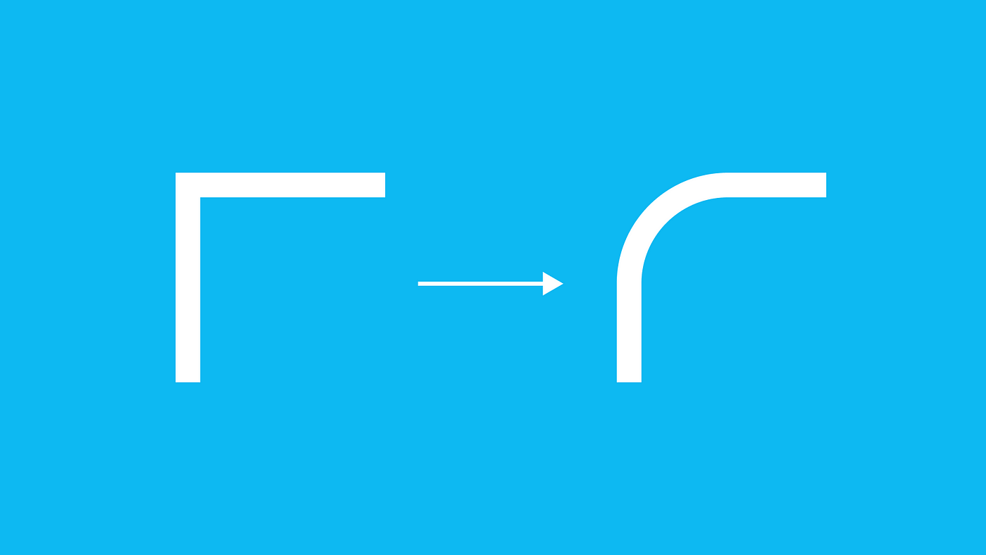
Rounded corners appear less bright
We can all appreciate the aesthetic beauty of rounded corners. But can we explain where exactly that beauty comes from? The answer to that is literally in our eyes.
Studies have shown that rectangles with rounded corners are easier on the eyes than rectangles with sharp edges because they take less cognitive effort to visually process. The fovea is fastest at processing circles. Processing edges involve more “neuronal image tools” in the brain. Thus, rectangles with rounded corners are easier to process because they look closer to a circle than a regular rectangle.
Scientific research done on corners by the Barrow Neurological Institute found that the “perceived salience of a corner varies linearly with the angle of the corner. Sharp angles generated stronger illusory salience than shallow angles”. In other words, the sharper the corner, the brighter it appears. And the brighter a corner appears, the harder it is to look at.

We’re conditioned for rounded corners
From a young age, we are taught that sharp corners are harmful. For this reason, in the physical world, we tend to avoid them and instead look for rounded, organic, safe objects.
When a child plays with a ball, most parents aren’t alarmed. But if the child was to play with a fork, the parents would take the fork away for the fear of the child hurting himself. This causes what neuroscience calls an “avoidance response” with sharp edges, that gets ingrained into our brains as we grow up.

Rounded corners are easier to process
Rounded corners are more effective for maps and diagrams because they allow our eyes to easily follow lines. Sharp corners throw our eyes off the path of the line, so we end up experiencing abrupt pauses when the line changes direction. But with rounded corners, the line leads our eyes around each corner to continue along the path smoothly.

Rounded corners also make effective content containers. This is because the rounded corners point inward towards the center of the rectangle. This puts the focus on the contents inside the rectangle. It also makes it easy to see which side belongs to which rectangle when two rectangles are next to each other.
Sharp corners point outward, putting less focus on the contents inside the rectangle. They also make it hard to tell which of the two sides belong to which rectangle when two rectangles are next to each other. This is because each rectangle side is exactly a straight line. The sides of a rounded rectangle are unique because the lines curve towards the rectangle it belongs to.

Rounding issues
So, after this initial reasoning about rounded corners, it’s easy to think: let’s apply rounded corners on everything, everywhere, every time!
This is obviously not a good approach: there’s a time and place for rounded corners, and they’re not always the best solution. When designing a product, we have to think about its purpose and objective in order to get the right user perception. Rounding a single corner might be insignificant on its own: but when done at scale (e.g., on the whole interface), it can drastically change the look and feel of the product.
To understand these effects, let’s take things down to a basic level. All design elements can be reduced to basic shapes and lines, subliminally conveying different personalities to the audience.
Let’s take a look at some logos:

And now at some typefaces:

It’s very clear how these logos and typefaces elicit different responses from each other. And it all comes down to shape psychology:
- Boxy shapes are commonly seen as reliable, uniform, traditional, and professional.
- Round shapes are commonly seen as charismatic, endearing, harmless, and friendly.
- Triangular shapes are commonly seen as dynamic, energetic and powerful.
Therefore, it’s crucial to think about our brand or product goals when we’re designing, because the shapes we choose for our basic design elements can have a big impact on user perception. Rounding corners might be valid if we want to achieve a friendly, innocent look and feel, but this isn’t always the case.
Another important thing to keep in mind is the similarity of design elements. When designing user interfaces, sometimes we want to give emphasis to a specific button, link or tag, to guide the user to an important action. This can’t be achieved if we exclusively use rounded shapes.
The Material Design System has some incredible guidelines to differentiate shapes on an interface. The key takeaway is that “shapes direct attention, identify components, communicate state, and express brand.”
Rounding up
There is definitely proof and reasoning for why we like rounded corners, both in physical and digital products. The attraction for roundness is deep-rooted in our development process from a young age, and grounded in the fact that everything in the natural world around us is rounded.
However, as we’ve seen, this does not mean we should blindly apply rounded corners in our design work. Different shapes elicit different responses from our users, and rounding corners might make our design create unintended perceptions and affect the overall user experience. We should also diversify the shapes when designing user interfaces, in order to guide the user to the right actions and communicate hierarchy and expression.
Rounding corners might seem a trivial design decision: but in the end, it has a big impact. Next time, let’s think twice and be mindful of our natural obsession with roundness!
Recommend
-
19
react-gh-corner React portals + Github corners + Styled component = :cupid: Demo
-
63
Observability-first Approach...
-
15
Try these 4 languages from 4 corners of Programming # c
-
18
Premium Home Chevron iconIt indicates an expandable section or menu, or sometimes previous / next navigation options.
-
8
Cutting Corners or Why Rails May Kill Ruby Posted on June 6, 2015 by solnic Blog
-
14
I Spend 1 Hour to Remove an UIImageView Rounded Corners, and Here’s Why This is a story about me spending 1 hour just to remove an UIImageView rounded corners. I am sure most fellow developers out there will have a simil...
-
3
A new Outlook version is coming to Windows 10 users soon We’ve known for a while that Microsoft is working on a new Outlook version for Windows 10, but of course, the Redmond-based software giant ha...
-
10
Rounded corners in MRTK UI 5 minute read Rounded corners are suddenly hip again and all the rage, even in Microsoft land, as is clear...
-
8
How I do round...
-
5
The tech helping driverless cars see round cornersPublished3 minutes agoMedia caption, ServCity dr...
About Joyk
Aggregate valuable and interesting links.
Joyk means Joy of geeK