

The Library + Flow approach to organizing Figma files
source link: https://uxdesign.cc/the-library-flow-approach-to-organizing-figma-files-70c02135c71f
Go to the source link to view the article. You can view the picture content, updated content and better typesetting reading experience. If the link is broken, please click the button below to view the snapshot at that time.
The Library + Flow approach to organizing Figma files

Organizing your files is a Sisyphean task. Much like housework, it is an ongoing task and will never truly be “done.” While I would never claim to be the domestic goddess of Figma files, I have learned a few things along the way (mostly through trial and error) that I want to share with you.
If you are part of a design team that already has an organized filing system, this article probably won’t be helpful to you. However, if you are part of a new small team or start-up, this will hopefully help you put the structure in place to build out your first projects.
In this article, we will cover:
- What makes a good filing structure?
- Library and flow approach
- The Libraries
- The Flows
- Closing thoughts
- Further reading
What makes a good filing structure?
While we can argue until the cows come home about what the ideal system is, there are three things that everyone can agree on when it comes to organizational structures:
1. Easy to maintain
If a system isn’t easy to maintain — no one will maintain it. Instead, lean towards making a system more simple with clear benchmarks than having a system with a lot of detail that is difficult to mantain.
2. Easy to understand
Designers and developers come and go. You know the drill. So unless a system is self-explanatory, no one will use it, or they will use it wrong. An easy test is to see if someone new can figure out how to do something without you explaining it to them. So while you can document how the filing structure should work, the question you should ask is: If it needs documenting, is it a good system?
3. Easy to navigate
A filing system should work much like good product architecture. Users should be able to navigate through the different projects, files, and pages without assistance.
What is the Library + Flow approach
Firstly, I want to clarify that this isn’t a groundbreaking concept or anything — chances are 99% of you reading this have got this system set up already, but call it by a different name. So for the 1% who haven’t, let me break it down for you.
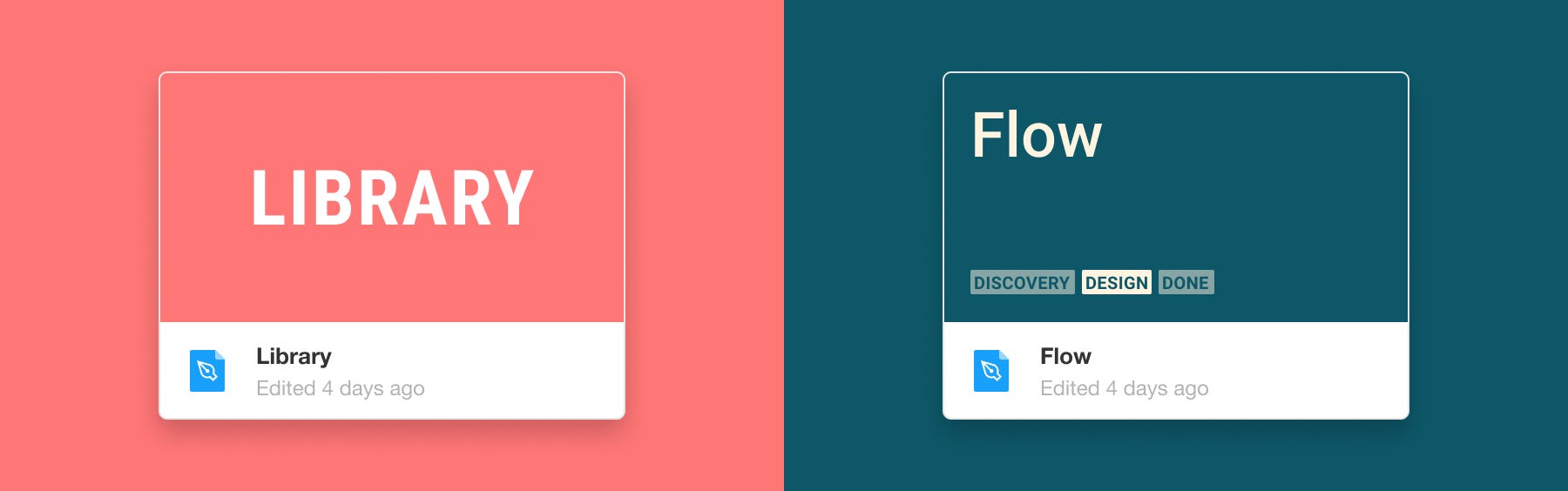
The Library and Flow approach break projects and files into two categories: Libraries and Flows. The Libraries are the master files, and the flows feed off them vampires 🧛. I also like to have an ad hoc section for all the random other stuff.
Separating your files into these three types helps you keep a sense of order and structure within your files.
Library files
In this context, a library file is a file with all your symbols and templates. These files are incredibly important and should only be updated by senior designers. These types of files are published so that flows can use them.
Flow files
In this context, a flow is a user story shown with screens. A flow is where your research, discovery, design, and prototypes are made. It is unlikely that you will publish these file types.
Ad hoc
This is just a section for all the little bits and pieces that aren’t really flows or libraries. These are the once-off emailers, or the mockup for a presentation, or the invite for the office party that you really don’t want to go to, but because you have made the invite you can’t claim you didn’t know about it.

The Library
Your library file types are the files that you publish so that all your team members can use those symbols.
So what are in library files?
Well, we will get to that in a bit, but before you do anything, you must understand how atomic design works.
Step 1: Understanding Atomic design
Have you read Brad Frost’s Atomic Design? If not, stop what you are doing and read it now. It’s a simple short read that illustrates really well how to think about design libraries. Whenever a new junior UI designer joins my team — it’s the first thing I make them read.

In a nutshell, it breaks down web design into different elements.
At the bottom, you have atoms or styles. This includes color, images, icons, fonts, border-radius, shadow, etc.
Then next, you have molecules that are made up of atoms. For example, a button is made up of colors, fonts, border-radius, and shadows.
Then next, you have components that are made up of molecules. These could be search fields that are made up of buttons and text inputs. Or top navigation made up of links and logos.
Then lastly you have templates that are made up of components.
All these elements are used to create consistent and organized designs..
Note: Something that is often misunderstood about atomic design is that you don’t have to call them “Atoms,” “Molecules, and “Organisms.” If “styles” and “components” work better for you, go for it. It is more about the methodology than the naming structure.
Step 2: Create your files
When I first started out, I put all my library elements into one file. It worked great at first — until it started getting real slow. Like real slow. Then I started getting the infamous Figma memory alerts banner. That’s when I realized that it makes more sense to separate components and templates into different files.
My library files are Components + styles, Graphics + icons, Templates, and Main pages. I have broken them down in more detail below.

Components + styles
So this is the base file that everything should always be linked to. This is the queen file and what she says goes — no questions asked.
So, what goes in this file? Whatever components and styles you want, but for demonstrative purposes, here is what is in mine:

And in each page is the following:
Styles: Colour swatches that are linked to color styles, fonts samples linked to text styles, persona profile picture symbols, logos symbols, and table styling explanation with symbols.
User inputs: Text field symbols, dropdown symbols, radio button symbols, checkbox symbols, toggle button symbols, rich text editors, and image/document uploaders.
Navigation: Buttons, links, tabs, accordions, pagination, and progress indicators.
Feedback: Alerts, toasts, tooltips.
Cards: Content cards, people cards, product cards
Modals + popups: Share modal, confirmation modal, promotion pop up, share modal, assign modal, add modal, cookies banner, and sitewide notification banner.
Page structure: Hero, filters, top nav, footer.
Graphics + icons
The project I work on has a lot of graphics and icons, and while they could go into the aforementioned ‘components + style’ file, I prefer to keep them separate for two reasons. 1) occasionally, an illustrator will need access to the graphics in there, and I don’t want them to go near my master file, 2) It’s generally better to try and lighten the load per file.

The icons and graphics folder contains the following:
Icons: Small icons, and graphic/big icons
Graphics: Illustrations, and splash screen illustrations
Archive: Icons and graphics that are no longer in use.
Templates
The project I work on, like most others, has a main template made up of multiple components that change depending on the situation. While you can have all your templates in one folder, I prefer multiple files to reduce the load. I am in eLearning and have the following template files:

Main pages
So, usually, this would be a flow, but I just find I use these pages far too often for them to live there. So these are pages that will often be part of a flow but not the sole purpose of the flow.
Some of my main pages are: Landing page, account settings page, search page, profile page, and performance (404, site down, loading screen, etc.).

I like to keep the pages in separate files, mostly because I forget where I put them, so having an obvious folder name really helps me. For those of you who have a memory span longer than a Dexter’s Laboratory episode, you can probably put them into one file.
Step 3: Create your master symbols
There are two things to remember when creating master symbols: 1) more time now, means less time later, 2) if your symbols are more difficult to document than necessary, you won’t do it.
So before we focus on how to set up a master symbol correctly, let’s look at how not to do it.
Don’t do this:
When I was first given the reigns to create my library, I wanted to have the most beautiful and comprehensive documentation that ever existed. So I would make different frames and put my symbols inside of them. Then I would write out paragraphs about how the other components should react and behave depending on the context. Finally, I would number these screens to work as a book when I exported them to Zeplin. And by golly, the first ten components I did like this looked 🔥 and the next few looked okay, then the next 30… not so much.
So, where did I go wrong?
- The harder you make something, the less likely you and your team are to do it. Having little paragraphs next to each state and interaction was madness. And to top it off, none of the developers even read it. Why? Because they have better things to do. Rather just give your components properties.
- I was trying to number my frames. Unfortunately for me, this idea was only a bit better than broccoli on pizza. Every time I needed to add a new symbol, I would update ALL the pages’ numbers. Hell no!
- I was adding master symbols inside a frame. While this was good practice a few years ago in Figma, it is not worth it with the variations update. Having symbols inside frames makes it harder to find, and adds more clutter. That being said, I will occasionally have symbols inside a frame if they are all very similar.
- I couldn’t tell from my files what was live on the site and what wasn’t.
- There was only one master symbol per element, with all the different states as symbol overrides. This means I would have to refer back to my flow files every time I wanted to see what a hover or focus state looked like.
Do this:
Use variations
The variations feature is the first thing I show anyone I am trying to convert to using Figma. Embrace this superpower!
While I use different properties depending on the component, I usually use:
- Device (E.g., Touch screen, Desktop)
- State (E.g., Hover, Focus, Default, Inactive, etc.)
- Completed (E.g., yes, no)
- Label (E.g., yes, no)
Document all your component states as variations. This will make creating flows a lot easier in the future. It will take longer now but will pay off later.
Show development status:
I am never happy with anything I make — least of all my components. Consequently, I often change elements and styles, much to the delight of the engineering team. However, changing my button text from being #333 to #222 isn’t high on anyone’s list. While it is an update that is needed, it isn’t needed right now. To note any component that isn’t exactly how the live version currently looks, I keep a status indicator in the symbol name. This also just helps teams avoid confusion when the designs don’t exactly match the live elements.
My system is this:
🟢 — Component is up to date and live
🟠 — Component needs to be updated and has a Jira ticket*.
🔴 — Component isn’t live yet.
*I’m not sure if anyone else does this, but I like to add the Jira ticket number to the component description. It just helps me to find where in the backlog it is.
Send developers your Figma files
Back in the day, I would send developers my beautifully laid out component designs in Zeplin. Now, I throw them a link in a Jira ticket to my Figma file which they can go inspect straight away. Some people don’t like this method as there is no permanent record of the work that was done (i.e. if a symbol is updated, it may change the design), but I just find this a lot easier to deal with.
Note: I thought all of the developers I worked with had a Figma account and used the inspect mode. It turns out one of them didn’t have an account and was just eyeballing the designs! So just double-check with them all that they have accounts and are using inspect mode.

The Flows
So a flow is a project or a user story. In a flow project, you will research, prototype, and design the main user story and its subsidiaries.
When setting up your flow files, you want to make a system easy to pass between different designers and easy to understand and update.
There are two things you can do to organise your flow files. The first is correctly setting up the thumbnail cover and file name. The second is having a page naming system.
Thumbnail and filename
While you can keep your basic project information in your file name, having a custom thumbnail often just communicates better.
I like to link the files I am working on with epics or stories in Jira. It just helps make sure that developers, designers, BAs, and managers are all working from the right documents.

Thumbnail and file name elements:
- File name: There are many ways to name your files, but the easiest is probably the Jira ticket number, followed by the story name.
- Jira ticket epic number: When working on a new project or feature, usually, one will create an epic in Jira for it. Once you have created an epic or story, you can add the number to your thumbnail image. Note: You can also add the epic number to your file name, so you can leave this out if you want.
- Lead’s name: Depending on your org structure, it is sometimes nice to have the product design lead’s name on the project. This helps create accountability and also helps project managers.
- Epic name: The epic name could be the name in the Jira ticket or the name of the feature or product.
- Project status: The project status clearly indicates the ‘readiness’ of your files and how soon you can ship them to development. You can have whatever steps you want here, but avoid making it more complicated than necessary otherwise, it gets annoying to update.
An alternative system: shortcodes
An alternative system is to use shortcodes to describe what part of the product you are in.
For example, SC = school content, VI = view, ST=student, CO = course. So if you see the code ST-SC-AC-CO-VIDEO, you know the story is about a student viewing a video page inside a course from a school. Likewise, TE-SC-ED-CO could be about a teacher editing a course for their school.
The pro with this system is you can very easily communicate complex variables. The con with this system is that it takes time for new team members to learn the shortcodes. And you can confuse codes, like does ED mean educator or edit?
Pages set up
Setting up your pages correctly in a file can help you get over the fear of a blank canvas. They can also help you and your team be more organized and communicate better.

Pages
When creating a new file, you may want to structure your different pages to keep everything nice and neat — especially if you work in a team. Working with a messy designer is like living with a messy roommate; you tend to spend a lot of time doing their dishes and picking up their clothes. (In the event that my old housemate and my boyfriend are reading this, yes, I know I am the messy one.)
Here are some pages that you can add to your file template:
- Thumbnail page: This is a page dedicated to the thumbnail mentioned above.
- Project info: This page can house details such as who is the lead designer, who requested the feature, any business requirements, persona details, etc.
- — — — — — — — — (dividers): These are just blank pages, but their page names helps to separate the pages in the page list.
- Story pages: These pages are the main working areas and will create the user stories. In the above example, you can see the Jira ticket number as well as the story name.
- Prototype page: Here, you bring the user journey to life with Figma’s prototype settings.
- Symbols: I don’t see many people do this — but maybe this is because I always make more symbols than is perhaps necessary, but I like to lump them all into one page. These symbols will only live in this project and won’t be published. For shared symbols — add them to the library files.
- Feedback: This is just for notes from testing or general feedback.
- Research: This tends to just be a spew of screenshots taken as part of one’s research.
- Archive: The archive page would probably be better off being called “purgatory.” This is a page that you can dump designs or ideas that don’t really fit into anything, but you don’t want to delete.
Emojis
Status emojis in page names help you and your team to tell what stage of the design your projects are in. There is a couple of different emojis you can use that say similar things.
Status emojis
Status emojis show what the current progress is of a design or a user story.
- Designs are done and ready to be shipped: ✅ ✔️ ☑️ 🚀
- Editing or in progress: ✏️🛠🖊 🖋 ✒️ 🖌 🖍 📝
- Archived: ⌛ 🛑 ⛔️ 📛 🚫❌
A word from the wise: Keep your status types as simple as possible. For example, “Updates needed,” “In review,” and “editing” are all kind of the same thing and can be all one symbol, so avoid confusion by using fewer state emojis.
Non-status emojis
So, I am in two minds about having non-status emojis. On the one hand, they don’t add anything that the label can’t already tell you, and they can be a mission to add. But, on the other hand, they are cute, and I like them.
- Prototype: ▶️
- Symbols: 🧩🎨
- Feedback: 💬
- Research: 🔍🔭 🔬
- Ideas: 💡
- Thumbnail/cover: 🖼
Device emojis:
Device-type emojis can be used on pages next to the state to indicate what platform you are designing for.
- Mobile: 📱
- Tablet*: 📲
- Laptop: 💻
- Desktop: 🖥
*There isn’t a tablet emoji (lame), so I use a phone with an arrow.
Templates
One of the easiest ways to keep your team’s flows organized is to have a template file that can just be duplicated at the start of any new journey.
Here are some templates for your copying pleasure:
Closing thoughts
I will admit that filing, organizing, and tidying up are not my skills in life (as I write this, I can see a pile of dishes that are balancing rather dangerously in the sink). So, I tend to overcompensate by “over organizing” my files then lose steam as time goes on. So I can’t stress enough how important it is to keep your filing systems as simple and easy to maintain as possible.
May you go forth and make designs that “Spark Joy.”
Recommend
About Joyk
Aggregate valuable and interesting links.
Joyk means Joy of geeK