

Simple and lightweight What's New style component that shows React Native app ne...
source link: https://reactnativeexample.com/simple-and-lightweight-whats-new-style-component-that-shows-react-native-app-new-features/
Go to the source link to view the article. You can view the picture content, updated content and better typesetting reading experience. If the link is broken, please click the button below to view the snapshot at that time.
React Native New Feature
Simple and lightweight What's New style component that shows your React Native app new features.
Installation
With npm:$ npm install react-native-new-feature --save
With yarn:$ yarn add react-native-new-feature
Basic usage
import NewFeature from 'react-native-new-feature'

const App = (props) => {
  const data = {
    title: {
      text: 'What\'s New',
    },
    items: [
      {
        title: {
          text: 'Easy setup',
        },
        subtitle: {
          text: 'The simple and typesafe WhatsNew struct enables you to structurize your awesome new app features',
        },
        image: {
          component: <Image source={require('./assets/icons8-approval-100.png')} style={{ width: 45, height: 45, tintColor: 'red' }}/>,
        }
      },
    ],
    detailButton: {
      text: 'Read more',
    },
    completionButton: {
      text: 'Continue',
    }
  }

  return (
    <NewFeature
      visible={true}
      title={data.title}
      items={data.items}
      detailButton={{
        ...data.detailButton,
      }}
      completionButton={{
        ...data.completionButton,
      }}
    />
  )
}
Customization
React Native New Feature can be fully customized as your need. Below is detail of sub components included and list of animations available:
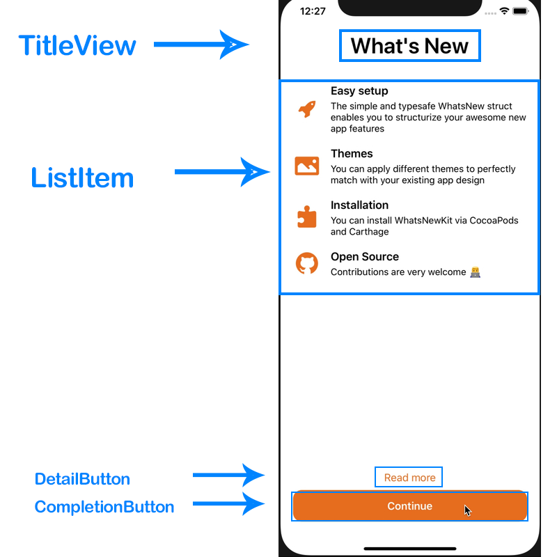
TitleView
Properties:
- text: string (required)
- color: string
- size: number
- weight: '600' // same as fontWeight property. default is '600'
Usage:
<NewFeature
  title={{
    text: 'Title',
    color: 'black',
    size: 35
  }}
  {...other props}
/>
ListItem
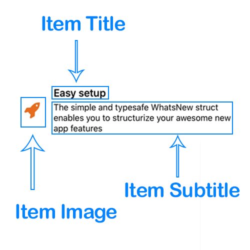
This component uses ScrollView to render list of new features, each row is a ItemView component which made from 3 sub-components ItemImage, ItemTitle and ItemSubtitle as described in picture below:
To customize these components,read the sections below.
Item Image
Properties:
- component(required): React component, usually is a <Image> or <Icon> ...,
Item Title and Item Subtitle
Properties:
- text: string (required)
- color: string // default is 'black' if don't specify
- size: number // default is 17 if don't specify
- weight: 'bold' // same as fontWeight property
Detail Button
Properties:
- text: string (required)
- color: string
- size: number
- weight: 'bold' // same as fontWeight property
- handler: function
Usage:
const myHandler = () => {
  console.log(1)
}

<NewFeature
  detailButton={{
    text: 'Read more',
    color: 'red',
    size: 17,
    handler: myHandler
  }}
  {...other props}
/>
Completion Button
Properties:
- text: string (required),
- color: string,
- size: number
- background: string,
- radius: number,
- weight: 'bold' // same as fontWeight property
- handler: function
Usage:
const myHandler = () => {
  console.log(1)
}

<NewFeature
  completionButton={{
    text: 'Read more',
    color: 'red',
    background: 'blue',
    radius: 14
    size: 17,
    handler: myHandler
  }}
  {...other props}
/>
Margin and Padding
margin and padding props are provided in order to help you have more control on layout. These props are applied to these components:
TitleViewItemImageItemTitleItemSubtitleDetailButtonCompletionButton
Usage:
<NewFeature
  title={{
    margin: {
      top: 1,
      right: 2,
      bottom: 3,
      left: 4
    },
    padding: {
      top: 5,
      right: 6,
      bottom: 7,
      left: 8
    }
  }}
  {...other props}
/>
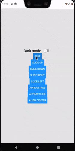
Animations
This package have 2 types of animations:
- Animation on root component appear
- Animation of the ListItem
Root component animation
Root component makes use of Modal component which is built-in of React Native
Usage:
<NewFeature
  appearAnimation={'fade'}
/>
appearAnimation is one of:
none(default if not specified)fadeslide
ListItem animation
Usage:
<NewFeature
  animation={'slide-down'}
/>
animation is one of:
none(default if not specified)fadeslide-upslide-downslide-rightslide-left
Orientation change support
By using purely React Native View flex layout, this component is auto-compatible when device orientation changed
A complete working demo is located at example folder
Contributing
To start developing with this project, simply run the following commands:
npm install # or yarn install (to install dependencies)

npm run watch # or yarn watch (to build this project in watch mode for development)

npm run build # or yarn build (to build project in production mode)
GitHub
Recommend
About Joyk
Aggregate valuable and interesting links.
Joyk means Joy of geeK