
Philip K. Dick paperbacks (Panther Science Fiction)
source link: https://fontsinuse.com/uses/40764/philip-k-dick-paperbacks-panther-science-fict?ref=sidebar
Go to the source link to view the article. You can view the picture content, updated content and better typesetting reading experience. If the link is broken, please click the button below to view the snapshot at that time.
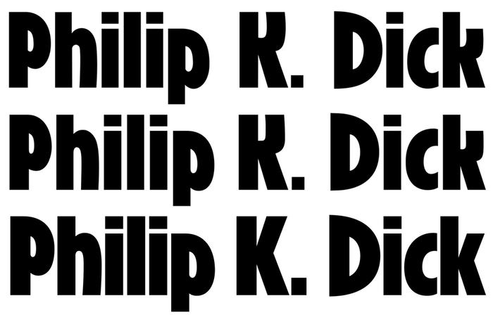
Designed by Harry Winters, Roslyn Gothic was released by Visual Graphics Corporation (VGC) in 1972, to be used with their Photo Typositor, a popular display typesetting machine of the phototype era. There were three styles; Medium, Bold, and Outline. The sans serif of condensed proportions is infused with some traits that seem to harken back to Art Nouveau, or Jugendstil: counters in d, g, or p are tear-shaped, e has a diagonal bar while the top arm of K is vertical, some stems in m, n, u are slightly curved, A is asymmetrical, and G is pointed at the bottom. Several of these features can also be found in German typefaces from around 1900, like Sezessions-Grotesk or Skulptur. By giving his design a large x-height and tight letterspacing, Winters turned these influences into a quintessential 1970s display typeface. With its punchy yet slightly alien-looking shapes, Roslyn Gothic became a popular choice on book covers in the science fiction genre.
Roslyn Gothic and its designer, Harry Winters, as shown in Industrial Art Methods, December 1972. Roslyn Gothic isn’t yet shown in a VGC catalog dated 1972, indicating it must have been new when the magazine came out.
As it was common with other publishers, too, Panther didn’t use a single typeface for all of their science fiction releases, but rather assigned a certain typeface to each author, building multiple sub-identities to increase their recognizability: Kabel Black for Asimov, City for Ursula K. LeGuin, American Uncial for Brian W. Aldiss, etc. The face chosen for Philip K. Dick was Roslyn Gothic Bold. The first of Dick’s paperbacks with Roslyn Gothic on the cover were issued in 1975. This choice was maintained at least until 1992.
Established in 1952, Panther Books Ltd. was a British publisher specializing in paperback fiction. By 1968, it had been acquired by Granada Group Ltd., making it a subsidiary company of Granada Publishing Ltd., and Panther Science Fiction a Granada imprint. Some of the shown books were published under other Granada imprints, including Triad Panther, or Grafton.
Source: https://www.flickr.com Uploaded to Flickr by
citizen3xx24j. License: All Rights Reserved.
The Zap Gun (1975). Cover art by Peter Andrew Jones. [More info on ISFDB]
The typeface used for “Hugo Award-winning author” between 1975 and 1980 is a version of News Gothic Condensed. It sometimes appears with the standard double-storey g, sometimes with a single-storey form, and occasionally with both, in changing positions. I wonder whether this was some sort of running gag among the typesetters.
In 1990, Garrett Boge of LetterPerfect digitized the boldest weight as Roslyn Gothic LP Bold. Mecanorma’s digital version, Roslyn, covers all three styles. Released by Red Rooster in 2010, Ryder Gothic is a reinterpretation by Steve Jackaman and Ashley Muir that adds a new light weight and several alternate glyphs. [There’s a fourth digitization by Panache Graphics, see comments.]
Recommend
About Joyk
Aggregate valuable and interesting links.
Joyk means Joy of geeK
![The Zap Gun (1975). Cover art by Peter Andrew Jones. [More info on ISFDB] The typeface used for “Hugo Award-winning author” between 1975 and 1980 is a version of Condensed. It sometimes appears with the standard double-storey g, sometimes with a single-storey form, and occasionally with both, in changing positions. I wonder whether this was some sort of running gag among the typesetters.](https://assets.fontsinuse.com/static/use-media-items/141/140744/upto-700xauto/60cf18f0/7936039020_7a962ef2e9_o_d.png)
