

Start Here: 5 Exercises to Prepare Your App for Large Screens
source link: https://material.io/blog/5-steps-large-screen-apps
Go to the source link to view the article. You can view the picture content, updated content and better typesetting reading experience. If the link is broken, please click the button below to view the snapshot at that time.
Start Here: 5 Exercises to Prepare Your App for Large Screens
What to prioritize when building a responsive experience
As developers build apps that work on more than one type of device, and with the introduction of new form factors like foldables, the need for responsive apps that work well at every size has never been greater. To that end, Material Design recently introduced a comprehensive update to layout guidance and components that expands the system’s adaptive capabilities to help prepare your apps for all kinds of screens.
To accompany our talk at Google I/O 2021, this post will walk through 5 things to prioritize when adapting your app for large screens, without requiring a full redesign or rewrite.
1: Conceptualize your column grid
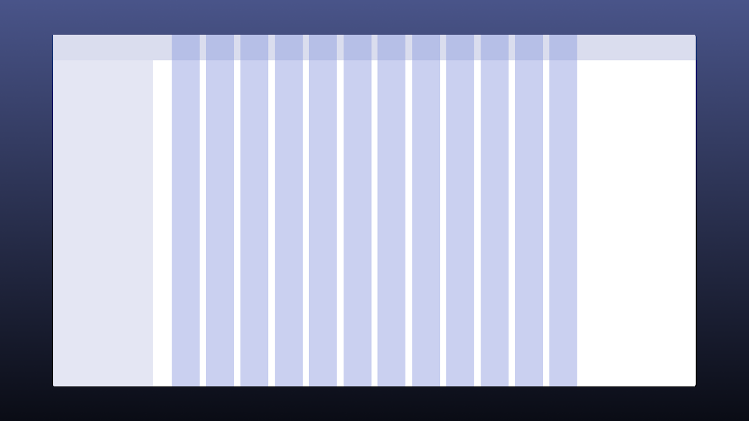
The first step in preparing your app is conceptualizing a column grid. If you’re building for the web, the notion of a column grid (and its importance) may already be familiar to you, but if not you may be wondering, “why use columns?” Columns are a great way to conceptualize interface designs for a few reasons.
First, they create a convenient structure for aligning elements of your layout. Column grids have been in use in print and graphic design for a long time, and that’s because they create the structure that print layouts need – helping make printed materials ergonomic and maximally readable. Printers have used and refined these layouts to help their users – readers or viewers – get the most out of the material, and we can use them to the same ends in interface design.

Right now, many apps consider the screen to consist of one big canvas or column, with elements primarily stacked on top of one another, or constrained to the left or right side of the layout, but ultimately drawn in relation to one another in horizontal and vertical terms. This approach can work well in small or narrow screens, but the problems begin to become obvious at larger sizes.
Applying a column grid to the layout allows for a large-screen experience that feels more intentionally organized. Elements on screen are organized relative to each other and the overall layout in a way that directs the user’s eye along a specified route according to the content’s informational hierarchy. This makes the experience feel more organic to the device and context.
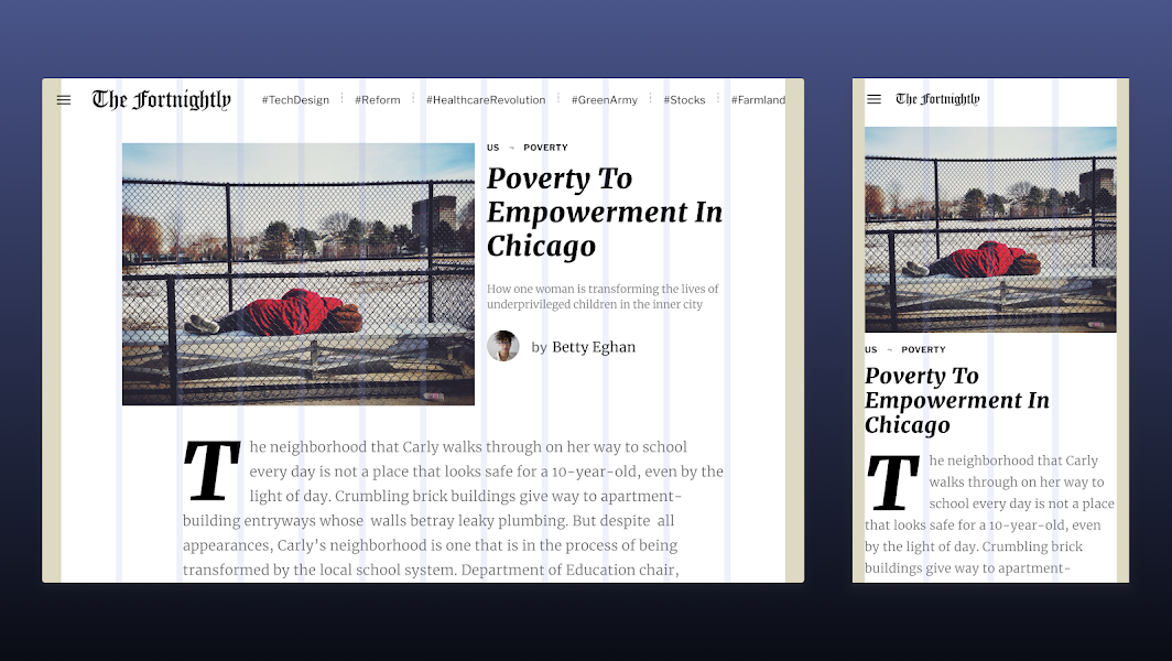
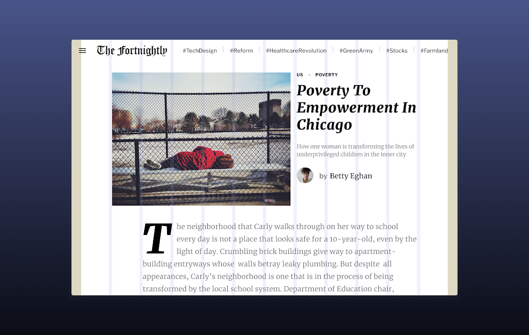
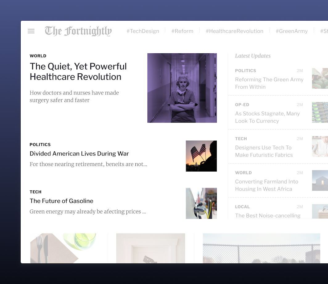
The column grid also helps to respond across screen sizes, large and small. In our example (from Fortnightly, a Material Study app), we can see that the layout comprises three primary regions: the photo, the headline and metadata, and the body of the article.
Since each of these regions spans four or more columns in our large-screen layout, we can easily reflow them into a vertical orientation for mobile, maintaining the same information hierarchy along the way.
To start conceptualizing a column grid in your own layouts, grab our Material Design Kit from the Material Figma Community, as well as your latest mockups. Begin to move your elements onto a sample column grid from the Design Kit, exploring how the elements align.
Check out our understanding layout and responsive column grid spec articles for detailed information on designing for full responsiveness.
To implement a column grid you can use flexible layouts. When using a row you can specify weights or flex values for each column in the row to have it flex predictably. On android this can be accomplished using the RecyclerView by creating a horizontal chain. You can visit the Android Developers site to learn more.
2: Create a composition that scales
When adapting your designs for large screens, be sure to keep visual composition in mind. On a larger screen, information hierarchy is crucial. The greater screen space means that more information will naturally be present on screen. Since the information won’t all be vertically oriented, it’s important to create a visual composition that strengthens information hierarchy, giving users a sense of which elements are related – through style, proximity, etc. – and how they fit together in an interactive context.
Layout regions
One way that we think about this in Material is to construct a scaling layout using what we call layout regions.

When working on guidance for large screens, we looked at the most common elements of an app’s overall layout, and came up with a way of thinking about them that allows for consistent responsive behavior.
We then divided the screen into three primary regions, with the first being the body region.
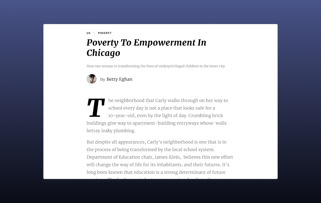
In our example from Fortnightly, that would be the article content. This container is based on the column grid from before, and has flexible margins and widths defined by the breakpoints described in the responsive layout grid article.
Next is the navigation region, which is comprised of navigational components to move the user between destinations and trigger key actions. It maintains a consistent width of 256dp when expanded and 72dp when collapsed. This container edges into the screen, condensing the dimensions of the body container.

In our example, you can see how the body of the article is now slightly more narrow to accommodate the fully expanded navigation container.
Finally, we have the app bar, which gives users access to key actions like opening and closing the navigation region, searching, or moving to supporting destinations.

Now our example is feeling like a more complete and comprehensive layout. The three regions of the screen are clear, and we can reasonably predict how they’ll look at other sizes.
With the basics laid out, it’s important to reflect on the internal composition of these layout regions. As screen size increases, screen space increases as well. As more information appears on screen to fill this space, it becomes more important to give that information structure and hierarchy so that the user’s mental model of it is maintained.
We’ve identified two main techniques for grouping information inside these elements that can be helpful as you think about the layout of your own app.
Visual grouping
The first is visual grouping, or putting related elements together—whether they have similar content, functionality, or meaning—by the use of open space and typography.
You may already be using this technique in your app today if, for example, you’re using a ListView or GridView on Android, which can be combined with Material cards or tiles.
Containment
The second technique, containment, can be a more explicit approach that relies on clear boundaries, either through elevation or visible dividers, to achieve the same effect as the more implicit visual grouping.

Material offers many components that implement containment techniques by default.
3: Use the right components for the job
Adapting to large screens means adapting to the ergonomics and size constraints of more form factors. With our recent updates, articles for 14 Material components have been updated to describe how they behave when scaling across devices.
Visual presentation
The first method of adaptation described for Material components is “visual presentation.” This can include changes in scale and placement of the elements on screen, as well as their relationships to one another. For example, a text list on mobile may adjust its margins, vertical spacing, and density to more appropriately fill space on a tablet screen. This type of adaptation is crucial when moving between screen sizes, as it preserves the user’s understanding of how each element behaves and maintains usability.
One way this is implemented is through size constraints. Most Material components have minimum and maximum dimensions, and several components (including buttons, text fields, and sheets) have been updated for Android with corresponding default Max Width values.

Snackbars, for example, have minimum and maximum dimensions on small and large screens. On small screens, the snackbar can expand upward to accommodate its messaging, while on larger screens, it expands horizontally to keep its content on one line while utilizing available space.
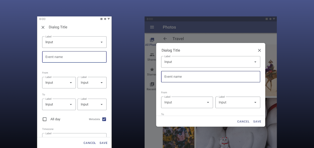
Similarly, dialogs can expand horizontally on large screens to support their content, reaching a max width that keeps in mind the readability of longer line lengths. At this max width, it can expand vertically up to a maximum height.
As a developer, you can also take advantage of components’ ability to use fixed or fluid dimensions, based on what makes sense for your layout, within each component’s size constraints.
Component swapping
Component swapping is another, more rare type of adaptation in which functionally equivalent components can actually swap with each other to meet the ergonomic expectations of different devices.
For example, a bottom navigation bar may switch to a navigation rail on tablets, putting the same nav destinations at easier reach, and opening up more vertical space for your layout on horizontally-oriented screens.
The transformation may continue by swapping to a Navigation Drawer on larger screens to provide quicker access to secondary destinations, with more descriptive labels. On Flutter, this set of transformations can be implemented as an automatic behavior using the adaptive_navigation package.
Components can switch types as well. For example, a full-screen dialog on mobile can be exchanged with a simple dialog on larger screens. This component change maintains the function of the dialog, while also making use of screen space in a way that preserves a user’s context by revealing underlying content.
Use caution when swapping components by ensuring that the interchangeable components are functionally equivalent. Do not, for example, swap a button for a chip. Use caution when changing between list items and cards. The component swap should always serve a functional and ergonomic purpose for the user.
4: Ensure your app maintains continuity
When adapting your app for large screens, make sure the experience does not break when the device configuration changes. There are multiple events to look out for such as screen resize, orientation change, or fold and unfold.
Fold and unfold events will usually trigger the “screenLayout”, “screenSize” and “smallestScreenSize” events. Since your configuration is subject to change, it’s important not to cache or hardcode any values about display size, window size or orientation since they will change at runtime.
To ensure the best experience across configuration changes make sure to save info regarding scroll position, text that has been input in text fields, current component state such as a video playback position and other interactive aspects.
For more information on saving UI states in Android, check out the Android Developers site.
5: Test input support for touch, keyboard, mouse, and more
When adapting for large screens there will be many new forms of input to account for. For example, consider keyboards, mice and trackpads, and the ergonomics of touch input on different screens. When running on some large screens your app could even be interacted with exclusively through a gamepad or a remote control with a directional input.
If you're building for Android, the Android Developers site has more information on accounting for game controllers as well as mice/pointers.
Testing for these input types will allow you to keep in mind the particular expectations of each form factor. For example, a hardware keyboard will mean that part of your layout will no longer be hidden when a text field is active.
Finally, more input types will also mean more states to account for such as hover and focus.
Have more questions? Reach out to us on Twitter @MaterialDesign any time, or come join our #AskMaterial session at I/O 2021!
Recommend
About Joyk
Aggregate valuable and interesting links.
Joyk means Joy of geeK