

CSS实现下划线动画的各种姿势
source link: https://gylidian.js.org/y0NIjj/
Go to the source link to view the article. You can view the picture content, updated content and better typesetting reading experience. If the link is broken, please click the button below to view the snapshot at that time.

CSS实现下划线动画的各种姿势
该文章还在施工中… 过几天再来看吧。
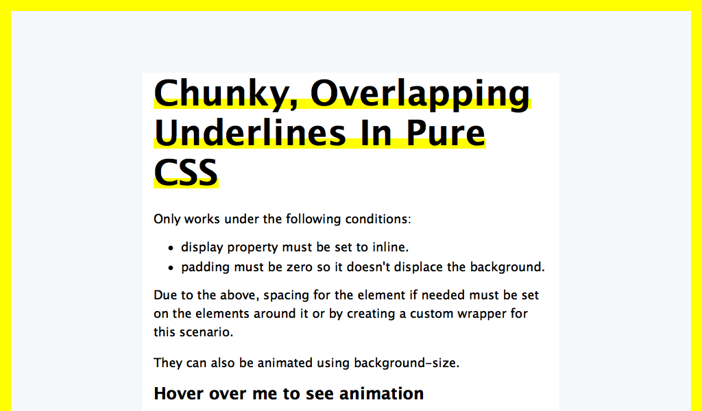
在背景图片上做手脚
思路就是 先让 background-image 限定在一定的高度,之后 :hover 时再用动画调整宽度。
STEP1: background-image
.underline {
    background-image: linear-gradient(transparent calc(100% - 10px), black 10px);
    background-repeat: no-repeat;
    // 或者
    background-image: linear-gradient(120deg, #7af7a9 0%, #FFEB3B 100%);
    background-repeat: no-repeat;
    background-size: 100% 0.2em;
    background-position: 0 88%;
    // 或者
    background-image: linear-gradient(transparent 0%, transparent 65%, yellow 65%, yellow 90%, transparent 90%, transparent);
}
STEP2:
.underline {
    background-size: 0% 100%;
    transition: background-size .3s ease-in;

&:hover {
        background-size: 100% 100%;
    }
}
在 border 上做手脚
.underline {
    border-bottom: .4em solid transparent;
    border-image: linear-gradient(to right, #A8DBED 0%, #E291E6 100%);
    border-image-slice: 1;
}
使用伪元素
h1 {
    position: relative;
    z-index: 0;

&::before {
        position: absolute;
        transition: .3s;
        content: '';
        width: 0%;
        left: 0;
        bottom: 0;
        height: 16px;
        background: lightpink;
        z-index: -1;
    }
    &:hover::before {
        width: 100%;
    }
}
.title .shadow {
    .is-red {
        box-shadow: inset 0 -6px 0 rgba(255,74,110,.2);
    }
    .is-turquoise {
        box-shadow: inset 0 -6px 0 rgba(35,209,153,.2);
    }
    .is-purple {
        box-shadow: inset 0 -6px 0 rgba(184,107,255,.2);
    }
    .is-yellow {
        box-shadow: inset 0 -6px 0 rgba(255,221,87,.2);
    }
}
Recommend
-
82
用SVG实现导航下划线光标跟随效果
-
9
powershell各种反弹姿势以及取证(一) mickey
-
58
喜闻乐见的背景时间--由于最近接触小程序比较多,又刚好经历过小程序的自动登录时代以及现在的点击登录时代。结合自己的实践以及观察到其他小程序的做法,就有了这篇小分享~ 本文可能涉及的内容-- 更新 首先感谢@shaonialife同学的精彩评论~ 可能由
-
53
日历控件定制是移动开发平台上比较常见的而且比较难的需求,一般会遇到以下问题: 性能差,加载速度慢,原因是各种基于GridView或RecyclerView等ViewGroup实现的日历,控件数太多,假设一个月视图界面有42个item,每个item里面分别就有
-
53
相比于依靠创作者手绘的动画,木偶动画的制作是个非常繁琐的过程,我们需要将一个动作分解成若干个环节,逐帧拍摄再连续放映为影片。近日,Adobe 和康奈尔大学提出了一种名为「变形木偶模板」的动画制作方法,可实现基于少量卡通角色样本...
-
24
点击上方“ 涛哥聊Python ”,选择“星标”公众号 重磅干货,第一时间送达 来源:学习python的正确姿势 我们...
-
14
作者 | 王洪鹏 责编 | Carol
-
47
各位Javaer都对锁应该都是不陌生的,无论工作还是面试的时候,都是很常见的。不过对于大部分的小型的项目,也就是单机应用,基本都是使用Java的juc即可应对,但是随着应用规模的扩大,在分布式系统中,依靠着诸如syncronized,lock这些就...
-
10
炎忍的博客Flutter 实现图片下划线的 TabBar发表于2021-08-26|更新于2021-08-26|编程字数总计:591|阅读时长:2分...
-
8
CSS 多行文本超链接下划线动效
About Joyk
Aggregate valuable and interesting links.
Joyk means Joy of geeK