
4

CSS 多行文本超链接下划线动效 - lwlcode
source link: https://www.cnblogs.com/lwlblog/p/17757416.html
Go to the source link to view the article. You can view the picture content, updated content and better typesetting reading experience. If the link is broken, please click the button below to view the snapshot at that time.
CSS 多行文本超链接下划线动效
乍一看,是不是感觉很简单,仔细一瞅发现事情好像没有那么简单。
如果十分钟还没想出怎么实现,那就把简历上的“精通css”改成“了解css”……😅
大部分人第一感觉都是想着用border-bottom去做,但是仔细看一下这个是多行文本,下划线始终在最后一行肯定是不合适的,而且下划线运动轨迹是:鼠标移入-从从到尾显示,鼠标移出-从头到尾消失。
让我们进入正题,这个效果是使用css的线性渐变linear-gradient实现的,具体代码如下:
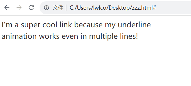
<!DOCTYPE html><html lang="en"> <head> <meta charset="UTF-8"> <meta http-equiv="X-UA-Compatible" content="IE=edge"> <meta name="viewport" content="width=device-width, initial-scale=1.0"> <title>Document</title> <style> .container { width: 400px; } .link { font-size: 1.2em; line-height: 1.6em; text-decoration: none; font-family: sans-serif; color: #333; } .underline { width: calc(100%); /* 兼容IE */ background-image: linear-gradient(transparent calc(100% - 2px), powderblue 2px); background-repeat: no-repeat; background-position: right; background-size: 0% 100%; transition: background-size 1s ease; } .link:hover .underline { background-position: left; background-size: 100% 100%; } </style></head> <body> <div class="container"> <a class="link" href="#"> <span class="underline">I'm a super cool link because my underline animation works even in multiple lines! </span> </a> </div></body> </html>
这里修改了background-position属性设置背景图像的起始位置,使得鼠标移出后的下划线运动轨迹是从头到尾消失,而不是反过来,如果不设置则是如下效果:
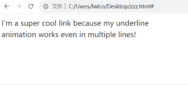
这个效果代码我就不复制了,把上面的background-position: right;和 hover 中的background-position: left;删掉就是了。
Recommend
About Joyk
Aggregate valuable and interesting links.
Joyk means Joy of geeK