

Readings KIDS — A children’s book website with an in-store experience
source link: https://blog.prototypr.io/readings-kids-a-childrens-book-website-with-an-in-store-experience-f2fd539bcd37
Go to the source link to view the article. You can view the picture content, updated content and better typesetting reading experience. If the link is broken, please click the button below to view the snapshot at that time.

Readings KIDS — A children’s book website with an in-store experience
A UX case study on designing a children book website with a focus on curation, description, and a virtual book-keeper.
Timeline
2 weeks, team of 4
My Role
User and Competitive Research, UX, UI, Branding, Motion Design, User flow, Task Analysis, Information Architecture, Prototyping, and Presentation
Deliverables
1xWebsite prototype, 1x Client Presentation
*We are not affiliated with Readings in any way, shape or form. This was a conceptual project done as part of further learning with General Assembly*
Case Study Summary 📦
What we did
We were approached by Readings, a Melbourne based bookstore, who are seeking to expand their online services with the focus on children’s books. At the end of this project, we —
- Discovered key research insights with recommendations on how to scale the client’s business in the children’s books area going forward.
- Re-branded and repositioned the client’s identity to appeal to their new target audience better, while still maintaining the familiarity of their established brand.
- A fully interactive website for their new market focus (Readings KIDS)
How we do it
For this project, we followed closely the Double Diamond process as our main workflow.

We had to conduct the whole process remotely due to COVID-19 lockdowns. To compensate for the reduced user research, we decided to double down on more desk researches, while also picking up remote tools into our process.Through competitive analysis, heaps of virtual user interview, and brand workshops, we managed to still gather strong insights that would later inform our design approach to the website.
Final Outcome?
A new children book website andproduct strategy for Readings, allowing them to start opening their doors into the online children books market.
How did we do it?
Scroll on below to see how a team of 4 did it all without even leaving their home (yes, it’s not magic 🪄) ↓
Prologue
Meet our protagonist — Readings
If you’re from down-under 🦘, chances are you would have heard of Readings. Established in 1969, Readings is one of the oldest and most familiar bookstore in Melbourne. Their main business model has always been to provide first-class customer service, reasonable prices and ‘keeping it local’, giving them their strong community presence.

Problem
Readings wants to support the local community by expanding the convenience of online shopping to their children’s books as well.
However, as your local neighbourhood bookstore, Readings is facing heavy competitions from your giant online book retailers like Amazon and Booktopia. So rather than competing by price, they’re thinking of competing using what they’re known best for — a highly-curated inventory, focusing on hand-picked quality over quantity.
“We want to give the readers a sense of quality. We’re not competing on price but rather, on what they can’t get from the other online retailers: consideration for their child and what they read.”
We heard you, let’s get started.

Chapter 1 — Discovery and Research
We decided to first get familiar with Readings by analysing their existing brand and website. To break it down, we divided this first chapter into —
Four (4) key to-dos:
- Current brand analysis and business research 📕
We wanted to know who Reading is according to themselves and their customers. We looked at their ‘About’ page, articles featuring Readings, and even customer reviews on travelling guide websites. - Task Analysis and Customer journey on current Readings website 🧑💻
How’s the current Readings website functioning? Is the check out process simple? Are there any strong curation of books as mentioned?


3. Competitive Analysis 🕵️
Who else is doing it like Readings? And how? Are they doing it well?
4. Defining our interview scope using our assumption list 🤔
We collated our assumptions into a topic map which helped us to determine what needed to be answered first.


Learning from what families adore 🎢 🐭
We know that the initial focus is on providing quality experience rather than pricing. So instead of just looking at other competing bookstores, we decided to also look at those that are well known when it comes to creating an experience for the young ones such as Disneyland, Roald Dahl and even IKEA.
Additionally, we also turned to those that puts ‘personalisation / curation’ as their best foot forward such as Netflix and even Medium.

Recruiting our interviewees virtually 👩💻
The restriction meant we couldn’t visit the store to recruit customers or staffs. We instead created an online survey asking people about their joys and tears on book shopping both online and in-store.
Expectedly, the COVID climate actually further strengthened our cause of bringing a physical experience into a digital one. Many admitted to miss the experience of in-store book shopping after being indoors for months and hoped that those browsing experience could be translated online instead.
Because of this, we received a good number of people interested in continuing the research further with a virtual interview. End result?
21 Virtual Interviews and 70 Survey Responses from book buyers 🎉
Chapter 2— Synthesis

What we know so far (key insights):
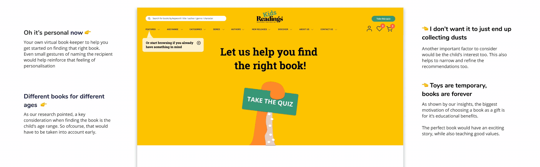
- Toys are seasonal, learning is forever. 🧠
The main motivation for gifting books over other items is for the long lasting effect of learning they provide. Therefore, the best books according to users are those that are first educative, and then aligned with the child’s age and interest.
“Even if they just get one takeaway or life lesson or enjoyment from the book, I know it’s been a good gift”
- Children books are tactile. 🧏
People prefer book-shopping in store as they are able to directly interact and better understand the physical traits of the books — texture, colour , size, materials, content, visual. This is especially important to consider as strong visuals and high tactility are often what makes a children book good. - Excuse me, I’m looking for… 🙋♀️
Another strong reason to buy in-store instead of online is that people rely heavily on recommendations as a starting guide. People tend to get overwhelmed on where to start online, whereas in the shops, you’ve got friendly book keeper Beth or category shelves to guide you.
Humanising our insights 🙋♀️

We re-phrased our key insights into ‘I’ statements to help determine the traits of our personas. These statements are then placed against an empathy map based on their needs, gains, pains and wants. All we had to do next was just to take this ‘building blocks’ and build up our personas. This took us half the usual amount of time when building a persona.
Meet Rebecca - our storyteller parent 💁♀️
‘I want my kids to also experience the educative and imaginative world of book reading from a young age’

When buying gifts for her children, she wants books that are entertaining but educational and have strong social values. She normally buys books last minute and convenience plays a big part on where she gets her books from. When it comes to children’s books she feels it’s important to physically touch and feel the books to help her decide if the book is the right one to purchase. Put simply for us —

Secondary persona — the gifter uncle 🙋♂️
“I want to differentiate myself as a gift giver with long lasting gifts. Buying the perfect book will make the perfect keepsake for the kiddo.”
When buying gifts for their niece and nephew, they want to buy a gift that is memorable, useful and will become a family favourite. This persona relies even more on recommendations as they have no idea where to start. When buying books, they themselves don’t have any preference between online / in- store. It’s whatever is convenient.
Although we will be focusing on our main personas a lot more, the secondary persona helps remind us on the next priorities of items to also consider.
Chapter 3 — Sketching and Ideation

By framing the problem statement at the centre (quite literally), we dissected Rebecca’s needs and values into chunks of actionable questions. This helps to keep us grounded on actioning things that are our user actually needs to be resolved.
So how might we…
- help Rebecca discoverthe right children books that are both educative and entertaining for her kiddos?
- build a curated and informative browsing experience that helps Rebecca decide if the chosen book is the right one?
- simplify the book shopping steps even more for a busy mum like her?

Design Studio 🧐
By referring back to our research and getting the lightbulbs above our heads lit, we decided on our MVP feature list that addresses our main user’s needs.
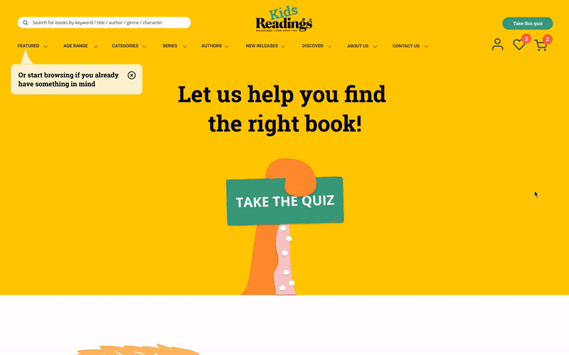
- A virtual book-keeper that help provides recommendations and curates books based on the shopper’s and the child’s specific preferences.
- Interactive book experience that allows users to ‘browse and skim’ the books, as well as understanding the books’ physicality better.
- A highly visual and convenient user flow to complete a purchase.
- An experimental ‘book trial’ service that delivers sample books for buyers to test-read before deciding to purchase.
How do you arrange your books?
Categorisation is key when it comes to books. For that, we conducted an online card sorting exercise to see how people are categorising things. This in turn helps us on how to best structure the website, and determine the copy of the categories.


Chapter Finale — Prototyping and Testing

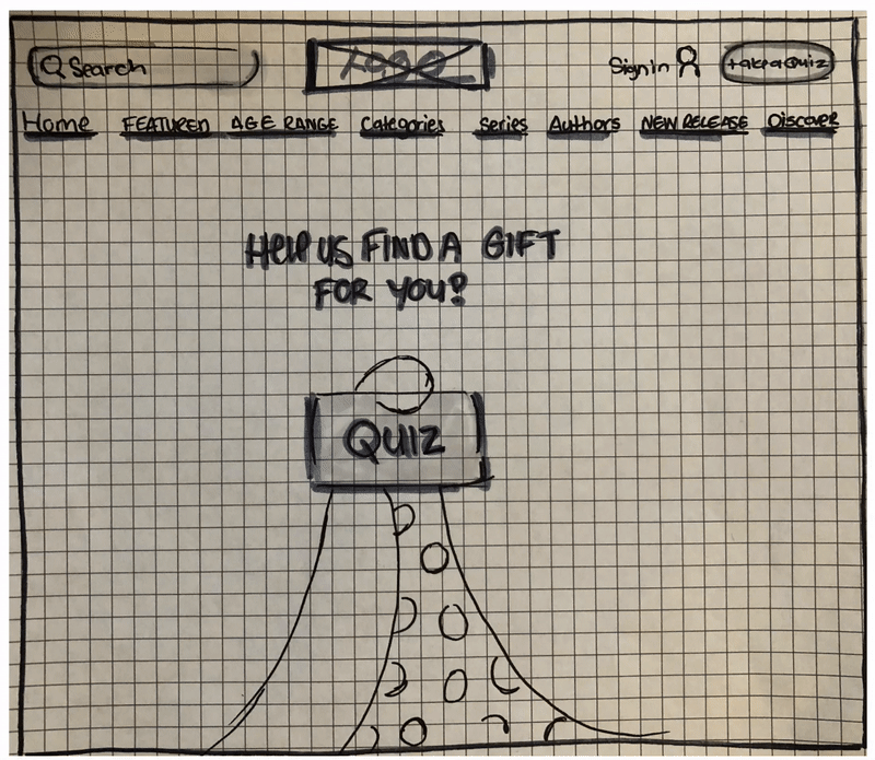
Paper Prototyping
With the planning done, it’s time to move on with production. We quickly sketched and prototyped several simple wireframes to validate basic design decisions and site structure.

Early Testing Result
- The ‘Book Keeper’ feature was a success as it felt very personalised. It also provides a good starting point which many appreciated as it could be paralysing as to where to even start looking 👀
- Interestingly, most people felt odd having to choose their relationship to the child in the first survey question. (Some even admitted that it would bring up complicated family memories) 🏡
- The flow was simple, quick and convenient as they are able to purchase book within three clicks 😌
There were several critiques on the UI elements and copywriting which we couldn’t determine if that was because of the prototype’s low fidelity. However, we were still relieved by the testing result as the purpose of this testing stage was just to test the site’s flow, structure and feature.
We then iterated our designs and took it to a higher fidelity, this time to with the focus on testing the design / visual elements and content copy.

Design and Brand guide
For inspirations, we turned to the physical ReadingsKids store and decided that we should follow the existing branding closely since it is already iconic in the community. We wanted to create something new, yet consistent and more of an extension. This helps inform our colour palette, font choices, and other UI elements.

Mood/Inspiration Board
Since we’re dealing with children as our end users, we know that the website would need to have a strong visual language as well. We conducted additional rounds of visual research and pooled together an inspiration board that would help supplement our design and branding exercise.

Introducing Readings KIDS 👦👧
So how did we tick the boxes?
- helped Rebecca discoverthe right children books that are both educative and entertaining for her kiddos through personalised recommendation and curated searches.
- built a curated and informative browsing experience that helps Rebecca decide if the chosen book is the right one by providing a rich description about the books (content skimming, product dimensions, video review, etc.)
- simplified the book shopping steps even more for a busy mum like her by creating a clear, sequenced purchasing flow with minimum steps.


That’s all folks! 🎬
I felt that the project was hardly containable within a 2 weeks time frame, especially with the additional pressure from Covid-19. However, it was definitely a valuable experience to learn how to navigate through such challenges, which would definitely be applicable in many future instances.
My key learnings from this project:
- Make time for more usability testing sessions. Even 3–5 usability tests are enough to reveal 80% of potential problems in the design 🔎
- Divide and conquer early. We did too many things as a group which resulted in a rather frantic rush towards the end of the project. We could have certainly benefited from scoping up and distributing the workload at an earlier stage 🏃♂️
- If given more time, I would have loved to push different concepts further. Maybe it could be AR / VR books? Maybe it doesn’t need to be a website at all? A book vending machine perhaps? Oh well, design is a never ending journey that makes it so enjoyable 🙌
Hey there! Melvin here ✌️

I’m a product designer, former architect and lifetime learner of all things design. A huge believer of artificial realities, I create experiences that live on the screens, in real-life or somewhere in between. When I’m not talking design, you can find me slurping a good bowl of ramen somewhere 🍜 yum
Find out more about what I’ve been up to on Instagram, personal website and LinkedIn. And if you’ve managed to make it all the way down here, I predict there’s an additional 30% chance that you’ll leave some claps behind 🤔
Thanks for reading, up top! 🖐
Recommend
About Joyk
Aggregate valuable and interesting links.
Joyk means Joy of geeK