
34

React Native customizable date picker component for iOS and Android
source link: https://reactnativeexample.com/react-native-customizable-date-picker-component-for-ios-and-android/
Go to the source link to view the article. You can view the picture content, updated content and better typesetting reading experience. If the link is broken, please click the button below to view the snapshot at that time.

react-native-date-picker
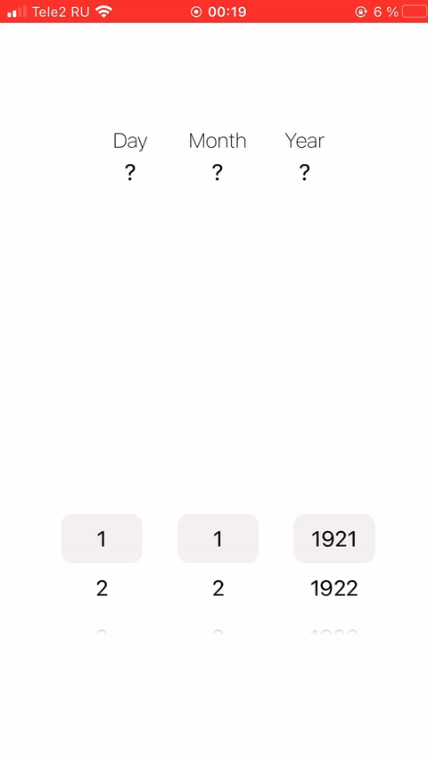
React Native customizable date picker component for iOS and Android. Designed using ScrollView.
? Example
? Installation
-
Add dependencies to the project
yarn add @dietime/react-native-date-picker npm install @dietime/react-native-date-picker --save -
Install additional dependencies
yarn add expo-linear-gradient npm install expo-linear-gradient --save -
Then, import with ...
import DatePicker from '@dietime/react-native-date-picker'; -
If you are not using Expo
You should also follow these additional installation instructions.
?? Usage
- Simple code example
import React, {useState} from "react";
import {Text, View} from "react-native";

import DatePicker from "@dietime/react-native-date-picker";

export default function App() {
    const [date, setDate] = useState();

    return (
        <View>
            <Text>{date ? date.toDateString() : "Select date..."}</Text>
            <DatePicker
                value={date}
                onChange={(value) => setDate(value)}
            />
        </View>
    );
}
JavaScript
? Documentation
Prop Required Type Description value ✅ Date or null or undefined Initial date for component onChange ✅ (value: Date) : void Callback on date change event height ⛔ number Custom component height width ⛔ number or string Custom component width such as 100 or '50%' fontSize ⛔ number Custom digits font size textColor ⛔ string Custom digits text color such as hex, rgb or rgba endYear ⛔ number Max year in component, default is current year startYear ⛔ number Min year in component, default is (endYear - 100) markColor ⛔ string Custom middle mark color such as hex, rgb or rgba markHeight ⛔ number Custom height of middle mark markWidth ⛔ number or string Custom width of middle mark such as 100 or '50%' fadeColor ⛔ string Custom color for top and bottom fade effect (only hex colors)GitHub
React Native customizable date picker component for iOS and Android. Designed using ScrollView. — Read More
https://www.npmjs.com/package/@dietime/react-native-date-picker
Latest commit to the master branch on 1-8-2021
Download as zipRecommend
About Joyk
Aggregate valuable and interesting links.
Joyk means Joy of geeK