

A react native and react-native-web Slider component
source link: https://reactnativeexample.com/a-react-native-and-react-native-web-slider-component/
Go to the source link to view the article. You can view the picture content, updated content and better typesetting reading experience. If the link is broken, please click the button below to view the snapshot at that time.
@miblanchard/react-native-slider
A pure JavaScript version of the <Slider> component for react-native and react-native-web. This can be a direct replacement for the Slider component from react-native/@react-native-community. Ideas and contributions are very welcome.
Install
yarn add @miblanchard/react-native-slider
npm i --save @miblanchard/react-native-slider
Version 1.x.x only supports React Native >= 0.59.0
React Native version(s) Supporting react-native-slider version(s) v0.59.0+ v1.x.xUsage
import React from "react";
import { Slider } from "@miblanchard/react-native-slider";
import { AppRegistry, StyleSheet, View, Text } from "react-native";

class SliderExample extends React.Component {
  state = {
    value: 0.2
  };

  render() {
    return (
      <View style={styles.container}>
        <Slider
          value={this.state.value}
          onValueChange={value => this.setState({ value })}
        />
        <Text>
          Value: {this.state.value}
        </Text>
      </View>
    );
  }
}

const styles = StyleSheet.create({
  container: {
    flex: 1,
    marginLeft: 10,
    marginRight: 10,
    alignItems: "stretch",
    justifyContent: "center"
  }
});

AppRegistry.registerComponent("SliderExample", () => SliderExample);
Props
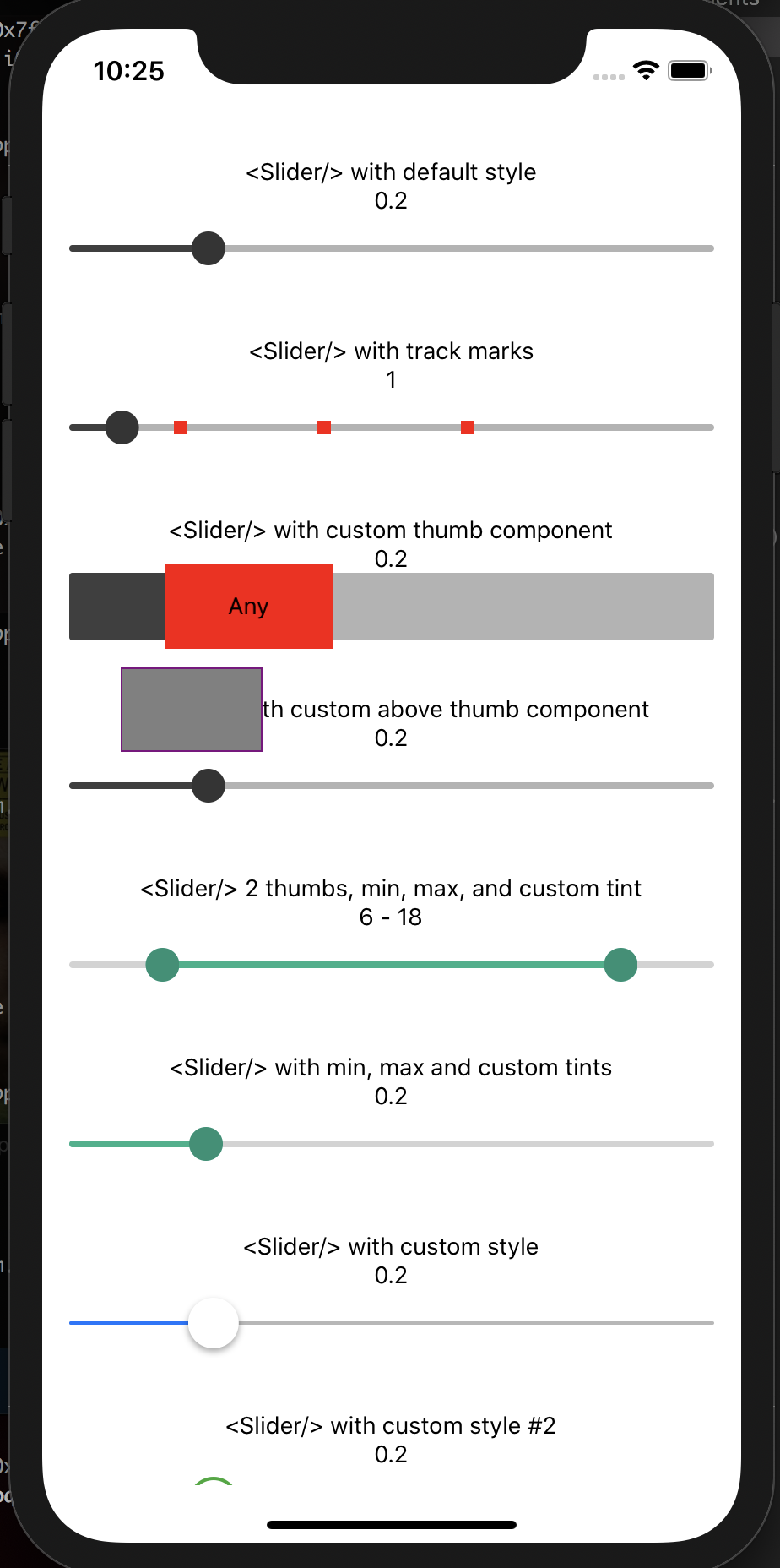
Prop Type Optional Default Description animateTransitions bool Yes false Set to true if you want to use the default 'spring' animation animationConfig object Yes undefined Used to configure the animation parameters. These are the same parameters in the Animated library. animationType string Yes 'spring | 'timing' Set to 'spring' or 'timing' to use one of those two types of animations with the default animation properties. containerStyle style Yes
The style applied to the container view around everything debugTouchArea bool Yes false Set this to true to visually see the thumb touch rect in green. disabled bool Yes false If true the user won't be able to move the slider maximumTrackTintColor string Yes '#b3b3b3' The color used for the track to the right of the button maximumValue number Yes 1 Initial maximum value of the slider minimumTrackTintColor string Yes '#3f3f3f' The color used for the track to the left of the button minimumValue number Yes 0 Initial minimum value of the slider onSlidingComplete function Yes
Callback called when the user finishes changing the value (e.g. when the slider is released) onSlidingStart function Yes
Callback called when the user starts changing the value (e.g. when the slider is pressed) onValueChange function Yes
Callback continuously called while the user is dragging the slider
renderAboveThumbComponent
function
Yes
null
Function which returns a custom Component of your liking to be rendered above the thumb and accepts an index of a thumb starting from 0.
renderThumbComponent
function
Yes
null
Function which returns a custom Component of your liking to be rendered within the thumb.
renderTrackMarkComponent
function
Yes
null
Function which returns a custom Component of your liking to be rendered on top of the slider truck at the values provided by trackMarks property. It accepts an index of a mark from trackMarks array the method is being executed for.
step
number
Yes
0
Step value of the slider. The value should be between 0 and maximumValue - minimumValue)
thumbImage
source
Yes
Sets an image for the thumb. thumbStyle style Yes
The style applied to the thumb
thumbTintColor
string
Yes
'#343434'
The color used for the thumb
thumbTouchSize
object
Yes
{width: 40, height: 40}
The size of the touch area that allows moving the thumb. The touch area has the same center as the visible thumb. This allows to have a visually small thumb while still allowing the user to move it easily.
trackClickable
bool
Yes
false
If true the user will be able to click anywhere on the track to set the value to that position.
trackMarks
Array
Yes
The value should be an array of numbers between minimumValue and maximumValue. In order to render a mark on top of the slider track at provided numbers renderTrackMark property should also be provided.
trackStyle
style
Yes
The style applied to the track value number or Array Yes 0 Initial value of the slider. The value should be a number or array of numbers between minimumValue and maximumValue, which default to 0 and 1 respectively. Default value is 0. This is not a controlled component, e.g. if you don't update the value, the component won't be reset to its inital value.
GitHub
A pure JavaScript <Slider> component for react-native and react-native-web — Read More
Recommend
About Joyk
Aggregate valuable and interesting links.
Joyk means Joy of geeK