

Create a button component with Figma Variants + Auto Layout
source link: https://uxdesign.cc/create-a-button-component-with-figma-variants-auto-layout-ac636ea1db76
Go to the source link to view the article. You can view the picture content, updated content and better typesetting reading experience. If the link is broken, please click the button below to view the snapshot at that time.
Responses (2)
Create a button component with Figma Variants + Auto Layout
Early this year, I posted an article about create button components using Figma’s Auto Layout. Over the past few months, Figma had dramatically improved their Auto Layout. YES! They finally allow you to adjust the spacing individually!! That was my biggest complaint about Auto Layout at that time.
They also introduce its newest feature — Variants, which help you clean up your components.
Today, I’m going to show you how to use these two features to build a robust component that helps you focus on crafting your own product's experience and be more efficient.
1. Define properties
Button is one of the most complex components in a design system. It has so many different variants. Now with dark mode, you need to double the number of components. It can quickly go over 100 combinations. To define all the properties and their orders, it is critical, and you should have a clear understanding of how you want to structure it before the next step.
In this example, I have the following properties:

When all properties listed, I start thinking about organising this component in Figma, so it is manageable and scalable.
My idea is to break it down to multiple tables:
- One button type per table
- Table rows are different button states and sizes
- Table columns are different shapes and styles
then grouping tables based on different themes. Layout similar to 👇

Why are themes not included in the table?
From my experiences, Some properties are rarely changed for a single component during the design process. Normally those properties were decided at an earlier stage (i.e. at the beginning of the Project), so excluding them from the table can reduce the table's size.
2. Setup the table
After all the properties defined, then start with a new frame, build the tables, and fill all properties to the table row and column headers.
Tip: apply auto layouts to the frame to expand itself while you are adding more properties.
3. Create the component, finally!
Finally, we can start filling the empty cells with the variants 😅.
But first, make sure we have all the colours ready.

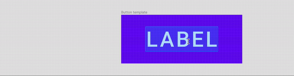
Then, start with an empty frame, let’s name it “Button template”.

Next, add the placeholder label, and use Figma’s auto-layout to maintain the button's padding.

Then we can start applying some colours to it:

Til now, we have finished the first variant of the button. Before we turn it into a component, we should check if it works as what we were expecting:
Looks good! Let’s duplicate it and make a few more templates for different sizes and button type.

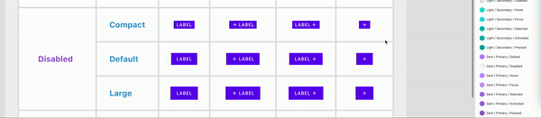
After copy and fill all variants into the table, we can then change the variants' colours to match the state.
After a few times, all variants for the different states of the Rectangle style is now finished.

Now we can finally create components for our button. Before converting the frame to a component, make sure the layer’s name has all the variants separated by “/”.

Next, use the Batch Create Componentplug in to create all components at once.

Then, combine all components as variants,

Wait. What?!🤯
Once we combined as variants, Figma moves all components to a new frame, which break our table.
My walkaround is carefully overlaying the variant on top of the table. Remember, lock the table frame when you do that. Otherwise, the variants will go into the table’s frame!

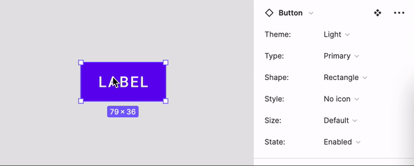
4. Name the variant’s properties and values
Before we create more variants for different styles, let’s make sure the properties and values are correct.
From this:

To this:

Let’s test it out, looks great!
Next is to create more components for different shapes and types. Select all components and click the “+” on the right button corner. Figma then duplicates all selected components and what we need to do is rename the value of the property.


Very quickly we should able to get the full set of variants for the “Primary” type.

After a few more copy & paste, we should be able to get all variants done!

And yep we just created a component with 1134 variants in total.😅

Feel free to grab my Figma file and try it out.
Thanks for reading!
Recommend
About Joyk
Aggregate valuable and interesting links.
Joyk means Joy of geeK