

UI design inspiration — Best shots in review 2020
source link: https://blog.prototypr.io/ui-design-inspiration-best-shots-in-review-2020-b1596f4f64c
Go to the source link to view the article. You can view the picture content, updated content and better typesetting reading experience. If the link is broken, please click the button below to view the snapshot at that time.
UI design inspiration — Best shots in review 2020
Here are the best Dribbble shots in the review of passed away 2020 🙏

During 2020 I assumed to be more effective while making Dribbble shots almost everyday to sharpen my design skill and promote Figma resources.
I’ve generated totally hundreds of shots, crafting it almost every day, to admit what kind of UI is most appreciated by the audience, to make sure I feel the design trends and vibes correct.
Now I craft well — that’s why I sell 😎
Here are the best shots in the review of passed away 2020 placed in ascending popularity order. So, the most liked shots were concentrated at the end. Stop procrastination — get your UI design inspiration.
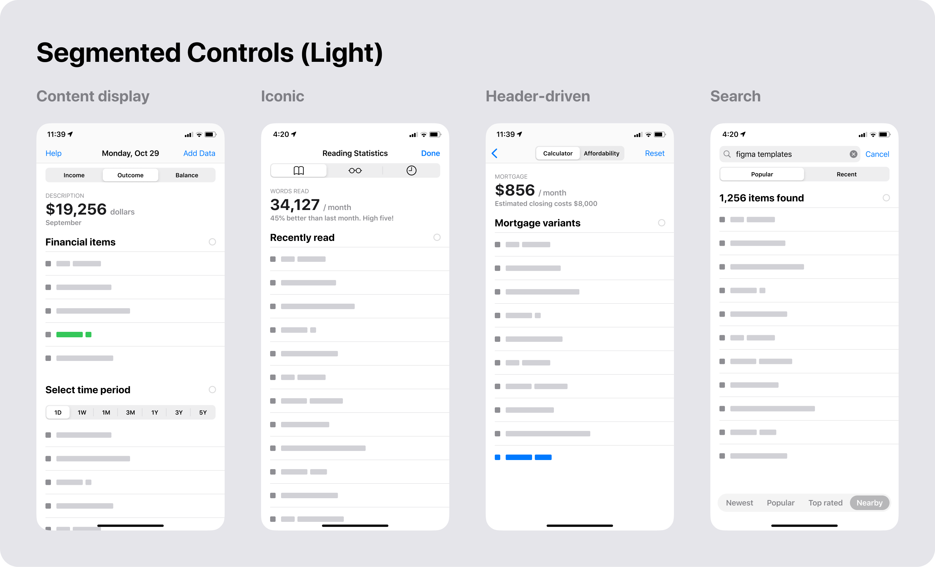
10th place. iOS Segments

This is the variant of theming for the native iOS segmented controls. A template was taken from the iOS design kit for Figma. Color and fonts were slightly themed to show customization opportunities when designing a mobile app that remixed from any commercial design asset.
9. Material-X UI kit

Material-X is the quintessence of everything I’ve self-learned in UI design since I switched from freelancing into design entrepreneurship without even a desire to become somebody who runs a home-brewed templates marketplace (still subjectively small, but constantly growing 🤞).
I’ve started ~3 years ago and refused a probable opportunity from Facebook product design department. But who cares? No regrets. I am happy now with what I doing and where I am now.
8. Selection Components

An effective shot where are a lot of checked statements provided within a range of color variations: Default, Selected=True, Attention (yellow), Warning (red). Instead of just observing this pic, you can interact and play live with checkbox components styled from Figma to React.
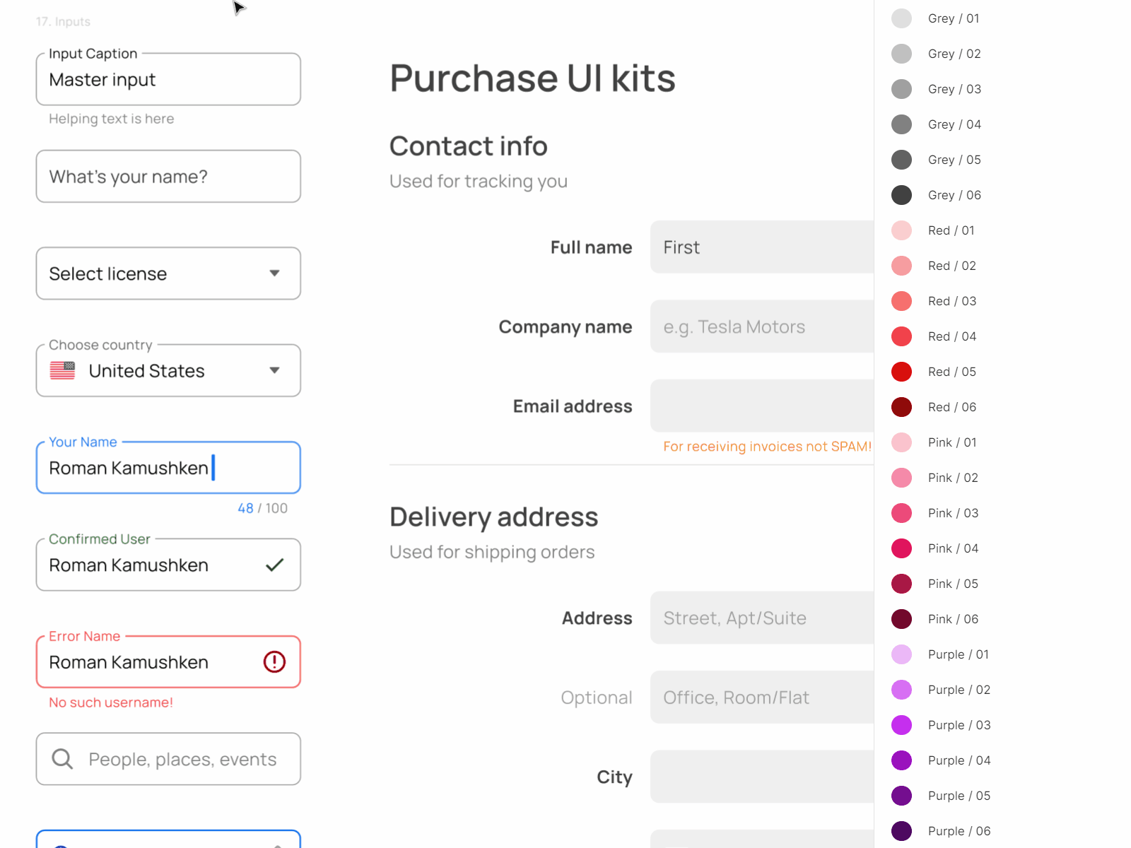
7. Inputs & Forms

The objection of this shot is to showcase a wide range of Forms’ variants and states included in Material-X UI kit. It’s easy to toggle between filled and outlined Inputs depending on your layout surface. And I made a simple AL3 tweak to push the input Caption outside the box as shown on GIF.
6. Navigation Menus

Simple, adjustable, and stylish side navigation samples are always on demand when you stuck with the next project. By this image I showcased the most common Nav variants: Compact sidebar, Scaled icons width divided sections, Classic nav with alerting activity, Expandable with sublevel.
5. Dialogs & Modals

There is nothing you have to do with Dialogs or Modals to avoid overwhelming user’s experience, but the animation. I bet this shot became attractive after I sharpened corners by pulling out corner smoothing in Figma to the maximum. And it’s more important how you going to animate it when building a real product. Check out how we did these Dialogs in React code.
4. Chips Components

This Chips UI design showcase was made in order to represent how many variations and active states are possible in an average GUI. A chip may contain Icon, Checkbox, Avatar, Badge, Counter, Close icon and I bet this is not a complete listing.
3. Orion UI kit

Orion for Figma is true 💎. One day I saw a fella showcasing his UI kit on Dribbble. A couple of sawbucks or so — is what he was asking for a license. Generally underestimating himself (as many of you, designers) I’ve instantly PMed him proposing to resell his asset on setproduct.com.
- Hey, are you crazy? You did an awesome job, your kit is aimed to save thousands of bucks. Raise the price x6–x5 times and let’s sell together.
Damn, this worked!
Alexander Petrov today is a partner of mine. And we have huge plans to extend and enhance the most trendy UI ideas to showcase our vision spreaded into a design world.
If you still a solo player, you must set yourself a goal for 2021+ to start to collaborate, if you have not started yet. Find someone on the net who is experiencing the same problems as you, or at least got the skills to build more complex products together.
PM me, if it’s you. I am looking for indie players (design/code) to get more serious shit done.
2. Checkbox Components

Just a kind of another presentation of almost the same Checkboxes from Figma React UI kit. One of a significant thing I’ve gained in 2020 — you have to clone and retransform your Dribbble shots sometimes in order to expect a chance for at least one of them will hit the tops.
🏆 1 . Datepickers & Calendar

The absolute winner without a straight plan! I’ve just remixed and themed some colors for our React design system Datepicker, then angled and cropped it.
Done! FYI, we shipped Ranged datepickers in the recent update. You can play and then compare to Calendars designed in Figma.
Recommend
About Joyk
Aggregate valuable and interesting links.
Joyk means Joy of geeK