

Adaptive design vs. responsive design | UX Planet
source link: https://uxplanet.org/the-designers-dilemma-on-adaptive-vs-responsive-design-f3cf8f1db19
Go to the source link to view the article. You can view the picture content, updated content and better typesetting reading experience. If the link is broken, please click the button below to view the snapshot at that time.
The designer’s dilemma on Adaptive vs. responsive design

For the last few weeks, I sat down with my colleagues for a few interviews to onboard new designers to the organization. While listening to the questions and the answers, I kept thinking about the technological marvels that we use nowadays to give the best experience to the users who interact with the products we design. We design products and implement for different devices and screen sizes. We usually talk about making the mobile-first approach to the implementation when working with web-based applications. The mobile app developers have to cater to several devices when implementing user interfaces. Understanding the difference between adaptive and responsive design will help the designers to plan and execute with better aim, purpose and results.
Let’s talk basics
The content is like water. Regardless of the device we use to view the content, it should be viewable and accessible to every user. The application content should give the expected experience to the user without having to experiment or learn about it. There is much confusion among designers on the words responsive design and adaptive design. The clear difference between the responsive and adaptive design seems a blur to many designers with less experience. Before going forward in looking into differences, let’s have a look at the meaning of responsive and adaptive design.
Responsive design

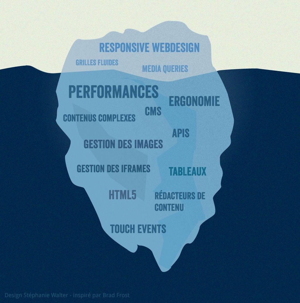
The term responsive design is a buzzword among the design community. The word responsive design was first coined on the book responsive web design, by Ethan Marcotte. The responsive website shows the content-based on the available browser space. Responsive designs respond to the change of in the browser width and change the placement of the elements to fit the space available. The content will move dynamically to arrange itself optimally for the browser window. The responsive design is straightforward. Put simply, responsive is fluid and adapts to the size of the screen no matter what the target device. Responsive uses CSS media queries to change styles based on the target device such as display type, width, height, etc., and only one of these is necessary for the site to adapt to different screens.
Adaptive design

Adaptive is useful for retrofitting an existing site to make it more mobile-friendly. The adaptive design allows the designers to take control of the design and develop for multiple viewpoints. The designer can select the viewpoints according to the needs of the user and the types of devices focus groups are using. Adaptive Web Design was introduced in 2011 by web designer Aaron Gustafson in his book, Adaptive Web Design: Crafting Rich Experiences With Progressive Enhancement. It is also known as a progressive enhancement of a website.
Responsive design relies on changing the design pattern to fit the real estate available to it, adaptive design has multiple fixed layout sizes. When the site detects the space, it selects the layout most appropriate for the screen.
What is to select for your implementation?

Responsive design is easy to work with when considering working with adaptive design. The designers have less work in controlling the layout and have to write less code to make it work for the user. Currently, it is the recommended methodology for the designers to work.
Responsive doesn’t offer as much control as adaptive, but takes much less work to both build and maintain. Responsive layouts are also fluid and whilst adaptive can and do use percentages to give a more fluid feel when scaling, these can again cause a jump when a window is resized. For example, in the image below, which shows a fluid layout, the designer is using percentage widths so that the view will be adjusted for each user.
Adaptive is useful for retrofitting an existing site to make it more mobile-friendly. This allows you to take control of the design and develop for specific, multiple viewports. Generally, you would begin by designing for a low-resolution viewport and work your way up to ensure that the design doesn’t become constrained by the content. As mentioned previously, it’s standard to design for six resolutions. However, you can make a more informed decision by looking at your web analytics for the most commonly used devices and then designing for those viewports.
Pros and cons of Responsive Design and Adaptive design (takeaway)
When it comes to web design, there are both Pros and Cons to how you design it. Whether it is Responsive or Adaptive, we recommend taking a step back and look at your goals for the website. Is it to inform people, or sell a product? Every business is different and depending on your strategy this could lend an answer as to what fits best for your company.
Responsive design (Pros)
- Abundance of templates to use.
- SEO friendly.
- Often easier to implement
Responsive design (Cons)
- Less screen size design control.
- Elements can move around
- Advertisements lost on screen.
- Longer mobile download times.
Adaptive design (Pros)
- Designers have more control over the UX for appropriate devices.
- On mobile, devices can sense the user’s environment.
- Advertising can be optimized based on user data from smart devices.
Adaptive design (Cons)
- Takes longer to build
- Devices are constantly changing screen sizes, which could make or break your design.
- Challenging for Search Engine Optimization because search engines have a difficult time appreciating the same content on multiple sites.
Resources
https://www.uxpin.com/studio/blog/responsive-vs-adaptive-design-whats-best-choice-
Recommend
About Joyk
Aggregate valuable and interesting links.
Joyk means Joy of geeK