

Enhancement of the User Experience of Space | by Sai Swarup Mohanty | Jan, 2021...
source link: https://uxplanet.org/enhancement-of-the-user-experience-of-space-e1501cf70c4a
Go to the source link to view the article. You can view the picture content, updated content and better typesetting reading experience. If the link is broken, please click the button below to view the snapshot at that time.
Enhancement of the User Experience of Space
Role : UX Researcher and Digital Product Designer
This project was aimed at enhancing the User Experience of Space by incorporating digital media technology. Digital Media was used as a medium of communication between users and space to assist human activity in spatial communication. Its relevance in today’s scenario is unquestionable as people’s behavior, and utilization of space has changed due to the onset of COVID-19. People have been forced to give up their old habits and adopt new habits relating to space usage, like social distancing.

User Research
Let’s start with a Literature Review …
The first task was a literature review of four topics that formed the backbone of this project. Here’s a brief summary of the literature review:

Exploring the steps taken by various countries in this context

User Survey
A questionnaire was circulated using google forms that was filled up by 80 users.


Interviewing the Users
5 Users were interviewed: a 20 year old boy, a 60 year old lady, a 35 year old corporate official, a 30 year old IT worker and a 45 year old shopkeeper. Here’s the summary of insights gained from their interviews:

User Personas

Scenarios
Some critical scenarios were also included where the personas would have trouble while following the distancing norms.

Empathy Mapping
To be able to understand each user’s perspective and problems in a better way, empathy mapping was performed for each persona.

Identifying the Pain Points
Based on the user survey, user interviews and the empathy mapping here are the pain points discovered:

The problem to be solved:
Based on the user research performed, the problem statement was defined to be:
To provide updated and relevant, location-based information to the users about the level of infection in and around themselves, so that they know whom to interact freely with and what paths to take while traveling, meaning more awareness and less anxiety.
Time to Explore :)
Ideating for User Behavior and Habits that could affect the problem

Ideating for potential solutions

Choosing the best solution
Based on the ideas generated, the exploration of user behavior and the pain points of the users , it was decided to design a personalized app that would guide the users at each step when they step out of their homes. The app would show the users the path with minimum risk and also inform them about the hospitals that are safe to visit. The app would also notify the users when they got close a potentially infected person.
Laying out the Information Architecture

Creating the prototype
A rough working prototype was prepared using Figma to validate the solution during the user testing.
Time to Validate the Designs…
Testing with the users
Once the prototype was ready, a list of tasks were handed out to the users for testing. There were six tasks in total and they were:

Due to the constraints imposed by the lockdown, the methods adopted were : i) Unmoderated User Testing
ii) Card Sorting
What the users felt about the designs


Time to finalize the design…
Color Palette

i) Due to the onset of COVID, most of the users had been experiencing anxiety and other such issues. Hence, the primary color had to be a calm color.
ii) Many psychologists had suggested people to get in touch with nature, especially plants, as they could rejuvenate the tired minds. The green color found in nature had a calming and de-stressing impact on the eyes. Hence, a light tone of green mixed with sky blue was chosen to be the primary color.
iii) Instead of using solid blocks of this color, soothing gradients were used as they made the interface look more alive.
iv) The background color used was White and not Grey as is customary in many applications today because White stood for hope and purity, something that people needed amidst this pandemic. The combination of white and light tone of green provided a calm and soothing experience to the users.
Some modifications in design…
i) Some animated characters have been inserted into the screens as per the context to lighten the mood of the user. Otherwise, the user would have grown tired of this product and dumped it sooner or later.
ii) Earlier there was no navigation bar and everything was controlled from the hamburger menu. So keeping product ergonomics in mind a navigational tab was introduced at the bottom containing the frequently used options.
iii) The information architecture was restructured a bit to give easier access to some options like different categories of news, health score etc.
iv) The product nomenclature was revamped to use names that the users could easily relate to.
v) Simpler and more aesthetically pleasing icons were used.

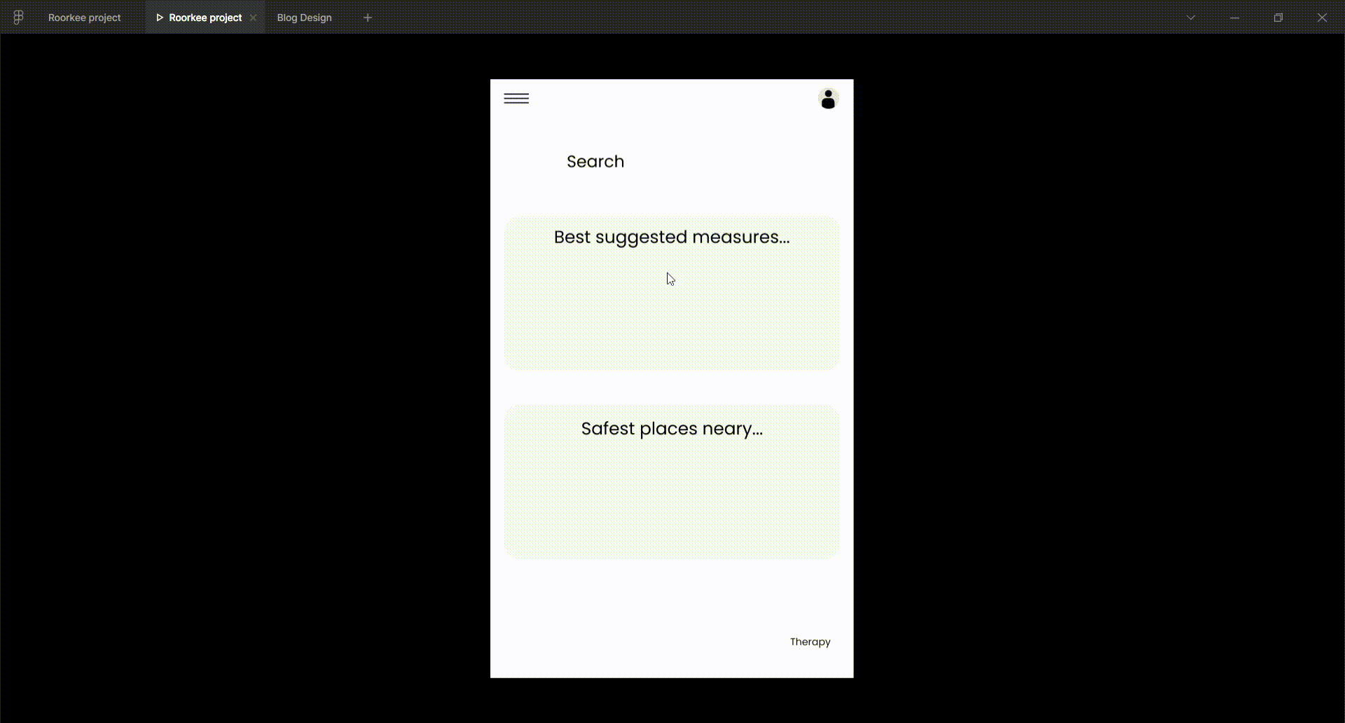
Final Prototype
I extend my sincere gratitude to Prof. Saptarshi Kolay, Department of Architecture and Planning, IIT Roorkee, for guiding me throughout the project and correcting my mistakes at each step. Here are a few things that I learnt from this internship project:
i) It isn’t enough to design a solution with good usability, if people get bored of using a product then it won’t create the impact that it is meant to.
ii) The first prototype doesn’t have to be perfect, it’s just meant for user testing so that some problems could be identified.
iii) Users want to perform the least amount of action to achieve a result.
To get access to the full prototype feel free to reach out to me at [email protected] . I’m open to opportunities in this field.
The illustrations used in this project have been modified after downloading from Freepik. Kudos to the designers who created such brilliant illustrations!!
This is an original piece of work and hence is prohibited from being used without obtaining prior consent.
Thank you for reading till the end!!! Did you know that by holding the clap button for a few seconds you can give a maximum of 50 claps. I’d really appreciate it if you could do this for me, as it motivates me to write more case studies.
If you liked this case study then do check this out as well: https://uxplanet.org/design-of-a-abroad-higher-education-applications-app-6db7b843ffe#e88c-f78002f58782
Recommend
About Joyk
Aggregate valuable and interesting links.
Joyk means Joy of geeK