
2

HTML5 弹性布局
source link: https://blog.csdn.net/weixin_46085790/article/details/112609851
Go to the source link to view the article. You can view the picture content, updated content and better typesetting reading experience. If the link is broken, please click the button below to view the snapshot at that time.
弹性布局相关属性
flex-direction相关属性
flex-wrap相关属性
justify-content相关属性
align-items相关属性
align-content相关属性
样例Demo
弹性布局相关属性
属性说明display值为flex时, 创建弹性布局容器flex-direction伸缩流方向flex-wrap伸缩流换行flex-flow伸缩流(包括方向与换行),综合了flex direction和flex-wrap属性justify-content主轴对齐align-items侧轴对齐align-content堆栈伸缩行,只有在flex-wrap:wrap和wrap-reverse 设置下且伸缩项目存在多行时才生效flex用于设置或检索弹性模型对象的子元素如何分配空间,是flex-grow、flex-shrink和flex-basis属性的简写属性,即伸缩性。默认值是0 1. autoorder设置或检索弹性模型对象的子元素出现的顺序。默认值是0flex-grow一个数字,规定项目将相对于其他灵活的项目进行扩展的量,即扩展比率flex-shrink一个数字, 规定项目将相对于 其他灵活的项目进行收缩的量,即收缩比率。flex-basis项目的长度。合法值“auto”"inherit"或一个后跟“%”‘ px”“ em"或任何其他长度单位的数字,即伸缩基准值
flex-direction相关属性
属性说明row主轴为水平方向,排列顺序与页面的文档顺序相同row-reverse主轴为水平方向,排列顺序与页面的文档顺序相反column主轴为垂直方向,排列顺序为从上到下column-reverse主轴为垂直方向,排列顺序为从下到上
flex-wrap相关属性
属性说明nowrap (默认值)值为flex时, 创建弹性布局容器wrap伸缩流方向wrap-reverse伸缩流换行column-reverse伸缩流(包括方向与换行),综合了flex direction和flex-wrap属性
justify-content相关属性
属性说明flex-start默认值。项目位于容器的开头flex- end项目位于容器的结尾center项目位于容器的中心space-between项目位于各行之间留有空白的容器内space-around项目位于各行之前、之间、之后都留有空白的容器内
align-items相关属性
属性说明stretch默认值。项目被拉伸以适应容器center项目位于容器的中心flex-start项目位于容器的开头flex- end项目位于容器的结尾baseline项目位于容器的基线上
align-content相关属性
属性说明stretch默认值。项目被拉伸以适应容器center项目位于容器的中心flex-start项目位于容器的开头flex-end项目位于容器的结尾space-between项目位于各行之间留有空白的容器内space-around
样例Demo
效果图: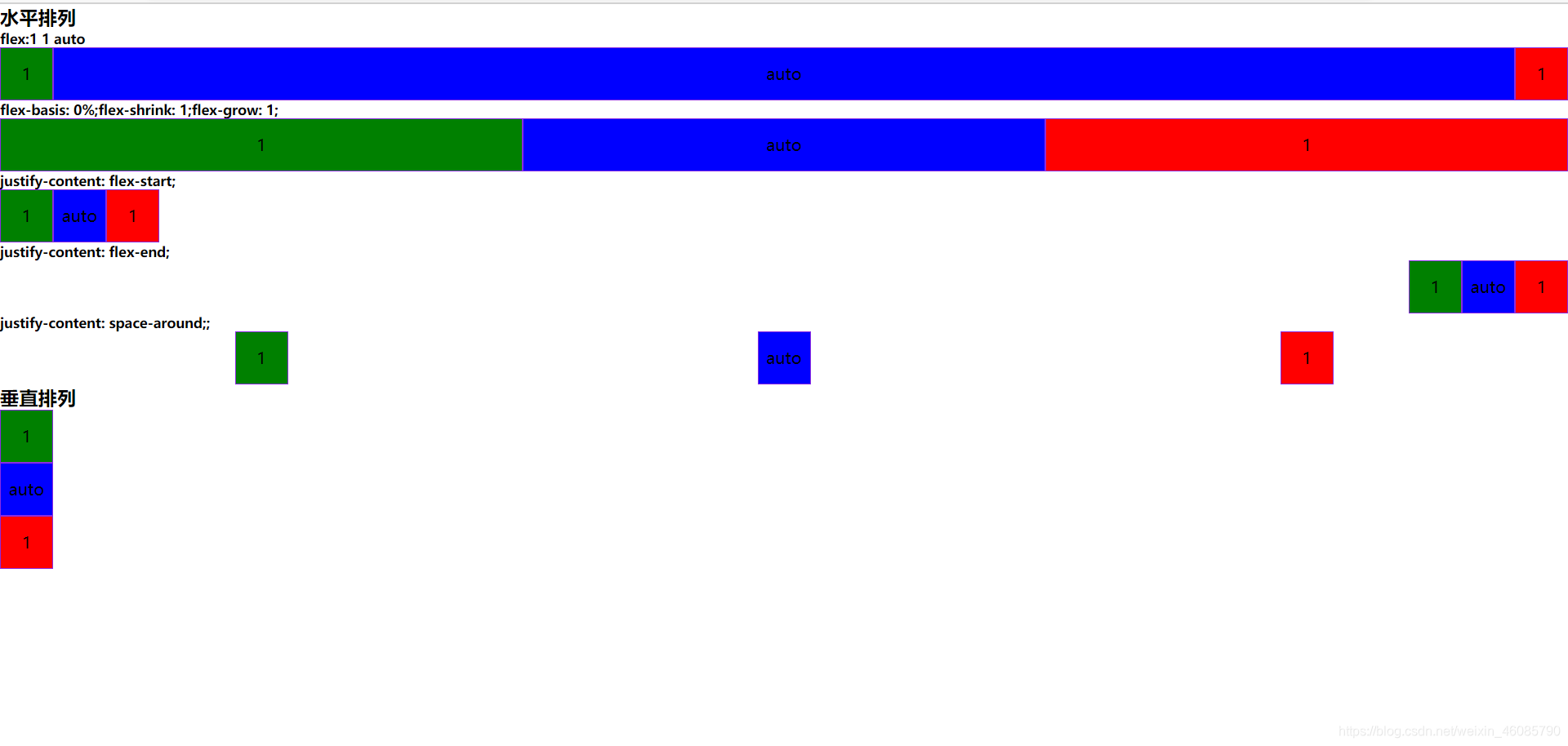
HTML5 实现:
<!DOCTYPE html>
<html>
	<head>
		<meta charset="utf-8" />
		<meta name="viewport" content="width=device-width,initial-scale=1.0" />
		<title>弹性布局</title>
		<style type="text/css">
			*{
				margin: 0;
				padding: 0;
			}
			.box{
				width: 50px;
				height: 50px;
				border: 1px solid blueviolet;
				text-align: center;
				line-height: 50px;
			}

			.flex-item1{

				background: red;
				order: 3;/*设置伸缩向的排序*/
			}
			.flex-item2{

				background: green;
				order: 1;/*设置伸缩向的排序*/
			}
			.flex-item3{

				background: blue;
				order: 2;/*设置伸缩向的排序*/
			}

			.flex-container1{
				display: flex;
				flex-direction: row;
				flex-wrap: wrap;
				/*主轴对齐*/
				justify-content: flex-start;
			}

			.flex-container2{
				display: flex;
				flex-direction: row;
				flex-wrap: wrap;
				/*主轴对齐*/
				justify-content: flex-end;
			}
			.flex-container3{
				display: flex;
				flex-direction: row;
				flex-wrap: wrap;
				justify-content: space-around;
			}
			.flex-container4{
				display: flex;
				flex-direction: column;
				flex-wrap: wrap;
				justify-content: space-around;
			}


			.flex-center1{
				/*伸缩向分配空间格式:flex:flex-grow;flex-fhrink;flex-grow*/
				/*表示除了占据原先的宽度外,还要分配剩余宽度(包括扩展或收缩)*/
				flex: 1 1 auto;

			}

			.flex-center2{
				/*表示分配所有宽度(包括扩展或收缩)*/
				flex-basis: 0%;
				flex-shrink: 1;
				flex-grow: 1;
			}
		</style>

	</head>
	<body>
		<h3>水平排列</h3>
		<h5>flex:1 1 auto</h5>
		<div class="flex-container1">
			<div class="flex-item1 box">1</div>
			<div class="flex-item2 box">1</div>
			<div class="flex-item3 box flex-center1">auto</div>
		</div>

		<h5>flex-basis: 0%;flex-shrink: 1;flex-grow: 1;</h5>
		<div class="flex-container1">
			<div class="flex-item1 box flex-center2">1</div>
			<div class="flex-item2 box flex-center2">1</div>
			<div class="flex-item3 box flex-center2">auto</div>
		</div>

		<h5>justify-content: flex-start;</h5>
		<div class="flex-container1">
			<div class="flex-item1 box">1</div>
			<div class="flex-item2 box">1</div>
			<div class="flex-item3 box">auto</div>
		</div>


		<h5>justify-content: flex-end;</h5>
		<div class="flex-container2">
			<div class="flex-item1 box">1</div>
			<div class="flex-item2 box">1</div>
			<div class="flex-item3 box">auto</div>
		</div>

		<h5>justify-content: space-around;;</h5>
		<div class="flex-container3">
			<div class="flex-item1 box">1</div>
			<div class="flex-item2 box">1</div>
			<div class="flex-item3 box">auto</div>
		</div>

		<h3>垂直排列</h3>
		<div class="flex-container4">
			<div class="flex-item1 box">1</div>
			<div class="flex-item2 box">1</div>
			<div class="flex-item3 box flex-center1">auto</div>
		</div>

	</body>
</html>
Recommend
About Joyk
Aggregate valuable and interesting links.
Joyk means Joy of geeK