

Free and Open Source GIS Ramblings
source link: https://anitagraser.com/
Go to the source link to view the article. You can view the picture content, updated content and better typesetting reading experience. If the link is broken, please click the button below to view the snapshot at that time.
In the previous post, we explored how hvPlot and Datashader can help us to visualize large CSVs with point data in interactive map plots. Of course, the spatial distribution of points usually only shows us one part of the whole picture. Today, we’ll therefore look into how to explore other data attributes by linking other (non-spatial) plots to the map.
This functionality, referred to as “linked brushing” or “crossfiltering” is under active development and the following experiment was prompted by a recent thread on Twitter launched by @plotlygraphs announcement of HoloViews 1.14:
Dash HoloViews was just released as part of @HoloViews version 1.14!
$ 𝘱𝘪𝘱 𝘪𝘯𝘴𝘵𝘢𝘭𝘭 𝘩𝘰𝘭𝘰𝘷𝘪𝘦𝘸𝘴==1.14
Automatically link selections across multiple plots (crossfiltering)
— plotly (@plotlygraphs) December 3, 2020
Turns out these features are not limited to plotly but can also be used with Bokeh and hvPlot:
It'll even work for hvPlot output. Would definitely be interested to see how it interacts with the geometries you usually work with.
— Philipp Rudiger (@PhilippJFR) December 4, 2020
Like in the previous post, this demo uses a Pandas DataFrame with 12 million rows (and HoloViews 1.13.4).
In addition to the map plot, we also create a histogram from the same DataFrame:
map_plot = df.hvplot.scatter(x='x', y='y', datashade=True, height=300, width=400)hist_plot = df.where((df.SOG>0) & (df.SOG<50)).hvplot.hist("SOG", bins=20, width=400, height=200) To link the two plots, we use HoloViews’ link_selections function:
from holoviews.selection import link_selectionslinked_plots = link_selections(map_plot + hist_plot)That’s all! We can now perform spatial filters in the map and attribute value filters in the histogram and the filters are automatically applied to the linked plots:
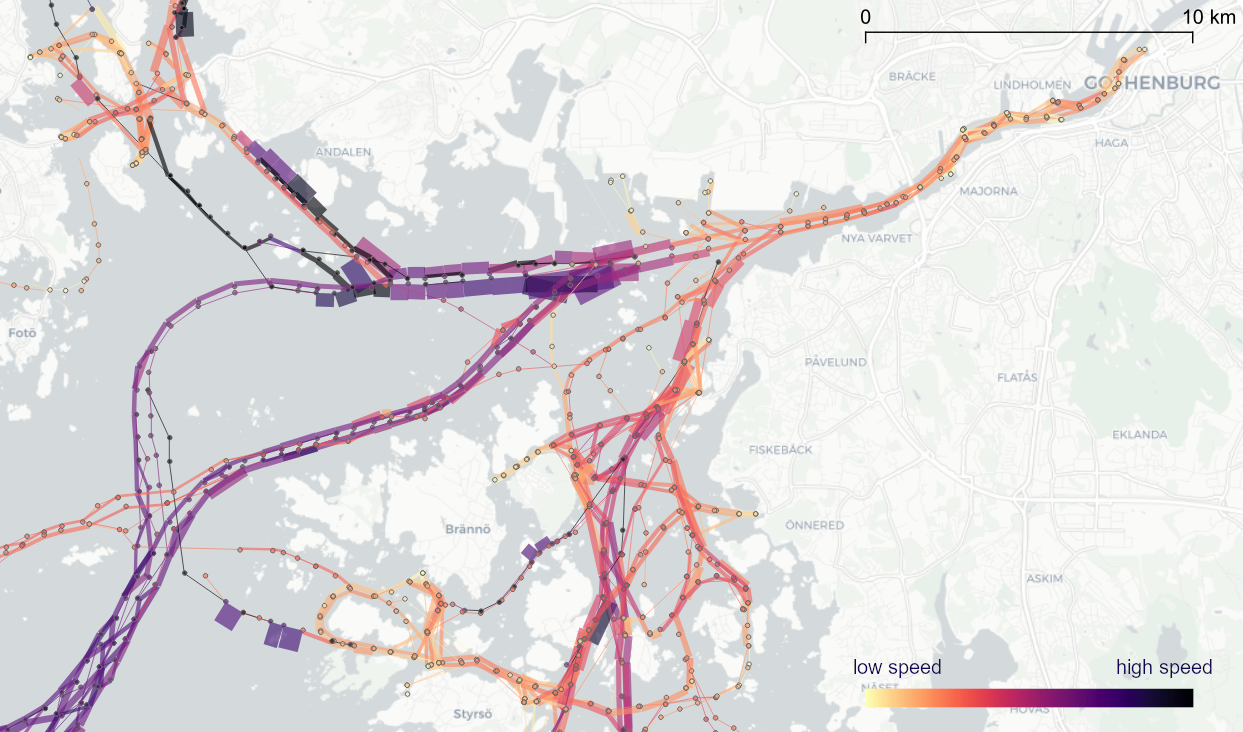
Linked brushing demo using ship movement data (AIS): filtering records by speed (SOG) reveals spatial patterns of fast and slow movement.
You’ve probably noticed that there is no background map in the above plot. I had to remove the background map tiles to get rid of an error in Holoviews 1.13.4. This error has been fixed in 1.14.0 but I ran into other issues with the datashaded Scatterplot.
It’s worth noting that not all plot types support linked brushing. For the complete list, please refer to http://holoviews.org/user_guide/Linked_Brushing.html
Even with all their downsides, CSV files are still a common data exchange format – particularly between disciplines with different tech stacks. Indeed, “How to Specify Data Types of CSV Columns for Use in QGIS” (originally written in 2011) is still one of the most popular posts on this blog. QGIS continues to be quite handy for visualizing CSV file contents. However, there are times when it’s just not enough, particularly when the number of rows in the CSV is in the range of multiple million. The following example uses a 12 million point CSV:
To give you an idea of the waiting times in QGIS, I’ve run the following script which loads and renders the CSV:
from datetime import datetimedef get_time():t2 = datetime.now()print(t2)print(t2-t1)print('Done :)')canvas = iface.mapCanvas()canvas.mapCanvasRefreshed.connect(get_time)print('Starting ...')t0 = datetime.now()print(t0)print('Loading CSV ...')uri = "file:///E:/Geodata/AISDK/raw_ais/aisdk_20170701.csv?type=csv&xField=Longitude&yField=Latitude&crs=EPSG:4326&"vlayer = QgsVectorLayer(uri, "layer name you like", "delimitedtext")t1 = datetime.now()print(t1)print(t1 - t0)print('Rendering ...')QgsProject.instance().addMapLayer(vlayer)The script output shows that creating the vector layer takes 02:39 minutes and rendering it takes over 05:10 minutes:
Starting ...2020-12-06 12:35:56.266002Loading CSV ...2020-12-06 12:38:35.5653320:02:39.299330Rendering ...2020-12-06 12:43:45.6375040:05:10.072172Done :)
Rendered CSV file in QGIS
Panning and zooming around are no fun either since rendering takes so long. Changing from a single symbol renderer to, for example, a heatmap renderer does not improve the rendering times. So we need a different solutions when we want to efficiently explore large point CSV files.
The Pandas data analysis library is well-know for being a convenient tool for handling CSVs. However, it’s less clear how to use it as a replacement for desktop GIS for exploring large CSVs with point coordinates. My favorite solution so far uses hvPlot + HoloViews + Datashader to provide interactive Bokeh plots in Jupyter notebooks.

hvPlot provides a high-level plotting API built on HoloViews that provides a general and consistent API for plotting data in (Geo)Pandas, xarray, NetworkX, dask, and others. (Image source: https://hvplot.holoviz.org)
But first things first! Loading the CSV as a Pandas Dataframe takes 10.7 seconds. Pandas’ default plotting function (based on Matplotlib), however, takes around 13 seconds and only produces a static scatter plot.

Loading and plotting the CSV with Pandas
hvPlot to the rescue!
We only need two more steps to get faster and interactive map plots (plus background maps!): First, we need to reproject the lat/lon values. (There’s a warning here, most likely since some of the input lat/lon values are invalid.) Then, we replace plot() with hvplot() and voilà:
Plotting the CSV with Datashader
As you can see from the above GIF, the whole process barely takes 2 seconds and the resulting map plot is interactive and very responsive.
12 million points are far from the limit. As long as the Pandas DataFrame fits into memory, we are good and when the datasets get bigger than that, there are Dask DataFrames. But that’s a story for another day.
If you are following QGIS topics on social media, you may have already seen this but if you don’t, I recommend having a look at Tim Sutton’s most recent adventures in building dashboards with QGIS:
Another dashboard update! This adds a new font attribute to the dashboard table and adds column icons. Needs the free UN-OCHA glyph font icons: https://t.co/KAZigpo90W
Latest GeoPackage containing all the logic for the above image is available here:https://t.co/QgfLaDZpIs pic.twitter.com/EFxvVuLsYx
— Tim Sutton (@timlinux) December 1, 2020
The dashboard is built using labeling and geometry generator functionality. This means that they work in the QGIS application map window as well as in layouts. As hinted at in the screenshot above, the dashboard can show information about whole layers as well as interactive selections.
Here’s a full walk-through Tim published yesterday:
You can follow the further development via Tim’s tweets or the dedicated Github issue (where you can even find an example QGIS dashboard project in a GeoPacakge for download).
The 2016 post More icons & symbols for QGIS still regularly makes it to the top 10 list of posts by visitors. I wouldn’t attribute this popularity to the quality of this particular post, however. Instead, it’s a pretty clear sign that QGIS users are actively searching for more styling resources to add to their installations.
When it comes to styling resources, the person to follow right now is clearly Klas Karlsson who’s been keeping a steady stream of styling-related posts coming to Twitter:
Created a style for manually placed measurements in #QGIS.
This actually works better than expected.
Turn on snapping. "click-click", and it's done.
(well more or less…)https://t.co/x9JNloGPNk pic.twitter.com/w4xw0ctUio— Klas Karlsson (@klaskarlsson) September 12, 2020
Using aggregate() with 'collect' doesn't really aggregate all geometries… Am I missing something or should I file a bug report.
(two layers, aggregate on green layer, not collecting all geometries in aggregate layer) pic.twitter.com/dYaLzQX51i— Klas Karlsson (@klaskarlsson) August 30, 2020
Additionally, he’s the master-mind behind QGIS Hub, a – currently prototypical – platform for sharing styling resources and print layout templates:

If you are interested in sharing styling resources, head over there. Similarly, if you want to lend a hand developing QGIS Hub, get in touch!
On Thursday, I was awarded the 2020 Sol Katz award for Free and Open Source Software for Geospatial. I feel very honored to have been selected for this award and I’d like to take this opportunity to share a few words of thanks:
As people working in open source projects, we are constantly reminded that we are all standing on the shoulders of giants. However, particularly this year, we also see just how important small personal connections are. For me, my involvement with open source communities really took off when I joined the QGIS hackfest in Vienna in 2009 and I felt that my participation was really appreciated and welcome. I couldn’t imagine being without these connections anymore.
Thank you to the whole QGIS community, particularly my fellow PSC members both current and former: Tim, Andreas, Jürgen, Richard, Paolo, Otto, Marco Hugentobler, Alessandro, our new chair Marco Bernasocchi, and of course QGIS founder Gary Sherman for starting this awesome project and for still being around and actively promoting geospatial open source by publishing so many great books covering multiple different OSGeo projects.
I’d also like to thank my partner and my family for being incredibly understanding whenever I’m spend my time geeking out over a new programming project, data analysis, forum question, or conference talk.
Thank you also to my friends, colleagues and fellow members of the larger OSGeo community for sharing ideas, providing valuable feedback, and spreading the word about all the great work that’s going on all around us.
I’m constantly amazed by all the innovation happening to nourish and grow our community. And I’m looking forward to continue being a part of these efforts.
Thank you!
Rendering large sets of trajectory lines gets messy fast. Different aggregation approaches have been developed to address this issue. However, most approaches, such as mobility graphs or generalized flow maps, cannot handle large input datasets. Building on M³ prototypes, the following approach can be used in distributed computing environments to extracts flows from large datasets.
This is part 3 of “Exploring massive movement datasets”.
This flow extraction is based on a two-step process, conceptually similar to Andrienko flow maps: first, we extract M³ prototypes from the movement data. In the second step, we determine flows between these prototypes, including information about: distribution of travel speeds and number of observed transitions. The resulting flows can be visualized, for example, to explore the popularity of different paths of movement:
After the prototypes have been computed, the flow algorithm computes transitions between pairs of prototypes. An object moving from prototype A to prototype B triggers an update of the corresponding flow. To allow for distributed processing, each node in the distributed computing environment needs a copy of the previously computed prototypes. Additionally, the raw movement data records need to be converted into trajectories. Afterwards, each trajectory is processed independently, going through its records in chronological order:
- Find the best matching prototype for the current record
- Ensure that the distance to the match is below the distance threshold and that the matched prototype is different from the previous prototype
- Get or create the flow between the two prototypes
- Ensure that the prototype and flow directions are a good match for the current record’s direction
- Update the flow properties: travel speed and number of transitions, as well as the previous prototype reference
This approach scales to large datasets since only the prototypes, the (intermediate) flow results, and the trajectory currently being worked on have to be kept in memory for each iteration. However, this algorithm does not allow for continuous updates. Flows would have to be recomputed (at least locally) whenever prototypes changed. Therefore, the algorithm does not support exploration of continuous data streams. However, it can be used to explore large historical datasets:
Flow example: passenger vessel speed patterns showing mean flow speeds (line color: darker colors equal higher speeds) and speed variation (line width)
If you want to dive deeper, here’s the full paper:
This post is part of a series. Read more about movement data in GIS.
To explore travel patterns like origin-destination relationships, we need to identify individual trips with their start/end locations and trajectories between them. Extracting these trajectories from large datasets can be challenging, particularly if the records of individual moving objects don’t fit into memory anymore and if the spatial and temporal extent varies widely (as is the case with ship data, where individual vessel journeys can take weeks while crossing multiple oceans).
This is part 2 of “Exploring massive movement datasets”.
Roughly speaking, trip trajectories can be generated by first connecting consecutive records into continuous tracks and then splitting them at stops. This general approach applies to many different movement datasets. However, the processing details (e.g. stop detection parameters) and preprocessing steps (e.g. removing outliers) vary depending on input dataset characteristics.
For example, in our paper [1], we extracted vessel journeys from AIS data which meant that we also had to account for observation gaps when ships leave the observable (usually coastal) areas. In the accompanying 10-minute talk, I went through a 4-step trajectory exploration workflow for assessing our dataset’s potential for travel time prediction:

Click to watch the recorded talk
Like the M³ prototype computation presented in part 1, our trajectory aggregation approach is implemented in Spark. The challenges are both the massive amounts of trajectory data and the fact that operations only produce correct results if applied to a complete and chronologically sorted set of location records.This is challenging because Spark core libraries (version 2.4.5 at the time) are mostly geared towards dealing with unsorted data. This means that, when using high-level Spark core functionality incorrectly, an aggregator needs to collect and sort the entire track in the main memory of a single processing node. Consequently, when dealing with large datasets, out-of-memory errors are frequently encountered.
To solve this challenge, our implementation is based on the Secondary Sort pattern and on Spark’s aggregator concept. Secondary Sort takes care to first group records by a key (e.g. the moving object id), and only in the second step, when iterating over the records of a group, the records are sorted (e.g. chronologically). The resulting iterator can be used by an aggregator that implements the logic required to build trajectories based on gaps and stops detected in the dataset.
If you want to dive deeper, here’s the full paper:
This post is part of a series. Read more about movement data in GIS.
Visualizations of raw movement data records, that is, simple point maps or point density (“heat”) maps provide very limited data exploration capabilities. Therefore, we need clever aggregation approaches that can actually reveal movement patterns. Many existing aggregation approaches, however, do not scale to large datasets. We therefore developed the M³ Massive Movement Model [1] which supports distributed computing environments and can be incrementally updated with new data.
This is part 1 of “Exploring massive movement datasets”.
Using state-of-the-art big gespatial tools, such as GeoMesa, it is quite straightforward to ingest, index and query large amounts of timestamped location records. Thanks to GeoMesa’s GeoServer integration, it is also possible to publish GeoMesa tables as WMS and WFS which can be visualized in QGIS and explored (for more about GeoMesa, see Scalable spatial vector data processing ).So far so good! But with this basic setup, we only get point maps and point density maps which don’t tell us much about important movement characteristics like speed and direction (particularly if the reporting interval between consecutive location records is irregular). Therefore, we developed an aggregation method which models local record density, as well as movement speed and direction which we call M³.
For distributed computation, we need to split large datasets into chunks. To build models of local movement characteristics, it makes sense to create spatial or spatiotemporal chunks that can be processed independently. We therefore split the data along a regular grid but instead of computing one average value per grid cell, we create a flexible number of prototypes that describe the movement in the cell. Each prototype models a location, speed, and direction distribution (mean and sigma).
In our paper, we used M³ to explore ship movement data. We turned roughly 4 billion AIS records into prototypes:
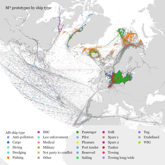
M³ for ship movement data during January to December 2017 (3.9 billion records turned into 3.4 million prototypes; computing time: 41 minutes)
The above plot really only gives a first impression of the spatial distribution of ship movement records. The real value of M³ becomes clearer when we zoom in and start exploring regional patterns. Then we can discover vessel routes, speeds, and movement directions:
The prototype details on the right side, in particular, show the strength of the prototype idea: even though the grid cells we use are rather large, the prototypes clearly form along vessel routes. We can see exactly where these routes are and what speeds ship travel there, without having to increase the grid resolution to impractical values. Slow prototypes with high direction sigma (red+black markers) are clear indicators of ports. The marker size shows the number of records per prototype and thus helps distinguish heavily traveled routes from minor ones.
M³ is implemented in Spark. We read raw location records from GeoMesa and write prototypes to GeoMesa. All maps have been created in QGIS using prototype data published as GeoServer WFS.
If you want to dive deeper, here’s the full paper:
This post is part of a series. Read more about movement data in GIS.
We’ve done it again!
This time, Daniel O’Donohue and I talked about spatiotemporal data in GIS, including – of course – Time Manager, the new QGIS temporal support, and MovingPandas.
Since we need both data and tools to do spatiotemporal analysis, we also talked about file formats and data models. If you want to know more about data models for spatiotemporal (especially movement) data, have a look at the latest discussion paper I wrote together with Esteban Zimányi (MobilityDB) and Krishna Chaitanya Bommakanti (mobilitydb-sqlalchemy):
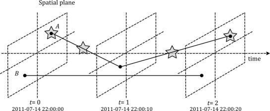
Data model of the Moving Features standard illustrated with two moving points A and B. Stars mark changes in attribute values. (Source: Graser et al. (2020))
For more details and all options for listening to this podcast, visit mapscaping.com.
Exploring large movement datasets is hard because visualizations of movement data quickly get cluttered and hard to interpret. Therefore, we need to aggregate the data. Density maps are commonly used since they are readily available and quick to compute but they provide only very limited insight. In contrast, meaningful aggregations that can help discover patterns are computationally expensive and therefore slow to generate.
This post serves as a starting point for a series of new approaches to exploring massive movement data. This series will summarize parts of my PhD research and – for those of you who are interested in more details – there will be links to the relevant papers.
Starting with the raw location records, we use different forms of aggregation to learn more about what information a movement dataset contains:

Besides clever aggregation approaches, massive movement datasets also require appropriate computing resources. To ensure that we can efficiently explore large datasets, we have implemented the above mentioned aggregation steps in Spark. This enables us to run the computations on general purpose computing clusters that can be scaled according to the dataset size.
In the next post, we’ll look at how to summarize movement using M³ prototypes. So stay tuned!
But if you don’t want to wait, these are the original papers:
[1] Graser. A., Widhalm, P., & Dragaschnig, M. (2020). The M³ massive movement model: a distributed incrementally updatable solution for big movement data exploration. International Journal of Geographical Information Science. doi:10.1080/13658816.2020.1776293.
[2] Graser, A., Dragaschnig, M., Widhalm, P., Koller, H., & Brändle, N. (2020). Exploratory Trajectory Analysis for Massive Historical AIS Datasets. In: 21st IEEE International Conference on Mobile Data Management (MDM) 2020. doi:10.1109/MDM48529.2020.00059
[3] Graser, A., Widhalm, P., & Dragaschnig, M. (2020). Extracting Patterns from Large Movement Datasets. GI_Forum – Journal of Geographic Information Science, 1-2020, 153-163. doi:10.1553/giscience2020_01_s153.
This post is part of a series. Read more about movement data in GIS.
QGIS Temporal Controller is a powerful successor of TimeManager. Temporal Controller is a new core feature of the current development version and will be shipped with the 3.14 release. This post demonstrates two key advantages of this new temporal support:
- Expression support for defining start and end timestamps
- Integration into the PyQGIS API
These features come in very handy in many use cases. For example, they make it much easier to create animations from folders full of GPS tracks since the files can now be loaded and configured automatically:

Script & Temporal Controller in action (click for full resolution)
All tracks start at the same location but at different times. (Kudos for Andrew Fletcher for recordings these tracks and sharing them with me!) To create an animation that shows all tracks start simultaneously, we need to synchronize them. This synchronization can be achieved on-the-fly by subtracting the start time from all track timestamps using an expression:
directory = "E:/Google Drive/QGIS_Course/05_TimeManager/Example_Dayrides/"def load_and_configure(filename):path = os.path.join(directory, filename)uri = 'file:///' + path + "?type=csv&escape=&useHeader=No&detectTypes=yes"uri = uri + "&crs=EPSG:4326&xField=field_3&yField=field_2"vlayer = QgsVectorLayer(uri, filename, "delimitedtext")QgsProject.instance().addMapLayer(vlayer)mode = QgsVectorLayerTemporalProperties.ModeFeatureDateTimeStartAndEndFromExpressionsexpression = """to_datetime(field_1) -make_interval(seconds:=minimum(epoch(to_datetime("field_1")))/1000)"""tprops = vlayer.temporalProperties()tprops.setStartExpression(expression)tprops.setEndExpression(expression) # optionaltprops.setMode(mode)tprops.setIsActive(True)for filename in os.listdir(directory):if filename.endswith(".csv"):load_and_configure(filename)The above script loads all CSV files from the given directory (field_1 is the timestamp, field_2 is y, and field_3 is x), enables sets the start and end expression as well as the corresponding temporal control mode and finally activates temporal rendering. The resulting config can be verified in the layer properties dialog:

To adapt this script to other datasets, it’s sufficient to change the file directory and revisit the layer uri definition as well as the field names referenced in the expression.
This post is part of a series. Read more about movement data in GIS.
Podcasts have become huge. I’m an avid listener of podcasts myself. I particularly enjoy formats that take the time to talk about unconventional topics in detail.
My first podcast experience was on the QGIS podcast hosted by Tim Sutton in 2014. Unfortunately, it seems like the podcast episodes are not online anymore.
Recently, I had the pleasure to join the MapScaping Podcast by Daniel O’Donohue to talk about Python for Geospatial:
Other guests Daniel has already interviewed include:
- Kurt Menke talking first about QGIS and in a second episode on QField and Input (data collection apps based on QGIS) and
- Paul Ramsey on Vector Tiles from PostGIS
Another geospatial podcast I really enjoy is The Mappyist Hour by Silas and Todd. Unfortunately, it’s a bit silent there now but it’s definitely worth to listen into their episode archive. One of my favorites is Episode 9 where Linda Stevens (Hecht) discusses her career at ESRI, the future of GIS, and the role of Open Source Spatial in that future:
If you listen to and want to recommend other spatial podcasts, please share them in the comments!
TimeManager turns 10 this year. The code base has made the transition from QGIS 1.x to 2.x and now 3.x and it would be wrong to say that it doesn’t show ;-)
Now, it looks like the days of TimeManager are numbered. Four days ago, Nyall Dawson has added native temporal support for vector layers to QGIS. This is part of a larger effort of adding time support for rasters, meshes, and now also vectors.
The new Temporal Controller panel looks similar to TimeManager. Layers are configured through the new Temporal tab in Layer Properties. The temporal dimension can be used in expressions to create fancy time-dependent styles:
TimeManager Geolife demo converted to Temporal Controller (click for full resolution)
Obviously, this feature is brand new and will require polishing. Known issues listed by Nyall include limitations of supported time fields (only fields with datetime type are supported right now, strings cannot be used) and worse performance than TimeManager since features are filtered in QGIS rather than in the backend.
If you want to give the new Temporal Controller a try, you need to install the current development version, e.g. qgis-dev in OSGeo4W.
Update from May 16:
Many of the limitations above have already been addressed.
Last night, Nyall has recorded a one hour tutorial on this new feature, enjoy:
Mapping spatial decision patterns, such as election results, is always a hot topic. That’s why we decided to include a recipe for election maps in our QGIS Map Design books. What’s new is that this recipe is now available as a free video tutorial recorded by Oliver Burdekin:
This video is just one of many recently published video tutorials that have been created by QGIS community members.
For example, Hans van der Kwast and Kurt Menke have recorded a 7-part series on QGIS for Hydrological Applications:
and Klas Karlsson’s Youtube channel is also always worth a follow:
For the Pythonically inclined among you, there is also a new version of Python in QGIS on the Automating GIS-processes channel:
This post introduces Holoviz Panel, a library that makes it possible to create really quick dashboards in notebook environments as well as more sophisticated custom interactive web apps and dashboards.
The following example shows how to use Panel to explore a dataset (a trajectory collection in this case) and different parameter settings (relating to trajectory generalization). All the Panel code we need is a dict that defines the parameters that we want to explore. Then we can use Panel’s interact function to automatically generate a dashboard for our custom plotting function:
import panel as pnkw = dict(traj_id=(1, len(traj_collection)), tolerance=(10, 100, 10), generalizer=['douglas-peucker', 'min-distance'])pn.interact(plot_generalized, **kw)Click to view the resulting dashboard in full resolution:

The plotting function uses the parameters to generate a Holoviews plot. First it fetches a specific trajectory from the trajectory collection. Then it generalizes the trajectory using the specified parameter settings. As you can see, we can easily combine maps and other plots to visualize different aspects of the data:
def plot_generalized(traj_id=1, tolerance=10, generalizer='douglas-peucker'):my_traj = traj_collection.get_trajectory(traj_id).to_crs(CRS(4088))if generalizer=='douglas-peucker':generalized = mpd.DouglasPeuckerGeneralizer(my_traj).generalize(tolerance)else:generalized = mpd.MinDistanceGeneralizer(my_traj).generalize(tolerance)generalized.add_speed(overwrite=True)return ( generalized.hvplot(title='Trajectory {} (tolerance={})'.format(my_traj.id, tolerance), c='speed', cmap='Viridis', colorbar=True, clim=(0,20), line_width=10, width=500, height=500) +generalized.df['speed'].hvplot.hist(title='Speed histogram', width=300, height=500) )Trajectory collections and generalization functions used in this example are part of the MovingPandas library. If you are interested in movement data analysis, you should check it out! You can find this example notebook in the MovingPandas tutorial section.
MovingPandas has come a long way since 2018 when I started to experiment with GeoPandas for trajectory data handling.
This week, MovingPandas passed peer review and was approved for pyOpenSci. This technical review process was extremely helpful in ensuring code, project, and documentation quality. I would strongly recommend it to everyone working on new data science libraries!
The lastest v0.3 release is now available from conda-forge.
All tutorials are available on MyBinder
New features include:
- Support for GeoPandas 0.7
- Trajectory collection aggregation functions to generate flow maps

This is a guest post by Bommakanti Krishna Chaitanya @chaitan94
Introduction
This post introduces mobilitydb-sqlalchemy, a tool I’m developing to make it easier for developers to use movement data in web applications. Many web developers use Object Relational Mappers such as SQLAlchemy to read/write Python objects from/to a database.
Mobilitydb-sqlalchemy integrates the moving objects database MobilityDB into SQLAlchemy and Flask. This is an important step towards dealing with trajectory data using appropriate spatiotemporal data structures rather than plain spatial points or polylines.
To make it even better, mobilitydb-sqlalchemy also supports MovingPandas. This makes it possible to write MovingPandas trajectory objects directly to MobilityDB.
For this post, I have made a demo application which you can find live at https://mobilitydb-sqlalchemy-demo.adonmo.com/. The code for this demo app is open source and available on GitHub. Feel free to explore both the demo app and code!
In the following sections, I will explain the most important parts of this demo app, to show how to use mobilitydb-sqlalchemy in your own webapp. If you want to reproduce this demo, you can clone the demo repository and do a “docker-compose up –build” as it automatically sets up this docker image for you along with running the backend and frontend. Just follow the instructions in README.md for more details.
Declaring your models
For the demo, we used a very simple table – with just two columns – an id and a tgeompoint column for the trip data. Using mobilitydb-sqlalchemy this is as simple as defining any regular table:
from flask_sqlalchemy import SQLAlchemyfrom mobilitydb_sqlalchemy import TGeomPointdb = SQLAlchemy()class Trips(db.Model):__tablename__ = "trips"trip_id = db.Column(db.Integer, primary_key=True)trip = db.Column(TGeomPoint)Note: The library also allows you to use the Trajectory class from MovingPandas as well. More about this is explained later in this tutorial.
Populating data
When adding data to the table, mobilitydb-sqlalchemy expects data in the tgeompoint column to be a time indexed pandas dataframe, with two columns – one for the spatial data called “geometry” with Shapely Point objects and one for the temporal data “t” as regular python datetime objects.
from datetime import datetimefrom shapely.geometry import Point# Prepare and insert the data# Typically it won’t be hardcoded like this, but it might be coming from # other data sources like a different database or maybe csv filesdf = pd.DataFrame([{"geometry": Point(0, 0), "t": datetime(2012, 1, 1, 8, 0, 0),},{"geometry": Point(2, 0), "t": datetime(2012, 1, 1, 8, 10, 0),},{"geometry": Point(2, -1.9), "t": datetime(2012, 1, 1, 8, 15, 0),},]).set_index("t")trip = Trips(trip_id=1, trip=df)db.session.add(trip)db.session.commit()Writing queries
In the demo, you see two modes. Both modes were designed specifically to explain how functions defined within MobilityDB can be leveraged by our webapp.
1. All trips mode – In this mode, we extract all trip data, along with distance travelled within each trip, and the average speed in that trip, both computed by MobilityDB itself using the ‘length’, ‘speed’ and ‘twAvg’ functions. This example also shows that MobilityDB functions can be chained to form more complicated queries.

trips = db.session.query(Trips.trip_id,Trips.trip,func.length(Trips.trip),func.twAvg(func.speed(Trips.trip))).all()2. Spatial query mode – In this mode, we extract only selective trip data, filtered by a user-selected region of interest. We then make a query to MobilityDB to extract only the trips which pass through the specified region. We use MobilityDB’s ‘intersects’ function to achieve this filtering at the database level itself.
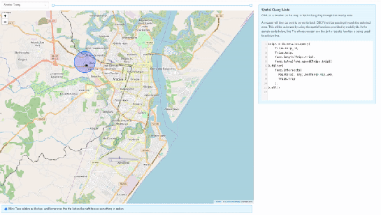
trips = db.session.query(Trips.trip_id,Trips.trip,func.length(Trips.trip),func.twAvg(func.speed(Trips.trip))).filter(func.intersects(Point(lat, lng).buffer(0.01).wkb, Trips.trip),).all()Using MovingPandas Trajectory objects
Mobilitydb-sqlalchemy also provides first-class support for MovingPandas Trajectory objects, which can be installed as an optional dependency of this library. Using this Trajectory class instead of plain DataFrames allows us to make use of much richer functionality over trajectory data like analysis speed, interpolation, splitting and simplification of trajectory points, calculating bounding boxes, etc. To make use of this feature, you have set the use_movingpandas flag to True while declaring your model, as shown in the below code snippet.
class TripsWithMovingPandas(db.Model):__tablename__ = "trips"trip_id = db.Column(db.Integer, primary_key=True)trip = db.Column(TGeomPoint(use_movingpandas=True))Now when you query over this table, you automatically get the data parsed into Trajectory objects without having to do anything else. This also works during insertion of data – you can directly assign your movingpandas Trajectory objects to the trip column. In the below code snippet we show how inserting and querying works with movingpandas mode.
from datetime import datetimefrom shapely.geometry import Point# Prepare and insert the data# Typically it won’t be hardcoded like this, but it might be coming from # other data sources like a different database or maybe csv filesdf = pd.DataFrame([{"geometry": Point(0, 0), "t": datetime(2012, 1, 1, 8, 0, 0),},{"geometry": Point(2, 0), "t": datetime(2012, 1, 1, 8, 10, 0),},{"geometry": Point(2, -1.9), "t": datetime(2012, 1, 1, 8, 15, 0),},]).set_index("t")geo_df = GeoDataFrame(df)traj = mpd.Trajectory(geo_df, 1)trip = Trips(trip_id=1, trip=traj)db.session.add(trip)db.session.commit()# Querying over this table would automatically map the resulting tgeompoint # column to movingpandas’ Trajectory classresult = db.session.query(TripsWithMovingPandas).filter(TripsWithMovingPandas.trip_id == 1).first()print(result.trip.__class__)# <class 'movingpandas.trajectory.Trajectory'>Bonus: trajectory data serialization
Along with mobilitydb-sqlalchemy, recently I have also released trajectory data serialization/compression libraries based on Google’s Encoded Polyline Format Algorithm, for python and javascript called trajectory and trajectory.js respectively. These libraries let you send trajectory data in a compressed format, resulting in smaller payloads if sending your data through human-readable serialization formats like JSON. In some of the internal APIs we use at Adonmo, we have seen this reduce our response sizes by more than half (>50%) sometimes upto 90%.
Want to learn more about mobilitydb-sqlalchemy? Check out the quick start & documentation.
This post is part of a series. Read more about movement data in GIS.
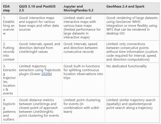
We recently published a new paper on “Open Geospatial Tools for Movement Data Exploration” (open access). If you liked Movement data in GIS #26: towards a template for exploring movement data, you will find even more information about the context, challenges, and recent developments in this paper.

- QGIS + PostGIS: a combination that will be familiar to most open source GIS users
- Jupyter + MovingPandas: less common so far, but Jupyter notebooks are quickly gaining popularity (even in the proprietary GIS world)
- GeoMesa + Spark: for when datasets become too big to handle using other means
and discusses their capabilities and limitations:
This post is part of a series. Read more about movement data in GIS.
In December, I wrote about GeoPandas on Databricks. Back then, I also tried to get MovingPandas working but without luck. (While GeoPandas can be installed using Databricks’ dbutils.library.installPyPI("geopandas") this PyPI install just didn’t want to work for MovingPandas.)
Now that MovingPandas is available from conda-forge, I gave it another try and … *spoiler alert* … it works!
First of all, conda support on Databricks is in beta. It’s not included in the default runtimes. At the time of writing this post, “6.0 Conda Beta” is the latest runtime with conda:


When the installs are finally done, it get’s serious: time to test the imports!

Success!
Now we can put the MovingPandas data structures to good use. But first we need to load some movement data:

Or course, the points in this GeoDataFrame can be plotted. However, the plot isn’t automatically displayed once plot() is called on the GeoDataFrame. Instead, Databricks provides a display() function to display Matplotlib figures:

MovingPandas also uses Matplotlib. Therefore we can use the same approach to plot the TrajectoryCollection that can be created from the GeoDataFrame:

These Matplotlib plots are nice and quick but they lack interactivity and therefore are of limited use for data exploration.
MovingPandas provides interactive plotting (including base maps) using hvplot. hvplot is based on Bokeh and, luckily, the Databricks documentation tells us that bokeh plots can be exported to html and then displayed using displayHTML():

Of course, we could achieve all this on MyBinder as well (and much more quickly). However, Databricks gets interesting once we can add (Py)Spark and distributed processing to the mix. For example, “Getting started with PySpark & GeoPandas on Databricks” shows a spatial join function that adds polygon information to a point GeoDataFrame.
A potential use case for MovingPandas would be to speed up flow map computations. The recently added aggregator functionality (currently in master only) first computes clusters of significant trajectory points and then aggregates the trajectories into flows between these clusters. Matching trajectory points to the closest cluster could be a potential use case for distributed computing. Each trajectory (or each point) can be handled independently, only the cluster locations have to be broadcast to all workers.

Flow map (screenshot from MovingPandas tutorial 4_generalization_and_aggregation.ipynb)
Privacy & Cookies: This site uses cookies. By continuing to use this website, you agree to their use.
To find out more, including how to control cookies, see here:
Our Cookie Policy
Loading new page

Recommend
About Joyk
Aggregate valuable and interesting links.
Joyk means Joy of geeK