

How to create strong hierarchy in digital design
source link: https://uxplanet.org/how-to-create-strong-hierarchy-in-digital-design-1f605f04d1fc
Go to the source link to view the article. You can view the picture content, updated content and better typesetting reading experience. If the link is broken, please click the button below to view the snapshot at that time.
How to create strong hierarchy in digital design
Don’t make these mistakes

Hierarchy is a key element in design, creating a good user experience, and achieving the business goals of a website or app. It’s also one of the biggest mistakes new designers make. When there is no clear hierarchy on a website or an app, you risk frustrating the user and losing them as a potential customer. Let’s dive into what visual hierarchy is, tips for how to achieve it, and how you can use it to improve your websites and app designs.
What is visual hierarchy in design?
There are many definitions of hierarchy. Most refer to a system of organized rankings, it’s an order or power structure to help everyone know who is on top and most important. For example, at a company, this would be the CEO. The CEO is at the top of the pyramid, the top of the chain of command with various leaders and individual contributors underneath in the organization chart.
Visual hierarchy, on the other hand, is the principle of arranging elements to show their order of importance. If everything in your design is the same size, the same weight, or the same color, then nothing is important. This is even more paramount in creating a good user experience for web design. You want to capture the attention of your user and guide them through an experience. Whether it’s a large headline, a bright color, or the placement, there are many ways to create a strong level of hierarchy in web design.
Why is hierarchy important?
Now that we understand what hierarchy is, why is it so important specifically for web design? Our brains have to look at something, we have to understand what we should be looking at first.
If there are too many things to look at on a landing page, then our eyes will have no idea where to look first and process information. If the hierarchy is too confusing on a website, a user will get frustrated and exit the site altogether. This creates a bad user experience. You’ve lost a potential customer forever, they’re not coming back.
In order to achieve a goal for your user, you need to use hierarchy to guide them through the website experience. Are they there to log in and make a purchase? Do they need to pay a bill? Are they looking for information to reach out and hire a company? Or is it more for pleasure, maybe a browsing experience like YouTube or Netflix? Whatever the goal, you must work with the client and use your design expertise to achieve it.
What does good hierarchy look like?
Let’s take a look at some examples of websites using good hierarchy best practices. Take a look at these designs and see if you can spot why the hierarchy works well.

In this example of Squarespace’s homepage, there’s a balance of hierarchy. The largest element is a glimpse into the Squarespace product, how you can use their tools to customize your own website.
Next, we read the headline “Everything you need to grow online.” which reinforces the mission behind Squarespace, a tool that helps you develop an online presence. There are clear calls to action with “Get started” buttons and also a balanced flow to the whitespace surrounding these elements.

In this example, a large headline with clear contrast tells us immediately what One Medical is and how they help. Next, we notice the lifestyle photography, reinforcing the idea that you can get medical care from the comfort of your own home.

The centered layout in this example draws our eyes to the headline “Tools to run your business”. Followed by the group of photos underneath, we get a better sense of how Square can help your business. We’re also not bombarded with too many actions, one clear “Get started” CTA button or, in a secondary CTA style, the option to view more solutions.
Key elements of visual hierarchy
Now that we have a basis for what good hierarchy looks like, let’s dive into the main elements you can change within your design to create a strong hierarchy. You can use one or a combination of a few to enhance your designs.
Size or scale
Our eyes are naturally drawn to elements that are larger in size. When looking at a landing page, we’re likely to notice the largest element first. Take a look at this example, what do you see first?

The largest element on this landing page is the Visa credit card image. Since this is a website mockup for a bank, it makes sense to include a photo of the actual product. Immediately, the user knows this website is for a bank, a credit card, or something to do with money.
Color
Another way to achieve hierarchy is to use color. This doesn’t mean your design should include as many colors as possible. Instead, how can you use color thoughtfully to draw your user's attention to a specific design element? In general, our eyes are attracted to bright colors but it depends on how you use them in combination with other colors and other elements of design.

In this example, the design uses muted colors but still achieves hierarchy with color. Notice the subtle differences between the headline text and the body copy. The headline is large but the color is pale pink on a dark forest green background. This level of contrast with color pushes the headline to a higher level of importance than the body copy which is in pastel green and blends more into the background.
Contrast
It’s important to create contrast in your design, especially when it comes to typography. You need to make sure your text is easily readable on the web and passes accessibility tests. Use this contrast checker tool to make sure your foreground and background are accessible on the web.
But you can also use color to create contrast. In this example, notice how the red text within the mainly black text headline stands out. By using a bright red to contrast the black, our eyes immediately read “early access” first and understand the exclusive nature of the offer.

Alignment
Using a grid for alignment is extremely important in web design. Without a grid, your design will look chaotic, unorganized, and it becomes difficult for a user to read the content of a website. The more content there is on a webpage, the more of a need there is for a grid.
In this fitness landing page, a 3-column grid is useful for a user to browse the popular exercise section.

Repetition
Our eyes are drawn to patterns. Repetition can be useful for creating hierarchy in your design. In this landing page example, notice how you immediately notice the beautiful plates of food. If it was just one small plate of food, we wouldn’t be as drawn as we are to the grid of plates, showing variation in the recipes of the meals they offer.

Proximity
Proximity refers to how elements appear in relation to one another and are one of the most basic elements of composition. By placing related elements close together, it suggests to the user that they are related.
The examples of circles below show how proximity can be used to help us perceive objects as being related. When the circles are random and spread out, they’re perceived as separate objects with no relation to each other. However, when the circles are pulled together in proximity, they are seen as one object and feel related.

Whitespace
Knowing how to use spacing properly in design gives your layout balance, flow, and focus. You don’t actually want to fill your entire canvas with type, color, photos, and illustrations. Instead, use white space to create a pleasing design layout and draw your attention to the most important elements.
Take a look at this landing page example. A strong hierarchy is achieved by a large headline but also by the use of generous white space surrounding the type. You can’t help but read the headline first and want to click on the enter button next.

Tips for creating strong hierarchy in design
Choose a focal point
First, decide what your most important takeaway is for your design. This will vary greatly depending on what you’re designing, who the client is, and what their business goal is. But each page of a website should serve one purpose. You’ll want to work with the client to understand their goal so you can narrow it down to one key focal point in your design.
Consider viewing patterns
Subconsciously, everyone has a viewing pattern for how they scan content quickly on the web. The two most popular viewing patterns people use are the Z pattern and the F pattern.
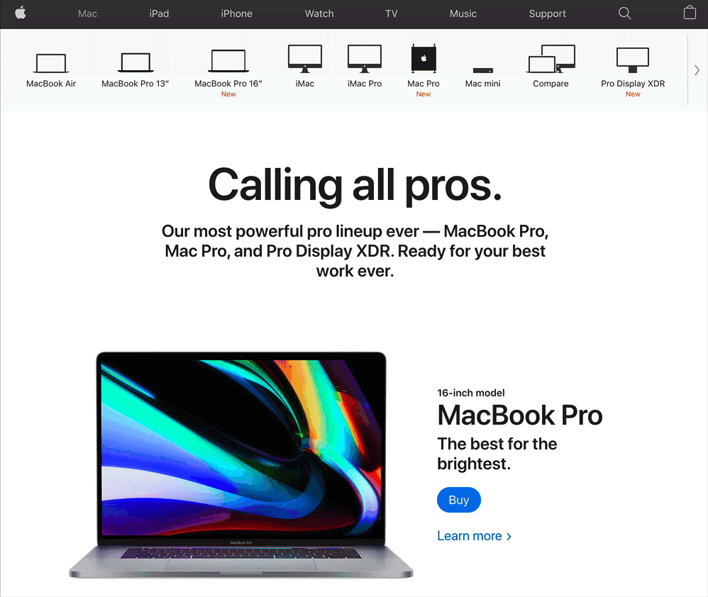
The Z pattern follows a path from top-left to top-right, then down to the lower left, and across to the lower right. Take a look at this example of an Apple landing page to understand how a Z pattern works.
The F pattern is utilized more on text-heavy pages, such as blog posts and articles. In this pattern, users scan sites from the top left to the top right, then down to the next line from left to right. This is similar to how the western world reads, from left to right, top to bottom.
Create multiple versions
When designing, you should always work on creating multiple versions. In order for you to arrive at the best visual solution, you need to explore several options. Maybe one version uses color differently, another could shift the order and scale of elements, maybe another focuses on changing the messaging.
There are so many ways you can organize the content of a website, be sure to consider all possible solutions before narrowing down to present to the client.
Critique the design of everything you see
I remember when I first started learning design, suddenly I was so aware and critical of every design around me. Whether it was a poster design for the latest movie premiere, the packaging on a product I was considering buying, a book cover, or a website. This is actually a good thing. It means you’re developing your creative eye. You’re noticing the design around you and how it can be improved.
The next time you’re looking at a sign or a product in a store, think about where the design is lacking and where it can be improved. This will train your eye over time and help you make better design decisions faster.
Recommend
About Joyk
Aggregate valuable and interesting links.
Joyk means Joy of geeK