

Dark Theme with MDC
source link: https://medium.com/androiddevelopers/dark-theme-with-mdc-4c6fc357d956
Go to the source link to view the article. You can view the picture content, updated content and better typesetting reading experience. If the link is broken, please click the button below to view the snapshot at that time.
Responses (5)
The greater the elevation, the more opaque the overlay.
This post is going to build upon that to see how we can adapt our apps to support dark themes.
User selectable dark themes were added to the Android platform in Android 10, but that does not mean they’re new to app developers. The default theme for Android devices was dark up until Android 5.0 (Lollipop)!
The difference last year was that the platform added a device-wide setting. Meaning that the user has additional control over the theme of the device, but also of apps.
Alongside the recent device-wide setting, we now also have comprehensive design guidance on material.io, which we will talk about later in this blog post.
Why support dark theme?
First up, why support a dark theme at all? The Material.io page on Dark Theme has a good summary on some of the technical benefits (emphasis mine):
Dark themes reduce the luminance emitted by device screens […]. They help improve visual ergonomics by reducing eye strain, adjusting brightness to current lighting conditions, and facilitating screen use in dark environments — all while conserving battery power [for OLED displays].
The most important reason though is that your users want it. The Android team added the system-wide dark theme setting because it consistently came up as a top requested feature by users.
Now that I’ve convinced you to support dark themes in your app, let’s look at how you add one…
Quick start
To add a dark theme to your app, use Material Design Components (MDC) for Android’s support:
#1: Change your theme
You need to change your theme to extend from one of the Theme.MaterialComponents.DayNight themes:
<style name="Theme.MyApp"
       parent="Theme.MaterialComponents.DayNight">    <!-- Other theme attributes --></style>
#2: Choose what mode to be in (optional)
This step is optional, but allows you to support devices running versions of Android before Android 10. Since most devices before Android 10 do not have a system-level dark theme setting*, apps can provide their own in-app setting to allow users to choose what theme to use per-app.
This is also still useful on Android 10+, as it allows users to override the system setting as they wish. As an example, imagine that the user sets their device theme to be controlled on a time schedule, but they know that they always want their social apps to use a dark theme.
To help with this, AppCompat (which MDC uses) provides an API to set the chosen mode: AppCompatDelegate.setDefaultNightMode(). Commonly this would be called whenever a preference changes.
* Not strictly true. Some device manufacturers have added a system-level dark theme to their devices which are running Android 9 (and below). Unfortunately there’s no way to determine this at runtime.
If you would like to read more about how the night mode feature in AppCompat works, have a look at this blog post:
#3: Test!
And there we have the basis of a dark theme! It’s time to test it out by checking each part of the app in both light and dark themes. Look out for any dark text on dark backgrounds, and hardcoded colors which do not have enough contrast against the dark backgrounds (typically, greys).
If you are using hard coded color values in your app, I recommend reading this blog post by Nick Butcher, which talks about preferring theme attributes:
We also cover this in our ‘Theming with Style’ talk at Android Dev Summit ‘19:
Material Dark Theme
Now let’s take a look at the design characteristics of dark theme which are described on Material.io.
Grey vs black
The first thing you might notice is that the default background for apps in dark theme is not black, but instead a dark grey: #121212.
There’s lots of discussions about why we chose grey vs black, especially since the platform in Android 10 uses a black background. This is largely a trade-off between usability vs power savings.
Using a pure black #000000 color as the background in the platform, allows the system apps and surfaces to use as little power as possible when they’re open on OLED displays. These system surfaces tend to be quite simple, typically just text and simple icons, so to battle contrast issues we can adjust the text and icon colors to suit.
In apps though, your surfaces can contain anything: complex colorful vector animations, bright imagery, contrasting branded surfaces and lots more. Placing these against a pure black background means that the resulting contrast is much higher, which can increase eye strain. Unlike text and icons we mentioned above, it is often difficult or unwanted to tint/re-color these types of content to reduce the contrast, meaning that a lighter background is the solution.
Color palette
Next up, let’s look at your app’s color palette. It’s likely that your app’s color palette has been chosen based on the assumption of a light/white background, so we likely need to make some tweaks to the color palette when the app is running in a dark theme.
Recap on Material color system
We’re going to be talking about color tones a lot below, so here’s a quick recap on the Material color system. It defines colors as a series of tones within each color. The tones are numbered from 50 (lightest, least saturated tone), to 900 (darkest, most saturated tone). Here’s the baseline teal and indigo color tones:
You can also play around in the Material color tool to get an idea of how the tones for different colors vary. Nick Rout also wrote up a deep-dive on the color system here.
colorPrimary
Your app’s primary color is the most displayed color (other than background and surface colors), so we need to make sure that it is legible in dark themes. Typically in a light theme, your light theme would be a 500 tone of a color, whereas in a dark theme we recommend a less saturated and more luminous tone, typically 200, but can be up to 50 depending on the hue.
For your colorPrimaryVariant, we recommend using the colorPrimary from your light theme. As a rough guide:
These values are just a starting point though. You should ensure that the chosen colors have a WCAG AA contrast ratio of at least 4.5:1 against the background/surface color at all used elevation levels (more on that later).
The Material Color Tool is handy for experimenting with colors.
colorSecondary
For your secondary color, it’s the same process as colorPrimary, by using a less saturated and more luminous tone of the same color.
The baseline Material dark theme treats the colorSecondaryVariant a little differently to colorPrimaryVariant, using the same tone for both colorSecondary and colorSecondaryVariant.
Again, as a rough guide:
Surface colors
Bold colored surfaces can be a great way to express your brand in commonly used components, such as cards. While vivid and bold colors work great against a white background, their legibility against a dark background isn’t so great.
If the device and/or app has been set to use a dark theme, the app should read this as an intention from the user that they want a muted, less vivid color scheme at that moment.
With that intention in mind, even if we use muted 50–200 color tones for branded surfaces, it can still be too bold and emit too much light for a dark theme:
So what should you do? There’s two options, which can be used together:
Use primary surface
The first step is the obvious one of not using bright, colorful surfaces when in dark theme. Material Design Components for Android makes this simple with its PrimarySurface styles, which switch between the Primary color in light theme and Surface color in dark theme.
Let’s look at an example. Say we have a BottomAppBar like the above example, we can use the Widget.MaterialComponents.BottomAppBar.PrimarySurface style:
<com.google.android.material.bottomappbar.BottomAppBar
   style="Widget.MaterialComponents.BottomAppBar.PrimarySurface" />
If you have a non-MDC view which you would like to be treated similarly, you can use the ?attr/colorPrimarySurface theme attribute:
<FrameLayout
    android:background="?attr/colorPrimarySurface" />

In fact, the components which use a bright surface color in light themes (such as MaterialToolbar), default to the same behavior. You may find that you don’t need to do any work here.
Branded surface color
To subtly express your brand color on all of your app’s surface, you can set your colorSurface to be a calculated color of colorPrimary with 8% opacity, composited over colorSurface, when in dark theme.
For an example using the baseline theme’s values:
This allows your brand to subtly be applied across the app, while still keeping the intention of a muted, low light color palette.
Crafting dark theme example
If you’d like to see an example of taking a light-themed app and adding a dark theme, watch Liam Spradlin’s video here, where he crafts a dark theme for the Reply Material Study app:
We’ve just gone through a lot of information about choosing colors, but how should you set these in your Android app?
We’re going to rely on some organisation of our themes. We’re going to use a theme structure like this:

This structure enables us to easily vary the theme in light and dark themes, while also allowing us to re-use common content in the base theme.
If you’d like to know more about this structure, I recommend watching the Developing Themes with Style talk which Nick Butcher and I gave last year.
values/themes.xmlvalues-night/themes.xmlElevation overlays
Earlier in this post, we mentioned in a few places about testing contrast against all elevation levels. You might have been wondering why that is, when elevation is about lifting surfaces to cast shadows, right? Well yes, elevation is about lifting surfaces, but it’s not just about casting shadows.
Shadows in the Material system are cast by numerous light sources, and as we lift surfaces (using elevation property), we are lifting them towards the light sources. Just like the world around us, shadows occur when those light sources are blocked by surfaces. Similarly, the closer that a surface is to a light source the more that the surface is lit, changing its perceived color.
For light surface colors, such as white, that change is imperceptible since it is already light. For dark surfaces though, it can have a large effect:
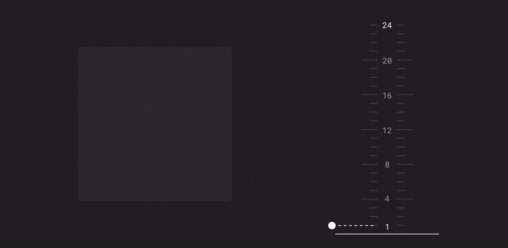
This is where elevation overlays come into play. The behavior of lightening the surface color is expressed as compositing a translucent white overlay of onSurface, over the surface color. The greater the elevation, the more opaque the overlay.
Going back to address the earlier points, this is why you need to test at the different elevations. As the visual surface changes based on the elevation, you need to make sure that any foreground colors provide enough contrast. Ideally you set a single onSurface color which works for all of the elevation values used in your app.
Widget support
All of the components in Material Design Components support elevation overlays automatically, including: Top App Bar, Bottom App Bar, Bottom Navigation, Tabs, Card, Dialog, Menu, Bottom Sheet, Navigation Drawer & Switch.
This means that using the standard elevation APIs will automatically apply an elevation overlay, as long as the background is set to ?attr/colorSurface (either explicitly or using a surface style variant). Going back to our earlier example:
There are some theme attributes which you can set to change the behavior of elevation overlays:
?attr/elevationOverlayEnabledallows you to turn on/off elevation overlays for your theme. This defaults to true in dark theme, false in light theme.?attr/elevationOverlayColorallows you to change the color of any elevation overlays. This defaults to?attr/colorOnSurface.
You shouldn’t really need to change these values though.
Custom views
So that’s great, but what if you’ve got a custom view which needs to support elevation overlay? Well you’re in luck. All of the elevation overlay support is built into MaterialShapeDrawable, with a bit of plumbing in your view:
Recommend
About Joyk
Aggregate valuable and interesting links.
Joyk means Joy of geeK