

Rick Wicklin, Author at The DO Loop
source link: https://blogs.sas.com/content/iml/author/rickwicklin
Go to the source link to view the article. You can view the picture content, updated content and better typesetting reading experience. If the link is broken, please click the button below to view the snapshot at that time.
Author

Distinguished Researcher in Computational Statistics
Rick Wicklin, PhD, is a distinguished researcher in computational statistics at SAS and is a principal developer of PROC IML and SAS/IML Studio. His areas of expertise include computational statistics, simulation, statistical graphics, and modern methods in statistical data analysis. Rick is author of the books Statistical Programming with SAS/IML Software and Simulating Data with SAS.
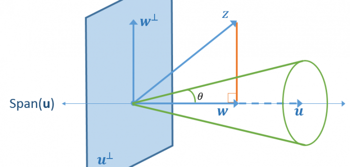

Do you know that you can create a vector that has a specific correlation with another vector? That is, given a vector, x, and a correlation coefficient, ρ, you can find a vector, y, such that corr(x, y) = ρ. The vectors x and y can have an arbitrary number
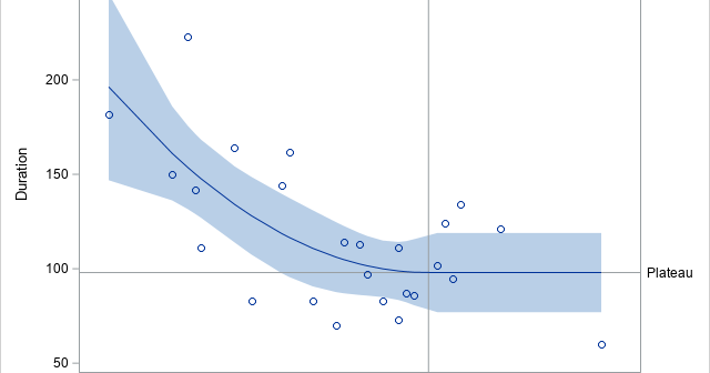
A segmented regression model is a piecewise regression model that has two or more sub-models, each defined on a separate domain for the explanatory variables. For simplicity, assume the model has one continuous explanatory variable, X. The simplest segmented regression model assumes that the response is modeled by one parametric
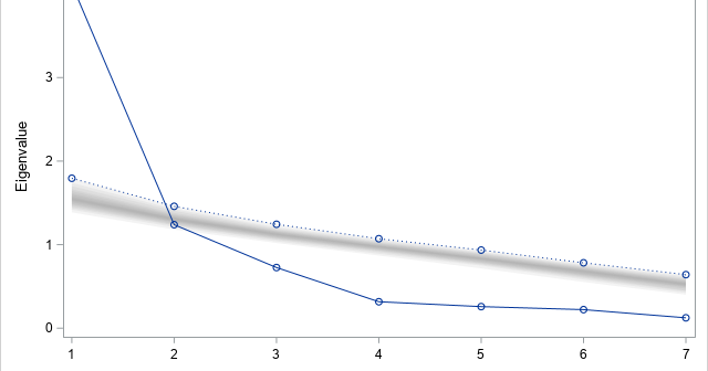
One purpose of principal component analysis (PCA) is to reduce the number of important variables in a data analysis. Thus, PCA is known as a dimension-reduction algorithm. I have written about four simple rules for deciding how many principal components (PCs) to keep. There are other methods for deciding how
"O Christmas tree, O Christmas tree, how lovely are your branches!" The idealized image of a Christmas tree is a perfectly straight conical tree with lush branches and no bare spots. Although this ideal exists only on Christmas cards, forest researchers are always trying to develop trees that approach the
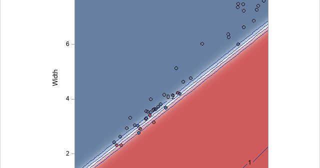
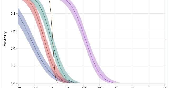
A SAS customer asked a great question: "I have parameter estimates for a logistic regression model that I computed by using multiple imputations. How do I use these parameter estimates to score new observations and to visualize the model? PROC LOGISTIC can do the computation I want, but how do
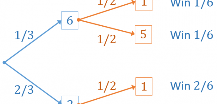
Most games of skill are transitive. If Player A wins against Player B and Player B wins against Player C, then you expect Player A to win against Player C, should they play. Because of this, you can rank the players: A > B > C Interestingly, not all games
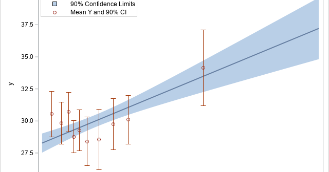
I previously showed how to create a decile calibration plot for a logistic regression model in SAS. A decile calibration plot (or "decile plot," for short) is used in some fields to visualize agreement between the data and a regression model. It can be used to diagnose an incorrectly specified
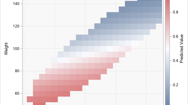
To help visualize regression models, SAS provides the EFFECTPLOT statement in several regression procedures and in PROC PLM, which is a general-purpose procedure for post-fitting analysis of linear models. When scoring and visualizing a model, it is important to use reasonable combinations of the explanatory variables for the visualization. When
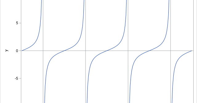
I have previously written about how to plot a discontinuous function in SAS. That article shows how to use the GROUP= option on the SERIES statement to graph a discontinuous function. An alternative approach is to place a missing value for the Y variable at the locations at which the
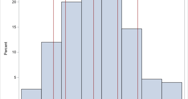
The REFLINE statement in PROC SGPLOT is one of my favorite ways to augment statistical graphics such as scatter plots, series plots, and histograms. The REFLINE statement overlays a vertical or horizontal reference line on a graph. You can specify the location of the reference lines on the REFLINE statement.
Recommend
About Joyk
Aggregate valuable and interesting links.
Joyk means Joy of geeK