

重温CSS:Border属性
source link: https://yanhaijing.com/css/2014/02/22/css-refresher-border/
Go to the source link to view the article. You can view the picture content, updated content and better typesetting reading experience. If the link is broken, please click the button below to view the snapshot at that time.

重温CSS:Border属性 译 编辑
边界是众所周知的,有什么新的东西吗?好吧,我敢打赌,在这篇文章中,有很多你不看永远不知道的东西!
不仅可以用CSS3来创建圆角,使用原有CSS一样可以显示自定义图形。这是正确的(有待考究);在过去,没发现这种技术之前,我们可能使用背景图像定位来显示一个园或箭头。幸运的是,我们能放下PS图象处理软件了。
你可能很熟悉边的最基本用法。
border: 1px solid black;
上面的代码将给元素应用1px的边。即简洁又简单;但我们也可以稍作修改。
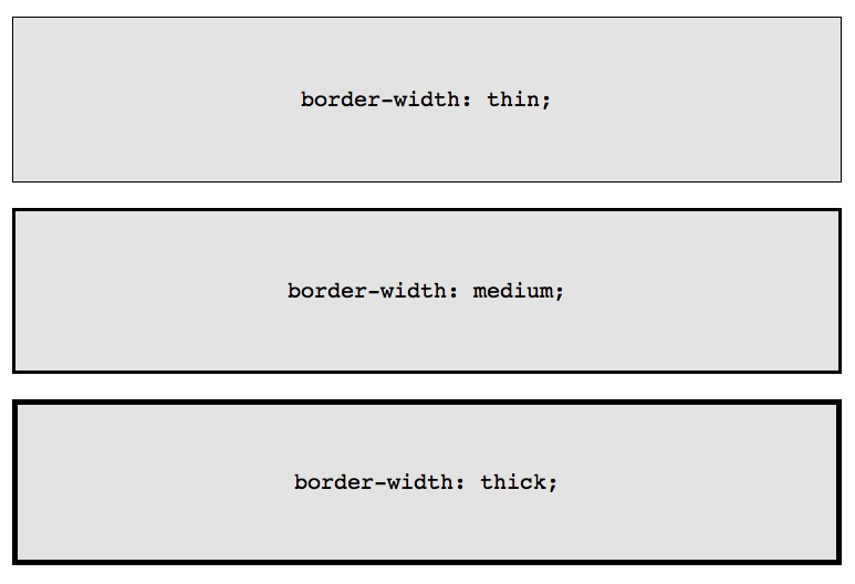
border-width: thick;
border-style: solid;
border-color: black;
除了指定具体的边框宽度值,也可以使用这三个关键词:thin,medium 和 thick。
虽然乍看起来单个属性的方式没必要,但有极少数的情况下,当它是有利的,例如当你需要在特定的事件发生时更新边的部分属性。
也许你需要在用户将鼠标悬停在一个特定的元素上时改变这个元素的边框颜色。使用复合属性需要重复像素值和边的样式。
box {
    border: 1px solid red;
}

.box:hover {
    border: 1px solid green;
}
一个更优雅的和简洁(DRY,don’t repeat yourself)的做法是只更新边的颜色属性。
.box {
    border: 1px solid red;
}

.box:hover {
    border-color: green;
}
此外,一会你会发现,这种单个属性的方式有助于通过CSS创建自定义的形状。
border-radius CSS3中的代表——第一个在社区中得到广泛使用新属性。这意味着,除去Internet Explorer 8及更低版本,所有的浏览器可以显示圆角。
为了使样式能正确应用,需要为Webkit和Mozilla内核添加前缀。
-webkit-border-radius: 10px;
-moz-border-radius: 10px;
border-radius: 10px;
然而,今天我们不关心前缀,只简单坚持官方形式:border-radius。
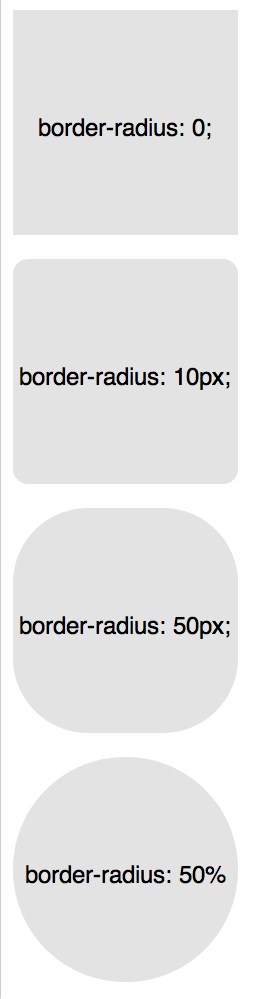
如你所料,我们可以为每个角指定不同的值。
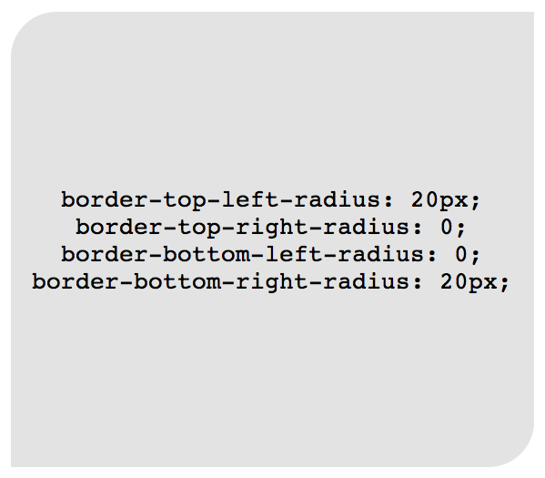
border-top-left-radius: 20px;
border-top-right-radius: 0;
border-bottom-right-radius: 30px;
border-bottom-left-radius: 0;
在上面的代码中,设置border-top-right-radius和border-bottom-left-radius为零是多余的,除非该元素有继承的值。
就像margin和padding一样,如果需要的话,这些设置可以合并为一个单一的属性。
/* 左上角, 右上角, 右下角, 左下角 */
border-radius: 20px 0 30px 0;
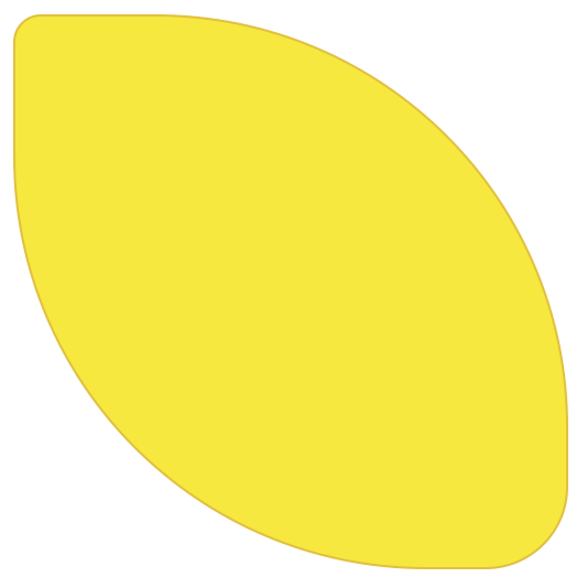
举个例子(网页设计师经常这样做),可以用CSS的border-radius属性模拟柠檬的形状,如下:
.lemon {
   width: 200px; height: 200px;

   background: #F5F240;
   border: 1px solid #F0D900;
   border-radius: 10px 150px 30px 150px;
}
许多设计师一直用的是目前为止在本章列出的知识,然而,有一些方法我们可以进一步扩展!
当给一个元素应用多个边的时候,有各种各样的技术可以参考。
solid,dashed和dotted是最常用的border-style属性值,还有其他几个我们可以使用的值,包括groove和ridge。
border: 20px groove #e3e3e3;
或者写成单个属性形式:
border-color: #e3e3e3;
border-width: 20px;
border-style: groove;
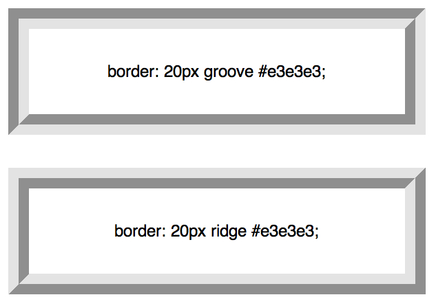
虽然这看起来不错,但ridge或groove效果并不是真正的多个边。
创建两条边的最流行的方式是利用outline属性。
.box {
   border: 5px solid #292929;
   outline: 5px solid #e3e3e3;
}
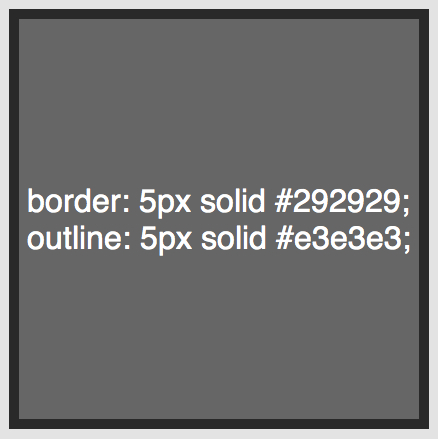
这个方法表现的非常棒,然而,最多两个边界。您应该需要创建一个层,实现渐变梯度效果,需要一种不同的方法。
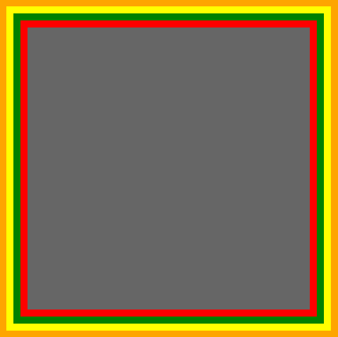
当轮廓技术无法满足要求时,另一种方法是利用::before和:after伪元素,并利用生成内容产生额外的边。
.box {
  width: 200px; height: 200px;
  background: #e3e3e3;
  position: relative;

  border: 10px solid green;
}

/* 创建和容器宽度相同的两个容器 */
.box:after, .box:before {
  content: '';
  position: absolute;
  top: 0; left: 0; bottom: 0; right: 0;
}

.box:after {
  border: 5px solid red;
  outline: 5px solid yellow;
}

.box:before {
  border: 10px solid blue;
}
这也许不是最优雅的方法,但它确实起作用了。需要注意的地方是很容易混淆边界颜色的顺序。确保正确的序列。
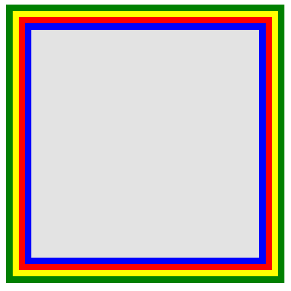
创建无限数量的边界更酷的方法是利用CSS3的box-shadow属性。
.box {
    border: 5px solid red;
     box-shadow:
       0 0 0 5px green,
       0 0 0 10px yellow,
       0 0 0 15px orange;
}
在这种情况下,我们灵活使用box-shadow属性,这种方法,并不是css规范的本意。
通过设置x,y,和模糊属性为0,我们可以使用多个值在需要的位置创建实线边界。因为box-shadow属性可以叠加,通过逗号分割,可以使用无限的值。
这种技术能很好的运行。在不能识别box-shadow属性的老式浏览器中,这只会呈现单一红色5px边界。
谨记:在所有浏览器里实现相同的设计是不必要的。为大部分现代浏览器书写你的CSS,然后为老式浏览器提供可行的回退版本。
自定义角度
除了给border-radius传递一个值外,我们也可以提供两个——由/分隔——为水平和垂直半径指定不同的值。
border-radius: 50px / 100px; /* 水平半径, 垂直半径 */
……相当于:
border-top-left-radius: 50px 100px;
border-top-right-radius: 50px 100px;
border-bottom-right-radius: 50px 100px;
border-bottom-left-radius: 50px 100px;
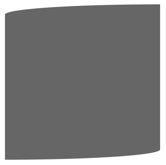
这种技术是特别有用,当你需要模拟一个平缓的,冗长的曲线,而不是一个通用的圆角。例如,下面的代码允许我们稍微变形一个正方形形状,模拟出更多卷纸一样的效果。
.box {
    width: 200px; height: 200px;
    background: #666;

    border-top-left-radius: 15em 1em;
    border-bottom-right-radius: 15em 1em;

}
CSS形状
也许最干脆的是直接使用边界,给宽和高为零的元素巧妙的应用边界。令人困惑,是吗?让我们看看一个演示。
在接下来的几个例子,假设以下标记……
<div class="box"></div>
……和基本样式如下:
.box {
   width: 200px;
   height: 200px;
   background: black;
}
最常用的例子是如何使用CSS形状创建一个箭头。
关键是了解如何用CSS生成箭头,通过为每个边设置不同的颜色,并且将容器的宽和高都减为零。
假设一个有arrow类的div作为容器:
.arrow {
  width: 0; height: 0;

  border-top: 100px solid red;
  border-right: 100px solid green;
  border-bottom: 100px solid blue;
  border-left: 100px solid yellow;
}
在本章的开始,更清洁的语法是不使用复合语法:
.arrow {
  width: 0; height: 0;

  border: 100px solid;
  border-top-color: red;
  border-right-color: green;
  border-bottom-color: blue;
  border-left-color: yellow;
}
我们甚至可以进一步精简,通过合并颜色值。
.arrow {
  width: 0; height: 0;

  border: 100px solid;
  border-color: red green blue yellow;
}
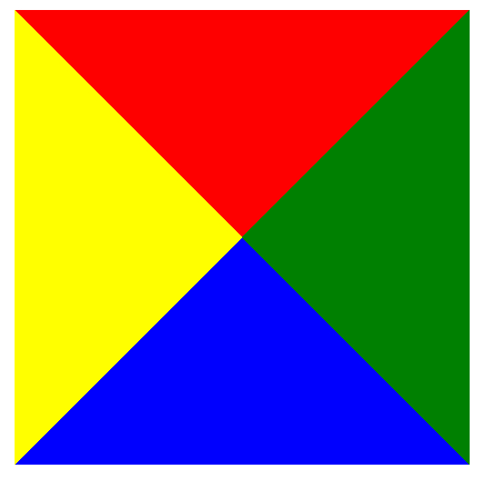
很有趣,不是吗?不过,当我们后退一步时更有趣。现在,如果我们将除了蓝边之外的所有的border-color设置为透明的将会怎样?
.arrow {
  width: 0; height: 0;

  border: 100px solid;
  border-bottom-color: blue;
}
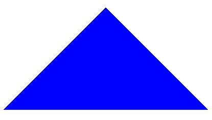
太棒了!但用div创建一个箭头似乎不太符合语义化。然而,通过after或before等相关伪元素可以用来创建箭头。
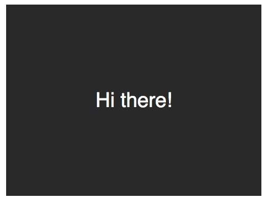
创建一个气泡
创建一个100%CSS的气泡,我们从下面的标记考试。
<div class="speech-bubble">Hi there!</div>
接下来,应用一些基本样式。
.speech-bubble {
    position: relative;
    background-color: #292929;

    width: 200px;
    height: 150px;
    line-height: 150px; /* 垂直居中 */

    color: white;
    text-align: center;
}
箭头将通过after伪元素实现。
.speech-bubble:after {
    content: '';
}
:before和:after伪元素可以用来在元素内容之前或之后插入生成内容。 接下来,只是简单复制箭头,并定位到适当的位置。我们开始通过绝对定位的内容,重置宽度和高度,并应用边界颜色。
.speech-bubble:after {
  content: '';
  position: absolute;

  width: 0;
  height: 0;

  border: 10px solid;
  border-color: red green blue yellow;
}
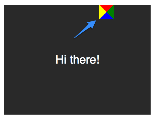
因为我们知道我们想要向下的箭头,上面的图片表明,除了红色(或上)边境其他的都应该被省略,或者设置为透明。
.speech-bubble:after {
  content: '';
  position: absolute;

  width: 0;
  height: 0;

  border: 10px solid;
  border-top-color: red;
}
当创建CSS形状是,因为我们不能使用width属性来指定箭头的宽度,而是应该使用border-width属性。在这种情况下,箭头应该更大点;所以border-width可以增加到15px。我们将箭头定位到容器的底部居中,通过利用top和left属性。
.speech-bubble:after {
  content: '';
  position: absolute;

  width: 0;
  height: 0;

  border: 15px solid;
  border-top-color: red;

  top: 100%;
  left: 50%;
}
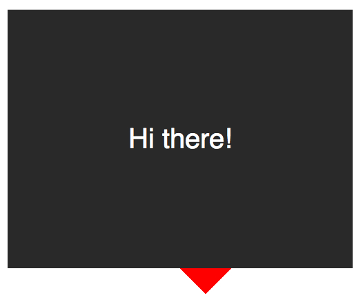
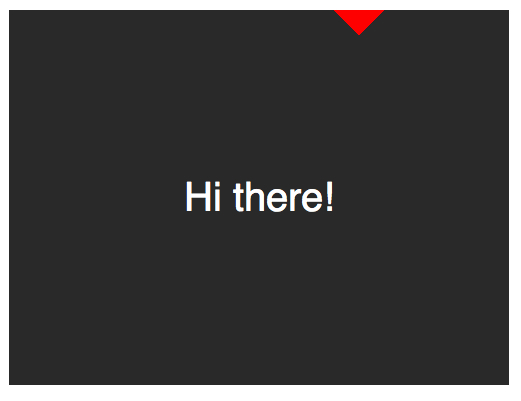
到这里就差不多了;最后一个步骤是更新箭头的颜色和容器的背景颜色相同。定位也需要修改,根据边界的宽度(15 px)。当我们在这里,我们还将应用一个微妙border-radius属性来使容器更像气泡。
.speech-bubble {
   /* … 其他样式 */
   border-radius: 10px;
}

.speech-bubble:after {
  content: '';
  position: absolute;

  width: 0;
  height: 0;

  border: 15px solid;
  border-top-color: #292929;

  top: 100%;
  left: 50%;
  margin-left: -15px; /* 调整边框宽度 */
}
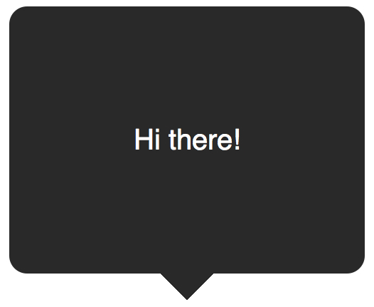
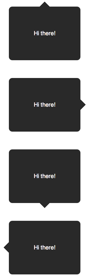
不错,不是吗?将这代码抽象为几个可重用的类,好应用到你将来的项目。
/*
   对话气泡
   用法:使用.speech-bubble和.speech-bubble-DIRECTION类
   <div class="speech-bubble speech-bubble-top">Hi there</div>
*/

.speech-bubble {
  position: relative;
  background-color: #292929;

  width: 200px;
  height: 150px;
  line-height: 150px; /* 垂直居中 */

  color: white;
  text-align: center;
  border-radius: 10px;

  font-family: sans-serif;
}

.speech-bubble:after {
  content: '';
  position: absolute;

  width: 0;
  height: 0;

  border: 15px solid;
}


/* 箭头的位置 */

.speech-bubble-top:after {
  border-bottom-color: #292929;

  left: 50%;
  bottom: 100%;
  margin-left: -15px;
}
.speech-bubble-right:after {
  border-left-color: #292929;

  left: 100%;
  top: 50%;
  margin-top: -15px;
}

.speech-bubble-bottom:after {
  border-top-color: #292929;

  top: 100%;
  left: 50%;
  margin-left: -15px;
}

.speech-bubble-left:after {
  border-right-color: #292929;

  top: 50%;
  right: 100%;
  margin-top: -15px;
}
补充:更好的垂直居中
使用line-height实现垂直居中的一个缺点是仅限于一行。当文本需要两行或两行以上时,每一行的高度将会太大。一个聪明的解决办法是设置气泡的display属性为table,和包装段落文本的display为table-cell。这就允许我们将文本设为垂直居中。
<div class="speech-bubble speech-bubble-top">
    <p>Text goes here.</p>
</div>
接下来,修改CSS。
.speech-bubble {
 /* 其他样式 */

  display: table;
}

.speech-bubble p {
  display: table-cell;
  vertical-align: middle;
}
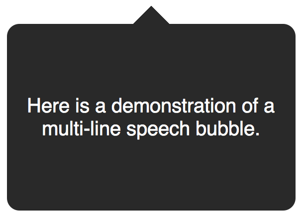
如果引用
display: table带来可怕的表格布局的老式回忆,别担心。这些属性是指显示一个元素的样式。
我们不局限于三角形;CSS能产生各种各样的形状,甚至心和生物危害标志!
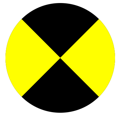
.biohazard {
  width: 0; height: 0;

  border: 60px solid;
  border-radius: 50%;

  border-top-color: black;
  border-bottom-color: black;
  border-left-color: yellow;
  border-right-color: yellow;
}
虽然最简单的border:1px solid black;语法很有帮助,如果我们聪明,我们可以创建各种有益的效果,图标和形状。谁会想到边界可以如此强大?关键是要记住常见的形状或对话框的样式应该只被创建一次,然后抽象出来实用的类为将来使用。
原文网址:http://yanhaijing.com/css/2014/02/22/css-refresher-border/
 关注微信公众号 颜海镜
 赞赏支持 微信扫一扫
Recommend
About Joyk
Aggregate valuable and interesting links.
Joyk means Joy of geeK