

Adding Narrative to a Covid Dashboard
source link: https://ehudreiter.com/2020/05/21/adding-narrative-to-a-covid-dashboard/
Go to the source link to view the article. You can view the picture content, updated content and better typesetting reading experience. If the link is broken, please click the button below to view the snapshot at that time.
Ehud Reiter's Blog
Ehud's thoughts and observations about Natural Language Generation
Years ago, I wrote a blog on Text or Graphics, which discussed whether data was best presented to users in words or visualisations. I concluded then that it was best to use a combination of both, in part because this provides support for different users (eg, visual thinkers vs verbal thinkers) and different tasks (eg, high-level summary vs detailed analysis), and also because some information (like geographic location) is best communicated in visualisations, while other information (such as data quality caveats) are best communicated in words.
I think a really nice example of this is the Covid-19 report/dashboard (click on the blue COVID-19 DASHBOARDS button to see the report) from Tibco, a leading analytics company, which includes some NLG narratives (produced by Arria). The result shows how NLG can “add value” to complex visualisations, by summarising and highlighting key facts, making information accessible to non-visual thinkers, etc.
Examples
The report is quite long, so I’ll just show a few examples here. It starts with a “Global Status Check” which includes a summary text produced by Arria (focusing on the two countries with highest number of cases), a map showing new cases by country, and a table showing details of the 10 countries with the most cases. I think the combination works really well – the text gives a few key facts in an overview, and the map and tables provide additional information for people who want this.

NLG text on its own
As of Sunday 17th May 2020, there are at least 4,364,603 confirmed cases of COVID-19 worldwide. So far, 283,911 deaths have been recorded as a result of the virus. The number of cases reported in the United States is increasing to a rate of 0.01%, while Russia is starting to slow down, having a rate of -0.08%, compared to its average rate of -0.07% over the previous week
A second example is the “Growth Trajectories” section, where an NLG text describes countries with the highest and lowest growth, with an accompanying graph which gives details of growth over time in a number of countries. In this case the graph is a great presentation and resource for people who love numbers, but it is daunting and indeed perhaps scary to non-visual thinkers, especially those who struggle to understand graphs. I think the NLG texts works much better for such people.
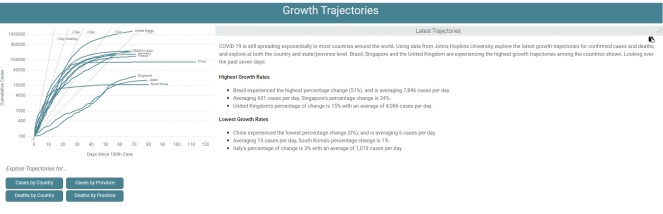
COVID-19 is still spreading exponentially in most countries around the world. Using data from Johns Hopkins University, explore the latest growth trajectories for confirmed cases and deaths, and explore at both the country and state/province level. Brazil, Singapore and the United Kingdom are experiencing the highest growth trajectories among the countries shown. Looking over the past seven days:
Highest Growth Rates
-
- Brazil experienced the highest percentage change (51%), and is averaging 7,846 cases per day.
- Averaging 651 cases per day, Singapore’s percentage change is 24%.
- United Kingdom’s percentage of change is 15% with an average of 4,086 cases per day.
Lowest Growth Rates
-
- China experienced the lowest percentage change (0%), and is averaging 6 cases per day.
- Averaging 15 cases per day, South Korea’s percentage change is 1%.
- Italy’s percentage of change is 3% with an average of 1,019 cases per day.
Another nice feature of the dashboard is that it is interactive, and users can zoom in on information they are interested in, and get both visual and graphical presentations of this data. Of course interactivity is common in visualisations, its really nice to see how it is used in this dashboard for textual presentations.
Final thoughts
I think the Tibco Covid dashboard is a great example of how to combine visualisations and narratives in order to make information accessible to all kinds of different people who are doing very different things. Most current dashboards (as of May 2020) just present visualisations, but hopefully we’ll see increasing numbers of dashboards in the future which also include narrative summaries produced by NLG systems!
Recommend
About Joyk
Aggregate valuable and interesting links.
Joyk means Joy of geeK