

深入理解linear-gradient
source link: https://xieyufei.com/2020/07/10/Line-Gradient.html
Go to the source link to view the article. You can view the picture content, updated content and better typesetting reading experience. If the link is broken, please click the button below to view the snapshot at that time.
linear-gradient是CSS3的一个新特性;在以前实现渐变、阴影等一些酷炫效果都是通过图片来实现的,但是通过linear-gradient我们可以实现同样丰富多样的效果。
定义及语法
linear-gradient()称为线性过渡函数,用于创建一个线性渐变的图像。为了创建一个线性渐变,我们需要最少传入三个元素:渐变方向、起始点颜色和终止点颜色(可以有多个终止点);因此,它的语法也是传入多个节点的颜色即可:
background: linear-gradient(direction, color-stop1, color-stop2, …);
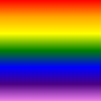
direction表示渐变的一个方向,color-stop表示渐变方向上不同的节点;我们尝试构建一个彩虹色渐变的div:
1
2
3
4
5
.box{
  width: 200px;
  height: 200px;
  background: linear-gradient(to bottom,red,orange,yellow,green,blue,indigo,violet);
}
我们定义了渐变方向上红橙黄绿青蓝紫七个节点,节点会在div上自动排列分布,节点中间的渐变部分则由浏览器自动计算绘制,因此一个彩虹div就出来了:
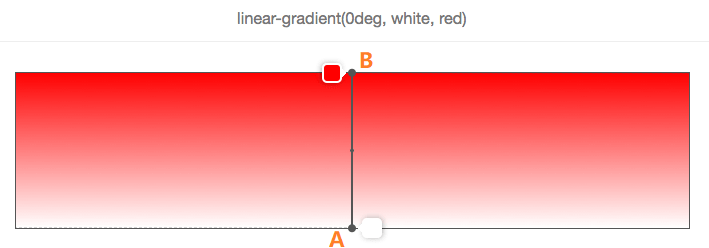
在渐变容器中,穿过容器中心点和颜色停止点连接在一起的线称为渐变线.
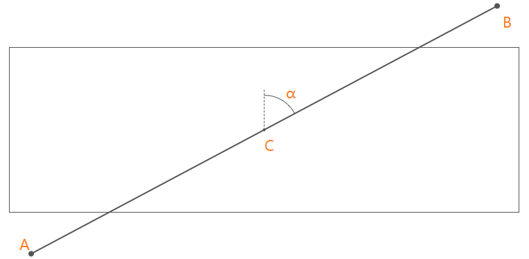
这里的渐变线从A到B,穿过容器的中心点C;渐变线AB与容器的垂直线形成的夹角α,称为渐变角度。
在上面语法中的direction就是用来控制渐变线的方向,它可以接收两种类型的值:
- 方向关键词:
to top、to bottom、to left、to right、to top right、to top left、to bottom right和to bottom left - 使用带单位的数字定义渐变角度:例如
45deg、1turn等(turn表示圈,1turn=360deg)
如果省略角度值的设置,默认direction就是to bottom,它转换成角度单位就是180deg或者0.5turn。
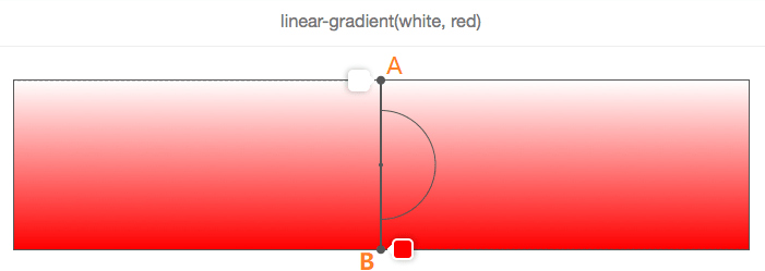
在上图中,没有设置direction,white至red渐变色是从上至下,它和使用to bottom方向关键词得到的效果是一致的。
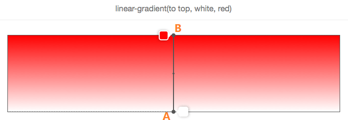
另外,使用to top和0deg的效果也是一样的:
除了left、right、top和bottom,另外四个使用了顶角关键词,比如:to top right,表示从容器的一个顶角到它的对角,因此他们的角度依赖于容器的尺寸大小。
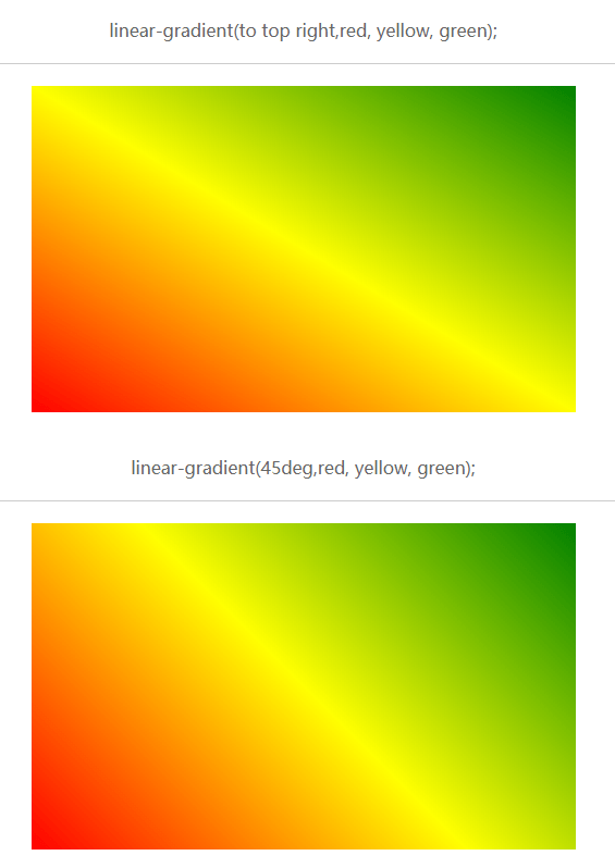
可以看出来,如果容器是一个长方形,to top right角度就不为45deg。
在上面demo中多个渐变节点都是浏览器自己均匀分布后计算出来的,我们可以在颜色后面显示的定义颜色在渐变色的位置;每个位置可以用百分比表示,也可以用CSS长度单位(px)来表示。
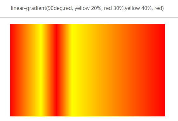
我们给每个颜色定义了自己的位置,以百分比为单位,这些单位都是以渐变线的开始位置进行计算的。
如果我们将两个渐变节点的位置重合,那么会发生什么呢?
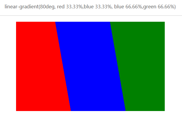
我们惊奇的发现之前的渐变色没了,而是分割成了不同的色块;同时我们发现两边的色块呈现梯形;在面试完50个人后我写下这篇总结中,我们通过border属性来画了三角形和梯形,因此我们可以通过linear-gradient很方便的就能画出来,这里不再演示。
linear-gradient还有一些丰富的效果
进度条效果
这样的进度条效果我们在浏览网页的时候经常会看到,很多都是通过图片或者animate实现的,我们可以通过linear-gradient实现简单的静态效果。

1
2
3
4
5
6
7
8
9
10
11
12
.box1 {
  width: 600px;
  height: 20px;
  margin: 20px;
  border-radius: 4px;
  background: linear-gradient(45deg,
  #5BC0DF 0%, #5BC0DF 10%, #76CAE3 10%, #76CAE3 20%,
  #5BC0DF 20%, #5BC0DF 30%, #76CAE3 30%, #76CAE3 40%,
  #5BC0DF 40%, #5BC0DF 50%, #76CAE3 50%, #76CAE3 60%,
  #5BC0DF 60%, #5BC0DF 70%, #76CAE3 70%, #76CAE3 80%,
  #5BC0DF 80%, #5BC0DF 90%, #76CAE3 90%, #76CAE3 100%);
}
通过渐变节点前后相连接,这样一个卡通风格的进度条就完成了。
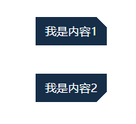
缺角按钮偶尔也会看到,它的实现其实很简单,将拼接部分的颜色设置为透明即可:
1
2
3
4
5
6
7
8
9
10
11
12
13
14
15
16
17
18
.box1 {
  width: 100px;
  height: 40px;
  line-height: 40px;
  margin: 40px auto;
  background: linear-gradient(-135deg, transparent 10px, #162e48 10px);
  text-align: center;
  color: #fff;
}
.box2{
  width: 100px;
  height: 40px;
  line-height: 40px;
  margin: 40px auto;
  background: linear-gradient(-45deg, transparent 10px, #162e48 10px);
  text-align: center;
  color: #fff;
}
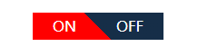
开关效果也是很多jQuery组件经常用的
1
2
3
4
5
6
7
8
9
10
11
12
13
14
15
16
17
18
19
20
<style>
  .switch_box {
    display: flex;
    justify-content: space-around;
    color: #fff;
    width: 144px;
    height: 30px;
    line-height: 30px;
    background: linear-gradient(45deg, #162e48 50%, #f00 50%);
    margin: 50px;
  }

.switch_box.active {
    background: linear-gradient(45deg, #f00 50%, #162e48 50%);
  }
</style>
<div class="switch_box active">
  <div>ON</div>
  <div>OFF</div>
</div>

Recommend
About Joyk
Aggregate valuable and interesting links.
Joyk means Joy of geeK