

Grow your design career as an individual contributor, part 3
source link: https://medium.com/facebook-design/grow-your-design-career-as-an-individual-contributor-part-3-4cbbe6f0a492
Go to the source link to view the article. You can view the picture content, updated content and better typesetting reading experience. If the link is broken, please click the button below to view the snapshot at that time.
Grow your design career as an individual contributor, part 3
Career growth might not be linear. If it isn’t, what other shape can it take?
When we think about growth, we usually think of it as a linear process, like Silicon Valley’s favorite hockey stick curve — upwards and to the right, exponentially increasing. We get better and better at what we do, accumulate more and more skills and experience, and then level up.
Thinking in this way focuses on “getting ahead” and “leveling up,” and we end up feeling dissatisfied if we’re not tracking on this upward trajectory. It’s also a fundamentally competitive mindset: grow faster than others or get left behind. But, it’s not always useful — or healthy — to think like this.
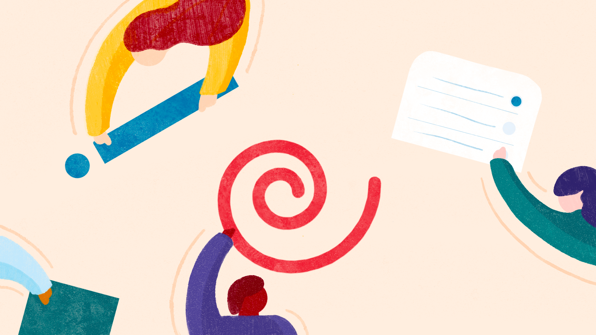
When I look back on the arc of my career, my growth has been more like a spiral. Much like the design process itself, my growth has been iterative with widening circles of complexity, scope and impact. We’re all just iterating ourselves — spiraling out to better and better versions of ourselves. But, how?
Beginning
When we all began designing, we probably started with what are essentially graphic design problems: the arrangement of visual forms within a two-dimensional space. Even the relatively simple exercise of arranging a couple of shapes is surprisingly complex. Shapes exert visual forces on each other, and we have to resolve tensions and find balance, harmony and simplicity in the arrangement. Certain combinations may strike us as more cohesive as we iterate, and these combinations may become patterns we recognize as effective for solving the specific design problem.
For example, an icon and text are usually arranged from left-to-right with the flow of text. And, after playing with the design of the icon and the typeface, we might end up with a lockup that makes us happy. Once we get a lockup we like, we group it as a single entity and treat it as an element in a larger composition.

In arranging these two larger elements, the same issues of resolving tensions, finding balance and iterating towards simplicity arise again, but, because each element is a bit more visually complex and the interaction is bit richer, it may take more skill or a higher order of pattern recognition to arrive at a harmonious arrangement.
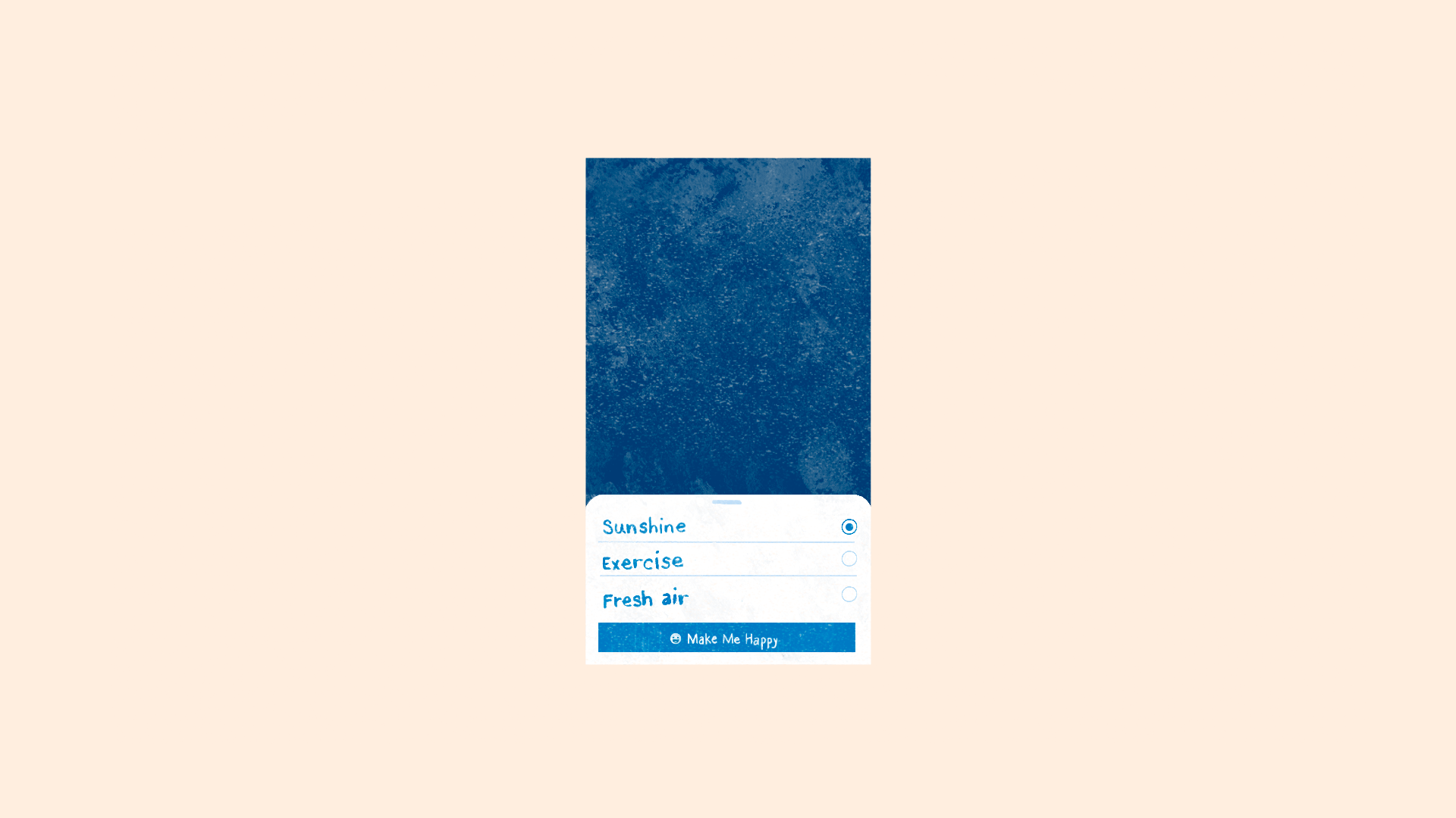
Not to over simplify the work of beginning designers, but what we essentially expect is this: arrange the user interface components onto a single surface in a way that makes sense to people, solves a particular functional purpose and is visually pleasing. The units of operation for a beginning designer are user interface components: buttons, controls, type, icons, etc., and what we expect as a result is a small feature like a “make me happy” bottom sheet.
Spiraling out
Once we’ve mastered designing for a single surface, that single surface becomes an element in a larger composition — perhaps an entire screen in a product.
Then, that entire screen can be part of something much bigger, like a complex flow, feature or product. This is what we ask of mid-level designers. The units of operation for a more experienced designer may be entire screens, and what we expect them to compose is an entire “make me happy” flow, feature or product. The patterns we ask them to recognize are no longer arrangements of an icon and text, or an action applied to a single screen, but the flow and interaction patterns that make up a whole feature or product.
Those same skills we used as a beginning designer of creating balance and simplicity, reconciling tensions, and so on, also apply for designing a complete flow, feature or product. Is the functionality balanced across the screens so there isn’t too much activity on one screen versus another? Are the tensions in the product, such as finding the right tradeoff between clarity and brevity, resolved? Is the flow as simple as possible so that people navigating the screens can do what they want and need to do?
If we fast-forward a few years, we might find ourselves in a place where our units of operation are entire apps, and the composition we’re creating is a company strategy that spans the multiple apps. But again, the ability to answer the same questions apply: are we balancing the roles of apps across our user base? Are tensions between how the apps are designed or overlap in use cases resolved? Is the strategy as simple as possible? It gets harder each time, the complexity increases, the teams get larger and the stakes get higher, but it’s the same design process each and every time.
This isn’t unique to digital product design
Let’s look at another example from a sister discipline: architecture. As architects, we might start by designing a piece of furniture or a room, which gives us the experience we need to try to tackle an entire house.
And, over time, some architects become urban planners and design entire cities. But the same design principles apply at each level of abstraction: organizing space into a hierarchy of use for people, families and the denizens of a place, finding balance between the spaces, resolving tensions in space usage and circulation, and iterating the forms until we discover the simplest expression.
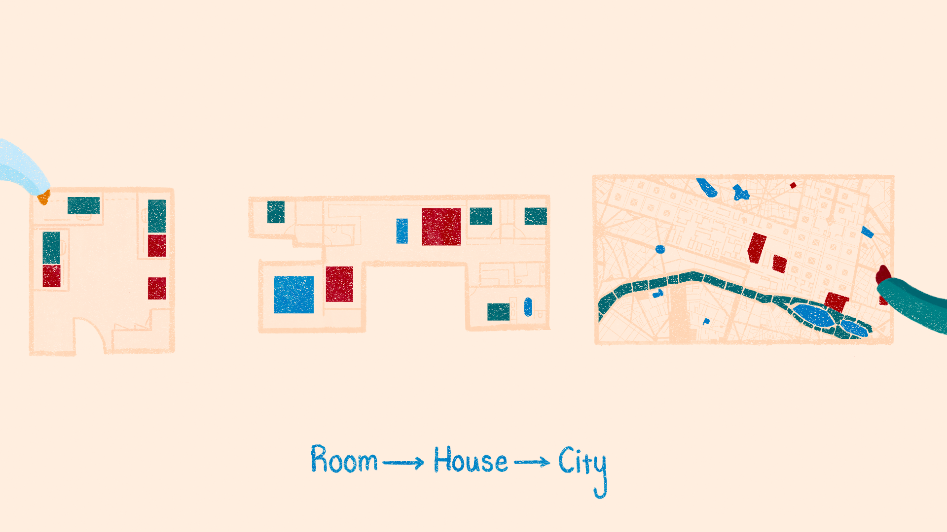
Of course, we want to practice on a room before designing a home, and we want the architect who’s designing our city to have cut her teeth on many rooms and homes first.
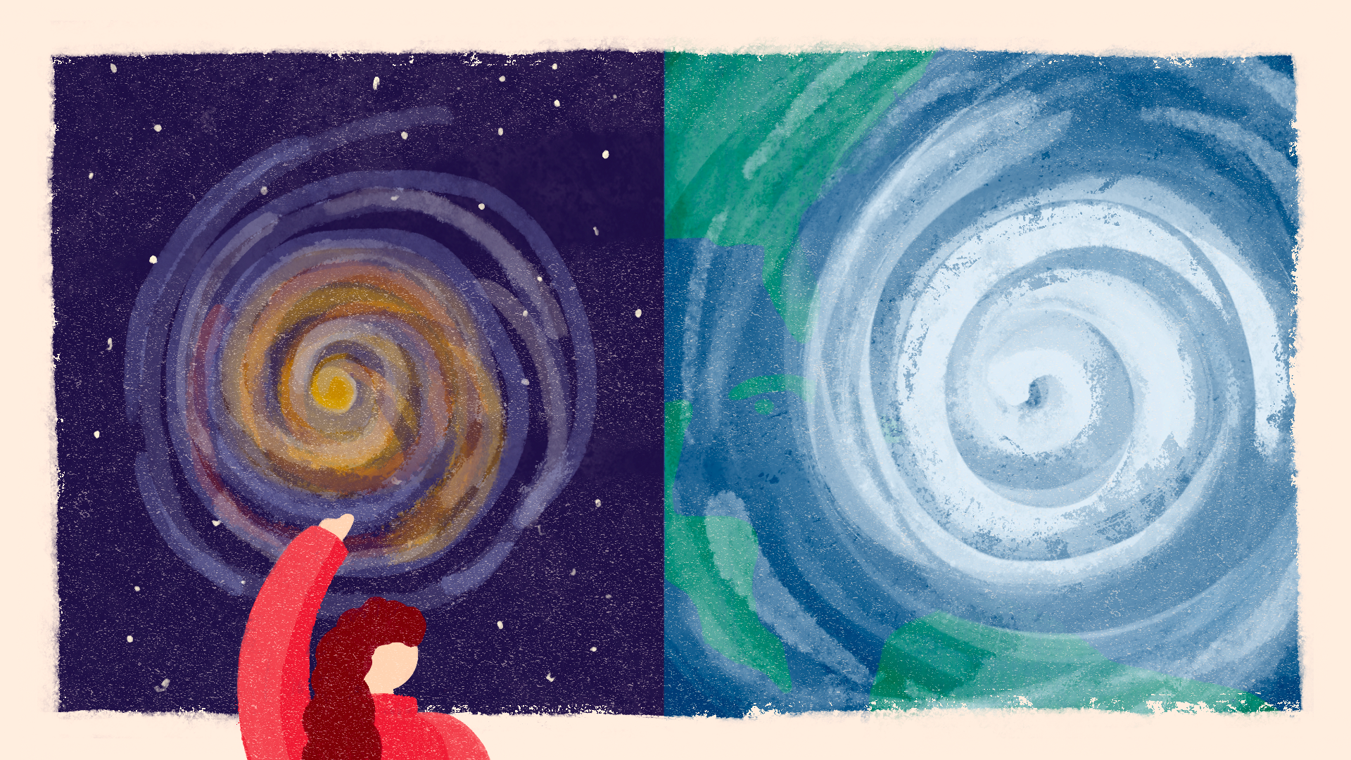
This hierarchical structure borne of the same underlying iterative, recursive design process that applies at each level of scale is a universal process found in architecture, living systems and digital product design.
This is why I like to think of growth as a spiral — we’re doing similar things, iteratively, but with ever-increasing complexity, scale and stakes.
Start spiraling
The spiral is also a more sustainable model because it focuses our growth on going deep instead of simply climbing higher. Focus on the craft of our profession, the core ideas of resolving tensions, finding balance and simplicity. What junior designers are doing today is not materially different from what senior designers are doing, and the craft of today will yield value for the craft of the future. So, we must keep doing what we’re doing and getting better at it by working on larger, more complex things.
And, as it turns out, many things in nature grow this way, so we’ll have the force of the universe behind us.
See this article and others like it at the new Facebook Design website.
Recommend
About Joyk
Aggregate valuable and interesting links.
Joyk means Joy of geeK