

How We Created A Multi-Brand Design System In Figma
source link: https://www.snappautomotive.io/blog/how-we-created-a-multi-brand-design-system-in-figma?ref=sidebar
Go to the source link to view the article. You can view the picture content, updated content and better typesetting reading experience. If the link is broken, please click the button below to view the snapshot at that time.
How We Created A Multi-Brand Design System In Figma
Apr 30, 2024
Casper Kessels
Two years ago, we set out to create SnappOS, a white-label infotainment system aimed at carmakers who don’t have the time or expertise to build their own. We work with carmakers ranging from high-end hypercars to mass-volume micromobility vehicles. All are served by one product.
However, each carmaker we work with has unique branding, features, and hardware setup. Naturally, we don't want SnappOS in a sports car to have the same look as in a city car. That is why we invested a lot of time and effort into creating a theming engine to handle this level of customization. Over the past months, we've been working on a design system that is closely connected to the theming engine and allows us to scale to tens of different brands without branching out. Here's how we did that.
The Theming Engine
Every carmaker we work with is served with the same core product. For each carmaker, it is crucial to go in the shortest amount of time possible from a white-label product to a finished solution adjusted to the screen layout, with custom features, and unique branding.
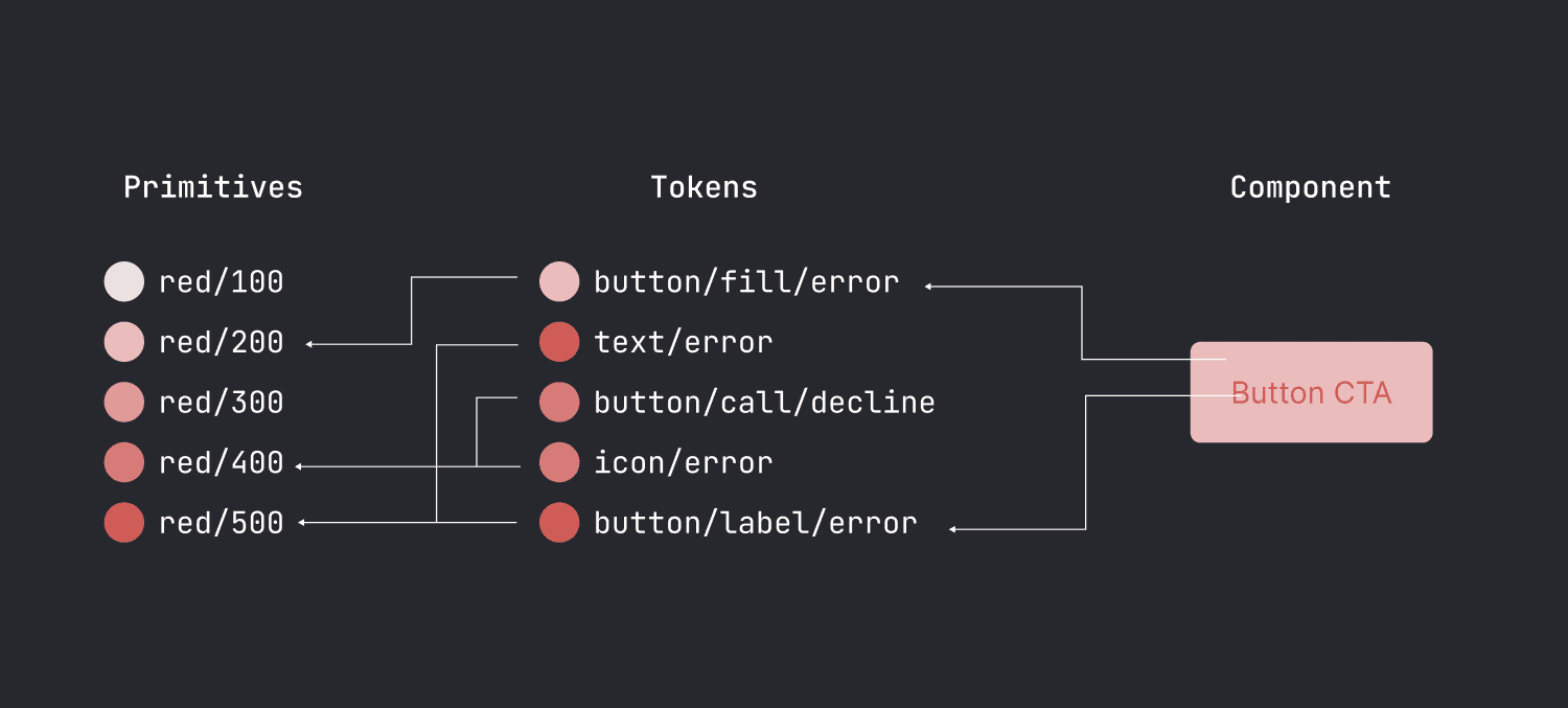
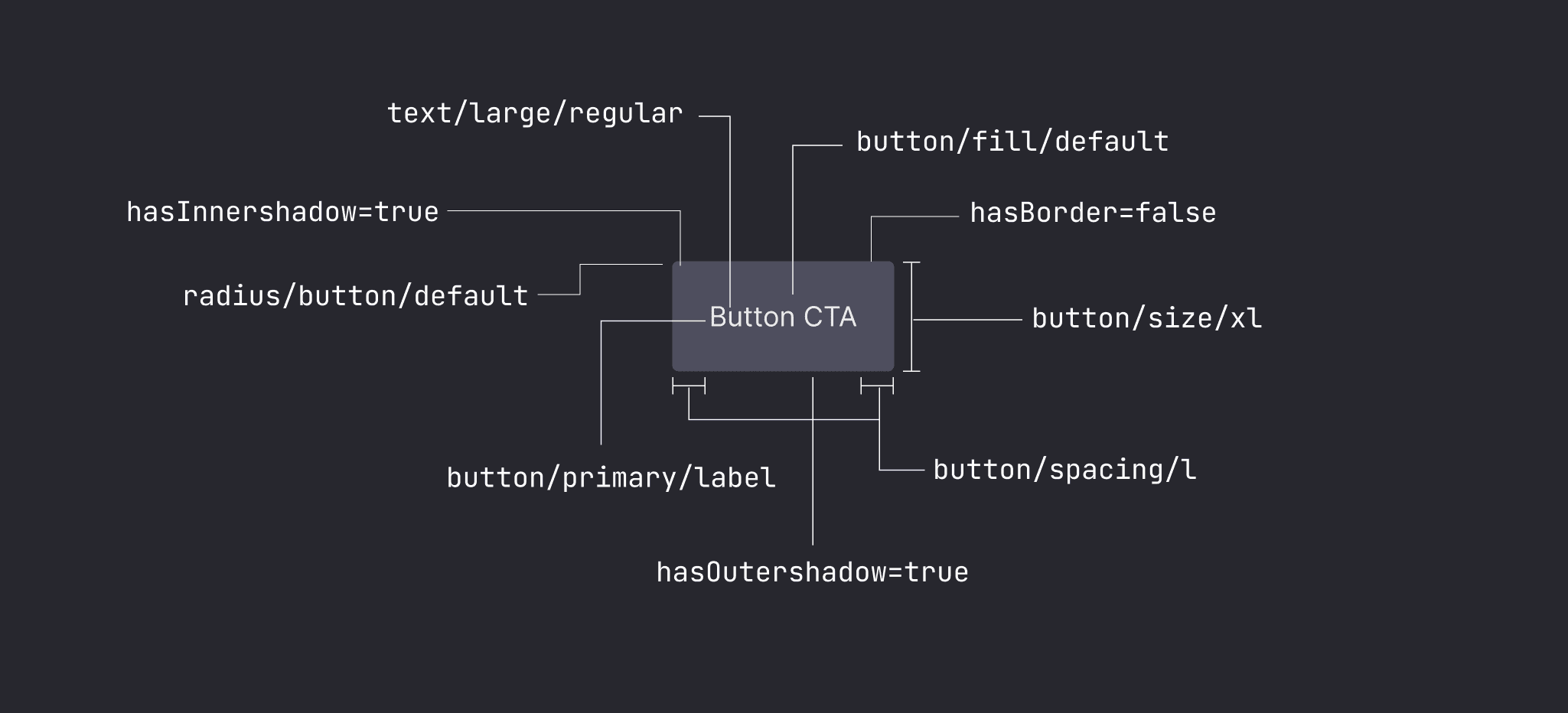
That is why we created our own 'theming engine', a core part of our product that ensures we can create distinct branding for each customer with the same product as the basis. We've written before about how the theming engine works in detail. The core idea behind the theming engine is simple. Anything that is customizable has a token assigned. A token can store any string or integer. Therefore, the tokens include the typical things like colors and fonts, but also icons, radius, spacing, effects, app icons, and operands like booleans. By changing the value of the token, we change the UI theme.
We developed the theming engine at the same time as the product so in the first year of development, there was a lot of trial and error to figure out the capabilities and limitations of the theming engine. That is why, when the first version of the product and theming engine was ready, the Figma library and codebase were not really connected. This made it difficult for designers to understand the capabilities of the theming engine, and very time-consuming for developers to implement the designs. So that is why we decided to create a design system from scratch that is easy to use by both designers and developers, has the same setup and logic of the theming engine, and serves all platforms from in-car to mobile.
The Previous Setup
With our first version, we ran into several problems because we were trying to do something that wasn’t supported by Figma.
In our original setup, we had one global components file with, you guessed it, all the components. Then for each theme, we duplicated a styles file with the colors, icons, and typography. Similarly, we duplicated the product files that included all the pixel-perfect final designs.
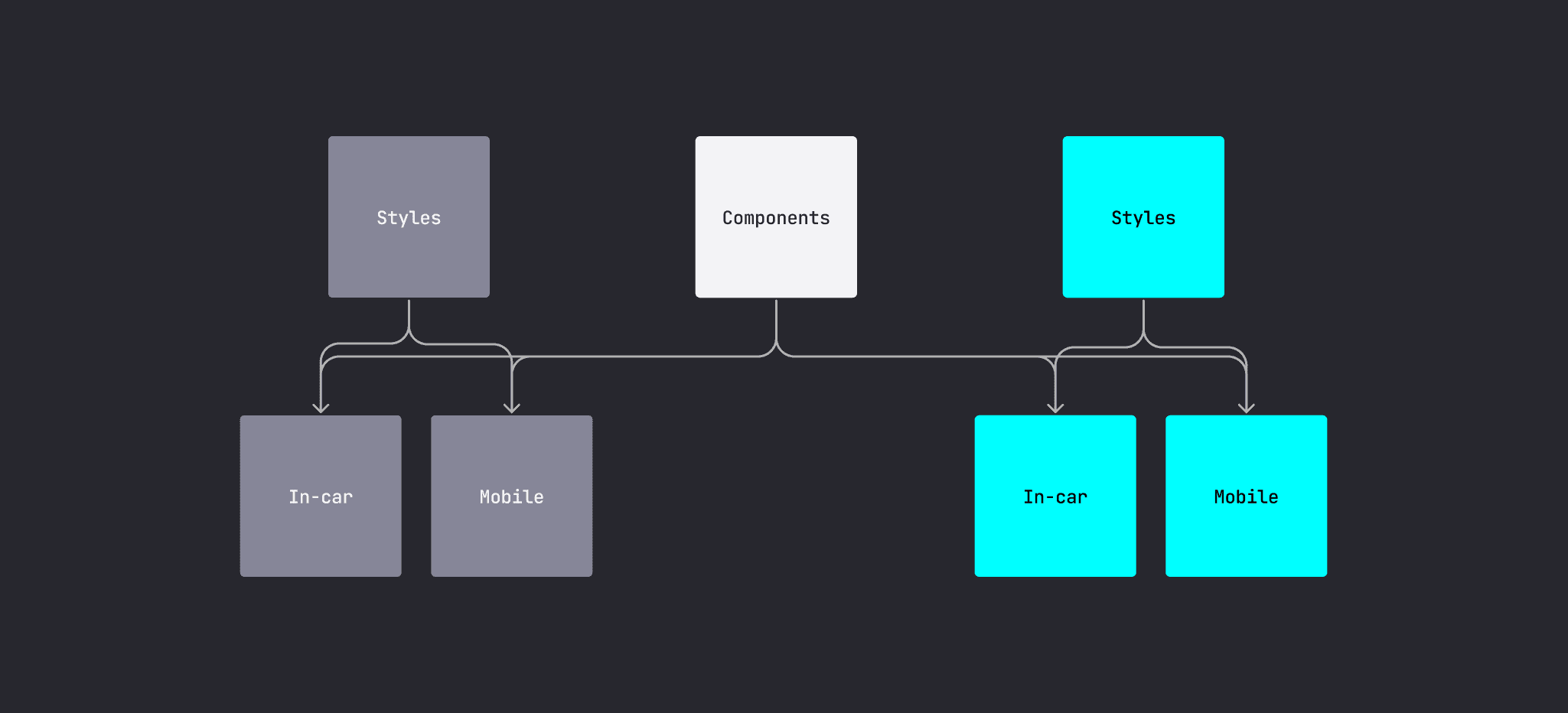
There were several problems with this setup. First, when replacing styles files, nested components don’t update resulting in a lot of manual work and mistakes. Furthermore, there are always some components that are specific to a carmaker, for example, climate controls. These were placed in the product file instead of the global components file but that resulted in components being all over the place. It also meant that there were at least 3 files needed for one theme. Lastly, the theming engine used a different way to declare the different styles compared to the designs in Figma. So it was time for a better setup.
Finding Solutions
Around the time we started, Figma released variables. These work exactly like our theming engine: a set of tokens that define all the customizable items in a theme. So we tried playing around with different setups centered around variables:
The variables allowed potentially for only one components file and one styles file with different modes for each theme. However, typography was not included yet so that would result in a separate typography file for each carmaker. Furthermore, the idea of using one set of primitive color values for all modes wouldn't work as each mode would have to use a different color palette. And with Figma’s pricing, adding a high number of modes would be unsustainable.
We played around with other setups but most had the same problem. When dealing with multiple files with component or styles declarations, it is very easy to end up with broken dependencies or components that aren’t overridden by changing their parent files.
After a couple of weeks of trying different setups, we settled on what is the least worst version, given the constraints of Figma.
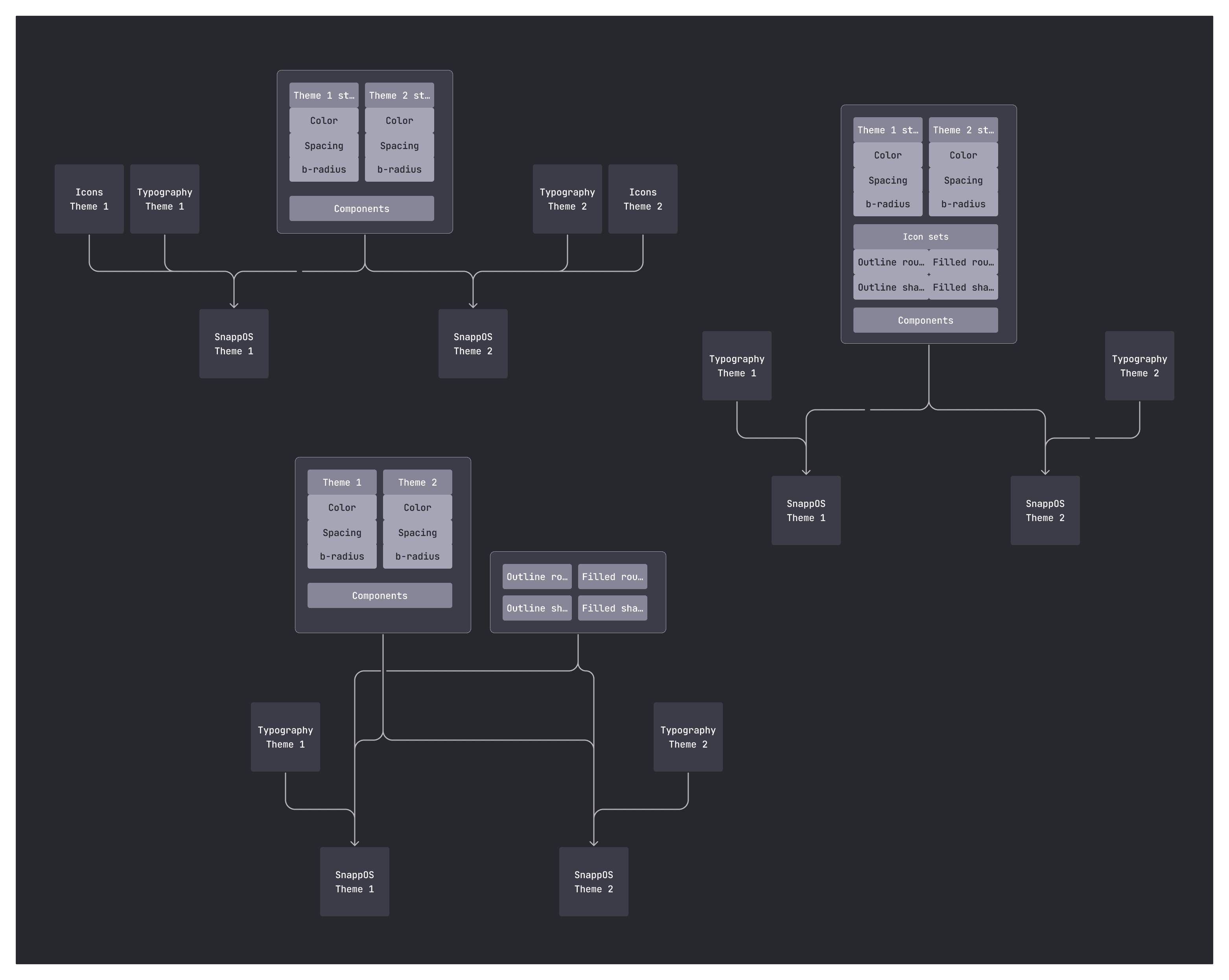
Our Design System Setup
We decided to move everything into one big file. For each customer, we duplicate the file and modify it within a set of constraints. This ensures that there are no broken dependencies and makes it easy to iterate on UI themes. Here is the file setup:
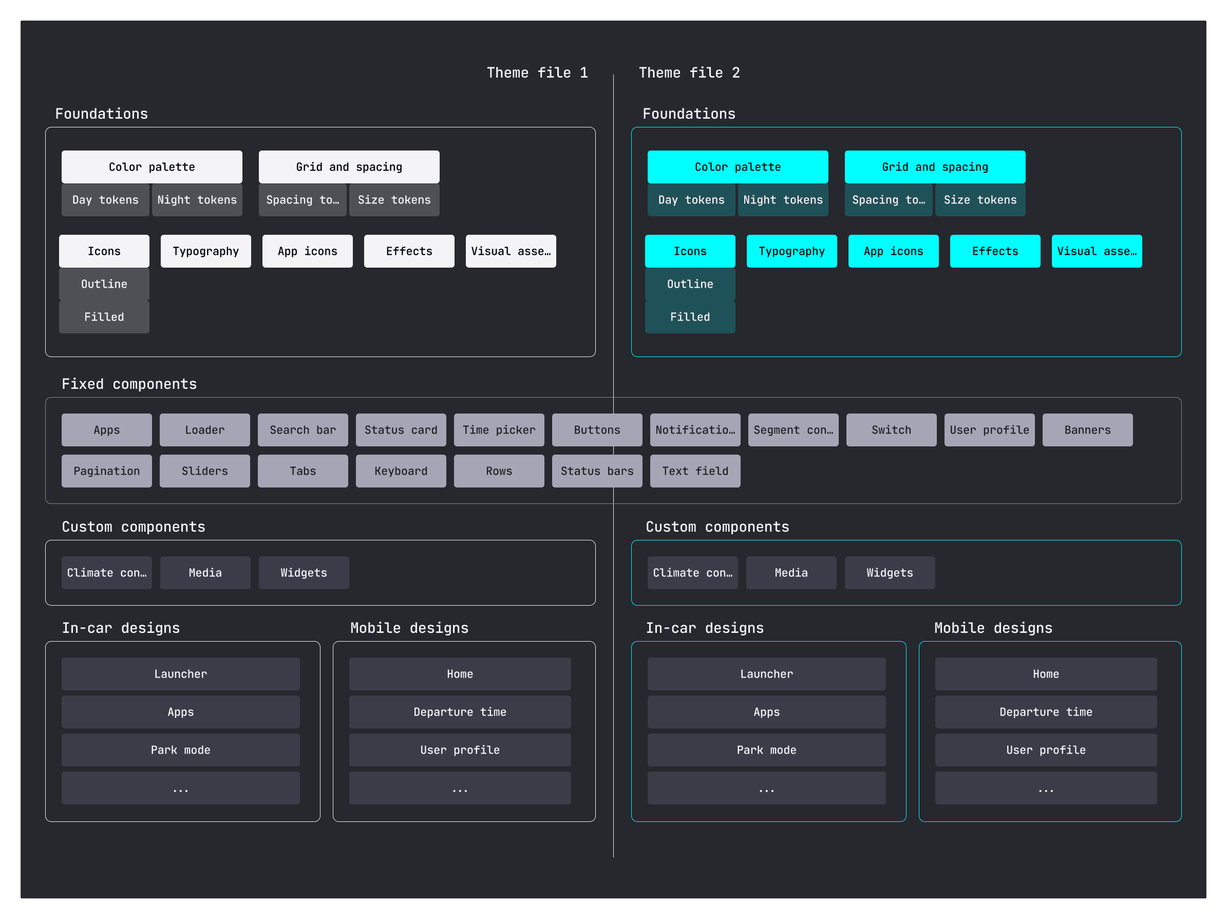
Foundations
The foundations form the core of a UI theme. These are all declared as tokens in the design system. We follow the typical setup of a set of primitive values for the color palette, spacing, and radius values. And from those primitive values, we build up our set of tokens.
The tokens consist of colors, typography, icons, app icons, spacing, radius, effects, and visual assets such as images of vehicles or user profile pictures. We currently have over 200 tokens per theme. Each theme can have a set of modes, for day/night themes, but also, for example, different modes adjusting the theme to the color of the car.
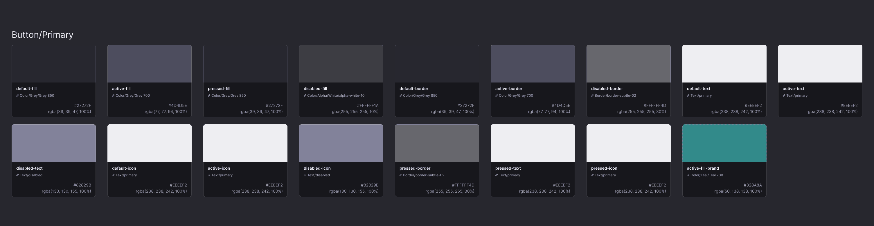
Out theming engine supports more logic than the current implementation of variables in Figma. So we even declare things in the list of variables that aren’t supported in Figma, such as a hasOutershadow boolean that toggles a shadow on components, an animationSpeed value, or a MapboxStyleURL that changes the theme of the map. We document these anyway because the list of tokens in Figma is the source of truth. When we finish a theme, we export the list of tokens with a plugin and with minimal development cost, we have a unique theme!
Fixed Components
The fixed components are the set of global components that are shared between all themes. These can’t be modified for a specific customer. The set of foundational tokens modifies these components for each UI theme. As mentioned earlier, when working with a new carmaker, we duplicate the entire file. We currently have about 20 different groups of components across the in-car and mobile products. So the main drawback is that this set of components must stay identical between all files and this requires manual work. The more customers we work with, the more work it is to keep them up to date between files.
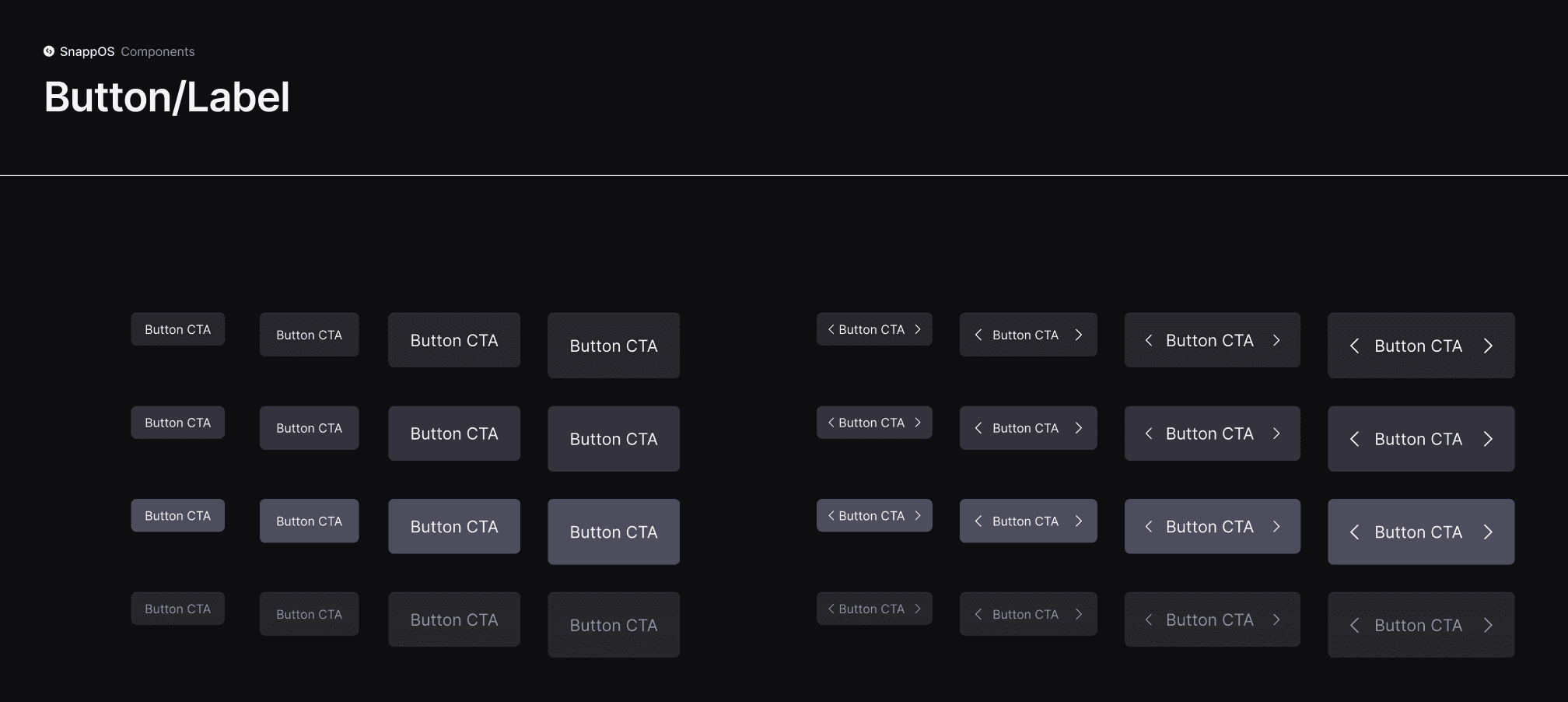
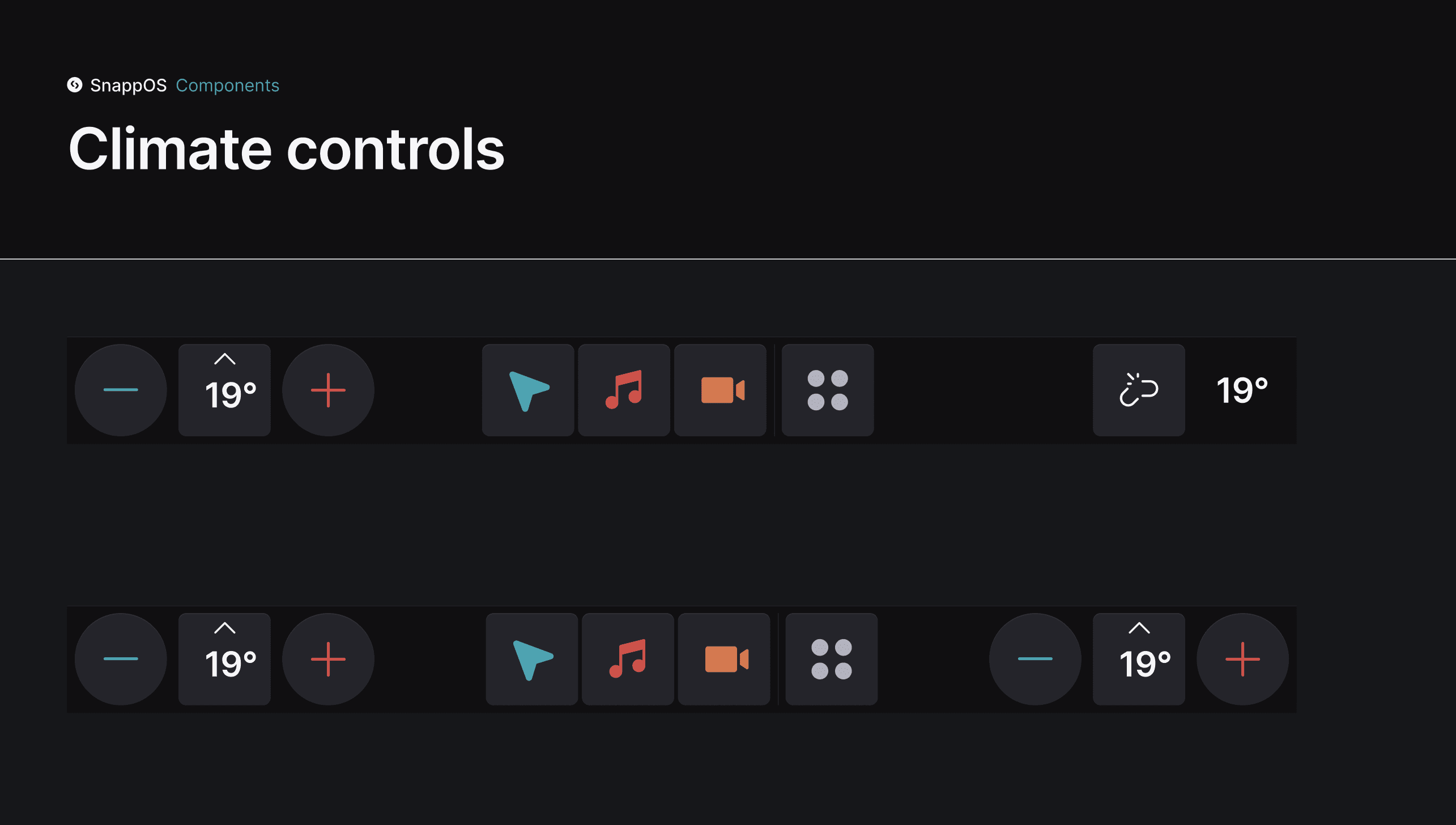
Custom Components
Additionally, we have a set of custom components that are specific to each carmaker. These are adjusted to the particular features of the car we work with. For example, each carmaker will have slightly different climate controls. However, we also include components here that have a large impact on the overall look of the system, such as the media player and widgets. This is to ensure that we can create visually distinct UI themes.
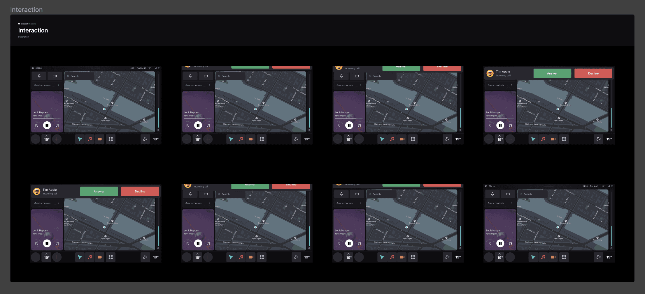
Screens
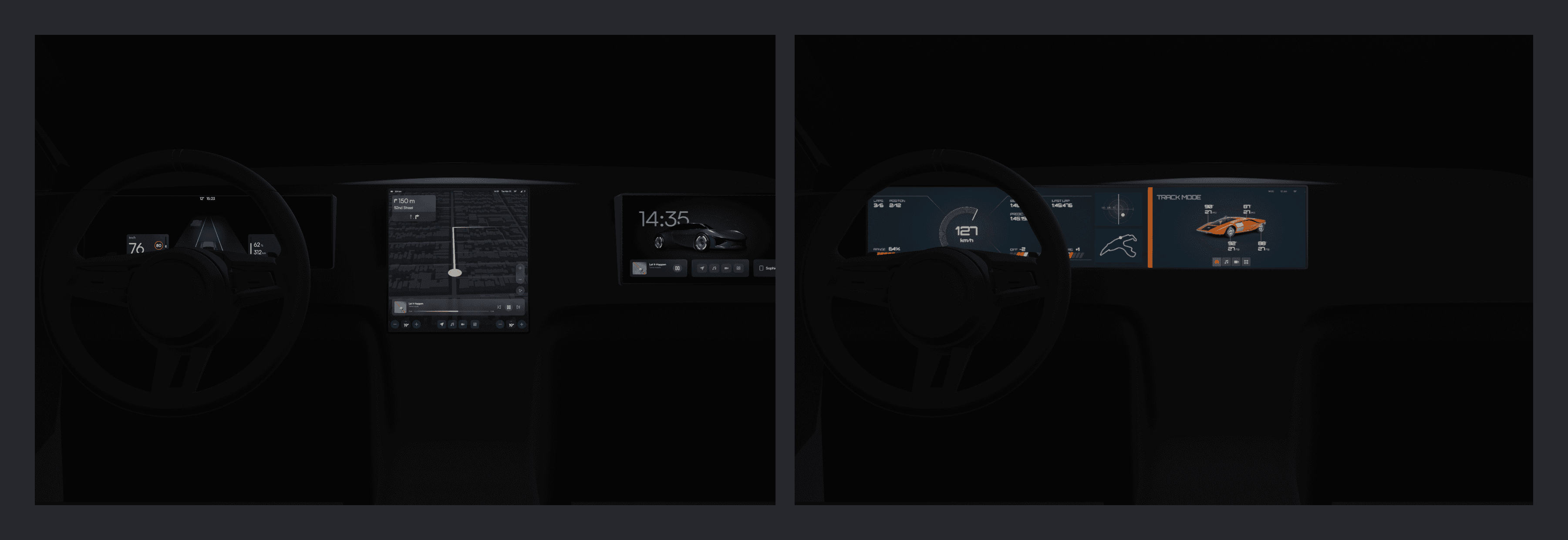
The 'Screens' pages have the final designs for the infotainment system and the mobile app. In these files, we also do the specification of the variants and behavior of the components.
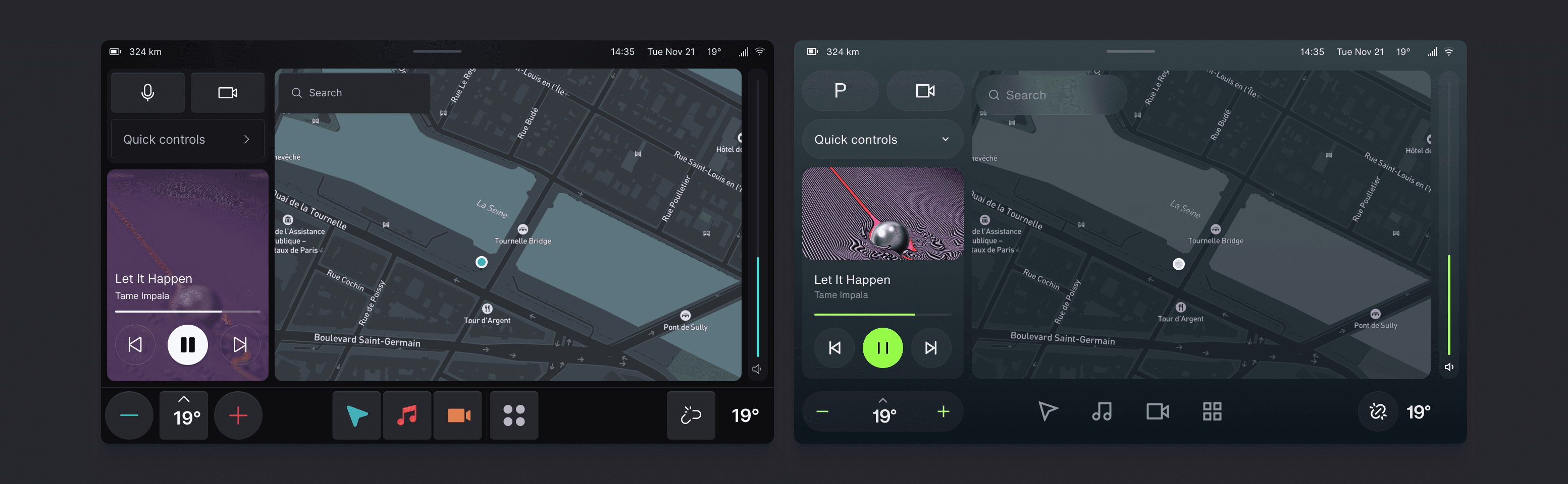
Dealing with Hardware Constraints
Often we are dealing with multiple displays inside an interior. For example, each display has its own color calibration and pixel density. To correct for this, we always design for the base pixel density of 160DPI and adjust the artboard size to scale proportionally with the pixel density. This ensures that the designs in Figma will look identical to the car. Moreover, we have set fixed minimum width and height tokens for all interactive elements to ensure that they are easily clickable while driving. These can be adjusted for each car. If there is a color calibration issue, we can fix this by creating special tokens.
Accessibility
Included in our base file are several accessibility checks. Most important is the text size which scales up proportionally with the pixel density of the screen. For contrast, we ensure that all text and icon elements use text tokens. We have three surface colors so we run checks with the darkest text color on the lightest surface color to ensure that it passes the contrast checks. We also run color blindness simulations and adjust the colors accordingly.
Final Thoughts
The advantage of this setup is that it is one self-contained design system setup. Duplicating the file will not result in broken dependencies. It is also easier to work in a single file for designers and developers, especially going back and forth between customizing the UI tokens and seeing the results.
We are not restricted by the number of tokens so we create as many as we need to design a distinct theme. This gives as much freedom to designers as possible without increasing development cost. Once we finish a UI theme, all we have to do is export the list of tokens with a plugin to our theming engine and that is it!
The big drawback of this setup is the fact that the set of fixed components must be kept up to date between files. So if we are working with five different carmakers and want to update the button component, we will have to go through each file to update the component. Keeping all files in line with each other will be labor intensive. However, since development is the real cost, it is optimal that this work doesn’t fall on developers as it did in other setups.
The whole process from deciding to redo the entire system to the finished setup took about 3-4 months with two designers, and two to four developers. We had plenty of other work ongoing so it was not a full-time effort. We are trying to do something that isn't really supported by Figma but thanks to its flexibility we did end up with a system that works. The result is that we can create a totally bespoke-looking infotainment system and implement it in less than two weeks instead of months.
Recommend
About Joyk
Aggregate valuable and interesting links.
Joyk means Joy of geeK