

Unity in Design – Basic Design Concepts Revisted
source link: https://www.uxpin.com/studio/blog/unity-in-design/
Go to the source link to view the article. You can view the picture content, updated content and better typesetting reading experience. If the link is broken, please click the button below to view the snapshot at that time.
Unity in Design – Basic Design Concepts Revisted

Unity in UI design is the cohesive arrangement of different elements within a user interface to create a visually harmonious and coherent experience for the end user. It involves organizing interface components such as buttons, icons, text, images, and other graphical elements in a way that they appear to belong together and form a unified whole.
This unity plays a crucial role in enhancing usability, aesthetics, and user satisfaction by creating a cohesive and well-integrated interface that communicates the intended message and facilitates user interactions.
In 2024, unity still remains to be an important principle of design. The evolution of design software and tools has given designers more flexibility and capabilities to achieve unity in innovative ways. For example, advanced software features allow for more precise control over layout, typography, and color palette, making it easier to maintain unity across various platforms.
Build a unified user interfaces and keep them so between design and development. UXPin is a prototyping tool that’s committed to making user interfaces unified. Use its functionalities to achieve a sense of unity that’s easy to replicate in code. Try UXPin for free.
Build advanced prototypes
Design better products with States, Variables, Auto Layout and more.

What is unity principle of design ?
The unity principle of design is a fundamental concept in graphic and UI design as well as art. It refers to the idea of creating visual harmony and cohesion within the web design or app design. It involves organizing elements of design in a way that they appear to belong together and form a cohesive whole.
By applying the unity principle of design, designers can get a clear message across while keeping the design is visually appealing and easy to understand.
How does unity in design enhance user experience?

A unified interface enhances the overall user experience by making it easier for users to understand and navigate the interface. When elements are cohesive and consistent, users can more intuitively interact with the interface, leading to a smoother and more enjoyable experience.
Think of a webpage that doesn’t follow unity as the principle of design. Its header probably contains a mixture of different fonts, sizes, and colors for the logo, navigation menu, and contact information. The logo design clashes with the rest of the page. The navigation menu items are scattered randomly, with no consistent spacing or alignment. Text blocks vary in font size, color, and alignment, making it difficult for users to follow the content flow.
The website lacks a cohesive visual identity and appears haphazardly thrown together. It overwhelms users with conflicting visual elements, making it difficult to navigate and engage with the content. Users may feel disoriented and frustrated due to the lack of unity in design, ultimately leading to a negative user experience and high bounce rates.
Now, imagine a web design that that effectively follows the principle of unity. The heading features a clean and elegant logo that reflects the brand’s identity, using a simple and cohesive color scheme. A minimalist navigation menu is prominently displayed, with clear and consistent typography and use of white space.
The website embodies a sense of unity and coherence throughout its design, creating a tranquil and inviting user experience. The consistent use of color, typography, imagery, and layout reinforces the website’s theme and brand identity. Users feel immersed in a harmonious environment, enhancing their engagement and enjoyment of the website.
This kind of unity can be achieved through visual unity and conceptual unity. Let’s differentiate between the two.
Conceptual unity vs visual unity
Conceptual unity and visual unity are two aspects of design that play critical roles in creating cohesive and effective compositions, whether in art, graphic design, product design, or digital interfaces. Understanding the differences between these two types of unity can help designers better execute their projects according to the intended message or function.
Conceptual Unity
Conceptual unity refers to the coherence of the ideas behind a design. It focuses on the underlying theme or narrative that ties all elements of the work together. This type of unity is achieved when all parts of the design support a common message or concept, making the overall purpose of the design clear to the viewer.
Characteristics of Conceptual Unity:
- Theme Consistency: All elements support a central theme or idea.
- Message Cohesion: Every part of the design contributes to a unified message, enhancing the communication of a specific concept or story.
- Emotional or Psychological Impact: The design evokes a consistent emotional response or intellectual engagement from the audience, aligned with the intended concept.
For example, in a marketing campaign, conceptual unity might be achieved through consistent messaging that aligns with the brand’s values across different media and platforms, even if the visual presentation varies.
Visual Unity
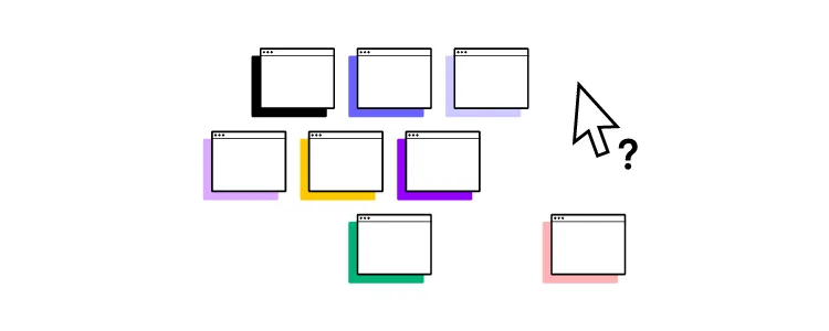
Visual unity, on the other hand, refers to the visual cohesiveness of elements within a design. It involves arranging the visual components in a way that they all feel part of a whole, usually by using consistent colors, shapes, sizes, or repeating patterns. Visual unity is crucial in guiding the viewer’s eye across the design and creating a sense of harmony and balance.
Characteristics of Visual Unity:
- Repetition: Repeating visual elements like colors, shapes, or textures throughout the design.
- Alignment: Arranging elements in a way that lines up along common axes or follows a specific grid structure.
- Proximity: Grouping related items close together to emphasize their relationship.
- Continuation: Creating a visual flow that leads the viewer’s eye through the design in a deliberate path.
Visual unity can be achieved through the consistent use of color schemes, typography, and layout structures across different pages, ensuring the site feels cohesive and navigable.
How to create unified design
Creating a unified design involves a thoughtful process that combines both conceptual and visual elements to produce a cohesive result.
Step 1: Fill out a design brief.
Detail the purpose, goals, and target audience of your design project. Include any specific messages or emotions you want to convey. Then, specify any necessary elements or constraints, such as branding guidelines, budget limits, or timelines. Remember to address potential challenges upfront to streamline the design process.
Step 2: Conduct a design workshop.
Get all relevant stakeholders involved in a design workshop, a dedicated time to brainstorm ideas and ensure that the expectations are aligned. Use the workshop to generate creative ideas and explore different approaches to the design. The workshop should end with a clear, agreed-upon direction for the visual and conceptual development of the project.
Step 3: Establish a visual style.
Decide on colors, typography, imagery, and overall aesthetic that align with the design brief. This style should visually communicate the intended message and appeal to the target audience. Then, create a style guide that will document these choices to maintain consistency throughout the design process.
Step 4: Gather content.
Before designing a mockup, start with content. Content-first design will help you determine how to create visual hierarchy and visual interest on the webpage or app page. It will also help you decide which elements should have more visual weight than others.
Step 5: Create a mockup.
Create detailed mockups of your design, which may include digital sketches or prototypes. Refine these mockups by continuously applying design principles to enhance visual and conceptual unity. For example, use balance and alignment to create a structured, aesthetically pleasing layout, arrange content to guide the viewer’s attention effectively, using contrast to highlight key areas, and more.
Step 6: Get feedback.
Have team members and stakeholders review the mockups, focusing on how well they meet the design brief and convey the intended message. If possible, gather feedback from potential users or members of your target audience to get insights into the effectiveness and appeal of your design.
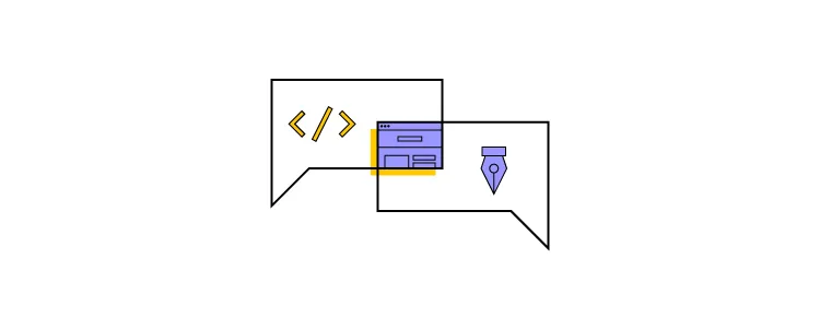
Step 7: Hand the design to development.
Share with devs a prototype that contains specifications such as dimensions, behavior, and interactions. Provide comprehensive documentation to support the developers, including style guides and interaction descriptions. Maintain communication throughout the implementation phase to address any issues that may arise and ensure the design integrity is maintained.
Practice using unity in design
Unity in UI design is about organizing interface elements such as buttons, icons, text, and images in a cohesive manner, ultimately leading to improved usability and user satisfaction.
In 2024, unity remains a vital aspect of design, with advancements in design software providing designers with more tools to achieve it creatively. For instance, advanced features in software like precise layout control and color palette management contribute to maintaining unity across various platforms.
Tools like UXPin facilitate the creation of unified user interfaces by offering functionalities that streamline the design-to-development process. By leveraging such tools, designers can ensure that the unity achieved in design translates seamlessly into the final product. Create user interface designs that have a sense of unity. Try UXPin for free.
Recommend
About Joyk
Aggregate valuable and interesting links.
Joyk means Joy of geeK