

3 simple design tips to improve your Web UI
source link: https://jonhilton.net/design-tips/
Go to the source link to view the article. You can view the picture content, updated content and better typesetting reading experience. If the link is broken, please click the button below to view the snapshot at that time.

3 simple design tips to improve your Web UI
April 11, 2024 · 4 minute read · Tags: aspnet | blazor | design
Does your heart sink when you have to work on the “design” for your web UI?
Mine too!
However, recently I’ve spent a lot of time implementing the UI for a new site (https://bookmagic.ai/).
Along the way, I noticed my instincts for detecting “good” UI vs cluttered/confusing UI had improved considerably.
Here are three top design tips I’ve stumbled upon while building out the UI.
- Let your elements breathe
- Related items should be close to each other (but don’t forget rule 1)
- Contrast is key
Let your elements breathe (padding and spacing)
Ever looked at a page and found it felt “cluttered”.
Chances are there wasn’t enough space, either between elements, or within them.
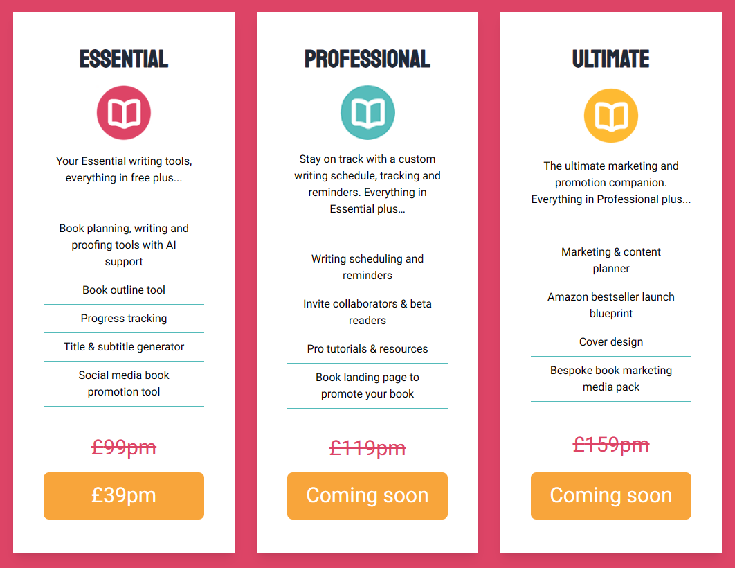
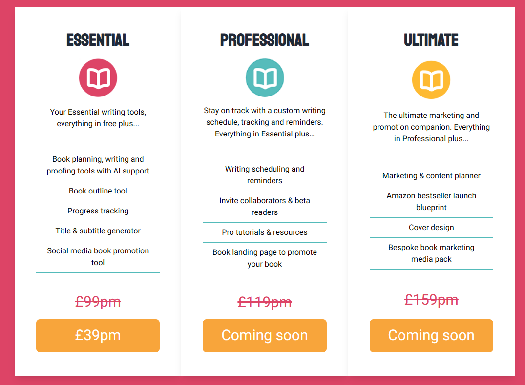
Take this pricing page for example:
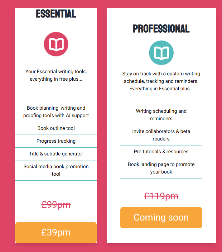
Now here’s the same page but with padding removed from one of the tiers:
The only difference (apart from the specific content) between the two “tiers” is that the one on the right (professional) has horizontal and vertical padding.
The Essential plan on the left has had that padding removed.
That simple change makes the essential tier looking more cluttered/busy.
Notice how there’s also a gap between the two tiers? This use of space is important for how the human brain interprets what it sees.
In design terms there are two types of space: positive and negative.
The positive space here is our elements (the product tiers).
The negative space is the gap between them.
Remove the negative space, and it makes it harder for our brains to figure out what to focus on.
You can see this even more clearly if we remove the padding and the space between elements.
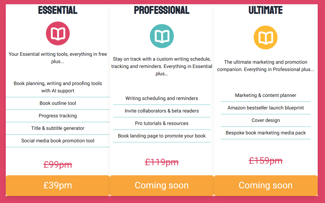
Now we’re left with a confusing jumble!
We’ve stripped away a lot of the negative space, and the result is much less visually appealing, and harder to navigate.
Apply it to your own UI
The key here is to play with both the padding (space within the element) and margins (space around the element).
In both cases you want to create a little breathing room for your elements.
A little negative space helps draw the eye to the actual elements you want users to focus on.
Related items should be close to each other (but don’t forget rule 1!)
Search the web for web design principles and you’ll soon run into proximity.
This is how close your elements are to each other, and what that conveys about the page.
If elements are close to each other we perceive them to be part of the same group.
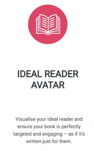
Take this list of features for example:
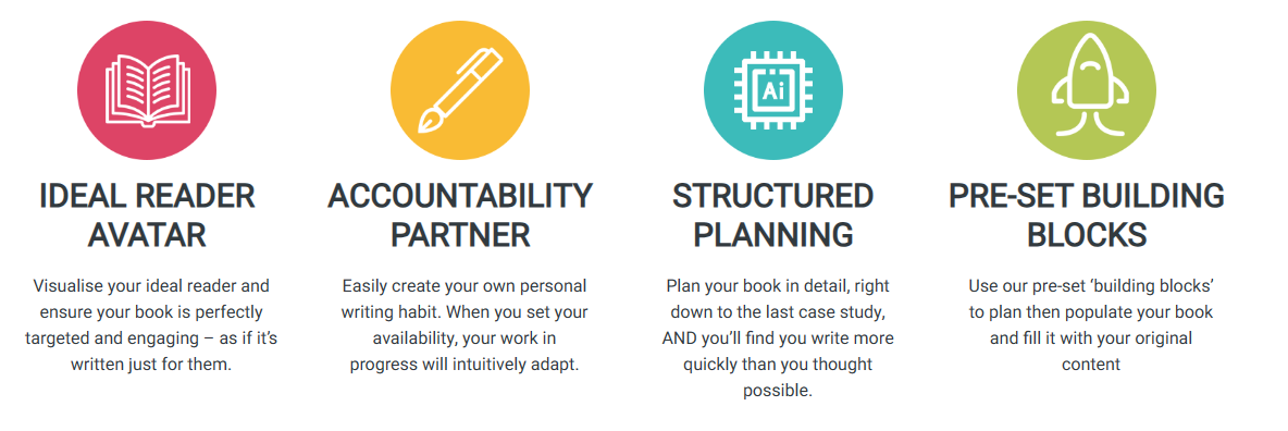
The icon, heading, and paragraph are all fairly close to each other.
This acts as a visual cue that they are all related, and associated.
Now let’s increase the gap between the elements.
The lack of proximity now makes it far less clear how (or indeed if) these elements are related.
But don’t forget the first rule! You need some space between elements, even if they’re related, otherwise you’re back to a cluttered mess.
Apply it to your own projects
Ensure related items are close to each other.
Do this by reducing margins (the space around elements),
Do leave some gaps (negative space), just not so much as to make the elements feel disconnected/unrelated.
Contrast is Key
Finally, contrast helps draw the eye to different parts of the page.
Both the examples we’ve seen have had a clear contrast between the background and foreground.
This helps draw the eye to the foreground elements.
But it also helps visually separate parts of the page.

Here the red background and white text draw your eye to the big headline.
But also the different colours above and below help the eye focus on different parts of the page.
Without this contrast everything would run into everything else.
Essentially everything would feel equal, probably leading to the viewer feeling overwhelmed, and unsure what to focus on.
Apply it to your own UI
Use contrasting colours between background and foreground elements.
Also use colours to create a clear distinction between different parts of your UI (and help the user focus).
In Summary
Design is a big subject, but even some relatively small changes can result in much better UI.
Let your elements breathe, ensure related items are close to each other, and use a little contrast to spruce up your features.
Your users will thank you :)
Join the Practical ASP.NET Newsletter
Ship better Blazor apps, faster. One practical tip every Tuesday.
I respect your email privacy. Unsubscribe with one click.
Next up
The quickest way to integrate PayPal checkout with Blazor SSR in .NET 8Web Development has become a maze
Even building a "simple website" seems daunting in 2024.
Cut through the chaos and build your next .NET web app in record time.
Precise, actionable advice, every week.
I respect your email privacy. Unsubscribe with one click.
</section
Recommend
About Joyk
Aggregate valuable and interesting links.
Joyk means Joy of geeK