

Bottom Tab Bar Navigation Design Best Practices
source link: https://uxplanet.org/bottom-tab-bar-navigation-design-best-practices-48d46a3b0c36
Go to the source link to view the article. You can view the picture content, updated content and better typesetting reading experience. If the link is broken, please click the button below to view the snapshot at that time.
Bottom Tab Bar Navigation Design Best Practices
This article describes the best practices of the bottom tab bar navigation for mobile and tablet devices.
First, learn why the bottom navigation tab bar is important for mobile apps. The next section describes the anatomy of the bottom navigation bar by showing its elements. Several best practices are listed in the next section along with a bunch of visual practical examples. The last section shows a few alternatives to the bottom navigation bar for different use cases using examples of real applications.
Key Takeaways
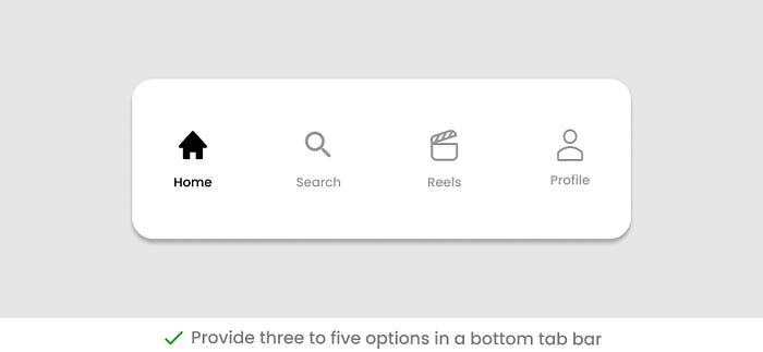
- Use the bottom tab bar when you have three to five main navigation options in your app.
- A bottom tab bar has a fixed layout and scrolling is not a desired behavior.
- Use icons along with text labels as tab titles. Follow standards for icons and labels.
- Use badges to show additional information with a tab.
- Show a standard empty state for tabs where no content is available.
- Use a hamburger menu and a navigation drawer for more than five options.
Bottom Tab Bar
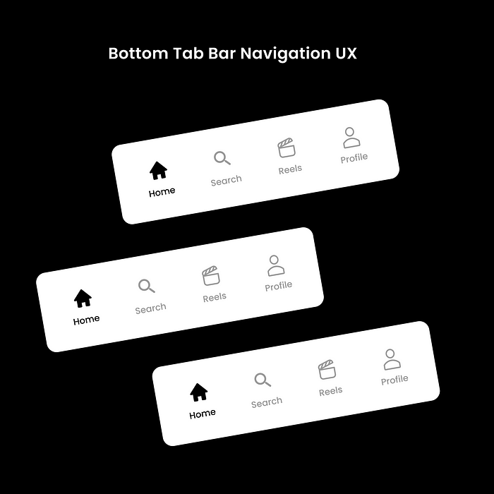
The bottom tab bar is a UI component that facilitates users to navigate the top-level views of an application in a single tap. A bottom tab bar is used in mobile and tablet devices and provides easier navigation to three to five top-level views of the application.
The bottom navigation bar is considered an unusual element for desktop interfaces. It is easy to miss the bottom bar due to the large screen size. This makes it harder for users to view the screen as a whole at first glance. It’s easier to spot bottom navigation on mobile because the screen size is much smaller.
Why Bottom Navigation?
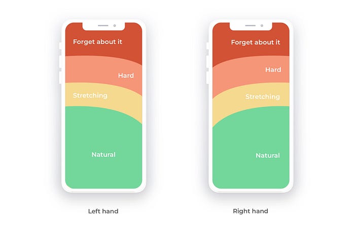
Designing a bottom navigation bar aligns with the rule of designing for the thumb-friendly zone. A bottom navigation bar is easier to reach with the thumb on mobile devices and hence becomes the more user-friendly approach.
Bottom Tab Bar Design Best Practices
The below best practices help you design an attractive and usable bottom tab bar for your application.
- Anatomy
- Layout
- Icons
- Labels
- Label Position
- States
- Badges
- Order of Placement
- Empty State
Anatomy
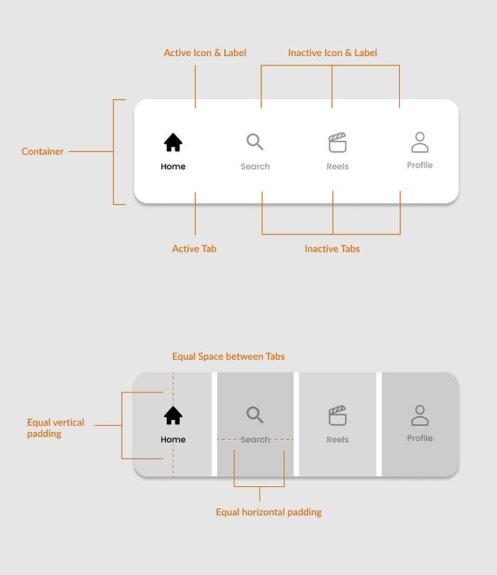
- Container
- Active/inactive tab
- Active/inactive icon and label
- Uniform space between tabs
- Uniform vertical and horizontal padding around tabs
Layout
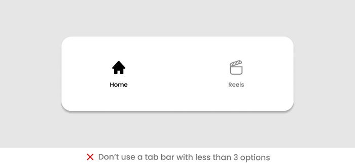
A bottom tab bar contains three to five tabs or options, as per Material Design guidelines. Provide only the top-level views of your application in the bottom tab bar.
Using a tab bar with less than three options is not recommended. Instead, you can use tab control to show these options.
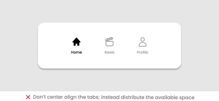
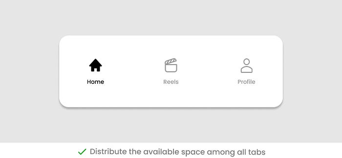
It is important to use the entire available space to display the options whether you display three or five tabs. Distribute the space among all the tabs.
Putting too many tabs in the bar is not a good idea.
- It makes it difficult for users to decide which tab they need to tap.
- More navigation options mean a complex application.
- It decreases the target touch area on a small screen.
- Also, it will give it a cluttered look on a small screen.
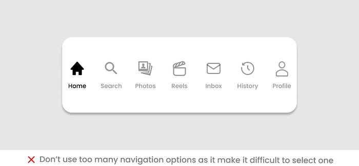
If the top-level navigation of your application has more than five views, provide access to the additional views through other UI locations. If you want more options to remain visible, consider using an alternate option (See the last section of this article).
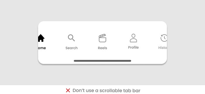
Fixed Layout
The layout of the bottom tab bar is fixed. All the available options are visible in the bar.

It is not recommended to use a scrollable bottom bar due to multiple reasons.
- The users are not expecting to scroll the bottom bar as it is not a standard pattern.
- It causes frustration for users as they need to remember if they have already scrolled the bar, or they may forget the direction to scroll.
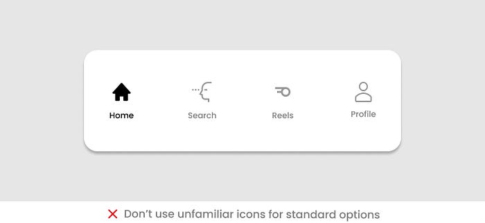
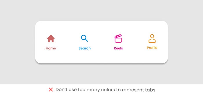
Icons
The tabs in the bottom navigation bar can be labeled as icons or a combination of icons and text.
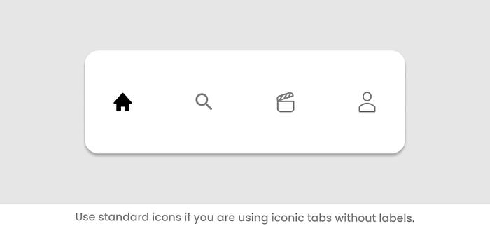
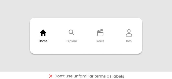
If you are using icons only, then make sure to use standard icons that are easier to recognize. Don’t use unfamiliar icons
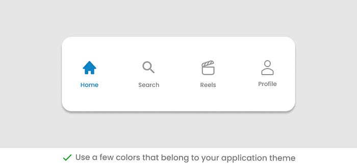
If you are using colored icons, do not use too many colors. Relate the color to the theme of your application.
Labels
For a clear understanding, it is better to use text along with icons.
For textual labels, make sure to:
Use meaningful labels that are related to the content type being displayed in the tab.
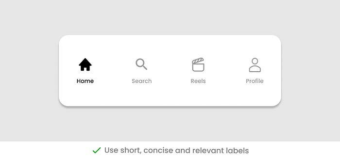
Use short, concise, and relevant labels.
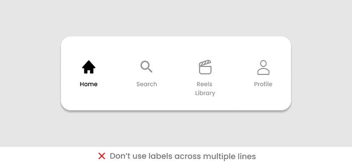
Do not use lengthy labels as small screens do not have enough space.

Do not use labels that can go beyond a single line.
Do not truncate the labels due to the small space available. Instead, use short labels.
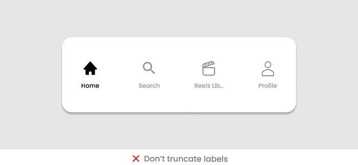
Don’t shrink labels as they look odd on the bar when compared to other labels.

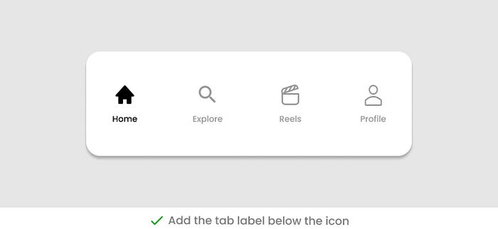
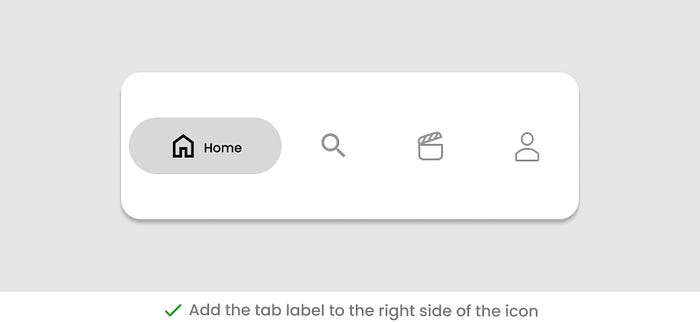
Label Position
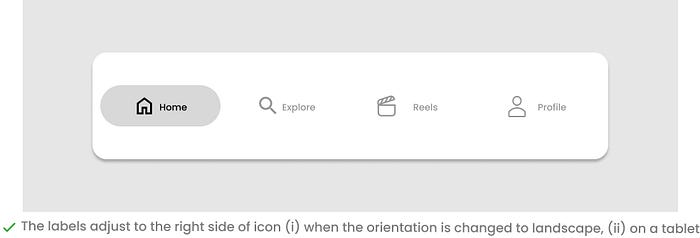
Place labels either below the icon or on the right side of the icon.
When the screen layout is changed to landscape on mobile, or you are using a tablet, then the labels are adjusted adjacent to the icons to utilize the available space. It also helps to spare more space in the vertical direction of the screen.
States
A tab has two states: active and inactive
Use a clear selection style to easily differentiate the active and inactive tabs. Otherwise, users will get confused about the state of the tab while interacting with them.
There are different ways to show active and inactive tabs.
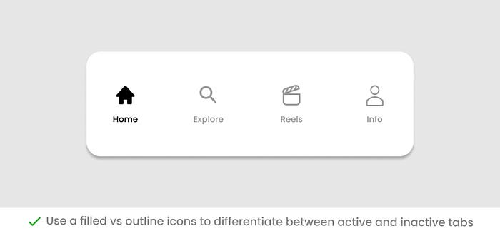
Use a combination of filled and outlined icons. The active tab will display as a filled icon.
Use a background to show the active tab.

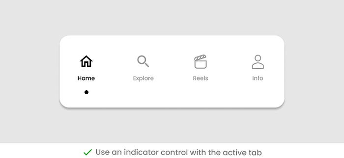
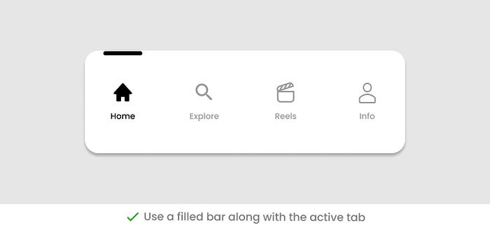
Use a symbol or bar item along with the active tab to make it prominent on the UI.
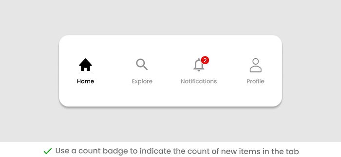
Badges
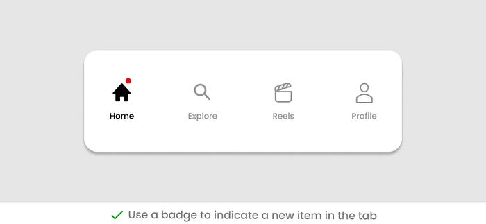
A tab can show additional information in the form of badges.
A badge represents the state of the content inside the tab without opening the tab. It helps to inform the users about any updates in the tab content.
If you are showing items in tabs that are populated in real-time like live posts, lists of emails, etc., use a badge to show the tab contains a new item.
Using a Dot badge can be helpful to show that a tab has a new piece of information.
Also, you can display a counter badge that represents the number of new items within the tab.
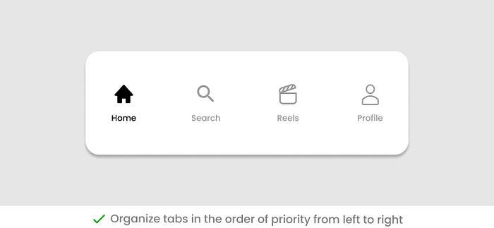
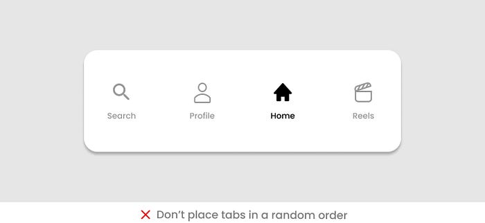
Order of Placement
Organize the bottom tab bar in a logical order that meets the users’ expectations. Place the top priority item on the leftmost side and organize the remaining items following the same rule.
Keep in mind the thumb-friendly zone and place the top priority item where the user is most likely to tap.
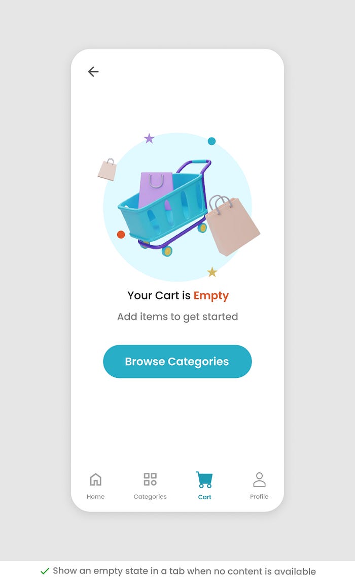
Empty State
There can be a scenario when you don’t have content to display inside a tab. Show an empty state of the tab if there is no content.
Hiding or disabling the tab when no content is available is not a good idea as it will leave users without a clue.
Disabling a tab makes it hard to find why it is disabled and how it can become enabled.
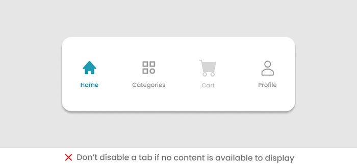
Hiding a tab will confuse users as they need to understand why a tab is hidden and how can it be visible again.
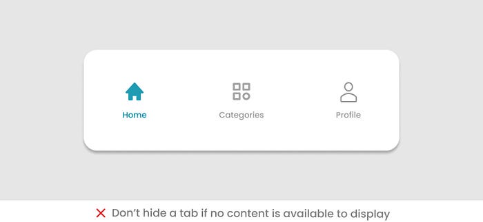
Display an empty state on clicking a tab when no content is available. A well-designed empty state includes a message and a call to action for users.
Alternate to the Bottom Tab bar
If you have more top-level navigation views that you want to display on the front UI, you can use an alternate solution in your app.
Provide three to four main options in the bar and use a More icon (…) as the last option. Clicking this icon will open the menu with all available options.
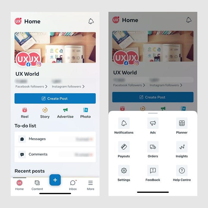
The Meta Business Suite app displays a More option as the last tab in the bottom navigation bar. Clicking More opens up a bottom navigation drawer with more options. The user can go to any required page or view from within the navigation drawer.
Use a hamburger menu and show all options when the menu is expanded. The options will remain hidden otherwise.
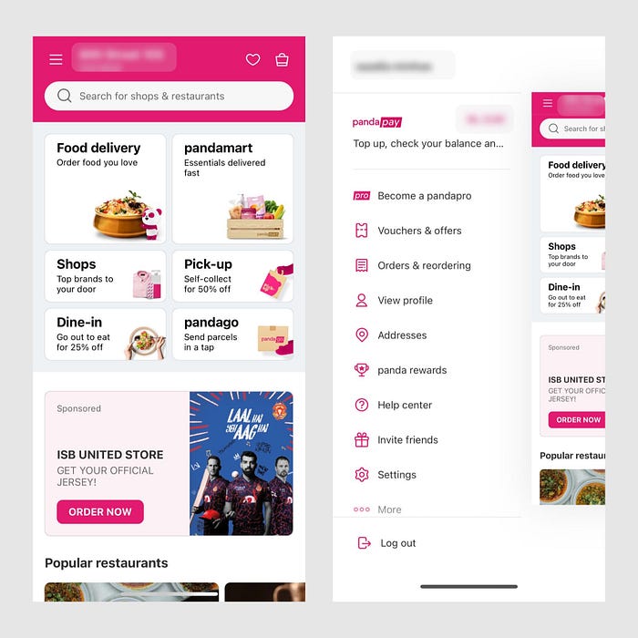
The Food Panda app does not display a bottom navigation bar. Instead, a hamburger menu icon is available on the top left. Clicking the icon displays a navigation drawer including links to all main pages of the app.
Use a combination of the bottom tab bar and hamburger menu.
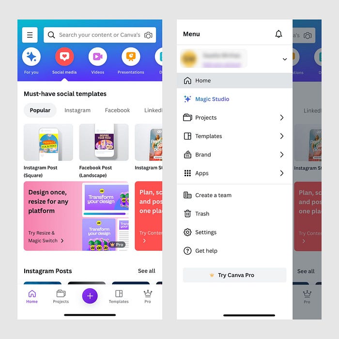
Canva uses a combination of the bottom tab bar and hamburger menu. It displays all items with high priority in the bottom bar, and other main pages are displayed in the menu.
Conclusion
The listed best practices and guidelines for designing a bottom navigation tab bar will help you improve the navigation experience of your application.
Recommend
About Joyk
Aggregate valuable and interesting links.
Joyk means Joy of geeK