

How I Revamped Min/Max’s Combat Interface | UX Planet
source link: https://uxplanet.org/from-frustration-to-fun-how-i-revamped-min-maxs-combat-interface-1f2d7ccf3c2c
Go to the source link to view the article. You can view the picture content, updated content and better typesetting reading experience. If the link is broken, please click the button below to view the snapshot at that time.
From Frustration to Fun: How I Revamped Min/Max’s Combat Interface
Move over website tweaks, this is a full-on raid into the world of RPG combat interfaces! As a UX designer, I’m usually knee-deep in menus and button placement. But recently, I snagged the ultimate quest: revamping the combat screen for the upcoming RPG, Min/Max.
For any RPG adventurer, the combat interface is the difference between epic victories and rage-quit frustration. Min/Max oozed potential, but its combat screen felt like a rusty sword — dull and clunky. Time to sharpen it up! This was like finding a hidden treasure chest for a UX nerd like me, someone who secretly binges on fantasy adventures. It was a chance to unleash my design skills fuelled by pure gaming passion. Every tweak, every pixel placement, held the power to transform how players experience combat in Min/Max. Imagine wielding the ultimate dev wand, crafting an interface that’s both intuitive and electrifying.
This article dives headfirst into the design process, where we’ll slay usability dragons and unearth hidden gems that elevate the player experience. We’ll explore the thought process behind each decision, from streamlining menus to making character stats crystal clear. We’ll conquer the challenge of balancing information with action, ensuring players have all they need to make strategic choices without feeling overwhelmed. This won’t be just a makeover, it’ll be an epic transformation.
Overview
The objective of this UX design case study is to revamp the combat screen interface for Min/Max, an indie Sci-fi RPG (Role Playing Game). As a UX designer, the challenge is to optimize the combat screen to enhance user experience, focusing on aspects such as panel width optimization, improving glanceable information.
Design goals
- Optimize the member panel layout to accommodate 4–5 characters comfortably within the combat screen interface.
- Improve the presentation of action economy information, ensuring clarity and ease of understanding for players.
- Ensure scalability and adaptability across various screen sizes and resolutions, maintaining consistency and immersion in the game experience.
Research and Analysis:
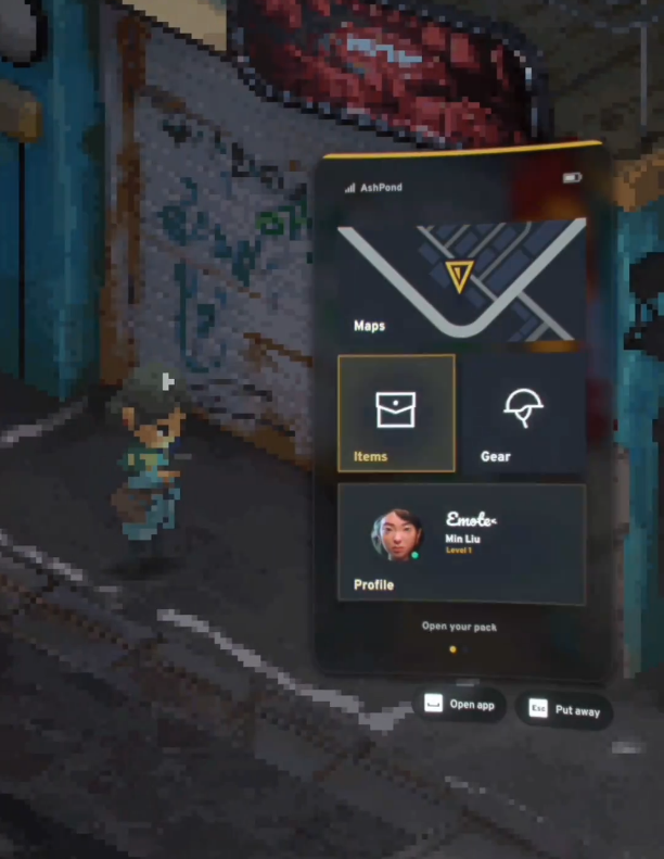
In every design endeavour I undertake, I always begin with thorough research. For this project, understanding the current state of Min/Max’s game interface was paramount. Upon analysis, it became apparent that the design was heavily influenced by mobile design conventions. Certain elements, such as characters appearing to interact with mobile phones and the use of large icons, suggested an emulation of mobile interactions.
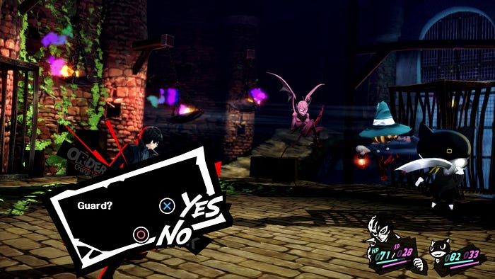
Given the creative latitude afforded by the challenge, I sought inspiration from other RPG games known for their exemplary UI design and UX. Persona 5 stood out as a shining example, with its bold and innovative UI design. However, replicating its intricate UI proved to be a daunting task, as every aspect of the game’s design, from the pause screen to inventory management, is meticulously crafted.
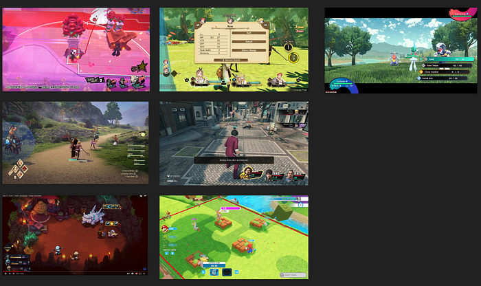
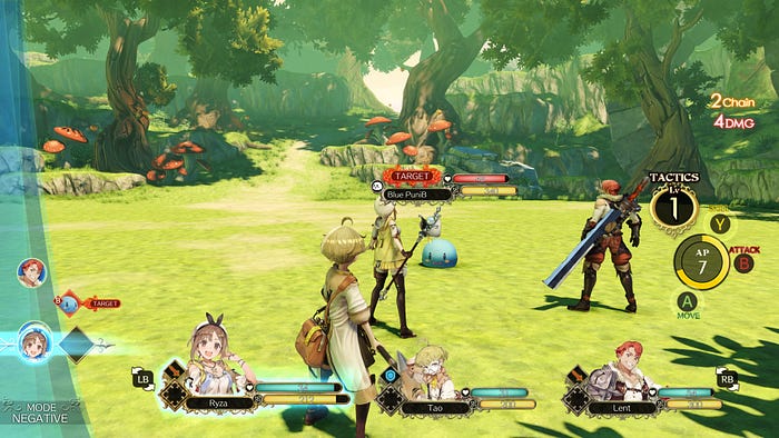
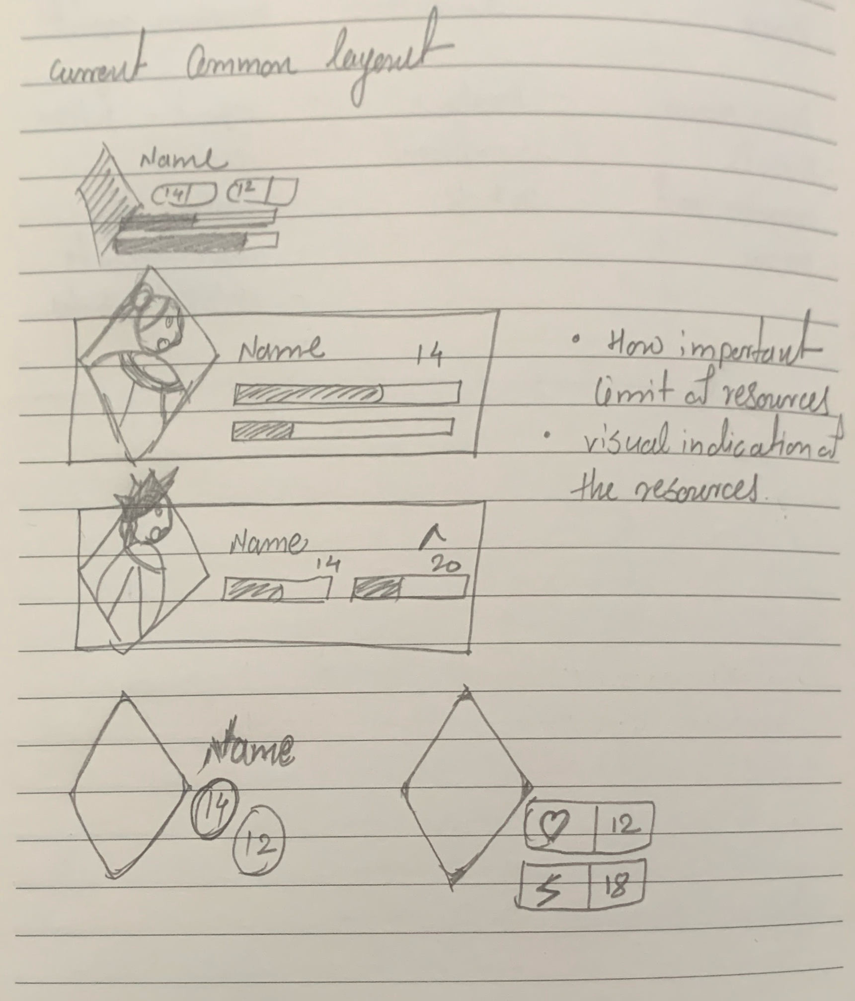
Therefore, I focused on dissecting the layout and presentation of member status panels in various RPG games. Analysing games like Mario + Rabbits and Atelier Ryza provided valuable insights into different approaches to UI layout and action presentation. These games offered contrasting styles, with some emphasizing animation and action sequences, while others prioritized the clarity of member panels and vital statistics.
One notable observation from my research was the importance of providing glanceable information for health and action economy points. Games like Atelier Ryza utilized color-filled bars for quick glancing, with detailed numerical values available upon closer inspection. This dual-level glanceability proved effective in catering to different player needs and preferences.
Reflecting on these insights, I compiled a comprehensive list of considerations for the design phase. These included incorporating character turn order indications, ensuring scalability for different screen sizes, and maintaining two levels of glanceability for health and action economy points. Armed with this knowledge, I prepared to transition to the ideation phase, equipped with a refined understanding of the project objectives and design constraints.
Insights gained in the Research phase.
- The current game interface of Min/Max draws heavily from mobile design conventions, featuring elements like characters interacting with mobile phones and large icons.
- Persona 5 serves as a notable reference for innovative UI design, but replicating its complexity poses significant challenges due to the intricacies of every game element’s design.
- Analysing RPG games like Mario vs Rabbits and Atelier Ryza reveals diverse approaches to UI layout and action presentation, with some prioritizing animation and action sequences while others focus on the clarity of member panels and vital statistics.
- Providing glanceable information for health and action economy points is essential, as demonstrated by games like Atelier Ryza, which utilize colour-filled bars for quick glancing and detailed numerical values for closer inspection.
- Key considerations for the design phase include incorporating character turn order indications, ensuring scalability for mobile devices, and maintaining two levels of glanceability for health and action economy points.
Ideation and prototype phase
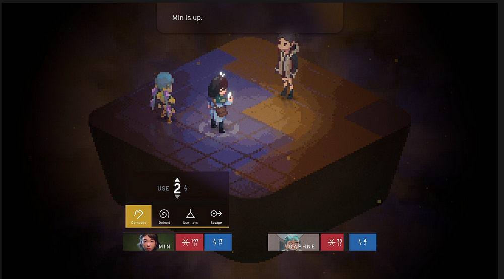
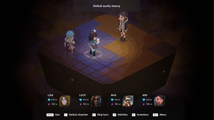
In the ideation phase, I delved into the resources provided by the challenge, refocusing my efforts based on the insights gathered during the research phase. With the challenge centered around a combat instance involving three characters, I closely examined the game scenario. Notably, combat unfolds within its own space, characterized by a central isometric area surrounded by empty space. This layout offers an ideal canvas for placing the UI, ensuring minimal interference with central game elements and allowing for the prominent display of character panels.
Initially, I explored various placement options for member panels within the game UI. Common options included positioning them along the bottom edge or right side of the screen. Through sketches and conceptualization, I discovered that placing the UI on either side would disrupt the consistency of the overlay and potentially clash with central game elements. Consequently, I opted to focus on positioning the member panel at the bottom of the screen for visual cohesion.
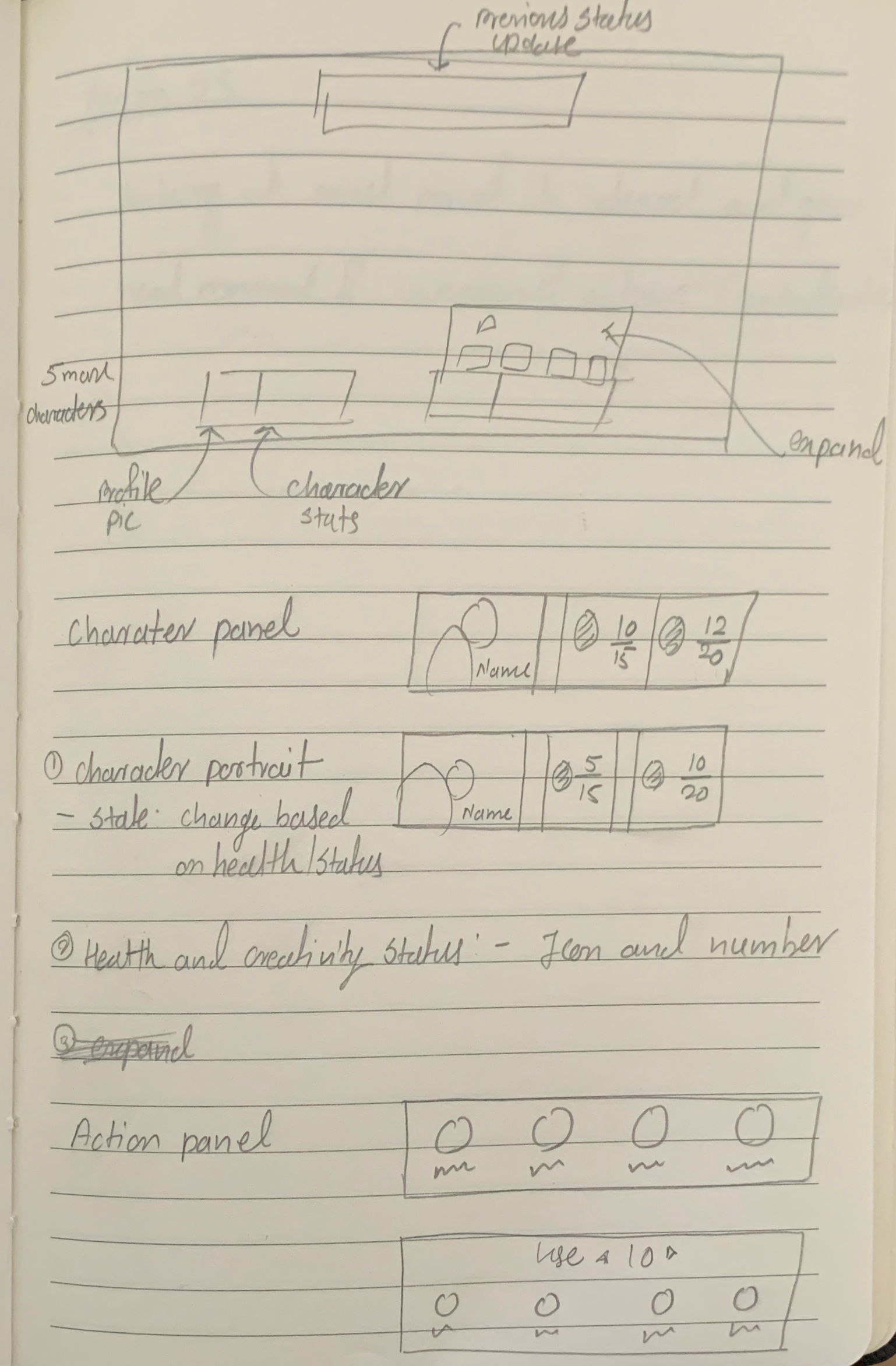
Given the importance of member panels in the challenge, I began experimenting with different arrangements for displaying character-related stats. In my initial sketches, I aimed to strike a balance between emphasizing key elements and avoiding visual clutter. Aligning with the Sci-Fi theme, I sought to imbue the design with a structured aesthetic, drawing inspiration from mobile phone interactions prevalent in other game elements.
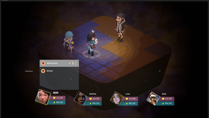
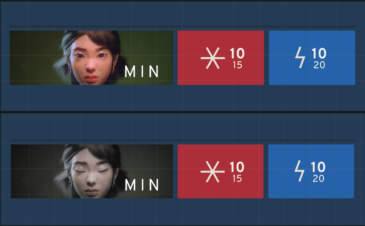
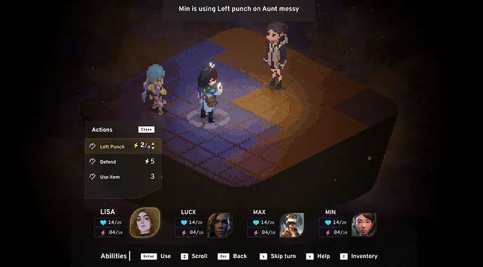
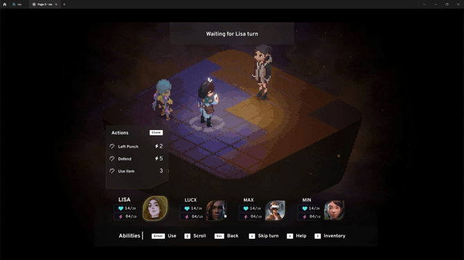
After drafting a preliminary version, I refined the design to prioritize character portraits and facilitate easy tracking of turn order and character details. Utilizing a ribbon-style layout with icons for displaying stats, I aimed to imbue the elements with distinct visual identities. Additionally, I envisioned character portraits rotating and displaying animations when switching between active characters, enhancing engagement and dynamism.
Subsequently, I directed my focus towards enhancing the action bar and effectively communicating combat interactions to users. Adopting a command bar style for the controls, I saturated the bottom edge of the screen to maintain consistency with the existing game UI. The improved version featured character portraits shifted towards the right for improved balance and readability. By applying an opaque glass style to each element of the member panel, I ensured alignment with the Sci-Fi theme while maintaining harmony with the overall game UI.
During the design phase, a crucial element emerged: clearly distinguishing between active and non-active characters within the member panels. This ensures players can instantly identify whose turn it is to unleash strategic combat fury. To achieve this, I opted for a subtle yet effective approach. While maintaining the overall shape of the character portraits to visually cohere with other interface elements, I employed strategic scaling. When a character becomes active, their portrait subtly enlarges, drawing the player’s eye and conveying their turn priority.
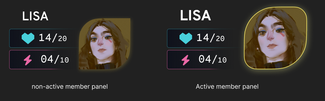
This approach prioritizes user focus. In the heat of combat, complex animations can be distracting. By keeping the interaction minimal, we ensure players can quickly grasp turn order without visual clutter impeding their strategic decision-making. The result is a clear and intuitive system that empowers players to stay focused on the battle at hand.
To enhance user interaction and accessibility across different devices, I considered compatibility with various control methods, including touch, controller, mouse, and keyboard. The empty space on either side of the screen provided flexibility for accommodating additional features or overlays, facilitating future expansions in the game’s development. Throughout the prototype phase, I envisioned motion design elements such as character focus changes and menu item highlights, refining the design with user interactions in mind.
Envisioning User Testing
While this project didn’t involve formal user testing due to its scope and timeline, several established methods could be employed to refine the combat screen interface further.
Here are some potential user testing approaches I considered:
- User Testing Sessions: Platforms like UserTesting, Lookback, or Zoom could facilitate in-person or remote testing sessions. Participants would share their screens as they interact with the prototype, allowing me to observe their behavior and capture valuable feedback.
- Expert Reviews: Collaborative design platforms like Figma or Adobe XD could be used to share the prototype with UX/UI design professionals for expert reviews. Their insights on usability, information clarity, and visual design would be invaluable for improvement.
- Remote Testing Platforms: Platforms like UsabilityHub, UserZoom, or Maze offer options for remote testing. By distributing tasks and surveys to a diverse pool of RPG players, I could gather quantitative and qualitative data on user experience and identify areas for improvement.
Collaboration with the Development Team:
Beyond formal user testing, collaborating with the development team at Min/Max would be crucial for refining the design. Their expertise in game development and understanding of the target audience would be invaluable in shaping the final product. This collaboration could involve:
- Internal Reviews and Discussions: Presenting the prototype to the development team and soliciting their feedback would be a key step. Their insights on technical feasibility, integration with existing game mechanics, and alignment with the overall game vision would be critical for success.
- Playtesting with the Development Team: Even without a large pool of external testers, playtesting the prototype with RPG-enthusiastic members of the development team could provide valuable early feedback on usability and enjoyment.
By incorporating these user testing methods and collaborating with the development team, the combat screen interface for Min/Max could be further optimized to deliver an intuitive and engaging experience for players.
Conclusion
This project served as a crash course in UX design for game interfaces for me. Having primarily focused on traditional UX design, I entered this project with a thirst for knowledge. Every decision, from optimizing panel width to streamlining action menus, forced me to consider the unique challenges and opportunities presented by RPG combat and Video games. It was a thrilling exercise in empathy, forcing me to see the world through the eyes of the player and prioritize what would make their combat experience most enjoyable. The most valuable lesson? By understanding user needs and wielding the tools of user research and testing, we can transform any interactive experience, unlocking a world of intuitive and engaging gameplay. So, the next time you encounter a frustrating combat screen, remember — a UX designer might just be the hero waiting to unlock a world of strategic joy. After all, in the ever-evolving realm of RPGs, a well-designed combat screen can be the difference between epic victories and frustration.
Recommend
About Joyk
Aggregate valuable and interesting links.
Joyk means Joy of geeK