

Steering the future: a new vision for car UX
source link: https://bootcamp.uxdesign.cc/steering-the-future-a-new-vision-for-car-ux-1243843f289d
Go to the source link to view the article. You can view the picture content, updated content and better typesetting reading experience. If the link is broken, please click the button below to view the snapshot at that time.
Steering the future: a new vision for car UX
You might have heard about this new trend in cars: a massive screen in the middle of the console that lets drivers control almost anything.
Right, I know, not a new trend: Tesla already had one in 2012.
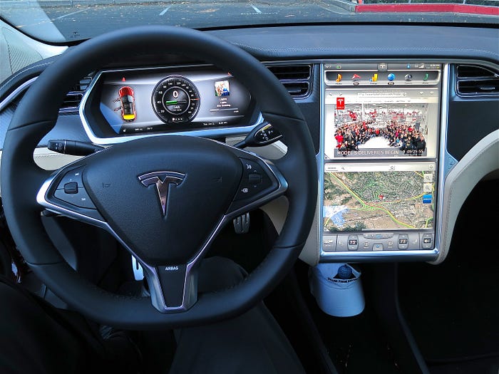
Production dashboard of the Tesla model S, 2012 (https://en.wikipedia.org/wiki/Tesla_Model_S)
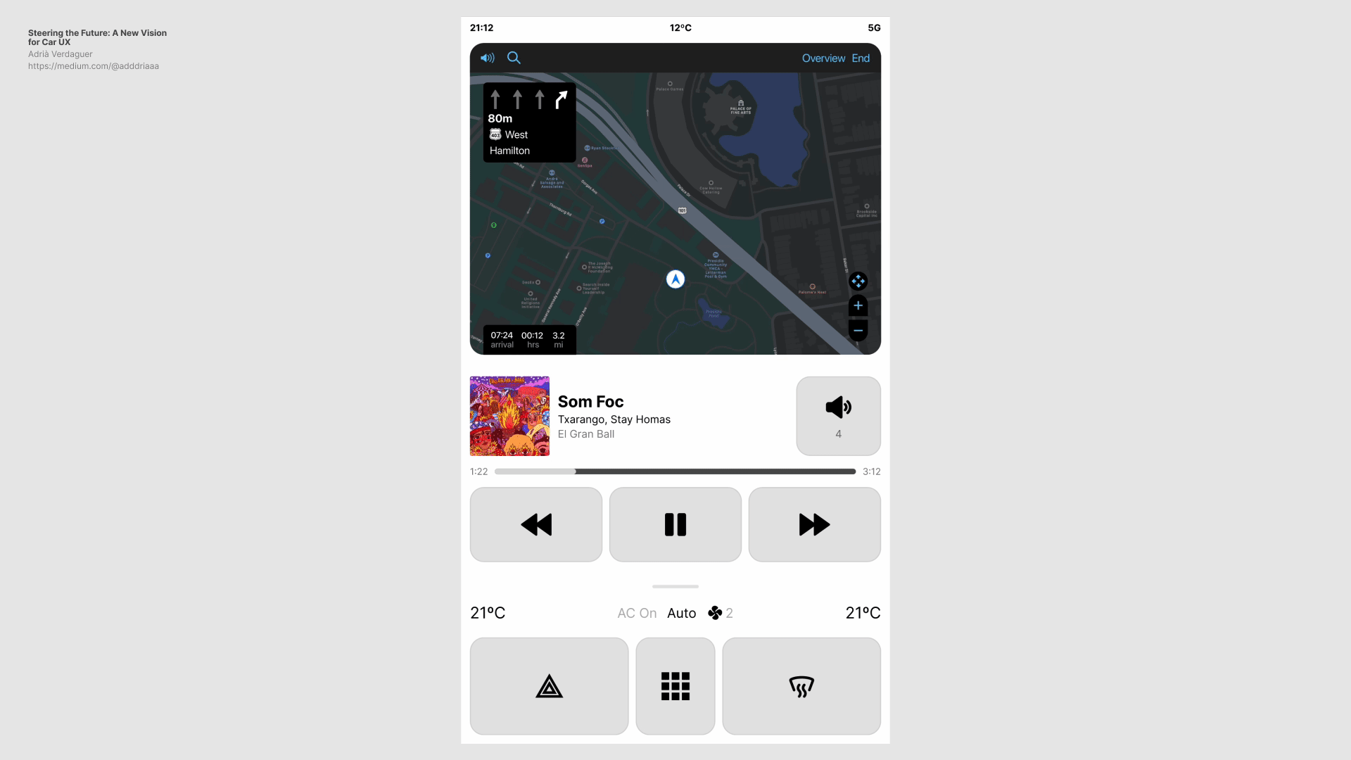
The thing is that twelve years later we’ve seen an evolution in the design of these screens, but it seems like the UX hasn’t really evolved as much. Let’s look at how these interfaces are today, what flaws can we find and how we can improve the experience drivers have with them. But first…
We’ve been here
Seeing what’s going on with car interfaces today makes me think about the first smart phones 20 years ago.
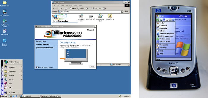
Left, Windows 2000. Right, Windows Mobile 2003
Pocket PCs. The first interfaces for these devices were literally taken from what was working in another completely different medium (a desktop computer) and fitted into a smaller screen. Some of the things that were not considered:
Input devices
Desktop computers work with a mouse and a keyboard, which make it easy to point and click at small buttons on their interfaces.
Mobile devices have no mouse or keyboard. The first Pocket PCs came with a stylus, that helped with the interaction… However with time (and some help) we’ve all discovered that there is another “input device” that we carry around all the time which is better suited to interact with smart phones… ☝️
Focused attention
When we use desktop computers, they capture nearly all of our focus. Our eyes are glued to the screen almost constantly, and our hands are busy with the mouse, trackpad, or keyboard 95% of the time. Clicking a close button that’s 20x20 pixels feels effortless.
However, smartphones operate under a completely different set of circumstances. People use their phones in a variety of settings, often multitasking with other activities. As a result, our focused attention with smartphones falls considerably in general, and interfaces have evolved to account for that.
What about cars?
Cars are no different to desktop computers or smartphones, they have a unique context: users must be able to interact with the interface while driving — and safely make it to their destination.
When driving, the focus is primarily on the road ahead: hands must remain on the steering wheel and eyes, well, obviously eyes on the road. This leaves a very minimal attention for interacting with other elements or interfaces in the car.
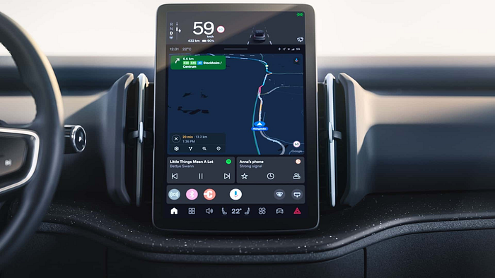
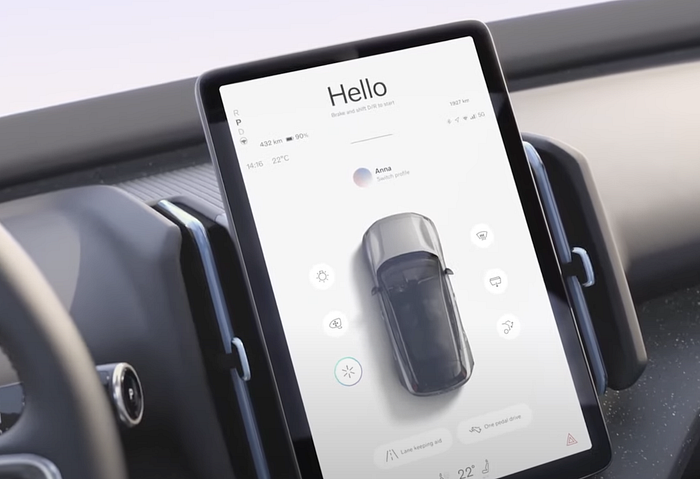
Volvo EX30 center display
Buttons on flat screens, specially small ones, are challenging to press when users have almost their entire attention somewhere else. To press a button on a flat screen successfully, you must be staring at it almost until your finger touches the surface.
Swedish magazine Vi Bilägare conducted a study comparing the use of physical buttons and touchscreens for tasks performed while driving. Physical buttons outperformed touchscreens.
Physical buttons outperform touchscreens in new cars, test finds
Physical buttons are increasingly rare in modern cars. Most manufacturers are switching to touchscreens — which perform…
It’s no surprise that emergency features such as hazard lights have to be incorporated as physical buttons elsewhere in the cabin for safety reasons.
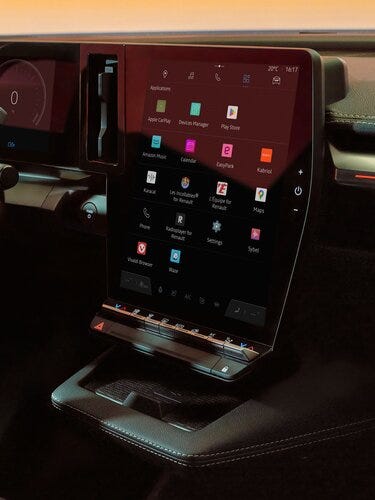
Renault Megane with the climate and hazard lights controls as physical buttons below the screen
But why? Could emergency features coexist with the rest of the UI and feel effortless to activate on a touchscreen while driving? Could we design a car interface that is easy to browse with buttons that are easier and faster to press? Maybe. Let’s explore.
How could we improve these interfaces?
Here are a few concepts that are important to consider when designing car interfaces.
Less is more
One of the biggest cliches, but it applies here. It’s key not to overload the screen with too much information or functions, but rather create an organised system that is easy to scan and browse.
While driving, larger buttons make for easier interaction. Considering that users are interacting with a flat surface without tactile feedback, it’s essential for buttons to be big.
Be focused
We must think strategically about the necessary elements in the UI, and tailor them to the user’s current or potential interactions.
Consider the context of each scenario: is the user driving, or is the vehicle stationary? What task is the user trying to perform? Is there a passenger who could assist?
Example where white space and decorative elements take up almost the entire screen real estate
Provide feedback
In situations where attention is limited, feedback becomes essential. Offer visual, auditory, and even tactile feedback for every interaction.
It may seem that certain actions inherently provide their own feedback (such as increasing volume), yet providing additional feedback is still good practice.
Use gestures
Last but most importantly, bring in gestures and ensure that the basic navigation patterns are so simple they could be performed blindfolded.
Whether it’s expanding the menu, navigating from the default screen to the car or entertainment sections, or collapsing the menu, users should be able of executing these interactions effortlessly, without even the need to glance at the screen.
How could this all work?
Is all of this possible? Let’s look at some wireframes.
In this first exploration, I’ve included four screens: the home view plus three menu views (climate, entertainment and apps).
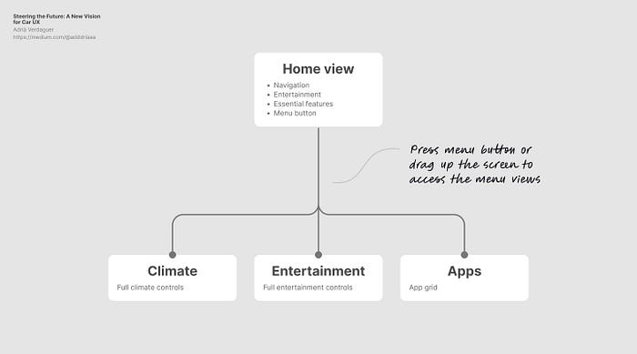
Sitemap of this exploration
The Home view has the minimum necessary components a user needs while driving: map/navigation, entertainment, climate information, and three key functions: hazard lights, max. defroster and menu button.
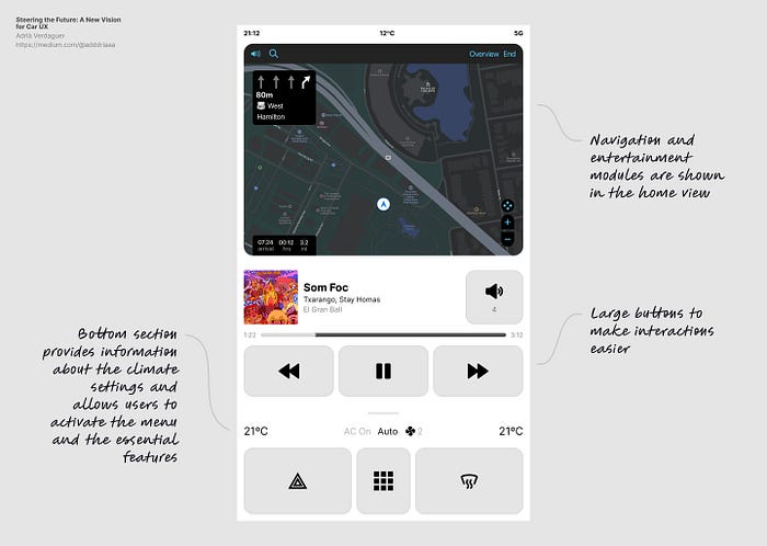
Home view
To bring up the main menu interface, users can tap the menu button or perform a gesture: dragging the screen up. This is a gesture that can be done while driving without even glancing at the screen.
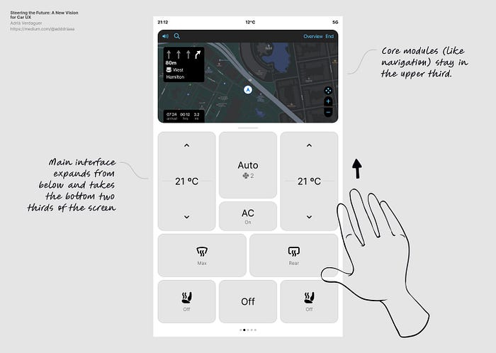
Access menu view through a gesture (defaults to climate controls while driving)
The viewport then compresses the core modules in the upper third, and uses the rest of the screen to display the menu views. The default view shown while driving is the climate controls. Users can adjust the climate settings here, or swipe left/right to access the rest of the menu views.
Based on these two interactions, users could potentially get to any of the three menu views from the Home view without looking at the screen more than half a second. Here’s an animated prototype with the flow:
Animated prototype: using gestures to activate and navigate through the interface
Finishing up
This is a first exploration and it just scratches the surface of where this could be taken. Yet it does address a few important issues and hopefully provides some ideas and inspiration into how these interfaces could evolve.
ps. I haven’t mentioned voice control, which is a very powerful way of interacting with the system. But there’s still work to be done in order to get voice interaction to a point where most users feel comfortable and are familiar enough to use it. Plus, we should not rely on voice controls to solve problems car interfaces have.
pps. Thank you for reading.
Recommend
About Joyk
Aggregate valuable and interesting links.
Joyk means Joy of geeK