

5 times “smart” copy swung into graveyard humor
source link: https://uxdesign.cc/5-times-smart-copy-swung-into-graveyard-humor-0d2a7c5cf4f9
Go to the source link to view the article. You can view the picture content, updated content and better typesetting reading experience. If the link is broken, please click the button below to view the snapshot at that time.
5 times “smart” copy swung into graveyard humor
What do tea, Fabulous app, Stravinsky, Italian pasta, and Grammarly have in common? Awkward English.

You’ve probably heard of the r/Engrish thread, where people collect awkward use cases of the English language. I’m one of these collectors. But instead of making fun of misspelled words, I collect UX copy gone wrong.
Like in the Fabulous app (mental health and habit tracker coaching), where I found a button called “collapse”:
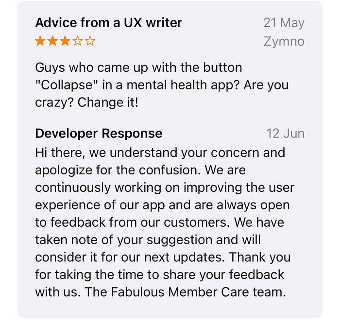
They actually changed it later, BTW.
I had beef with this button. Because:
- Who gives a button such a long name (or a name at all) in an app (mobile devices = small screens)?
- Using “collapse” in a mental health app is a bad idea for users who might be struggling with depression.
I’ve been traveling Europe on a scavenger hunt for more awkwardness. There has been ample. Here are four more recent examples of UX and brand copy that were intended to be quirky but ended up a bit dark.
P.S. Quirky copy — is it good? I usually detest humorous copy (with the rare brilliant exception of CitizenM’s brand…
Recommend
About Joyk
Aggregate valuable and interesting links.
Joyk means Joy of geeK