

Dear Tinder: your UX needs work. Too bad you broke up with me first.
source link: https://blog.prototypr.io/dear-tinder-your-ux-sucks-too-bad-you-broke-up-with-me-first-1dda3d5c336b
Go to the source link to view the article. You can view the picture content, updated content and better typesetting reading experience. If the link is broken, please click the button below to view the snapshot at that time.
Dear Tinder: your UX needs work. Too bad you broke up with me first.

Credit: Dave Herring
Hello, Tinder. I’m here, inspired to write another UX article. This time, it’s out of spite.
I was chatting to someone. The exchange was going quite well. They appeared genuinely interested in my hobbies. I was optimistic!
Until right as I was about to send my next message…
You permanently BANNED me. 🔥🙅♀️
Poor communication
Leaving me in the dark, you didn’t give me a reason as to why I was banned. After days of confusion I revisited your rules, spotting my infringement: I included my Instagram handle in my bio.
I guess you thought that because I was no longer your user, you didn’t owe me an explanation. An explicit reason for the breakup would have been nice… rather than a cold ghosting.

What I saw when I opened the app. Not very descriptive.
A quick Google search reveals that I’m not the only one who was initially confused as to why I was banned. Perpetrators have rights, too.
Not willing to compromise
I emailed support asking for a review of the decision to ban my account, and received an automated reply. I emailed again– a final appeal to emotion– but I received the same message:

My plea to Tinder to review my case

Tinder’s automated response
I understand it would be challenging logistically for you to respond to every email with a personal response. I normally don’t get offended by automated emails, but this one made me want to flail my hands in the air to get your attention. You can add that to my user journey.
I normally don’t get offended by automated emails, but this one made me want to flail my hands in the air to your get attention. You can add that to my user journey.
Liar, cheater
You built an entire brand around the “don’t make me think” ethos. You touted that finding love is as easy as a swipe of a thumb.
You’ve spent years priming my attention span to be a fraction of a nanosecond. So don’t expect me, or any user for that matter, to give your new community guidelines more than a cursory scroll.
At some point I do remember signing off on some rules. But I wasn’t expecting all these rules to actually apply to me, a typical law-abiding citizen. I don’t have a tendency to cyber bully or post obscene content. I’m just a girl who popped an Instagram handle into my bio in an attempt to connect with people after seeing others do the same.
Am I at fault because I didn’t read the rule stating that listing social media handles was against your guidelines? Offline, yes. In the world of good UX? No. If you want to keep you crown as a user-friendly app, it’s your duty to provide a safe space where it’s hard for users to mess up.
Can we work it out?
I’d like to make this work, Tinder. But it’s going to take some acknowledgement on your end that your current UX doesn’t accommodate well-meaning folks who have short attention spans and are prone to mistakes.
Ultimatum 1: Be more descriptive
I’m sure users would appreciate knowing the exact reason as to why they were banned rather then receiving a vague message like the current experience. Being more explicit would help regulate the community in the long run when people inevitably use a fake number app to create a new account.
I propose that upon opening Tinder post-ban, a user is prompted with a message that states the guideline they broke:
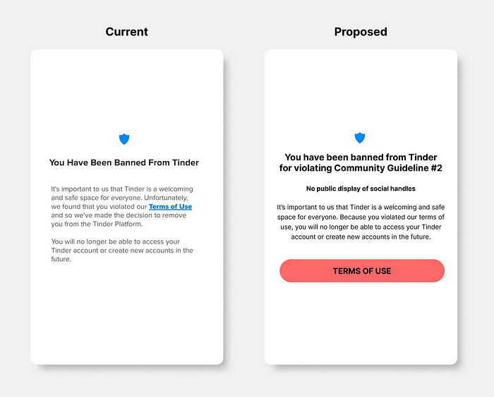
I propose a redesign that explicitly states a user’s infringement of Tinder’s guidelines.
Ultimatum 2: Make it harder for users to mess up
But ideally, your UX would prevent users from including a social media handle in their profile in the first place.
Redesign 1: Soft Warning
This first option allows users to continue on with their social handle in their bio after they are warned of the consequences if they choose to do so:

Redesign 1: When a user includes a social media handle in their bio, they’re given a nudge to remove it.
Redesign 2: Hard Block
This second option prevents users from saving their profile completely if they are suspected of including a social handle. You could police for “@” symbols in bios as a quick way to identify the inclusion of social handles. You could also… I don’t know… use AI or something to scan for any handles. In my opinion this is the most ethical, user-friendly approach:
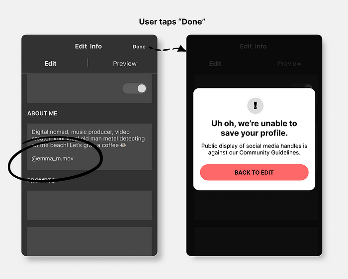
Redesign 2: If users include a social handle in their bio, they are unable to save their profile.
Advice for your next fling
Descriptive messaging coupled with better error prevention tactics would foster a stronger relationship between you and users. Communication is key, and cold shoulders only delay resolution.
Recommend
About Joyk
Aggregate valuable and interesting links.
Joyk means Joy of geeK