

【CSS定位属性】用CSS定位属性精确控制你的网页布局!
source link: https://studygolang.com/articles/36576
Go to the source link to view the article. You can view the picture content, updated content and better typesetting reading experience. If the link is broken, please click the button below to view the snapshot at that time.
【CSS定位属性】用CSS定位属性精确控制你的网页布局!
YunDuanCode · 大约5小时之前 · 14 次点击 · 预计阅读时间 7 分钟 · 大约8小时之前 开始浏览CSS定位属性是用于控制网页中元素位置的一种方式,它能够让元素在页面上精准地落在我们想要的位置。
在CSS中,定位(Positioning)是控制元素在页面上如何定位和显示的一种机制。它主要包括四种属性:静态定位(static)、相对定位(relative)、绝对定位(absolute)、固定定位(fixed)。
每种定位方式都有其独特的特点和使用场景,下面将分别介绍这几种定位属性。
一、Static(静态定位)
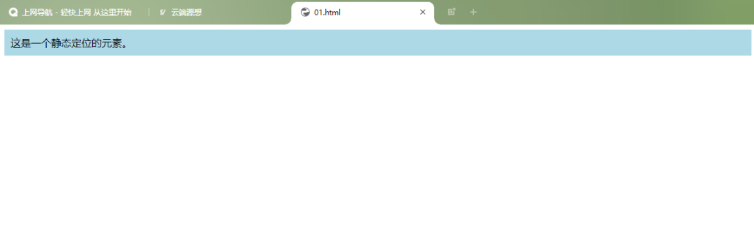
静态定位是元素的默认定位方式,元素按照正常的文档流进行排列。在静态定位状态下,不能配合top、bottom、left、right来改变元素的位置。
- 可以用于取消元素之前的定位设置。
代码示例:
<!DOCTYPE html>
<html>
<head>
<style>
.static {
  background-color: lightblue;
  padding: 100px;
}
</style>
</head>
<body>


<div>这是一个静态定位的元素。</div>


</body>
</html>
二、Fixed(固定定位)
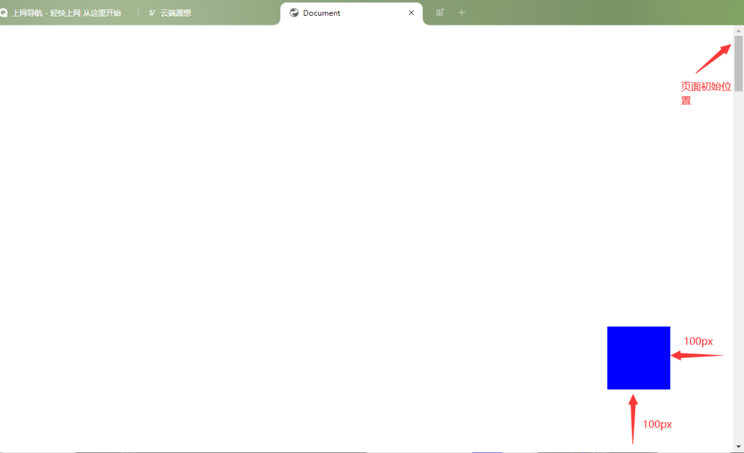
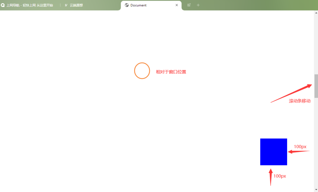
固定定位使元素相对于浏览器窗口进行定位,即使页面滚动,元素也会保持在固定的位置。
- 固定定位的元素会脱离正常的文档流。
示例代码:
<!DOCTYPE html>
<html>
<head>
    <meta charset="UTF-8">
    <meta http-equiv="X-UA-Compatible" content="IE=edge">
    <meta name="viewport" content="width=device-width, initial-scale=1.0">
    <title>Document</title>
    <style>
        *{
            margin: 0;
            padding: 0;
        }
        body{
            /* 给整个页面设置高度,出滚动条以便观察 */
            height: 5000px;
        }
        div{
            width: 100px;
            height: 100px;
            background-color: blue;
            /* 固定定位 */
            position: fixed;
            right: 100px;
            bottom: 100px;
        }
</style>
</head>
<body>
    <div></div>
</body>
</html>
运行结果:
移动前
移动后
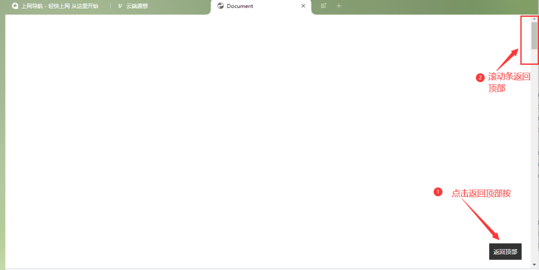
比如我们经常看到的网页右下角显示的“返回到顶部”,就可以用固定定位来实现。
<!DOCTYPE html>
<html>
<head>
    <meta charset="UTF-8">
    <meta http-equiv="X-UA-Compatible" content="IE=edge">
    <meta name="viewport" content="width=device-width, initial-scale=1.0">
    <title>Document</title>
    <style>
        body {
            position: relative;
        }
        .content {
            /* 页面内容样式 */
        }
        #backToTop {
            position: fixed;
            bottom: 20px;
            right: 20px;
            background-color: #333;
            color: #fff;
            border: none;
            padding: 10px;
            cursor: pointer;
        }
</style>
</head>
<body style="height: 5000px;">
    <div>

    </div>
    <button id="backToTop" onclick="scrollToTop()">返回顶部</button>
    <script>
        function scrollToTop() {
            window.scrollTo({top: 0, behavior: 'smooth'});
        }
</script>
</body>
</html>
运行结果:
三、Relative(相对定位)
相对定位是将元素对于它在标准流中的位置进行定位,通过设置边移属性top、bottom、left、right,使指定元素相对于其正常位置进行偏移。如果没有定位偏移量,对元素本身没有任何影响。
- 不使元素脱离文档流,空间会保留,不影响其他布局。
代码示例:
<!DOCTYPE html>
<html>
<head>
    <meta charset="UTF-8">
    <meta name="viewport" content="width=device-width, initial-scale=1.0">
    <title>Document</title>
    <style>
        .box1{
            width:200px;
            height:100px;
            background:skyblue;
            margin:10px;
        }
        .box2{
            width:200px;
            height:100px;
            background:pink;
            margin:10px;
            position:relative;/*相对定位*/
            left:100px;/*向右偏移100px*/
            top:-50px;/*向上偏移50px*/
        }
        .box3{
            width:200px;
            height:100px;
            background:yellowgreen;
            margin:10px;
        }
</style>
</head>
<body>
    <div>1</div>
    <div>2</div>
    <div>3</div>
</body>
</html>
运行结果:
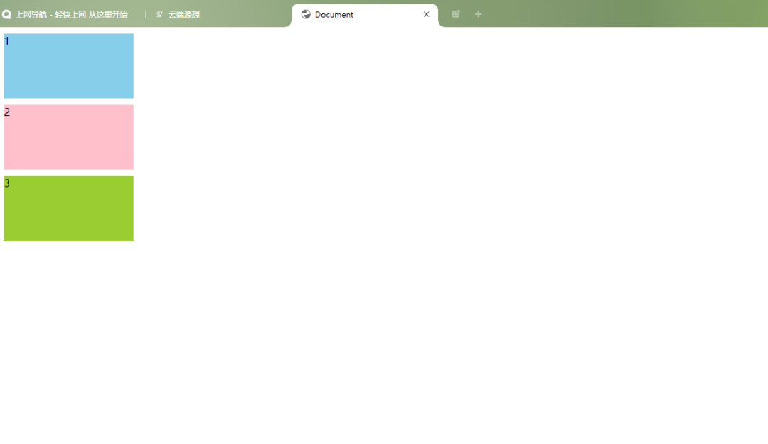
没使用相对定位之前是这样的:
使用相对定位后:相对于原来的位置向右偏移了100px,向上偏移50px。
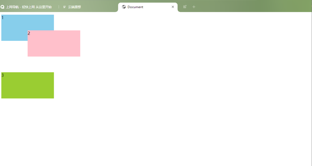
虽然它的位置发生了变化,但它在标准文档流中的原位置依然保留。
四、Absolute(绝对定位)
绝对定位使元素相对于最近的非 static 定位祖先元素进行定位。如果没有这样的元素,则相对于初始包含块(initial containing block)。绝对定位的元素会脱离正常的文档流。
如果该元素为内联元素,则会变成块级元素,可直接设置其宽和高的值(让内联具备快特性);
如果该元素为块级元素,使其宽度根据内容决定。(让块具备内联的特性)
<style>
.wrap{
width:500px;
height:400px;
border: 2px solid red;
}
.box1{
width:200px;
height:100px;
background:skyblue;
margin:10px;
}
.box2{
width:200px;
height:100px;
background:pink;
margin:10px;
position:absolute;/*绝对定位*/
left:100px;/*向右偏移100px*/
top:30px;/*向下偏移30px*/
}
.box3{
width:200px;
height:100px;
background:yellowgreen;
margin:10px;


}
</style>
<div>
       <div>1</div>
       <div>2</div>
       <div>3</div>
       </div>
图片将第二个设置为绝对定位后,它脱离了文档流可以定位到页面的任何地方,在标准文档流中的原有位置会空出来,所以第三个会排到第一个下面。
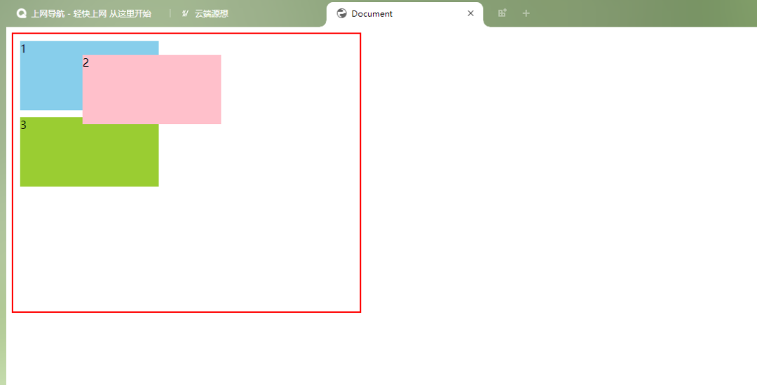
第二个相对于它的父元素向右偏移100,向下偏移30。
想要快速入门前端开发吗?推荐一个前端开发基础课程,这个老师讲的特别好,零基础学习无压力,知识点结合代码,边学边练,可以免费试看试学,还有各种辅助工具和资料,非常适合新手!点这里前往学习哦!
五、z-index(层级顺序的改变)
层叠顺序决定了元素之间的堆叠顺序。z-index 属性用于设置元素的层叠顺序。具有较高 z-index 值的元素会覆盖具有较低 z-index 值的元素。
- 默认值是0
- 数值越大层越靠上
- 没有最大值和最小值
- 可以给负数
代码示例:
<!DOCTYPE html>
<html>
<head>
    <meta charset="UTF-8">
    <meta http-equiv="X-UA-Compatible" content="IE=edge">
    <meta name="viewport" content="width=device-width, initial-scale=1.0">
    <title>Document</title>
    <style>
        div:nth-of-type(1){
            width: 300px;
            height: 300px;
            background-color: skyblue;
            position: absolute;
        }
        div:nth-of-type(2){
            width: 200px;
            height: 200px;
            background-color: pink;
            position: absolute;
        }
        div:nth-of-type(3){
            width: 100px;
            height: 100px;
            background-color: yellowgreen;
            position: absolute;
            z-index: -1;
        }
</style>
</head>
<body>

    <div></div>
    <div></div>
    <div></div>


</body>
</html>
运行结果:
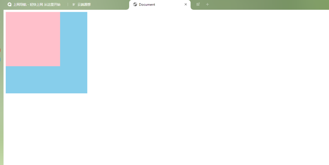
可以看到,最后一个div依然存在,但是看不见了,原因就是我们改变了z-index属性值。
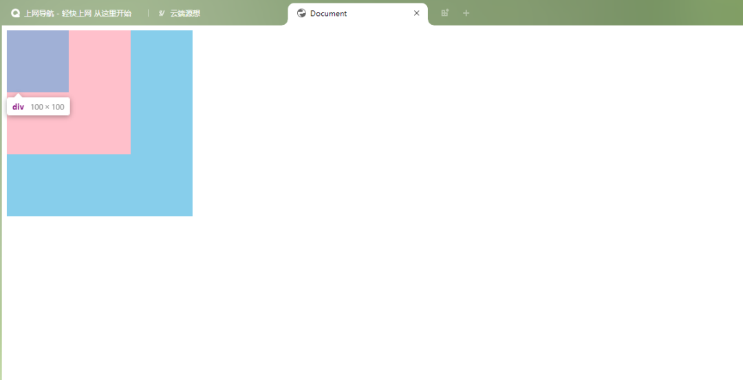
以上就是CSS定位属性的介绍了,通过这些定位属性,可以灵活地控制网页中元素的位置和堆叠顺序。
在实际应用中,CSS定位属性的使用需要考虑到整体布局和用户体验。合理运用这些定位技巧,可以让你的网页不仅美观,而且易于使用和维护。记住,好的设计总是细节和功能的完美结合。
有疑问加站长微信联系(非本文作者))

入群交流(和以上内容无关):加入Go大咖交流群,或添加微信:liuxiaoyan-s 备注:入群;或加QQ群:692541889
Recommend
About Joyk
Aggregate valuable and interesting links.
Joyk means Joy of geeK