

Building a Reusable Infinite Scroll Component With React
source link: https://blog.bitsrc.io/react-infinite-scroll-b5140e48d2cc
Go to the source link to view the article. You can view the picture content, updated content and better typesetting reading experience. If the link is broken, please click the button below to view the snapshot at that time.
Building a Reusable Infinite Scroll Component With React
How To Build A Reusable Infinite Scroll Component In React?

Have you ever seen pages like this?
This is the landing page for the Medium Publication — Bits and Pieces. Did you notice the way that the published articles keep loading as I keep scrolling down?
It eliminates the need for the user to manually click on a “Load More” button to load content, and keeps loading content until there isn’t any.
This is a major user experience improvement to any app. It creates an illusion of an “infinite scroller” where the user does not have to perform any additional interaction to load more data onto the site. For instance, check this out:
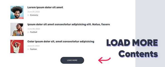
Most applications are currently built using this “Load More” button. It loads an initial set of data and enforces the user to manually load content if they desire.
But, loading more data is always desirable as you’re scrolling down right? It gives the natural indication that the content the user is searching for isn’t available and has to be fetched.
So, that’s what I’m going to show you today. Let’s take a look at building our own infinite scroller component. I’ll be building this as an independent component so that you can freely use this scroller in your app with no hassle of re-implementing it.
Pst, if you want to dive into the code, checkout my Bit Scope.
Step 01 — Pre-requisites
To do so, I’m going to be leveraging a next-generation build system called Bit. If you’re not familiar with it, it’s a build system that lets you design, develop, build, test and version component in an independent environment.
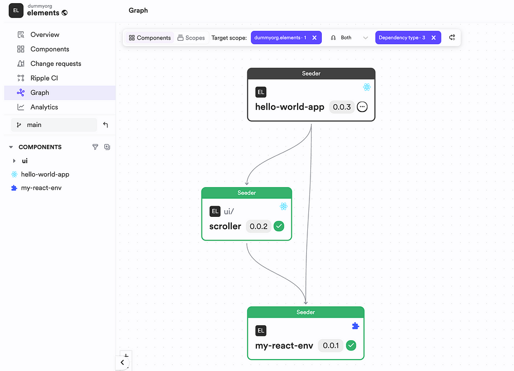
This means that I don’t have to maintain a giant monolith project, but rather work on each component independently and manage these components through a tree:
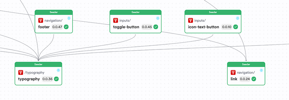
Once Bit identifies a change in a component, it leverages its CI Server — Ripple CI to build and propagate the changes up the tree to make sure all components use the latest version.
So, let’s install Bit before we build our scroller. To do so, use Bit’s version manager (BVMM) to install Bit globally:
npx @teambit/bvm install
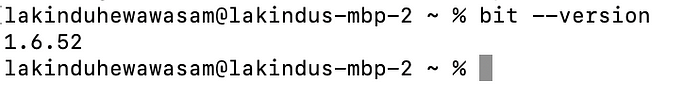
Next, to verify your installation, run the command:
bit --version
If you’ve installed Bit correctly, you’ll see the output:
Step 02 — Creating a Bit Workspace
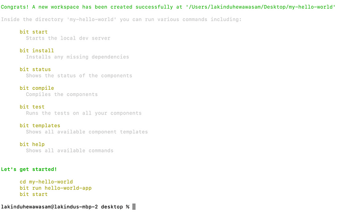
Next, let’s bootstrap a React workspace to build our scroller on. This will spin up the dev environments necessary to build with React.
To do so, run the command:
bit new hello-world my-hello-world --env teambit.community/starters/hello-world --empty --default-scope dummyorg.elements
Tip: Replace
dummyorg.elementswith your Bit Username and Scope name.
Once you execute this command, you’ll see the output:
Next, head over to your project and launch the dev server using the command:
bit start
Next, visit your dev server using the URL — http://localhost:3000 and you’ll see the output:
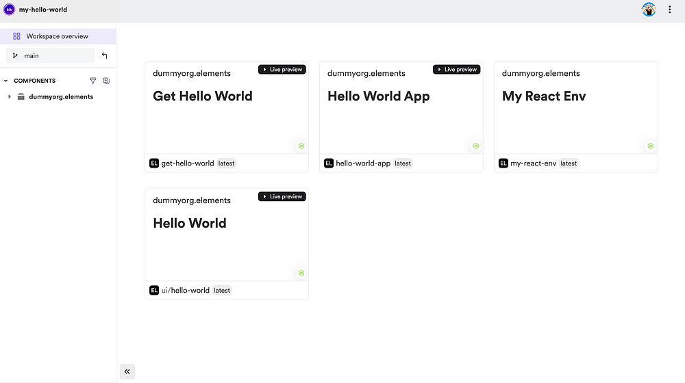
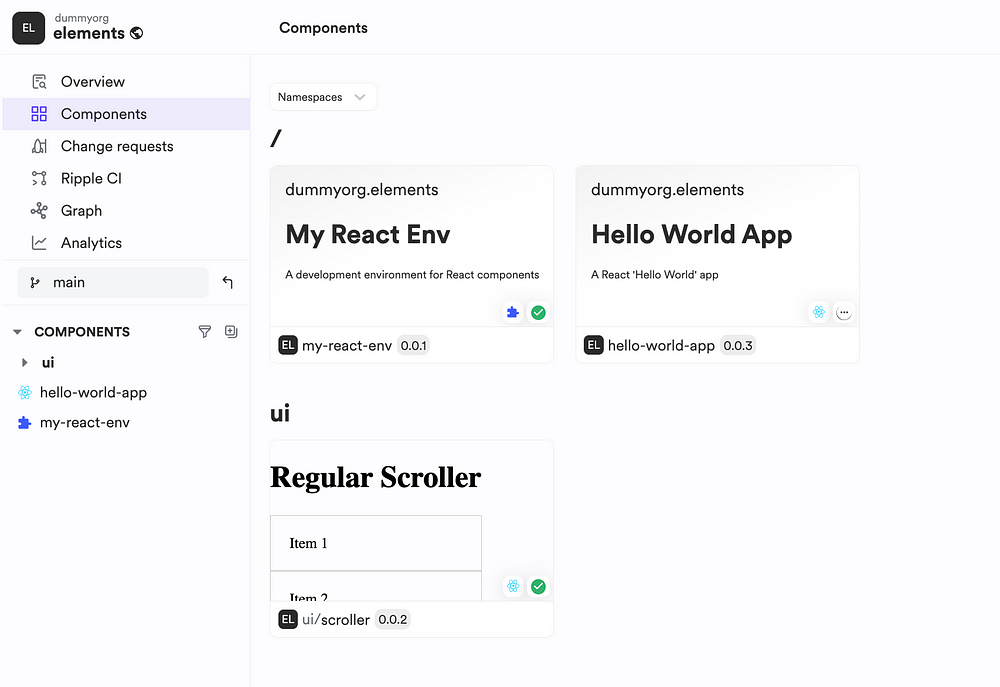
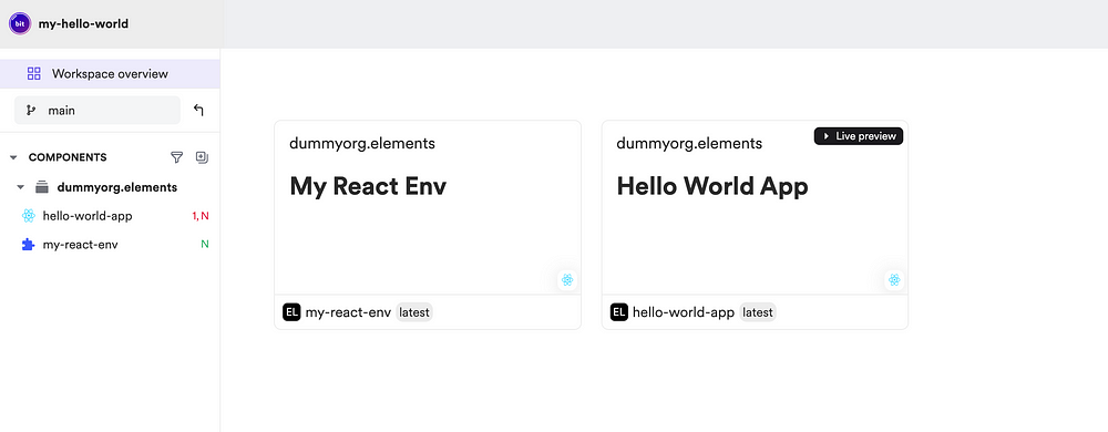
This workspace already comes preloaded with a bunch of components including an App component that lets us work with a fully functional React app off the box. So, let’s do some cleanup and get rid of the utility and the UI components using the command:
bit remove get-hello-world && bit remove ui/hello-world
Afterward you should be left with an environment and an app:
Step 03 — Building The Scroller
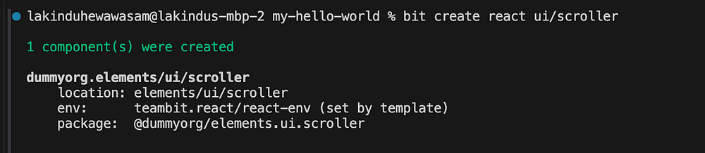
Next, let’s build the infinite scroller. To do so, let’s create a React component using the command:
bit create react ui/scroller --env my-react-env
You should see the output:
Next, open your scroller.tsx file and include the code:
import React, { useState, useEffect } from 'react';

export type ScrollerProps = {
  /**
   * custom loader to use
   */
  loader?: React.ReactNode;

/**
   * the content within the scroller
   */
  children?: React.ReactNode

/**
   * a function that triggers the load for data.
   * @returns anything
   */
  fetchMoreData: () => Promise<void>;
};

export function Scroller({ loader, children, fetchMoreData }: ScrollerProps) {
  const [isLoading, setIsLoading] = useState<boolean>(false);

useEffect(() => {
    const handleScroll = () => {
      // Set a threshold value to trigger fetching data
      const threshold = 100;

// Calculate the distance from the bottom of the page
      const scrollPosition = window.innerHeight + window.scrollY;
      const bottomPosition = document.documentElement.offsetHeight - threshold;

// Check if the user has scrolled to the bottom or beyond the threshold
      if (scrollPosition >= bottomPosition && !isLoading) {
        setIsLoading(true);
        fetchMoreData().then(() => {
          setIsLoading(false);
        });
      }
    };

// Add event listener for scroll event
    window.addEventListener('scroll', handleScroll);

// Clean up: remove event listener when component unmounts
    return () => window.removeEventListener('scroll', handleScroll);
  }, [isLoading, fetchMoreData]);

return (
    <div>
      {children}
      {isLoading && (loader || <p>Loading...</p>)}
    </div>
  );
}
As you can see, we’ve implemented our scroller component to load more data if the user has scrolled beyond a defined threshold in the screen or if the user has scrolled to the bottom of the screen. By doing so, we’re able to achieve an infinite scroller.
Additionally, we’ve also introduced customizability into the loader by letting users provide their custom implementation of the loader.
Next, let’s add some compositions to this component to showcase it’s power. To do so, update the scroller.composition.tsx with the following:
import { useEffect, useState } from 'react';
import { Scroller } from './scroller';
export const BasicScroller = () => {
const [data, setData] = useState<string[]>([]);
useEffect(() => {
const loadData = async () => {
const newData = await fetchData();
setData(prevData => [...prevData, ...newData]);
}
loadData();
}, [])
const fetchMoreData = async () => {
// Simulating fetching more data
const newData = await fetchData();
setData(prevData => [...prevData, ...newData]);
};
const fetchData = (): Promise<string[]> => {
// Simulating API call
return new Promise(resolve => {
setTimeout(() => {
const newData = Array.from({ length: 10 }, (_, i) => `Item ${i + 1}`);
resolve(newData);
}, 1000);
});
};
return (
<div>
<h1>Regular Scroller</h1>
<Scroller fetchMoreData={fetchMoreData}>
{data.map((item, index) => (
<div key={index} style={{ padding: '20px', border: '1px solid #ccc' }}>
{item}
</div>
))}
</Scroller>
</div>
);
}
export const ScrollerWithCustomLoader = () => {
const [data, setData] = useState<string[]>([]);
useEffect(() => {
const loadData = async () => {
const newData = await fetchData();
setData(prevData => [...prevData, ...newData]);
}
loadData();
}, [])
const fetchMoreData = async () => {
// Simulating fetching more data
const newData = await fetchData();
setData(prevData => [...prevData, ...newData]);
};
const fetchData = (): Promise<string[]> => {
// Simulating API call
return new Promise(resolve => {
setTimeout(() => {
const newData = Array.from({ length: 10 }, (_, i) => `Item ${i + 1}`);
resolve(newData);
}, 1000);
});
};
return (
<div>
<h1>Custom Scroller</h1>
<Scroller fetchMoreData={fetchMoreData}
loader={<>Loading through custom loader</>}
>
{data.map((item, index) => (
<div key={index} style={{ padding: '20px', border: '1px solid #ccc' }}>
{item}
</div>
))}
</Scroller>
</div>
);
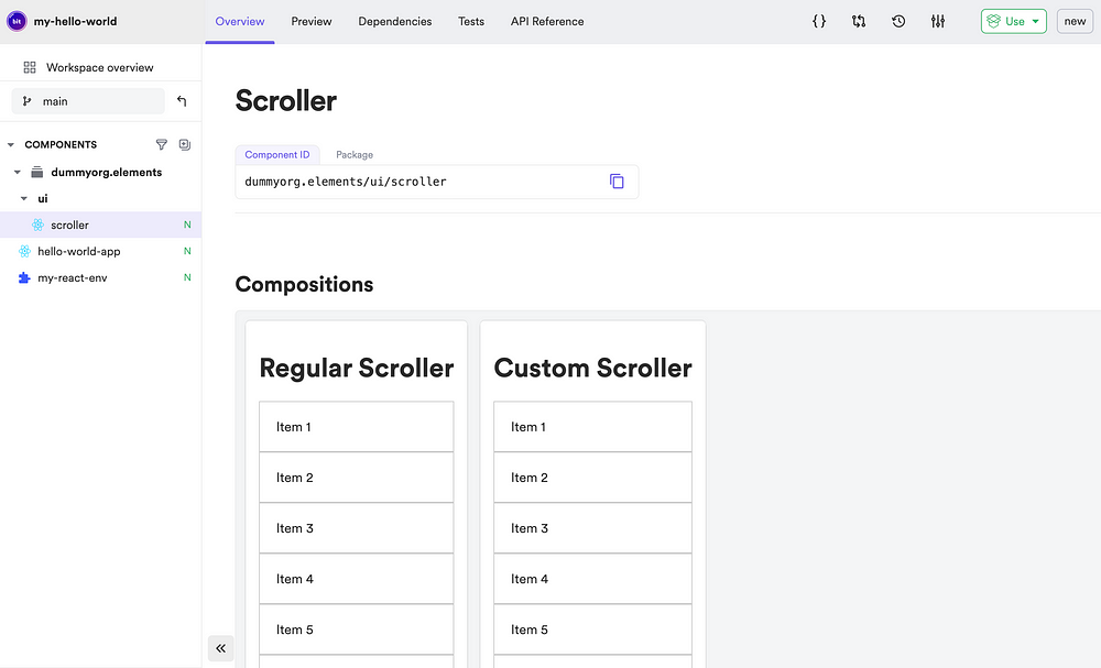
}Next, head back to your Bit server and you should see the output:
If you inspect a composition in greater detail, you can see it working as expected:
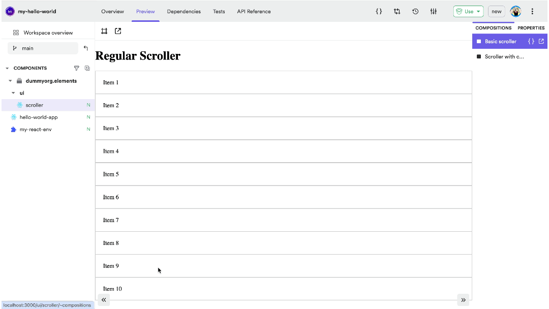
As you can see, the infinite scroll behavior is working as expected, with the custom loader as well.
So, let’s go ahead and share this for everyone to use.
To do so, run the command:
bit tag && bit export
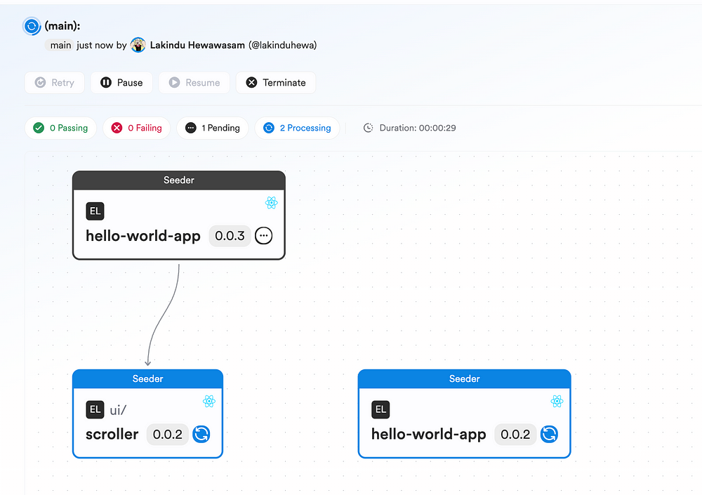
Once you do so, you should see a Ripple CI link generated on your console. Click on it to see Ripple CI building your React component.
Ripple CI automatically understands the changes made to the component tree and builds only the changes to make sure that all components stay in sync.
Step 04 — Consuming the scroller
Let’s leverage this scroller in a React app. To do so, visit the hello-world-app.app-root.tsx and update it with the following:
import ReactDOM from 'react-dom/client';
import axios from 'axios';
import { useEffect, useState } from 'react';
import { Scroller } from '@dummyorg/elements.ui.scroller';

const getPosts = async (): Promise<string[]> => {
    const resp = await axios.get('https://jsonplaceholder.typicode.com/posts');
    return resp.data.map((post: any) => post.title as string) as string[];
};

export const HelloWorldApp = () => {
    const [posts, setPosts] = useState<string[]>([]);

useEffect(() => {
        getPosts().then((data) => {
            setPosts(data);
        })
    }, [])

const loadMorePosts = async () => {
        const newPosts = await getPosts();
        setPosts((prev) => [...prev, ...newPosts]);
    }

return (
        <Scroller
            fetchMoreData={loadMorePosts}
        >
            {posts.map((post) => <p>{post}</p>)}
        </Scroller>
    )
};


const root = document!.getElementById('root');
ReactDOM.createRoot(root as HTMLElement).render(<HelloWorldApp />);
We’ve updated the app to leverage Axios and to use the JSON Placeholder API to dynamically load data.
So, lets test this out by launching the app outside of the Bit server using the command:
bit run hello-world-app
You should see the app loading and working with the scroller:
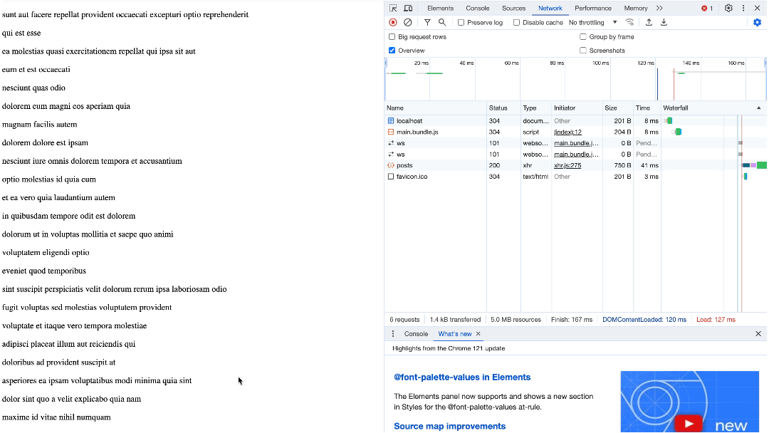
As you can see, when the user keeps scrolling down the window, the API call is invoked automatically and data is fetched and rendered!
You can tag and export your app with the command set we used earlier and you’ll see Ripple CI build your App accordingly:
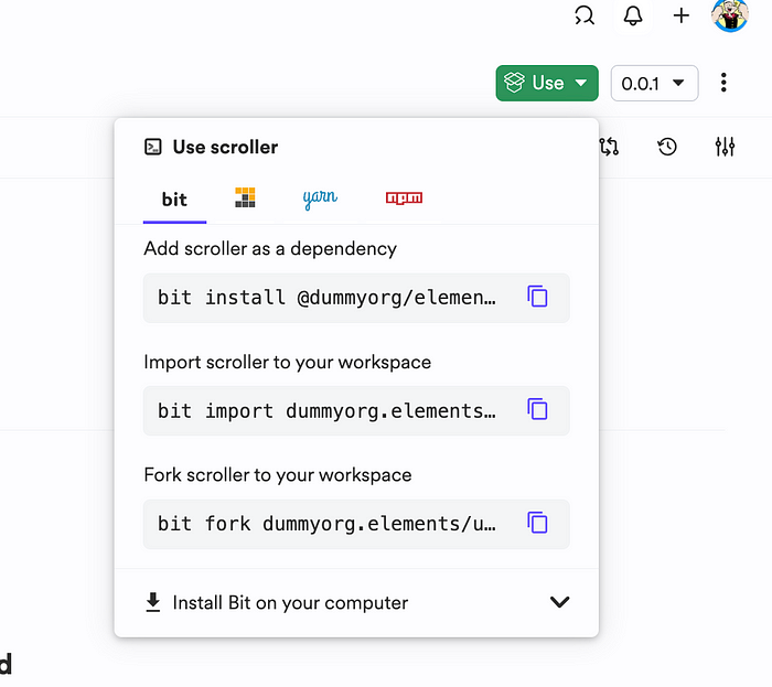
You can leverage this component in your React apps as well! All you have to do is install it as an NPM package:
Wrapping Up
And there we have it!
That wasn’t hard was it? Now you’re able to build great user experiences without having to go through the hassle of manually implementing anything!
To check out the full implementation, visit my Bit Scope
I hope you found this article helpful.
Thank you for reading!
Learn More
Recommend
About Joyk
Aggregate valuable and interesting links.
Joyk means Joy of geeK