

Composable Applications: A Practical Guide
source link: https://blog.bitsrc.io/composable-applications-a-practical-guide-335f47a92b41
Go to the source link to view the article. You can view the picture content, updated content and better typesetting reading experience. If the link is broken, please click the button below to view the snapshot at that time.
Composable Applications: A Practical Guide
Engineering for Adaptability: A Guide to Composable Software Solutions

Composable software is a design approach that aims to simplify the development and maintenance of software systems. It does so by breaking down the system into independent components that can be combined and reused in different ways.
Composability permeates through every phase of the development lifecycle, from initial design and architecture to implementation and onward to deployment. It’s important to recognize that ‘composable’ exists not as a binary attribute but as a continuum.
A system can be more or less composable depending on the degree of independence of its components. The more independent the components are, the more composable the system is.
Two factors for “component independence”
The degree of “independence” exhibited by components in a software system can generally be attributed to two main factors:
1. The design patterns and principles used to separate the system's concerns into independent components, such as the single responsibility principle, the open/closed principle, the dependency inversion principle, and so on.
2. The tools and technologies used to support the components' development, deployment, and management.
In this article, we’ll use Bit to develop and release independent components and integrate them into a larger system or application.
Component ownership and access control will be managed by segregating the components' source code into distinct “remote scopes,” which serve as dedicated hosting environments on bit.cloud
bit.cloud for Bit component hosting
This approach facilitates precise control over who can access and modify each component, ensuring that permissions are aligned with organizational roles and responsibilities.
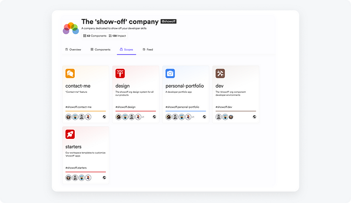
A demo organization on bit.cloud. Components in the org are hosted on separate “scopes”.
Composability in the design phase
In this phase, the goal is to identify the different concerns of the system and separate them into independent components.
Components and their APIs should be designed to address immediate needs, not solve problems that are not yet present. This is known as the YAGNI (You Ain’t Gonna Need It) principle.
It’s not only a recipe for simpler and more maintainable systems but also ensures components will be fully tested in real-world scenarios. If a component is not being used, it is not verified (trust is an important aspect of component reusability).
Existing components are often found and reused to address some of the “concerns” that were identified.
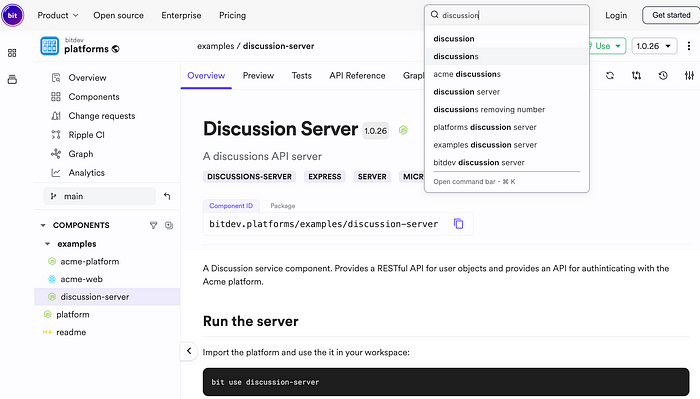
Searching for a “discussions” server (Bit component) on bit.cloud
This process of searching for existing solutions does not stop at the “top-level” but continues to smaller levels of component granularity in a recursive manner.
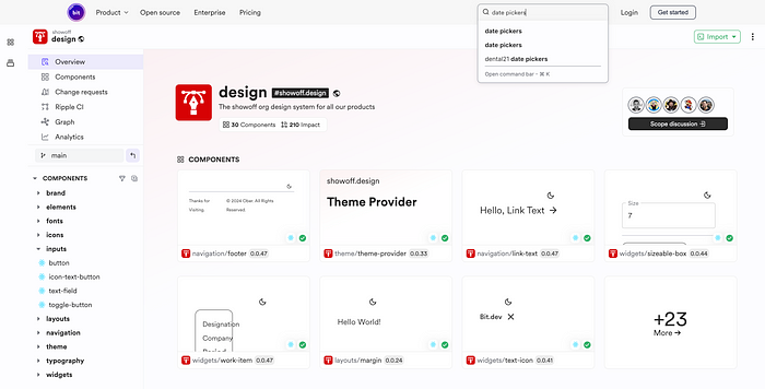
Elementary components in a “design” scope
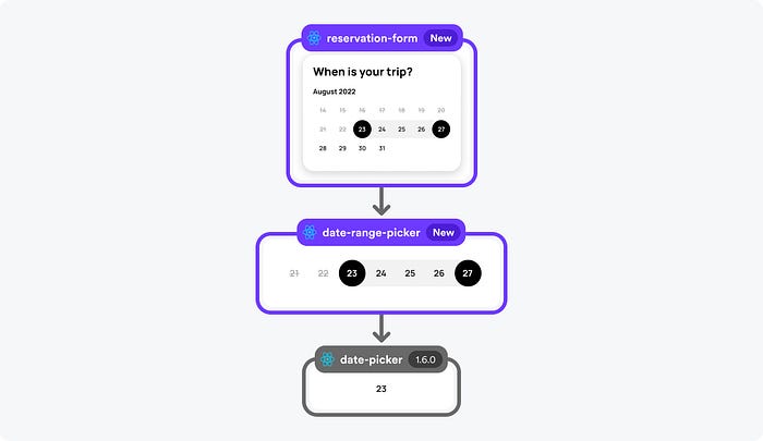
Components are rarely built from scratch but instead composed from existing components.
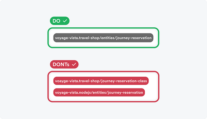
Each component is given a component ID. The ID is constructed from the component name, which specifies its main purpose, the namespaces that explain its context, and the scope, which defines who owns the component.

The Bit component ID — composed of the owner name, the namespaces and the component name
It’s important to adopt a business-centric mindset when constructing, naming, and organizing Bit components. Component names should be descriptive and closely aligned with the specific business needs they address.
Similarly, components should be organized into ‘scopes’ (remote component hosting) in a manner that reflects their business structure and functionality. That is, ownership and access control should be based on business logic, not technical considerations.
Components should be named according to their purpose, not implementation
This business-oriented naming convention serves multiple purposes. First, it makes the codebase more accessible to all stakeholders, including non-developers such as designers and product managers. This fosters a more inclusive and efficient collaboration, with an increased feedback loop among all team members.
Second, properly named, business-centric components make component dependency graphs easier to understand, which, in turn, makes it easier to refactor code, identify bugs, and resolve them.
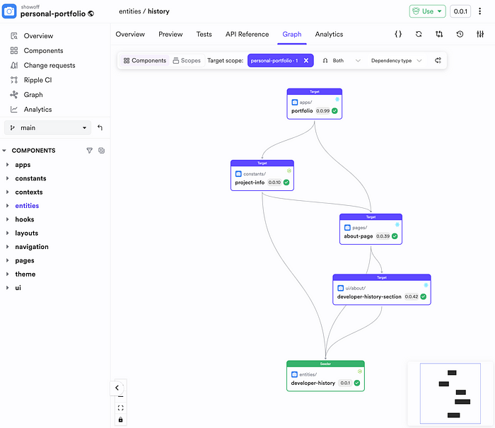
The dependency graph of part of a system
Lastly, a business-oriented naming convention makes it easier to find and discover components, promoting component reuse and saving time and resources.
Composability in the implementation phase
In this stage of the development process, the goal is to build the components in a way that makes them easy to combine and reuse. As mentioned earlier, using the SOLID principles as general guidelines is a good starting point.
However, adhering to the correct principles and patterns is not enough. To keep components independent, reusable, and portable, maintain them as Bit components.
A Bit component is a standalone unit of code that can be developed, tested, and versioned independently. It can be shared and reused across different projects, and it can easily integrate into larger systems or applications.
Unlike packages published from a monorepo, Bit components are decoupled from a specific repository or a project-level build setup. Each component is completely autonomous, with its own version history, build pipeline, and tooling.
For example, let’s create a simple empty Bit workspace:
bit new basic my-workspace
Now, let’s create a new component. We’ll create a React component as an example, but keep in mind that any other tech or framework can be used to implement your Bit components. We’ll host the component in our design scope, named “sparks”:
bit create react actions/buttton --default-scope bitdesign.sparks
The component is still coupled to the workspace/repository at this stage. To make it independent, we need to version and release it:
bit tag -m "first version"
bit export
The component is now being built and tested in the cloud, independently of the workspace.
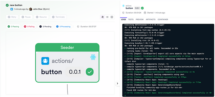
The ‘button’ Bit component is built isolated from its workspace
Once the build process is complete, the component will be ready to be consumed by other projects.
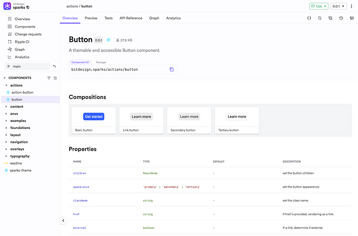
The ‘button’ component in its remote scope “sparks”
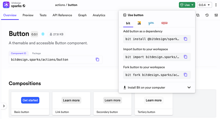
One way to consume it would be to install it:
bit install @bitdesign/sparks.actions.button
Components can also be installed in non-Bit projects using standard package managers:
npm i @bitdesign/sparks.actions.button
Remember that Bit components are not tied to a specific repository or project-level build setup. This means that they can be developed and maintained in any repository. For example, let’s create a new Bit workspace and import our componentfrom its remote scope:
bit new basic my-other-workspace
cd my-other-workspace
bit import bitdesign.sparks/actions/button
The workspace should now have the component available as a package in the node_module directory, but also as source files in the working directory. Changes to the source files are automatically reflected in the corresponding package:
.
├── sparks
    └── actions
        └── button
           ├── button.tsx
           └── index.ts
└── node_modules
    └── @bitdesign
       └── sparks.actions.button
Composability in the deployment phase
This phase is about deploying the components in a way that makes it easy to scale and manage the system.
We’ve already seen how Bit components can be versioned and released independently. The release process, so far, has been limited to publishing packages and hosting the component source code in different “scopes” in bit.cloud.
However, the release process can be extended to include the deployment of the components. Not all components need to be deployed independently, but some might be deployed as microservices, serverless functions, micro frontends, or full applications.
For example, to deploy our demo Bit component to Netlify, we’ll add a new file to its directory:
cd sparks/actions/button
touch button.bit-app.ts
Then, we’ll add the following code to the file:
/** @filename: button.bit-app.ts */

import { ViteReact } from '@bitdev/react.app-types.vite-react';
import { Netlify } from '@teambit/cloud-providers.deployers.netlify';

const netlify = {
  accessToken: process.env.NETLIFY_AUTH_TOKEN,
  productionSiteName: 'buttton-mfe',
  team: 'sparks',
};

export default ViteReact.from({
  name: 'button-app',
  deploy: Netlify.deploy(netlify),
});
From now on, every release of this component will include its deployment to Netlify. That is, this component’s build pipeline, which includes compiling, linting, testing, packaging, and so forth, has been extended with an additional step — deployment as a Vite app to Netlify.
Similarly, components can be deployed as serverless functions to AWS, as a microservice to Google Cloud, and so forth.
Regardless of the deployment strategy, the system remains composable as the components are still independent and can be combined and reused in different ways.
Having a centralized system rather than a distributed one does not mean the system is no longer composable. The key is to keep the components independent and reusable.
Conclusion
When components are independent, the development strategy, deployment strategy, and system architecture can be changed quickly and safely.
This is the essence of composability: the ability to rapidly change the system without breaking it.
Recommend
About Joyk
Aggregate valuable and interesting links.
Joyk means Joy of geeK