

Why UX design principles will forever be relevant
source link: https://uxdesign.cc/why-ux-design-principles-will-forever-be-relevant-ea50971bb053
Go to the source link to view the article. You can view the picture content, updated content and better typesetting reading experience. If the link is broken, please click the button below to view the snapshot at that time.
Why UX design principles will forever be relevant
Usability is about human psychology, not technology.
For a long time, digital user experience (UX) has been focused on flat, rectangular, physical screens. Websites and mobile apps have reigned supreme when it comes to designing interfaces and interaction experiences.
But the world is changing. Quickly. At the time of writing, we’re seeing the:
- revolution in artificial intelligence (AI), from OpenAI and Google interfaces capable of generating text, images, music and video, to hype around products like the Rabbit r1 and the Ai Pin by Humane — perhaps early glimpses of future AI assistants.
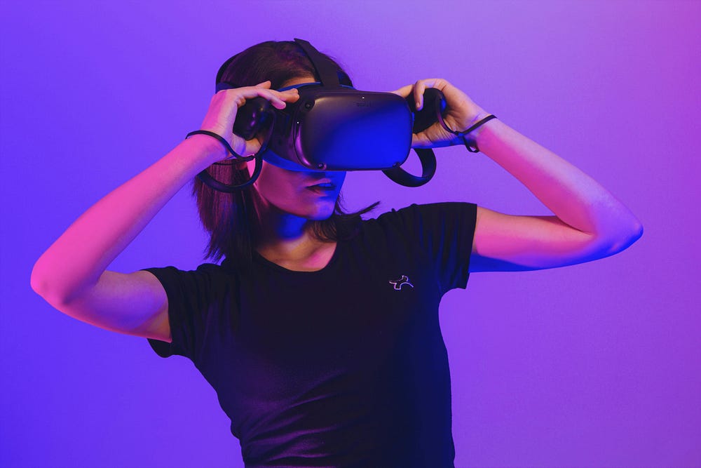
- growth of the augmented/virtual reality (AR/VR) market, from industry-leading spatial computing headsets like the Meta Quest and Apple Vision Pro to smart/AR glasses emerging as the next big thing in wearable tech.
- development of brain-computer interface (BCI) research and potential applications, including (ideally non-invasive) use cases for medicine, marketing, education and games.
If you’re a ‘traditional’ UX/product designer, it might seem like the relentless pace of emerging technology is leaving you behind. You might have even wondered:
How can old-school design principles be relevant in a world of futuristic tech?
But here’s the thing: while new technologies require learning new technical skills, the knowledge that actually makes you a good designer — such as understanding design principles — is universal. It’s future-proof.
In fact, the principles of design might actually be more relevant to emerging technology products.
So it’s probably a good point to start talking about them.
The principles of design
The seven fundamental principles of design were introduced to the world by Don Norman in his book The Design of Everyday Things, which has become essential reading for UX designers.
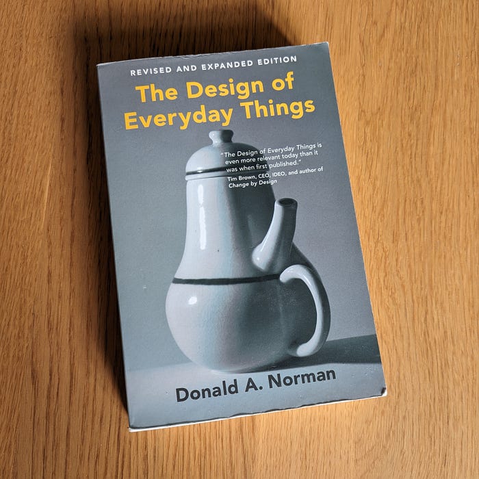
Don Norman’s The Design of Everyday Things — image by author
In this seminal work, Norman argued that products are usable if they follow these seven principles: good discoverability underpinned by affordances, signifiers, feedback, mappings and constraints, within the context of a conceptual model.
Here’s what each of those principles are about, in a nutshell:
1. Discoverability
Discoverability describes how easy it is to understand what interactions are possible with a product.
Usability should be intuitive. For example, when you load up a website it should be obvious what it’s for, who it’s aimed at, how to use it, etc.
Good discoverability is about making it obvious what users can do with a product without additional context. The easiest way to design for this? Follow established patterns and conventions so the product feels familiar to users (Jakob’s Law).
But discoverability isn’t actually a thing in itself, so much as the cumulative effect of those five supporting principles: affordances, signifiers, feedback, mappings and constraints.
2. Affordances
Affordances are the actions that are possible within the system or product.
The concept of affordance describes the the relationship between the properties of a product and capabilities of the user.
That’s a very technical, nerdy way of thinking about design principles, though. In simple terms, we can think of affordances as what you can do with a product — how to operate and interact with it.
For example, a mobile app might afford actions like scrolling, swiping, tapping, typing, searching and navigating. The app has properties, and users have the capability to do them.
3. Signifiers
Signifiers are the perceivable signals that indicate to users what actions are possible, and how they should be done.
For UX designers, signifiers are more important than affordances because they tell the user how to use the design. All the functionality in the world is worthless if people don’t know how to use it.
Some classic examples of signifiers you see all the time in typical user interface (UI) design include:
- arrows signifying users can scroll, swipe or drag to refresh
- buttons indicating that pressing them will perform an action
- icons suggesting the type of action to be performed in that area of the screen, e.g. a magnifying glass for search
4. Feedback
Feedback alerts users to the result of their actions and the current state of the product.
If signifiers tell users how to use a design, then feedback tells them what’s happening when they interact with it. There are two concepts in play here, so let’s look at them individually:
- Result of user actions: We need to know the design is responding to our clicks and taps. For example, links changing colour when we use them — this feedback tells us the product or system is registering our interactions, and reassures us the design is working as expected.
- State of the product: We need know when the overall state of the product or system has changed. For example, receiving an ‘order received’ message during an online purchase — this feedback reassures us the status of the transaction has changed from in-progress to complete.
It’s important that feedback is immediate, but planned appropriately so important information is prioritised. (If you tell users too much at once they’ll get overwhelmed and probably ignore everything.)
5. Mappings
Natural mappings help users to better understand the relationship between controls and the result of their actions.
‘Mapping’ means using spatial correspondence between the layout of controls and the product being controlled.
A classic example of mappings in product design is the layout of a cooker hob corresponding to the layout of the hob controls, or the arrangement of light switches matching the actual placement of lights in the room.
In UX design, an example of natural mappings that spans different devices is scrolling:as a user you can swipe up or down using a laptop trackpad to scroll up or down a webpage; similarly, you roll a mouse wheel up or down to perform the same action.
6. Constraints
Constraints help prevent slips and mistakes by removing opportunities for errors.
The concept of constraints is initially counter-intuitive. But it turns out limiting user interactions is actually helpful rather than just annoyingly restrictive.
It’s also easy to overlook adding constraints to a design, because you design products to be used correctly. But the reality is users get tired, distracted and easily make mistakes. Or they might confidently use a product incorrectly. In either case, we can minimise errors by adding constraints.
It’s beyond the scope of this article to explain the different theoretical types of constraints (logical, semantic, cultural and physical). But generic examples include things like asking for confirmation beforeusers clear or cancel something — avoiding a mistake through an accidental slip or mis-click — or restricting logins to trusted third-parties for security reasons.
Constraints are built into the design — image by charlesdeluvio on Unsplash
7. Conceptual model
A simplified explanation of how something works, and it doesn’t matter if this approximation is accurate as long as it’s useful.
The final piece in the design principles puzzle is the conceptual model. The idea is that users need some relatable model of how a product or system works to be fully confident and comfortable using it.
Take the modern smartphone: it’s not necessary for users to understand how it works on the level of an engineer or software developer. All they need to know is that it’s a phone, which also acts as a camera, calculator, notepad and hundreds of other things. The conceptual model is simply that it’s a helpful, entertaining multi-functional device.
Approximate conceptual models of products are useful, in the same way as simplified mental arithmetic (e.g. 10 x 40 instead of 9 x 42) — you don’t get the absolutely correct answer, but for practical, everyday situations it’s typically good enough to be useful.
Recommend
About Joyk
Aggregate valuable and interesting links.
Joyk means Joy of geeK