

Poetic Typeset: The 29 Best Fonts for Poetry
source link: https://www.designyourway.net/blog/best-fonts-for-poetry/
Go to the source link to view the article. You can view the picture content, updated content and better typesetting reading experience. If the link is broken, please click the button below to view the snapshot at that time.
Poetic Typeset: The 29 Best Fonts for Poetry
Ever paused on a page, not just for the words, but the dance of the fonts that grace it? Typography in poetry isn’t just about letters on a page; it’s about setting a mood, a tempo, a visual whisper that complements each verse.
In a world where content is king, the right throne—the best fonts for poetry—can elevate words from mere sounds to an experience. As a web designer, I’ve seen how a well-chosen typeface transforms the ordinary into something that lingers in the mind’s eye.
This article isn’t just a rundown. It’s a crafted journey into the elegant typefaces and typography intricacies meant for the artful language of poetry. You’ll learn about the subtle influences of serif versus sans-serif, the harmonious bliss in font pairings, and even the legal maze of font licensing.
By the end, expect to be well-versed not only in creative font selection but in weaving a visual rhythm that’s as impactful as the poetry itself.
The Best Fonts for Poetry
| Best Fonts for Poetry | Category | Serif/Sans-serif | Period/Designer | Notable Features |
|---|---|---|---|---|
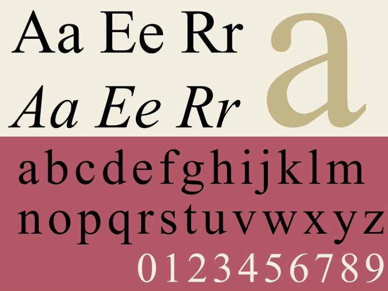
| Times New Roman | Traditional | Serif | 1931, Stanley Morison | Classic, legible, professional |
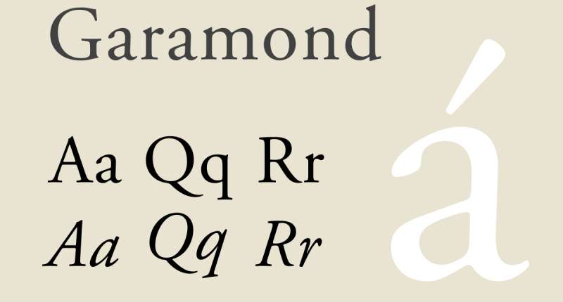
| Garamond | Classic | Serif | 16th century, Claude Garamond | Elegant, old-style, readable |
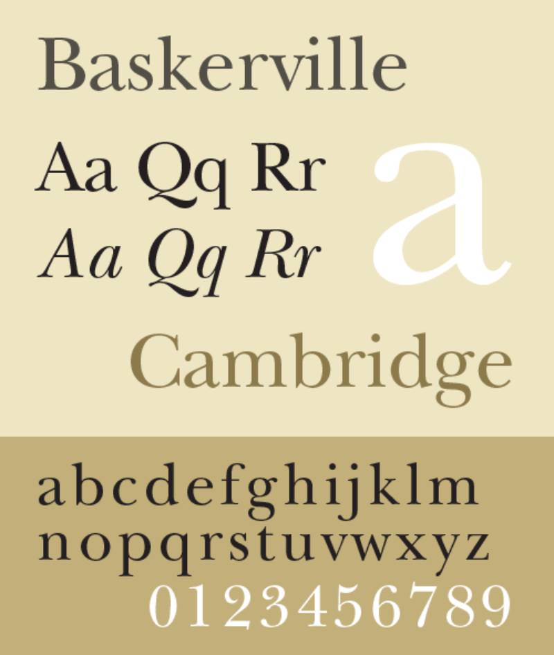
| Baskerville | Transitional | Serif | 1757, John Baskerville | Crisp, serious, strong contrast |
| Palatino | Old-style | Serif | 1949, Hermann Zapf | Large x-height, warm, versatile |
| Janson | Baroque | Serif | 17th-century, Nicholas Kis | Traditional, sharp serifs |
| Georgia | Modern | Serif | 1993, Matthew Carter | Clear, sturdy, screen-optimized |
| Caslon | Old-style | Serif | 1722, William Caslon | Timeless, warm, British aesthetic |
| Bodoni | Modern | Serif | Late 18th century, Giambattista Bodoni | Dramatic, thin serifs, high contrast |
| Book Antiqua | Traditional | Serif | 20th century | Similar to Palatino, legible |
| Cambria | Contemporary | Serif | 2004, Microsoft | Designed for on-screen reading |
| Arial | Grotesque | Sans-serif | 1982, Monotype Typography | Versatile, clean |
| Helvetica | Neo-grotesque | Sans-serif | 1957, Max Miedinger with Eduard Hoffmann | Neutral, clear, professional |
| Futura | Geometric | Sans-serif | 1927, Paul Renner | Modern, clean, geometric shapes |
| Calibri | Humanist | Sans-serif | 2004, Lucas de Groot | Contemporary, soft, warm |
| Verdana | Humanist | Sans-serif | 1996, Matthew Carter | Clear, wide, screen-friendly |
| Optima | Humanist | Sans-serif | 1958, Hermann Zapf | Elegant, classical proportions |
| Century Gothic | Geometric | Sans-serif | 1991, Monotype Imaging | Open, round shapes, modern |
| Franklin Gothic | Gothic | Sans-serif | Early 20th century, Morris Fuller Benton | Strong, straightforward |
| Trebuchet MS | Humanist | Sans-serif | 1996, Vincent Connare | Friendly, clear cut |
| Gill Sans | Humanist | Sans-serif | 1928, Eric Gill | Clean, classic British |
| Comic Sans | Casual | Sans-serif | 1994, Vincent Connare | Informal, oft-maligned |
| Lucida Handwriting | Script | Script | 1992, Charles Bigelow and Kris Holmes | Casual, cursive |
| Brush Script | Script | Script | 1942, Robert E. Smith | Informal, artistic |
| Lobster | Display | Script | 2010, Pablo Impallari | Quirky, bold, vintage |
| Pacifico | Script | Script | 2011, Vernon Adams | Relaxed, flowing, retro |
| Dancing Script | Casual | Script | 2011, Impallari Type | Dynamic, playful |
| Great Vibes | Script | Script | 2012, TypeSETit | Elegant, flowing, formal |
| Kaushan Script | Script | Script | 2012, Impallari Type | Handwriting, distinctive |
| Amatic SC | Handwritten | Sans-serif | 2011, Vernon Adams | Quirky, narrow, organic |
Classic Serif Fonts
Let’s dive right into the heart of poetry and fonts. It’s all about feeling the words, right? And the best fonts for poetry play a huge part in this. They’re like the unsung heroes, silently shaping our reading experience.
Ah, the timeless classic! When you think of typography for poets, this one’s often the front runner. It’s traditional, but with an elegance that just makes poetry flow.
Now here’s a font that’s been around the block. It’s got that old-style flair but keeps things professional. Garamond and poetry are like peanut butter and jelly – a perfect match.
Oh, the charm of Baskerville! It adds an academic and respected touch to poems. If your poem is a deep, thoughtful piece, Baskerville’s your go-to.
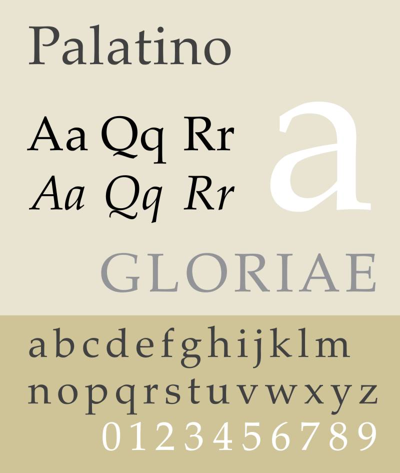
Versatility is Palatino’s middle name. Whether your poem is light-hearted or heavy, this font can handle it all. Plus, it’s super readable – a big win for font aesthetics for poems.
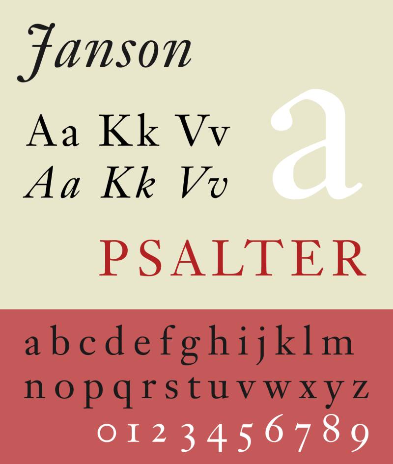
Here’s one for the academics. Janson and elegant typeface selection go hand in hand. It’s got a reputation, especially in the academic world of poetry.

Digital age, represent! Georgia is known for being comfortable for digital reading. It’s like the modern poet’s best friend – looks great on screens.
An English classic, that’s Caslon for you. It’s got history, style, and it makes your poetry feel like it’s straight out of a classic novel.

Bold and stylish, Bodoni brings a contemporary edge. It’s for when your poetry needs that extra punch.
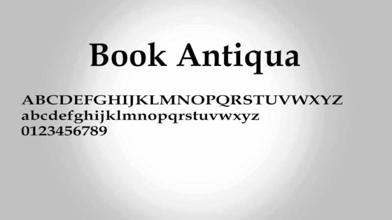
Warm, inviting, and just a touch nostalgic. Book Antiqua is like a cozy nook for your words to nestle in.
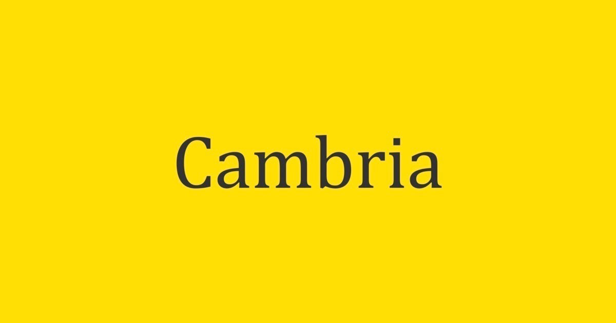
Designed for on-screen readability, Cambria is a modern hero. It makes sure your digital poetry is easy on the eyes.
Modern Sans-Serif Fonts
Diving into the modern world of poetry, let’s chat about modern sans-serif fonts. These are the game-changers, the trendsetters in the world of best fonts for poetry. They bring a fresh, clean vibe that’s just perfect for contemporary poetry.
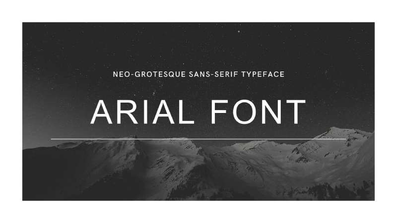
Let’s start with Arial. Super versatile, and you know what? It’s everywhere. Arial is like that cool, easy-going friend who fits in at any poetry gathering. It’s a great choice for a modern, no-fuss look in poetry.
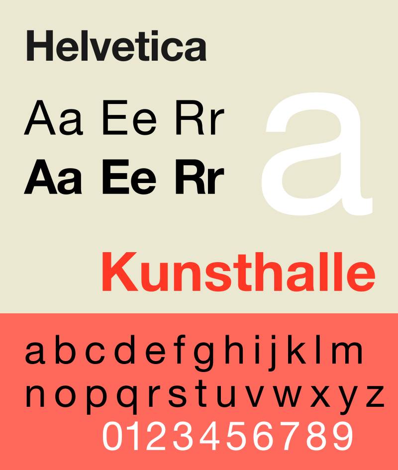
Now, Helvetica is the neutral king. It’s all about readability, and that’s a big deal when you’re showcasing your latest poem. It’s got a neutral vibe, making it perfect for a wide range of poetic styles.
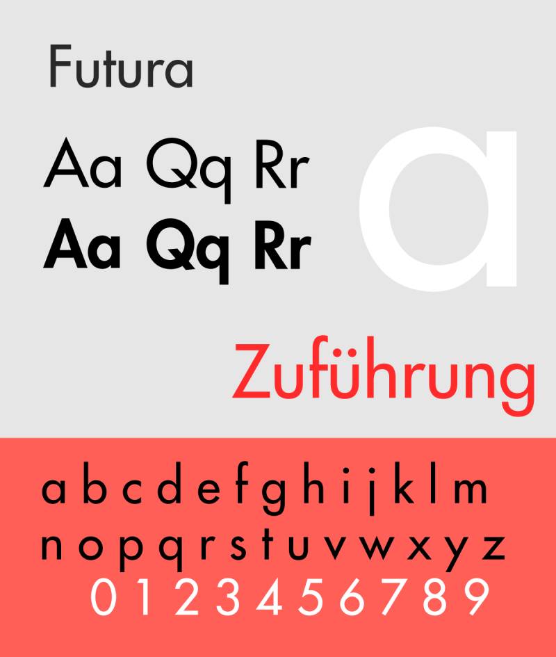
Talk about a contemporary, digital feel. Futura’s got that clean, geometric style. It’s like the font version of a modern art gallery – sleek, stylish, and perfect for modern and experimental poetry.
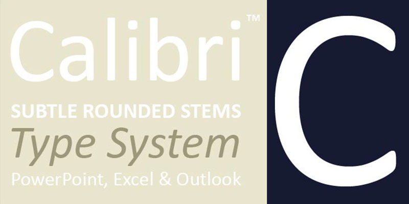
Friendly and modern, that’s Calibri for you. It’s one of those fonts that just make your digital poems feel welcoming. Plus, it’s super easy on the eyes, perfect for those long, reflective poems.
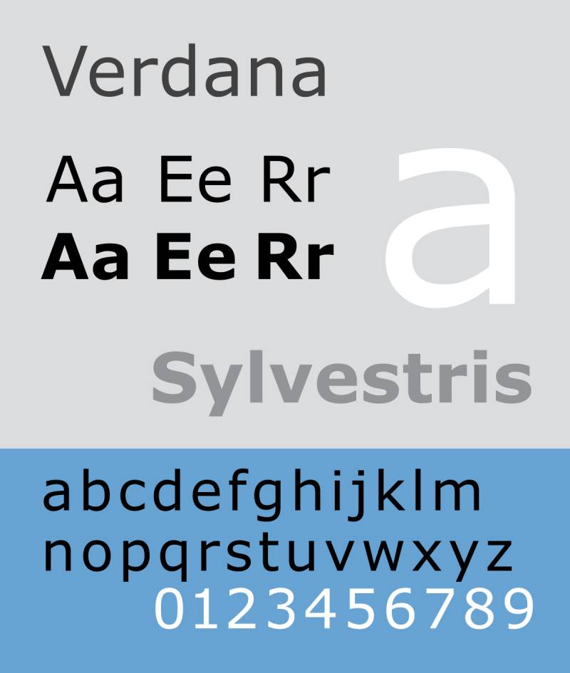
Here’s to clear and legible! Verdana takes the cake when it comes to making your words pop, especially on digital platforms. It’s like the font equivalent of a clear, sunny day – everything’s easy to see and feels good.
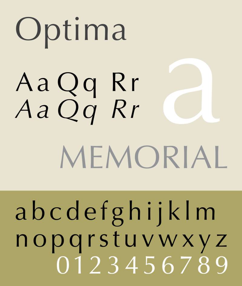
Elegant and humanist, Optima adds a touch of sophistication to your poetry without being over the top. It’s like that well-dressed guest at a poetry reading who has a subtle charm.
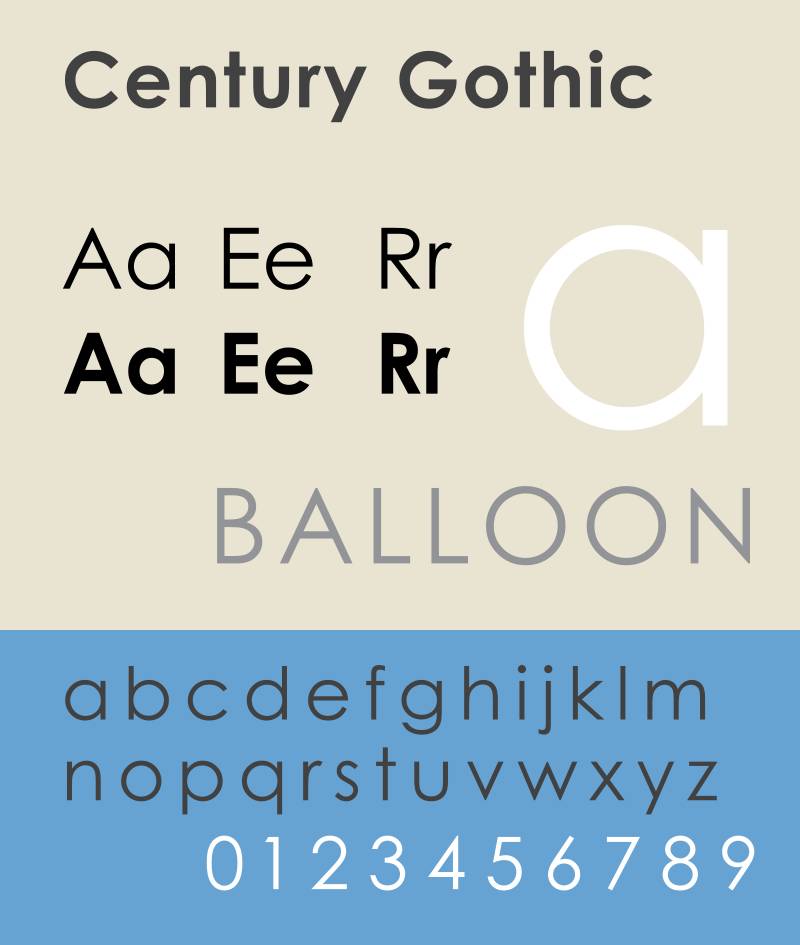
Ah, the geometric beauty of Century Gothic! It’s all about style and making a statement. It’s perfect for when your poem needs a touch of futuristic or abstract vibes.

Strong and assertive, this font is for when your poetry has something bold to say. It’s got presence, and it’s not afraid to stand out.
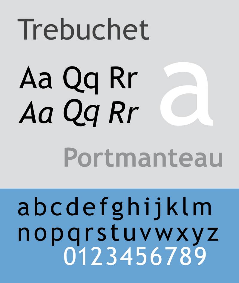
Casual, friendly, and oh-so-readable. Trebuchet MS is like that cool, laid-back buddy who makes everything feel more approachable.
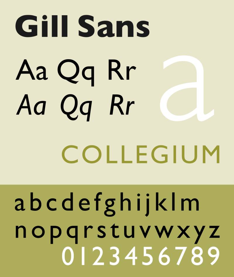
Here’s a classic, clean choice. Gill Sans has that timeless look that’s just right for a wide range of poetry. It’s like a versatile actor who can take on any role in the world of poetry.
Script and Decorative Fonts
Alright, let’s talk about script and decorative fonts – these are the showstoppers in the world of best fonts for poetry. They’re like the spice in your favorite dish; just a little bit can make a huge difference. These fonts are all about adding that personal touch and artistic flair to your poems.
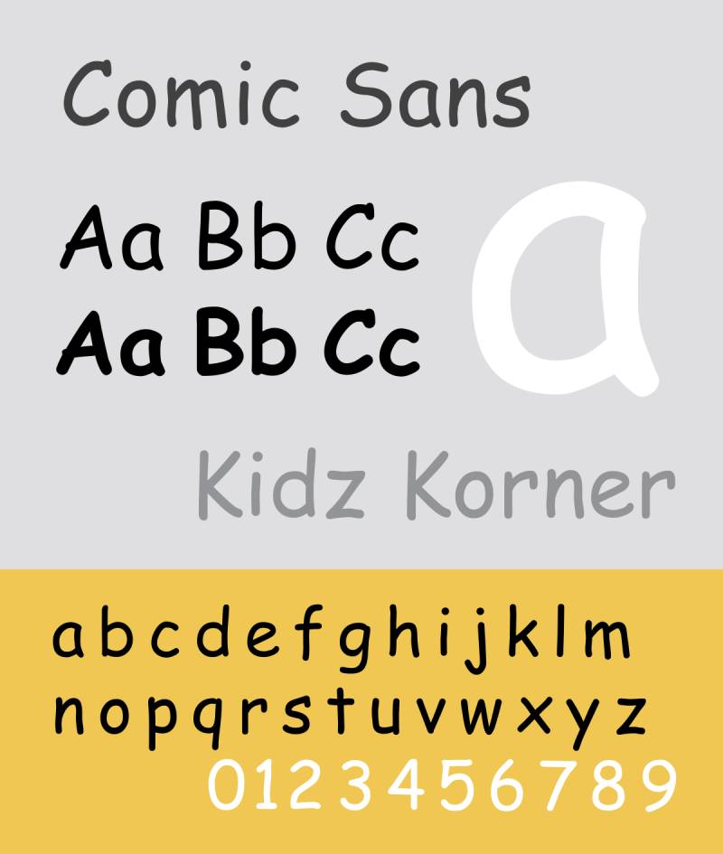
Okay, hear me out. It’s casual, it’s informal, and yeah, it gets a lot of flak. But sometimes, that’s just the vibe you need for your quirky, light-hearted poetry. It’s like wearing pajamas to a poetry slam – unconventional but fun.
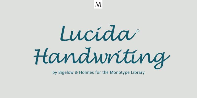
This one’s personal and informal. Lucida Handwriting is like writing in your journal, giving your poems a touch of intimacy. It’s great for poems that are meant to feel like a personal letter.
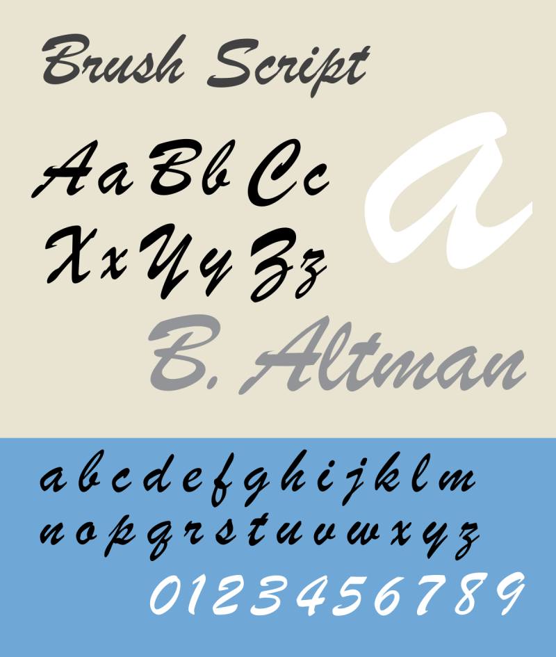
Flowing, expressive, and it almost dances across the page. Brush Script is perfect for those emotionally charged poems that need a bit of dramatic flair. It’s like the font equivalent of a passionate spoken word performance.

Bold and stylish, Lobster adds a contemporary twist to the script font family. It’s great for making a statement and giving your poems a modern, yet artistic look.

Casual script vibes, Pacifico is laid-back and easy-going. It’s great for poems that have a light, breezy feel. Think of a poem that feels like a day at the beach – that’s Pacifico.
Playful and light, just like its name suggests. Dancing Script is perfect for poems that have a rhythmical, joyful feel. It’s like your words are dancing to their own beat.

Elegant and flowing, Great Vibes adds a touch of sophistication. It’s perfect for romantic or heartfelt poetry, where every word feels like a gentle whisper.
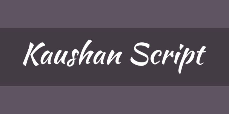
Distinct and readable, Kaushan Script adds personality without sacrificing clarity. It’s great for when you want your poems to have a unique voice.
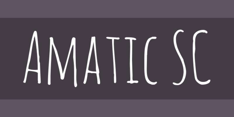
Quirky and handwritten feel, Amatic SC is perfect for when your poetry is all about breaking the norms. It’s like doodling in the margins of your notebook – fun, unique, and a bit unexpected.
Factors to Consider When Choosing a Font for Poetry
When you’re hunting for the best fonts for poetry, it’s not just about picking the prettiest one. There’s a bit more to it. Fonts have personalities, you know? They can change how your poem feels and breathes on the page. Let’s break it down, shall we?
Readability and Legibility
First things first, if your reader can’t read your poem easily, what’s the point, right? Readability in poetic texts is key. It’s like making sure the stage is set for your words to perform.
Clear and Easy-to-Read Fonts: No one wants to squint or get lost in fancy letters when diving into your poem. Go for fonts that don’t make your readers work hard. Think about font size considerations here too. Not too big, not too small – just right.
Font Size Considerations: Size matters, folks. Too small, and your readers are reaching for their glasses; too big, and it’s like shouting. Find that sweet spot where your poem feels comfortable to read.
Matching Font with the Poem’s Mood
Now, this is where the magic happens. The font you pick can totally set the mood for your poem. It’s like choosing the right music for a movie scene.
Traditional Fonts for Classic Poetry: Going old-school with your poetry? Classic serif fonts like Times New Roman or Garamond can add that timeless and professional touch. They bring the elegant typeface selection to the table.
Modern Fonts for Contemporary Themes: Writing something more modern? Sans-serif fonts like Arial or Helvetica, known for their neutral and readable quality, might be your jam. They bring a contemporary and digital feel that’s just right for modern themes.
Experimental Fonts for Avant-Garde Poetry: Feeling adventurous with your words? Try something like Futura or Lobster. These fonts add a unique, bold and stylish look, perfect for poetry that breaks the mold.
Different Types of Poetry and Corresponding Font Requirements
Poetry comes in all shapes and sizes, and so should your fonts. It’s all about matching the vibe.
Traditional Poetry
Elegance of Serif Typefaces: There’s a reason why serif fonts are classic. They bring an academic and respected feel to traditional poetry, like wearing a fancy dress to a posh dinner.
Suitability of Fonts like Palatino and Janson: These guys are the MVPs for traditional poetry. They’re like that reliable friend who always knows how to dress for the occasion.
Modern and Experimental Poetry
Clean Lines of Sans-serif Fonts: Sans-serif fonts are the cool kids in the font world. They bring a sleek, modern and friendly vibe, perfect for poetry that’s all about breaking new ground.
Unconventional Choices for Unique Expressions: Don’t be afraid to experiment. Sometimes, a funky font like Amatic SC can bring your avant-garde poem to life.
Visual Poetry
Fonts Allowing Manipulation and Visual Arrangements: Visual poetry is all about the looks. Pick fonts that let you play around with layout and design. Think outside the box – or the page, in this case.
Different Types of Poetry and Corresponding Font Requirements
Choosing the best fonts for poetry isn’t a one-size-fits-all deal. Poetry comes in many flavors, and each type has its own vibe. Let’s break it down and match these styles with their perfect font partners.
Traditional Poetry
Elegance of Serif Typefaces
Old-school poetry, like sonnets and ballads, needs a font that respects its roots. We’re talking about serif fonts – they’ve got that classic, timeless feel.
- Times New Roman: It’s the granddaddy of classic fonts. It’s like putting on a vintage record; it just feels right.
- Garamond: Think of this as the fine wine of fonts. It’s sophisticated, refined – perfect for your traditional verses.
Suitability of Fonts like Palatino and Janson
When your poetry is more about deep thoughts and less about being flashy, these fonts are your go-to.
- Palatino: This font is like that smart friend who knows a lot but doesn’t brag. It’s sophisticated yet approachable.
- Janson: It’s academic, respected. Janson is like that professor whose lectures you actually don’t want to miss.
Modern and Experimental Poetry
Clean Lines of Sans-serif Fonts
Modern poetry? It’s all about breaking the mold. Sans-serif fonts are like the modern art of the typography world – sleek, clean, and oh-so-cool.
- Helvetica: Neutral, readable, and it just fits with anything. It’s like the little black dress of fonts.
- Calibri: This one’s modern, friendly, and super easy on the eyes. It’s like that chill café where everyone feels welcome.
Unconventional Choices for Unique Expressions
Got a poem that’s out there, pushing boundaries? Let’s get wild with font choices.
- Futura: It’s got a contemporary, digital feel. Perfect for when your poetry is all about being in the now.
- Lobster: Bold, stylish, and a bit quirky. It’s like that indie movie that sticks with you.
Visual Poetry
Fonts Allowing Manipulation and Visual Arrangements
Visual poetry is where words meet art. You need fonts that are more than just letters; they’re part of the visual magic.
- Brush Script: It’s flowing, expressive. Each word you write with this font is like a stroke of paint on a canvas.
- Great Vibes: Elegant, flowing. It turns your poem into a piece of visual elegance.
Best Practices in Font Selection for Poetry Books and Submissions
When it comes to poetry, every detail counts – especially the font. It’s not just about making words look pretty; it’s about making them speak. Let’s get into the nitty-gritty of picking the best fonts for poetry for your next book or submission.
Font Size Guidelines
Ideal Font Sizes for Poetry Books
Size matters, folks. Too big and your poem feels like it’s shouting; too small, and it’s whispering in a crowded room.
- Aim for a sweet spot where the words are comfortable to read. Typically, somewhere between 11 and 14 points works well.
- Consider the length of your poem too. Longer poems might need a smaller font to fit elegantly on the page.
Adjusting Font Size Based on the Specific Font
Different fonts have different personalities, and size plays into that.
- Some fonts, like Arial or Helvetica, are super legible even at smaller sizes.
- Others, like those fancy script fonts, might need a bump in size to stay readable.
Common Fonts Used by Published Authors
Let’s talk about what the pros use. There’s a reason why these fonts are popular.
Preferences in the Publishing Industry
The publishing world has its favorites. These fonts are like the little black dresses of poetry – they always work.
- Times New Roman and Garamond are like old friends in the publishing world. They’re classic, reliable, and they just get poetry.
- For a more modern touch, fonts like Arial or Calibri are becoming go-to choices. They bring a clean, contemporary vibe.
Balancing Font Weight and Tone
The weight of a font – how bold or light it is – can really change the mood of your poem.
- A heavier font can add a sense of seriousness or urgency to your words.
- Lighter fonts can feel more delicate, perfect for more introspective or gentle poetry.
FAQ On The Best Fonts For Poetry
What makes a font suitable for poetry?
It’s all ’bout striking a balance. A suitable font blends readability with an emotional undertone that echoes the poem’s rhythm. Typefaces like Garamond or Times New Roman offer that classic, timeless feel, while something like Google Fonts’ Dancing Script might add that personal, handwritten touch.
How do serif and sans-serif fonts affect poetic presentation?
Serif fonts whisper tradition, each foot leading you to the next line, while sans-serifs shout modernity, clean and uncluttered. It’s like picking between a vintage wine or a sleek cocktail; each sets a unique mood and frames visual rhythm in its own light.
Why is legibility important in poetry fonts?
Legibility is the silent guardian of comprehension, ensuring each word, each pause, is effortlessly absorbed. In a form where nuance is everything, a legible font ensures the reader won’t miss the soft hum of a subtle metaphor or the sharp edge of a sudden break.
Can creative font selection impact the interpretation of a poem?
Absolutely. The right font is like a subliminal soundtrack, underscoring emotions, amplifying impact. Take Adobe Fonts. They offer a typographic design playground where the right choice might just let a melancholic verse sigh or a joyous stanza soar.
What are some recommended fonts for poetry in print?
When you’re printing, you need fonts ready for the stage. Garamond, Caslon, and Baskerville step up with grace, elegance, and a certain typographic design that whispers, “This is poetry.” Their clear, clean lines imprint words to memory as much as to paper.
What’s the difference between using fonts for digital versus printed poetry?
Pixels versus paper, it’s a whole new game. On screens, clarity is king. Look for fonts that can handle the glare, like those refined characters in Google Fonts. But in print, dabble in typographic design with more decorative flourishes. Think texture, think weight—that tangible poetry.
Are there any free poetry fonts for commercial use?
Yes! Google Fonts is the treasure trove, offering poetic typefaces without a price tag or legal fine print. Scout for options like Merriweather or Libre Baskerville. Just double-check that license, will ya? Free should mean free to use wherever your words take you.
How does font licensing work for poetry publications?
Entering the legal maze—licensing can be complex. But here’s the deal: when you choose a font, that license is your golden-ticket agreement on where and how you can use it. From books to blogs, make sure your chosen typeface is cleared for the journey.
Are handwritten-inspired fonts a good choice for poetry?
Oh, for sure. When poetry gets personal, a font with the curves and flair of calligraphy speaks volumes. It’s cozy, it’s intimate—it’s your handwriting-inspired font mimicking ink flowing from thought to paper. Just make sure it’s not so intricate that it swallows your words whole.
How do font pairings work in poetry?
Imagine two dancers—one leads, the other follows. In font pairings, one voice stands out; it’s your poem baring its soul. The supporting font—that’s your stagehand—ensures everything else is effortless to navigate. Together, they create a typographic design duet that’ll leap off the page.
Conclusion
So, we’ve wandered through the garden of typography, plucking the best fonts for poetry from branches heavy with serifs and sans-serifs alike. It’s been a trek—one that’s showcased the elegance and legibility necessary to let poetry breathe on the stage of the page.
Here’s the meat of it:
- Fonts aren’t just carriers of words; they’re silent narrators.
- The right pick—from the refined Garamond to the more contemporary feels of Google Fonts’ offerings—lifts the soul of a poem.
- The creative font selection plays a backing track to the symphony of verses.
Typography in literature deserves respect. Font aesthetics are as critical as the words they frame. Dig into the readable font styles, flirt with calligraphy, but always keep the dance of readability waltzing with style.
Now, armed with the best fonts for poetry, you’re ready to pen tomes that touch hearts with the same weight as the words they present. Go forth and let thoughts cascade across pages in fonts that do them justice.
If you enjoyed reading this article on the best fonts for poetry, you should check out these articles also:
Renowned for his expertise in logo design and visual branding, Bogdan has developed a multitude of logos for various clients.
His skills extend to creating posters, vector illustrations, business cards, and brochures. Additionally, Bogdan's UI kits were featured on marketplaces like Visual Hierarchy and UI8.
Recommend
About Joyk
Aggregate valuable and interesting links.
Joyk means Joy of geeK