

Flutter Essentials: Strategies for Collapsible Text in Flutter
source link: https://keyholesoftware.com/flutter-essentials-collapsible-text/
Go to the source link to view the article. You can view the picture content, updated content and better typesetting reading experience. If the link is broken, please click the button below to view the snapshot at that time.

Flutter Essentials: Strategies for Collapsible Text in Flutter
Rachel Walker February 20, 2024 Development Technologies, Flutter, Mobile, Tutorial Leave a Comment
As a mobile developer, I have had to create a lot of listing pages. The content, styling, and layout may all differ, but structurally, they are the same. When I first started using Flutter, I was immediately impressed by how fast they are to stand up. Nearly out of the box, the ListView and the Card work extremely well and support a wide variety of devices and use cases with no additional styling – all while remaining extensible.
With this in mind, when I needed to create a listing page that displayed variable lengths of pre-generated text that could be expanded and collapsed, I was not particularly concerned about the complexity of the task. However, I very quickly realized that Flutter is less optimized for handling large blocks of text than it is for displaying lists. I quickly encountered unexpected complexities that I had to manually account for. In this post, I’ll walk through the basic structure and explore which components can be used for solving this problem and creating collapsible text in Flutter.
The Setup
As a starting point for the project, I have three core requirements:
- The text needs to be displayed in a list that is scrollable and rendered correctly across devices.
- The user needs to be able to select the text.
- Long text should be truncated to no more than 2-3 lines, with an option to expand it.
The first item is fairly straightforward.
First, create a base component to host the list. It can use a ListView of Cards to set up the underlying infrastructure. The Cards can then display the text and maintain the collapsed/expanded state.
import 'package:flutter/material.dart';
class CollapsibleTextList extends StatelessWidget {
final List<String> entries = [
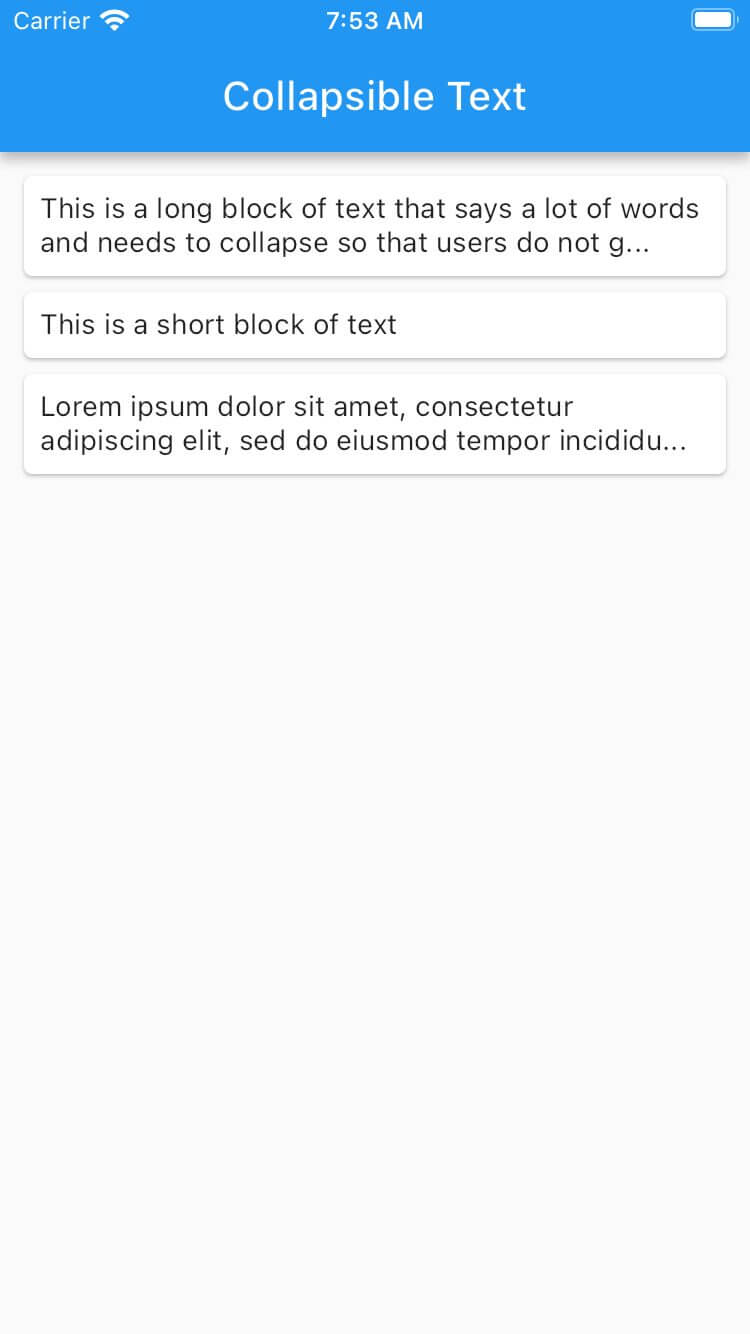
'This is a long block of text that says a lot of words and needs to collapse so that users do not get inundated with tons of information that they do not need to see upfront',
'This is a short block of text',
'Lorem ipsum dolor sit amet, consectetur adipiscing elit, sed do eiusmod tempor incididunt ut labore et dolore magna aliqua. Ut enim ad minim veniam, quis nostrud exercitation ullamco laboris nisi ut aliquip ex ea commodo consequat. Duis aute irure dolor in reprehenderit in voluptate velit esse cillum dolore eu fugiat nulla pariatur. Excepteur sint occaecat cupidatat non proident, sunt in culpa qui officia deserunt mollit anim id est laborum.'
];
CollapsibleTextList({super.key});
@override
Widget build(BuildContext context) {
return ListView.builder(
padding: const EdgeInsets.all(8),
itemCount: entries.length,
itemBuilder: (BuildContext context, int index) {
return Card(
child: Padding(
padding: const EdgeInsets.all(8.0),
child: CollapsibleText(text: entries[index])),
);
},
);
}
}
class CollapsibleText extends StatefulWidget {
final String text;
const CollapsibleText({
Key? key,
required this.text,
}) : super(key: key);
@override
State<CollapsibleText> createState() => _CollapsibleTextState();
}
class _CollapsibleTextState extends State<CollapsibleText> {
@override
void initState() {
super.initState();
}
@override
Widget build(BuildContext context) {
return Text(widget.text);
}
}

This takes care of the first requirement. The text is visible and scrollable across the devices.
For the second requirement, a minor adjustment is needed. The default behavior of the Text component prevents text selection. This also prevents copying the text. While this may be common in mobile apps, it is not the norm in web-based apps and may be a surprise to developers.
Luckily, the SelectableText component can be used. In this case of displaying a simple String, the component can just be substituted directly. It will also accept TextStyle for straightforward font styling. In more complex cases, especially when TextSpans are used instead of a String, the SelectableText.rich() constructor may need to be used.
Collapsing and Expanding
Now that the listing is present and the text can be selected, the collapse and expand functionality needs to be added. This breaks down into a few tasks:
- Determining what constitutes “long text” that needs to be collapsed.
- Styling the text based on if it is collapsed or not.
- Allowing the expanded behavior to toggle on and off.
It would be nice if #1 and #2 were handled by Flutter and the toggle behavior of #3 could be provided to whatever mechanism Flutter provides. There are a few properties that look helpful: TextSpan has a maxLines property and TextStyle has overflow. With that in mind, a first guess would look like:
SelectableText.rich(
   TextSpan(
    text: widget.text,
    style: const TextStyle(overflow: CustomToggle())),
    maxLines: 3,
 )),
Unfortunately, that overflow property only accepts TextOverflow values, rather than custom components or TextSpan. So this is not yet supported by Flutter. It does have an open issue, though.
In the meantime, the options become using a third-party library or handling the cases manually. For an app doing a lot of text handling, it may be worth investigating libraries, but I went ahead with a manual investigation.
What Constitutes Long Text?
There are a few ways to define long text, the two main ones I explored were setting a character limit cutoff and checking the visible line count. Each approach has pros and cons that will differ based on the actual application.
Setting a Character Limit
The main advantage of using a character limit cutoff is that it is very simple. While there may be some edge cases to handle around cutting off words in inconvenient places, these can also generally be ignored.
The main disadvantage is that it does not scale well across devices. Setting a 100-character limit will look natural on mobile, but will prematurely truncate text on desktop and tablet. To avoid this, different scale breaks need to be set across different widths.
This can be done using a MediaQuery to get the width of the total screen, then setting breakpoints manually and testing across all supported devices. This will look something like:
class _CollapsibleTextState extends State<CollapsibleText> {
 @override
 void initState() {
   super.initState();
 }

 @override
 Widget build(BuildContext context) {
   double screenWidth = MediaQuery.of(context).size.width;
   int charLimit;
   if (screenWidth > 600) {
     charLimit = 200;
   } else {
     charLimit = 100;
   }

   String summary = widget.text.length > charLimit
       ? '${widget.text.substring(0, charLimit)}...'
       : '';

   return SelectableText(summary.isEmpty ? widget.text : summary);
 }
}

Visible Line Count
The other approach to collapsible text in Flutter is determining how many lines the text will take up, then truncating it appropriately. The main advantages of calculating from the visible line count are consistency across devices, scalability, and responsiveness. While the prior solution with the MediaQuery approach accounts for rough breakpoints, it does not account for other factors that could impact the display – such as accessibility font size scaling.
The main disadvantage of determining the visible line count is that it is significantly more complex, both at development time and potentially at runtime depending on the depth of the component tree.
The first step is to determine the available space that will be available for printing text. The LayoutBuilder can be used to pass the constraints from a parent component to a child. Once the exact size of the space is known, a TextPainter can be used to lay out the text and measure it.
The LayoutBuilder is very helpful for laying out tricky components, but it needs to be used cautiously. It runs during the layout phase of rendering to dynamically compute the layout constraints. If there are complex components nested within it, loading can be delayed if there are frequent rebuilds or layout computations. This is especially apparent when multiple LayoutBuilders are nested.
The TextPainter uses the styling it is provided with to determine the canvas size of the text without actually painting it. It is critical to ensure that the styles it evaluates exactly match what will be rendered. This includes obvious things like TextStyle but also more subtle things, such as accessibility text scaling, which can be accessed via MediaQuery.of(context).textScaleFactor. The TextPainter must be disposed of as well.
With this in mind, in the code snippet below, the LayoutBuilder is used directly in the return and the TextPainter is used in a function to return the display text limited to 2 lines of length. Like the code for the count approach, this manually handles adding ellipses for the overflow to ensure they consistently display.
class _CollapsibleTextState extends State<CollapsibleText> {

 @override
 void initState() {
   super.initState();
 }

 String getTextOverflow(String text,
     {double minWidth = 0,
     double maxWidth = double.infinity,
     int maxLines = 2,
     double fontSize = 14}) {
   final TextPainter textPainter = TextPainter(
       text: TextSpan(text: text),
       maxLines: maxLines,
       textDirection: TextDirection.ltr)
     ..layout(minWidth: minWidth, maxWidth: maxWidth);

   var overflow = '';
   if (textPainter.didExceedMaxLines) {
     int endIndex = textPainter
         .getPositionForOffset(Offset(maxWidth, fontSize * maxLines))
         .offset;
     overflow = '${text.substring(0, endIndex - 3)}...';
   }
   textPainter.dispose();
   return overflow;
 }

 @override
 Widget build(BuildContext context) {
   final textScaleFactor = MediaQuery.of(context).textScaleFactor;
   final defaultTextStyle = DefaultTextStyle.of(context);
   final adjustedTextSize =
       (defaultTextStyle.style.fontSize ?? 14) * textScaleFactor;


   return LayoutBuilder(builder: (context, constraints) {
     final String overflowText = getTextOverflow(widget.text,
         maxWidth: constraints.maxWidth, fontSize: adjustedTextSize);
     if (isExpanded || overflowText.isEmpty) {
       return SelectableText(widget.text);
     }
     return SelectableText.rich(
       TextSpan(text: overflowText),
       maxLines: 2,
     );
   });
 }
}
Toggling
Now that the difficult part is done in our journey to create collapsible text in Flutter, a toggle can be added to allow users to expand or collapse the text.
Common in designs, this will show as a link to the right of the ellipses. However, since Flutter is missing the mechanism for custom overflow, this would also need to be done manually by accounting for the extra text when calculating the character count or the space of the overflow text. It is substantially easier to put the toggle on its own row.
Once the placement is determined, adding the toggle is simple state logic with a GestureDetector.
class _CollapsibleTextState extends State<CollapsibleText> {
 bool isExpanded = false;

 @override
 void initState() {
   super.initState();
 }

 String getTextOverflow(...) {
   ...
 }

 @override
 Widget build(BuildContext context) {
   final textScaleFactor = MediaQuery.of(context).textScaleFactor;
   final defaultTextStyle = DefaultTextStyle.of(context);
   final adjustedTextSize =
       (defaultTextStyle.style.fontSize ?? 14) * textScaleFactor;

   return LayoutBuilder(builder: (context, constraints) {
     final String overflowText = getTextOverflow(widget.text,
         maxWidth: constraints.maxWidth, fontSize: adjustedTextSize);
     return Column(crossAxisAlignment: CrossAxisAlignment.start, children: [
       if (isExpanded || overflowText.isEmpty)
         SelectableText(widget.text)
       else
         SelectableText.rich(
           TextSpan(text: overflowText),
           maxLines: 2,
         ),
       if (overflowText.isNotEmpty)
         Row(mainAxisAlignment: MainAxisAlignment.end, children: [
           GestureDetector(
             onTap: () {
               setState(() {
                 isExpanded = !isExpanded;
               });
             },
             child: Text(
               isExpanded ? 'Show Less' : 'Show More',
               style: const TextStyle(
                 color: Colors.blue,
                 decoration: TextDecoration.underline,
               ),
             ),
           ),
         ])
     ]);
   });
 }
}
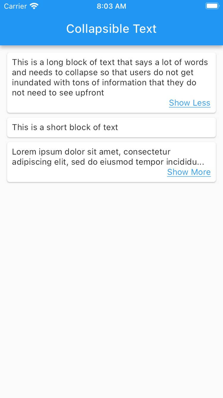
With that last piece added, the requirements have been met. The text displays appropriately and can be expanded and collapsed as needed by the user.
Wrapping Up
Overall, adding this collapsible text component was much more work than I expected given how straightforward some other common development tasks have been using Flutter. With that in mind, based on the current open issues, I anticipate a lot of future platform development around the text components to reduce the amount of nesting and custom logic required for use cases like these. There is solid support from the Flutter community, and Flutter continues to be a strong and evolving player in the mobile development space.
Thanks for reading. Leave your feedback below, and check out our other posts on the Keyhole Dev Blog.
Recommend
About Joyk
Aggregate valuable and interesting links.
Joyk means Joy of geeK