

Ad Appeal: 20 Awesome Fonts for Ads
source link: https://www.designyourway.net/blog/fonts-for-ads/
Go to the source link to view the article. You can view the picture content, updated content and better typesetting reading experience. If the link is broken, please click the button below to view the snapshot at that time.
Ad Appeal: 20 Awesome Fonts for Ads
Imagine this: A world where each letter in an ad is a charismatic character, each word a story whisperer. That’s the power of pairing the right message with the right typeface. Now think about some examples of the best fonts for ads—and what if finding the perfect match for your next campaign could be as simple as flipping through a lookbook of the most effective, the most engaging, the show-stoppers of ad typography?
This piece is your ticket there. Your trusty guide to the psychology of fonts and their make-or-break role in visual communication and branding.
From versatile sans-serifs to trustworthy serifs, you’ll explore the quintessence of advertising typefaces that blend form with function to elevate your message.
By the curtain call, you’ll walk away with a bespoke collection of font picks that guarantee readability, viewer engagement, and a seamless echo of your brand’s spirit.
Buckle in; it’s time to dive into the aesthetic font choices that stand as titans in the ad world.
The Best Fonts For Ads
| Best Fonts for Ads | Typeface Style | Suitable for | Visibility | Notes |
|---|---|---|---|---|
| Helvetica | Sans-serif | Print, Web, Corporate | High | Neutral and flexible, widely used professionally |
| Arial | Sans-serif | Print, Web, General Use | High | Common default, similar to Helvetica |
| Futura | Geometric Sans | Modern, Fashion, Technology | Medium | Distinctive geometric shapes |
| Univers | Sans-serif | Print, Web, Corporate | High | Large family, offers many weights |
| Calibri | Humanist Sans | Digital Documents, Business Communication | High | Default in Microsoft Office, accessible |
| Gotham | Geometric Sans | Political, Trendy, Architecture | High | Professional with a modern feel |
| Proxima Nova | Geometric Sans | Web, Mobile Apps, Digital Ads | High | Modern and friendly, web-friendly |
| Montserrat | Geometric Sans | Digital, Posters, Startups | Medium | Trendy, great for headers and display use |
| Franklin Gothic | Sans-serif | Newspapers, Headlines | Medium | Strong, robust character |
| Garamond | Old-style Serif | Print, Elegance, Books | Low | Classic, readable at small sizes |
| Times New Roman | Transitional Serif | Newspapers, Academic | Medium | Traditional, familiar to many |
| Baskerville | Transitional Serif | Books, Print Material | Medium | Elegant and serious |
| Georgia | Serif | Web Readability, E-books | High | Designed for clarity on screens |
| Clarendon | Slab Serif | Posters, Signage, Advertising | Medium | Strong and stable, good for emphasis |
Top Serif Fonts for Advertising
Trajan
Ever seen those movie posters with epic fonts? Chances are, that’s Trajan. It’s grand, it’s authoritative – perfect for making a statement.
Bodoni Moda
This one’s a fashion icon. Bodoni Moda has got style, making anything it’s on look high-end.
Copperplate
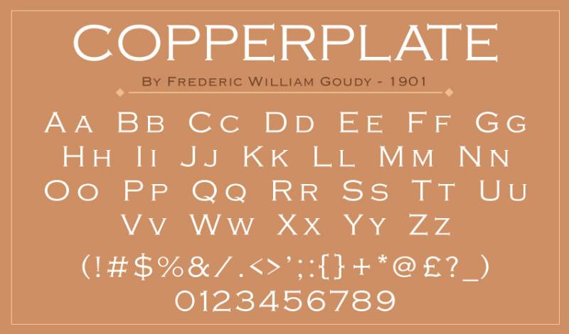
Need something that feels engraved and timeless? Copperplate’s your pick.
Minion
Don’t let the name fool you. Minion is a versatile font, great for a more subdued, professional look.
Monalisa
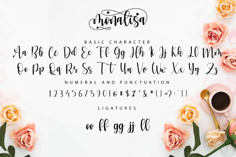
This font is like the painting – a classic. It’s elegant and works great for brands with a long history.
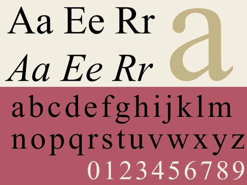
Garamond
Ah, the reader’s friend. Perfect for longer texts without losing that classy touch.
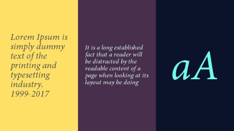
Times New Roman
The old reliable. It’s familiar, which makes your ad feel instantly recognizable.
Baskerville
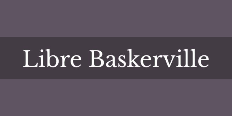
Looking for something with a bit more punch? Baskerville’s strong contrast makes it pop.
Georgia
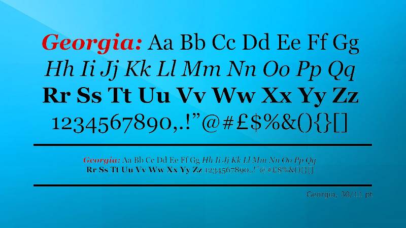
It’s like Times New Roman’s younger, cooler cousin. Great for digital platforms.
Clarendon
This one’s got a firm, solid look. It’s bold without being over the top.
Top Sans Serif Fonts for Advertising
Helvetica
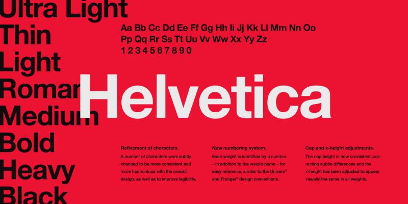
The superstar of sans serifs. Helvetica is like that friend who fits in everywhere. It’s versatile and always looks professional.
Arial
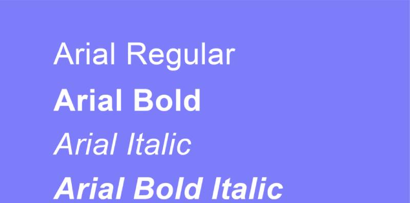
The go-to choice for clarity. Arial is like Helvetica’s younger sibling, familiar but with its own personality.
Futura
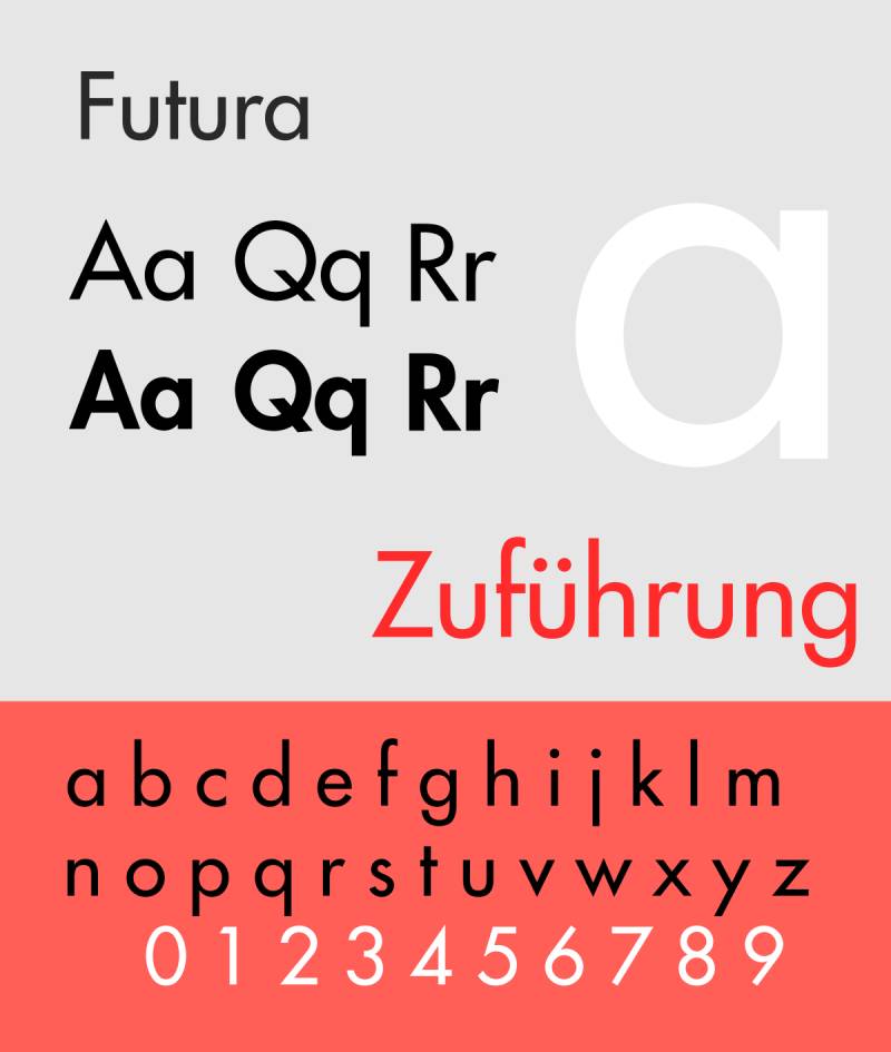
Want to add a touch of geometric style to your ad? Futura’s your font. It’s got this cool, futuristic feel that can make any ad stand out.
Univers
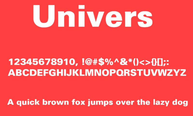
Univers is all about flexibility. With a wide range of weights and styles, it’s like a Swiss army knife for designers.
Calibri
The new kid on the block. Calibri’s become super popular for its clear, friendly appearance.
Gotham
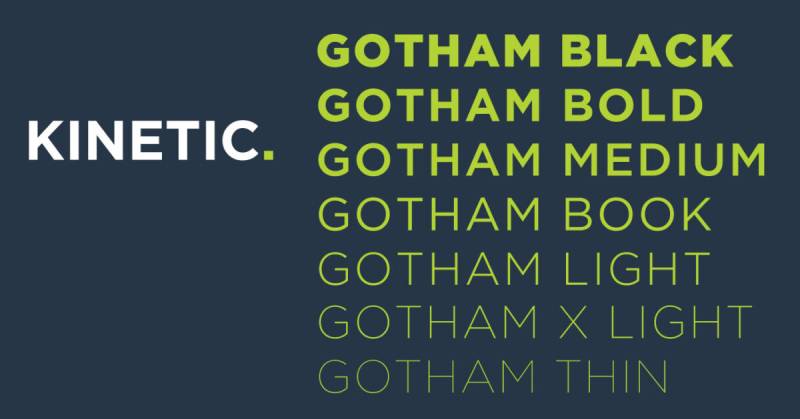
Gotham’s got this solid, no-nonsense vibe. It’s bold, it’s assertive – perfect for making a statement.
Franklin Gothic
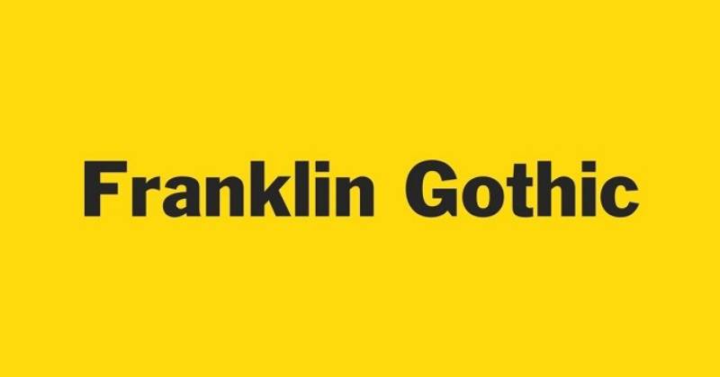
Need something strong but not too overpowering? Franklin Gothic strikes that balance beautifully.
Proxima Nova
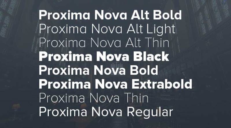
It’s like Helvetica’s trendy cousin. Proxima Nova is modern, stylish, and fantastic for digital platforms.
Myriad Pro
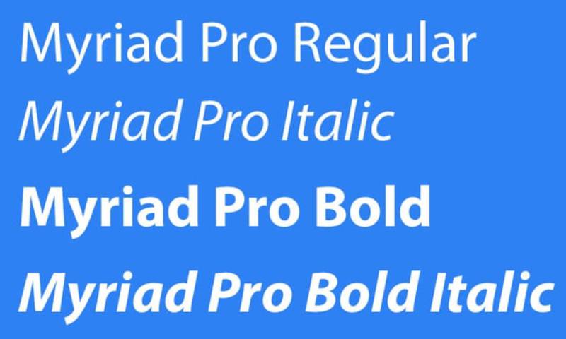
Soft, friendly, and super versatile. Myriad Pro works great in both digital and print ads.
Montserrat
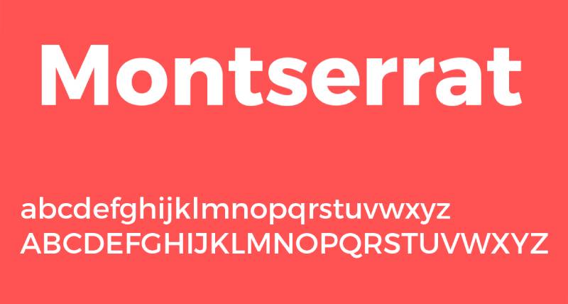
This one’s a gem for web design. Montserrat is clean, readable, and has a certain charm that works well in any online ad.
FAQ On Fonts For Ads
What Makes a Font Ideal for Ads?
Fonts work their magic subtly, yet powerfully. An ideal ad font partners well with your brand’s voice. Think beyond aesthetics—clarity and readability come first. Plus, it’s got to evoke the right emotional response.
How Do Fonts Impact Viewer Perception?
It’s all psychology. Fonts set a mood; they nudge emotions. Serif fonts? They whisper tradition and reliability. Sans-serif? Now you’re talking modern, approachable. Your choice whispers a message before the actual words do.
Are Certain Fonts Better for Online Ads?
Online’s a different beast. Fonts like Arial or Roboto—found in Google Fonts—shine for web roles. They’re legible on screens and ooze web-safe charm. Designed for readability, they help keep those eyeballs on your ad, longer.
What About Font Size in Advertising?
Size matters. It’s like Goldilocks—not too big and not too small. Your main copy? Standing tall at 14-16 px is a nice sweet spot online. Headlines? You can push that gauge higher for impact.
Can Font Choice Improve Ad Conversion Rates?
Spot on. A bold, attention-grabbing font can make call-to-actions (CTAs) pop, nudging clicks. But don’t ignore font psychology—the right font flavor turns viewers into clickers. It’s the subtle art of ad design and typography.
Which Fonts Are Most Legible for Print Ads?
In print, go for fonts with meat—thicker strokes, clear characters. Think Helvetica or Garamond. Remember, outdoor ads meet viewers at a high-speed glance—stand out with legibility.
How Important Is Font Licensing for Ad Use?
Heads up on font licensing—it’s critical for staying legal. Copyright Law quirks make some fonts off-limits for commercial use without a permit. Stick to licensed or license-free fonts; dodge legal snags.
Should I Use the Same Font Across All My Ads?
Consistency? That’s branding gold. A consistent font fosters brand identity recognition. Don’t be afraid to mix it up with subtlety though—just stay true to the core brand vibe.
Is It Worth Paying for Premium Fonts?
Consider the branding scale. Premium fonts offer uniqueness, which can be a game-changer for a standout brand identity. But if your budget squeaks, many free options do a bang-up job without stretching the purse strings.
How Do I Test If I’ve Chosen the Right Font for My Ad?
Good old A/B testing. Pitch your chosen font against another, keep all else equal, and measure. Which one converts? Engages? Which one’s your silent hero, driving those results home? The data will speak.
Conclusion
And just like that, we’ve strutted through the vibrant catwalk of typefaces, showcasing not just examples but heroes in their own right—the best fonts for ads that speak volumes without uttering a single sound.
It’s about aligning elegance with readability, marrying conversion rates with character design, and inviting viewer engagement through every curved serif and straight-laced sans-serif.
The camp of Helvetica has been visited, Garamond’s grace appreciated, and the modern charm of Futura indulged.
Your ads stand at the brink of transformation, ready to harness the compelling power of these typographic titans to woo and win your audience.
Remember, in this kingdom of clicks and conversions, the throne is won by those who wield the sword of the strongest message, paired with the mightiest of typefaces.
Go forth and conquer, with these alchemical blends of letterforms in your arsenal, shaping the future narrative of your brand’s story.
If you enjoyed reading this article on fonts for ads, you should check out these articles also:
Renowned for his expertise in logo design and visual branding, Bogdan has developed a multitude of logos for various clients.
His skills extend to creating posters, vector illustrations, business cards, and brochures. Additionally, Bogdan's UI kits were featured on marketplaces like Visual Hierarchy and UI8.
Recommend
About Joyk
Aggregate valuable and interesting links.
Joyk means Joy of geeK