

DropDown or Button? Both: Telerik DropDrownButton for Blazor
source link: https://www.telerik.com/blogs/dropdown-button-both-telerik-dropdrownbutton-blazor
Go to the source link to view the article. You can view the picture content, updated content and better typesetting reading experience. If the link is broken, please click the button below to view the snapshot at that time.

Telerik DropDrownButton for Blazor

Streamline your UI by tucking secondary button actions into a dropdown. See how to customize the button style and set individual icons for each action option.
DropDownButton for Blazor is the perfect combination of the features that a regular button has to offer with the capabilities of a dropdown component.
This is an ideal option to provide to the end user of your .NET Blazor app a simple UI to display hidden options to choose from with a single click. Typical scenarios for using such a component include:
- When we need to add options in toolbars for the end users
- To provide capabilities as standalone buttons, like the Save As button in a Save dialog
This simple but extremely useful component is now part of Progress Telerik UI for Blazor suite and comes with:
- Rich customization API
- Events for advanced scenarios
- 18+ predefined themes with ability to customize them
- Keyboard navigation
- Accessibility and RTL support
Now, let’s see it in action! ?
Adding Telerik DropDownButton to a Blazor Application
If this is the first time, you are adding a Telerik component, you need to prepare your .NET Blazor application. To use Telerik UI for Blazor, you need to:
First, Prepare the Environment
Full details can be found in Telerik documentation.
Then You are Ready to Add the TelerikDropDownButton
Add a <TelerikDropDownButton> tag to your HTML page similar to the rest of Telerik UI for Blazor components:
<TelerikDropDownButton >
</TelerikDropDownButton>
This is enough to display the button, but it will not be useful at this stage, right? ?
To make it look like it should, we can set up its content by defining the <DropDownButtonContent> tag and we add the choices we need to be displayed when the button is clicked with the <DropDownItems> tag. Let’s continue with that.
Adding DropDown Content
In order to add content to the dropdown area of the Telerik DropDownButton, you have to use its DropDownContent tag. It is of type object so you can add any other component as content of the dropdown. The content can be plain text, HTML or another component.
Example:
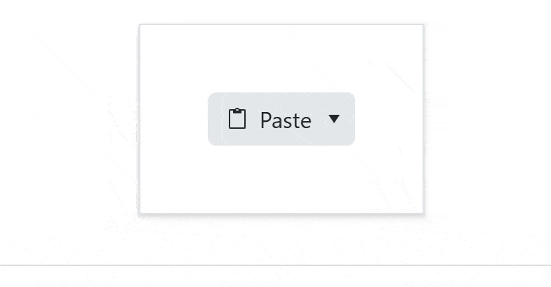
<TelerikDropDownButton>
  <DropDownButtonContent>Paste</DropDownButtonContent>
</TelerikDropDownButton>
Adding TelerikDropDown Items
To add dropdown items or “secondary buttons,” simply define them inside the DropDownButtonItems tag like this:
<TelerikDropDownButton>
…
  <DropDownButtonItems>
    <DropDownButtonItem  >Paste</DropDownButtonItem>
    <DropDownButtonItem  >Paste as HTML</DropDownButtonItem>
    <DropDownButtonItem  >Paste MarkDown</DropDownButtonItem>
    <DropDownButtonItem  > Set Default Paste </DropDownButtonItem>
  </DropDownButtonItems>
</TelerikDropDownButton>
The items above are very useful, but still, we can make them look better and extend their functionality by:
- Adding an image or icon by setting the
Iconattribute - Setting their
Enabledattributed to false if we want an item to be disabled for some reason. - Handling
OnClickevent
Note: The
Icon,OnClickandEnableattributes can be assigned to the DropDownComponent itself too.
Here is the full definition of the component:
<TelerikDropDownButton  Icon="@SvgIcon.Clipboard"  OnClick="@(() => OnButtonClick("Paste"))">
  <DropDownButtonContent>Paste</DropDownButtonContent>

  <DropDownButtonItems>
    <DropDownButtonItem  Icon="@SvgIcon.ClipboardText"  OnClick="@(() => OnItemClick("Paste  Text"))">Paste  Text</DropDownButtonItem>
    <DropDownButtonItem  Icon="@SvgIcon.ClipboardCode"  OnClick="@(() => OnItemClick("Paste  as HTML"))">Paste  as HTML</DropDownButtonItem>
    <DropDownButtonItem  Icon="@SvgIcon.ClipboardMarkdown"  OnClick="@(() => OnItemClick("Paste  Markdown"))">Paste  Markdown</DropDownButtonItem>
    <DropDownButtonItem  OnClick="@(() => OnItemClick("Set  Default  Paste"))">Set  Default  Paste</DropDownButtonItem>
  </DropDownButtonItems>
  <DropDownButtonSettings>
  <DropDownButtonPopupSettings  MaxHeight="500px"  MinWidth="150px">
    </DropDownButtonPopupSettings>
  </DropDownButtonSettings>
</TelerikDropDownButton>
Next, let’s review the attributes in detail.
Adding Icons
The <TelerikDropDownButton> and <DropDownButtonItem> provide an Icon parameter that allows you to add an icon to the main button and all secondary action items.
The Icon parameter is of type object and it accepts:
- A property of the static SvgIcon class
- A member of the FontIcon enum
- A string that is a CSS class for a custom icon
OnClick Event
Both the primary button and the secondary buttons offer the OnClick event, which fires when the user clicks or taps the button. Each of them executes a separate OnClick handler.
The example above executes the following event handler:
private  void  OnItemClick(string item)
  {
    Console.WriteLine($"User clicked {item} option");
  }
Now, Let’s Play with the Appearance ?
Themes Support and Styling with ThemeBuilder
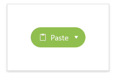
Telerik DropDownButton comes with 18 predefined variations of the Default, Bootstrap, Fluent and Material built-in themes. You can easily choose one of them and edit it or create a new one with Progress ThemeBuilder.
In our example, we will set the theme to Bootstrap with Nordic color variations.
The DropDownButton provides the same appearance parameters as the regular Button component. We can set:
- FillMode to Outline
- Rounded to Full
- Size to Large
- ThemeColor to the color marking the “success” states to have a completely different look and feel
<TelerikDropDownButton  FillMode="outline"
  Rounded="full"
  Size="lg"
  ThemeColor="success”>
  ...
</TelerikDropDownButton>
Explore more styling options with the appearance demo.
Configure the Popup
The dropdown popup can also be customized by using its DropDownButtonPopupSettings, like what’s shown below:
<TelerikDropDownButton  Icon="@SvgIcon.Clipboard"  OnClick="@(() => OnButtonClick("Paste"))">
  ...
  <DropDownButtonSettings>
    <DropDownButtonPopupSettings  MaxHeight="500px"  MinWidth="150px">
    </DropDownButtonPopupSettings>
  </DropDownButtonSettings>
</TelerikDropDownButton>
More Functionality—Accessibility, RTL and Keyboard Support
Accessibility and RTL
The Telerik UI for Blazor DropDownButton comes with built-in right-to-left (RTL) support and offers right-to-left rendering. By setting the EnableRtl parameter of the TelerikRootComponent to true, Telerik DropDown will change its direction:
<TelerikRootComponent  EnableRtl="true">
  @Body
</TelerikRootComponent>
Keyboard Navigation
By default, the KeyboardNavigation is enabled and allows us to use the keys below as described:
- Enter or Space – If the popup is opened, activates the currently focused item and closes the popup. If the popup is closed, it executes the default action of the DropDownButton.
- Alt + Down arrow – Opens the popup element.
- Alt + Up arrow – Closes the popup element.
- Esc – Closes the popup element.
- Up arrow – Focuses the previous item in the list.
- Down arrow – Focuses on the next item in the list.
- Home – Focuses on the first item in the list when the popup is opened.
- End – Focuses the last item in the list when the popup is opened.
- Tab – Moves focus outside of the component.
More Resources and Demos
As you saw, this simple UI component is actually very powerful. See more of it in Telerik UI for Blazor demos, play with it directly in Telerik REPL for Blazor and Telerik documentation, or customize with ThemeBuilder.
Try Now
You can check out Telerik UI for Blazor yourself: download it for free now, play with it and share your feedback and ideas with the Telerik team on Telerik Feedback Portal or Telerik Forums.
Happy coding!
</div
Recommend
About Joyk
Aggregate valuable and interesting links.
Joyk means Joy of geeK